CSS v.3 has improved to such a degree that designing web pages is now easy and fun. Let’s take a more in depth look at the some of the improvements made to CSS 3.
1. Border-radius
You can make HTML elements elliptical without using Photoshop or dealing with image files, using the border-radius rule. In the past, designers that needed to create an elliptical image had to cut the edges and place all images into HTML elements. This took too much time and was far too complicated when it came to making future modifications. Now all you need to do to make the element elliptical is apply the rule below. That’s it!
Rule:
-webkit-border-radius: 3px;

-moz-border-radius: 3px;

border-radius: 3px;
The rules starting with a dash are vendor-specific rules for Mozilla and Webkit rendering engines. If you want to make your web pages look smoother, border-radius is your best bet, and it certainly doesn’t harm users without a border-radius supported browser. It just means they won’t see the web page as smooth as it should be (which isn’t a big deal for most!)
There’s also a nifty little web tool that will create a border-radius rule for you. Simply visit http://border-radius.com/.
2. Border-image
Previously it was not possible to define an image for borderlines. With CSS 3, however, the border-image gives you the ability to create even better designs.
Multiple backgrounds
The luxury of having multiple background images was not possible before CSS 3 either. A designer had to create nested elements and give each one another background image. Now it is possible to define multiple background images with CSS 3.
background: url(top.png) top left no-repeat,

url(middle.png)center left no-repeat,

url(bottom.png) bottom left no-repeat;
3. @font-face
Internet bandwidth has increased worldwide. Even mobile devices have more than adequate internet speed which allows them to load web pages faster than ever before. These technological advancements have encouraged designers to use custom fonts on their websites. The font-face styling rule existed before but with CSS 3 it allows any kind of font to be used on the web (i.e. TrueType (.ttf) and OpenType (.otf) fonts).
@font-face {

font-family: “the-font”;

src: url(the-font.tff) format(“truetype”);

}
4. Attribute Selectors
In my opinion, this is the most useful improvement of them all. Selecting HTML elements is now so much easier with CSS 3. While having these selectors on older browsers won’t create an error, the browser will not apply the rules that you have chosen. This can be very dangerous. While these rules won’t really harm visitors, your selectors may not be applied, which could definitely cause a problem.
Let’s say you need to hide a container element and everything in it. If the selector doesn’t match, it won’t be hidden from the user, and the user may try to use it. Or maybe you have a 3 step registration and you are hiding the containers with CSS.
The visitor may see all the steps at the same time. Or worse yet, the containers may get mixed on top of each other and break your whole design and registration logic.
Some new selector examples:
/*Select the elements whose title attribute is an “a” character.*/

p

/*title attribute start’s with an “a” character. */

p

/*ends with an “a” character. */

p

/*contains an “a” character. */

p

/*Pretty obvious */

:nth-child()

/*Select the nth child with the same type of given element.*/

:nth-of-type()
Nth-of-type example
CSS Rules

p:nth-child(2) { color: black; }

p:nth-of-type(2) { color: black; }
Html to match
Words
Little
/* First rule matches this p */
Piggy
/* Second rule matches this p */
5. Opacity
At last, there’s a working transparency styling rule! In the past, designers had to rely on JavaScript to have transparent elements, and even that was not reliable enough. It was also making the page slower, since it wasn’t natively supported. But now it’s natively supported thanks to CSS 3 Opacity rule!
opacity: 0.5;

filter:alpha(opacity=40); /* For IE8 and earlier */
6. Box-shadow
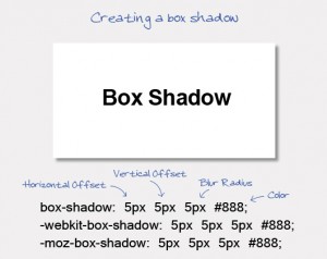
With the box-shadow rule, it is so easy to put shadowing behind the elements. At first you may think that this is not so useful, but placing a little bit of light shadow behind the elements really makes them stand out and differentiates them from one another. Visit some of the biggest websites such as YouTube.com and WordPress.com, and you will see that a number of elements they use have some kind of soft gray shadowing. There’s a perfectly valid reason for this in terms of human-computer interaction. We like simplicity and a similarity between colors. This, however, comes with a price because it is difficult to distinguish the page structure when it comes to menus and content for the user. A little bit of light shadowing can help solve this visual ambiguity problem.
box-shadow: 3px 3px 10px #333;
7. Text-Shadow
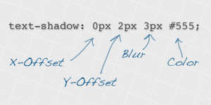
Text-shadow is very similar to box-shadow but it is for your text. It can make your text look like an image, which makes that specific text stand out against other text you may have on the page. This is especially useful when it comes to SEO because search engines do not understand images. Text-shadow allows you to have an image-like piece of text that catches the attention of your visitors while also catching the attention of search engines for specific keywords.
Check out this menu from WuFoo’s homepage. The letters there are text, not images. Take note of the applied text-shadow.
Example:
text-shadow: 0px 2px 3px #555;
Source of the image: line25.com
8. RGBA Colors
RGBA stands for Red Green Blue and Alpha. Alpha determines the opacity and RGB defines the colors and their density. If you remember basic physics from high school, colors in the universe consist of 3 main hues: red green and blue. Those three colors can be combined to create every other color in existence.
background: rgba(255, 212, 45, 0.5);
The density of the color is determined by numerical values ranging between 0 and 225. Zero is the darkest part of the color spectrum and 225 is the brightest. So if you were creating a color and put 0 in the box that determines the density of red, there would be no red hue in the color you created. Putting 225 in that box would incorporate a dense, scarlet red.
If you wanted black, all hues would be set to zero (0,0,0) because you don’t want any color. If you wanted white, you would use 255 for each hue, because white is the brightest.
Important Note
Not all CSS 3 features work on older versions of internet browsers. As you may already know, Google Chrome, Opera and Mozilla Firefox browsers update themselves automatically. Internet Explorer, however, does not, which poses a problem for designers. You may run into issues with IE 7 and IE 8 users. The compatibility of the element with the browser depends on the styling rule, not the rules of CSS 3 as a whole. So while one rule may not work on IE 8, another rule might be. You need to test all of your elements before releasing your work to the public.
While CSS 3 is simple to use, it does require a basic understanding of design and scripting to implement properly. If you’re interested in redesigning your website and need help, contact us today. The initial consultation is free!
Editorial by Jani Seneviratne.


