In the digital age, a website serves as the primary storefront for many businesses. For YetiCycles.com, a high-end mountain bike manufacturer, their website needed to reflect the premium quality of their products. Recognizing the importance of a strong online presence, we undertook a comprehensive redesign to enhance user experience, engagement, and overall functionality. This article delves into the specifics of the redesign, illustrating how strategic changes can significantly benefit any business looking to modernize its online platform.
A website redesign isn’t just about making a site look prettier; it’s about improving performance, increasing user engagement, and ensuring that the site meets the evolving needs of its audience. For YetiCycles.com, the redesign was a pivotal step in aligning their digital presence with their brand values of quality, innovation, and user-centric design. This article will guide you through the various changes made, explaining the rationale behind each decision and the anticipated benefits.
Homepage Redesign
1. Header Banner
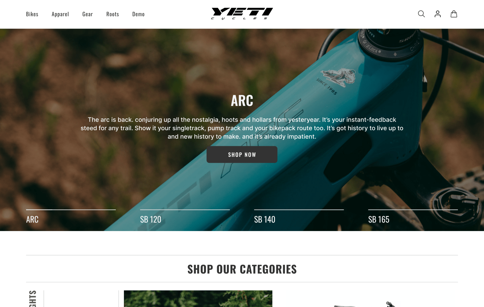
The header banner is often the first point of interaction between a website and its visitors. For YetiCycles.com, we created a visually striking header banner that immediately communicates the brand’s identity and values. The header banner acts as a digital billboard, making a strong first impression and setting the tone for the rest of the site.
A well-designed header banner is crucial because it can capture the visitor’s attention within seconds. It serves as a snapshot of what the brand represents and what visitors can expect. By focusing on a high-quality, engaging banner, we aimed to boost brand recognition and retention. This strategic approach helps distinguish YetiCycles.com from competitors with outdated and cluttered designs.
2. New User Interface
The new user interface (UI) was designed with the primary goal of enhancing user engagement and trust. A modern, clean UI can significantly improve the user’s experience, making navigation intuitive and enjoyable. For YetiCycles.com, the updated UI not only enhances visual appeal but also simplifies the user journey, reducing friction and encouraging exploration.
An effective UI design is critical for retaining visitors and converting them into loyal customers. By creating an interface that is both attractive and functional, we aimed to increase user satisfaction and encourage repeat visits. The new design sets YetiCycles.com apart from its competitors, many of which still rely on text-heavy and visually unappealing websites.
3. Simplicity in Design
In web design, simplicity is key. For YetiCycles.com, we focused on creating a simple, clean interface that communicates information clearly and concisely. Complex designs and cluttered layouts can overwhelm visitors, leading to frustration and higher bounce rates. By using clear language and avoiding unnecessary elements, we ensured that the site is easy to navigate and understand.
A simple design enhances user experience by making it easier for visitors to find what they’re looking for. This approach not only improves usability but also builds trust in the brand. Visitors are more likely to engage with and trust a site that is straightforward and easy to use.
4. Banner Ads
Banner ads play a crucial role in promoting products and increasing brand visibility. For YetiCycles.com, we incorporated strategically placed banner ads that showcase key products and special offers. These ads are designed to catch the visitor’s eye and direct them to relevant pages, increasing the likelihood of conversions.
Effective banner ads are measurable and can significantly boost a brand’s online presence. By integrating visually appealing and relevant ads, we aimed to drive traffic to specific product pages, thereby increasing sales and enhancing the overall user experience.
5. Accessibility
Ensuring that the website is accessible to all users was a top priority in the redesign of YetiCycles.com. Accessibility means making the site usable for people with various disabilities, including visual, auditory, and motor impairments. By adhering to accessibility standards, we ensured that every user, regardless of their abilities, can navigate and interact with the site effectively.
Accessibility is not just a legal requirement but also a moral one. A website that is accessible to all users demonstrates a brand’s commitment to inclusivity and social responsibility. For YetiCycles.com, ensuring accessibility helps in reaching a wider audience and providing a better overall user experience.
6. Value Proposition
The value proposition is a critical element of the homepage, designed to capture the visitor’s attention and communicate the unique benefits of YetiCycles.com’s products. By highlighting high quality, competitive prices, and limited-time offers, the value proposition helps in attracting and retaining customers.
An effective value proposition is clear, compelling, and prominently displayed. For YetiCycles.com, we ensured that the value proposition is the first thing visitors see, making it easy for them to understand the advantages of choosing YetiCycles products. This approach not only improves user engagement but also increases the likelihood of conversions.
Interactive Features
Quick View Functionality and Hover Effects
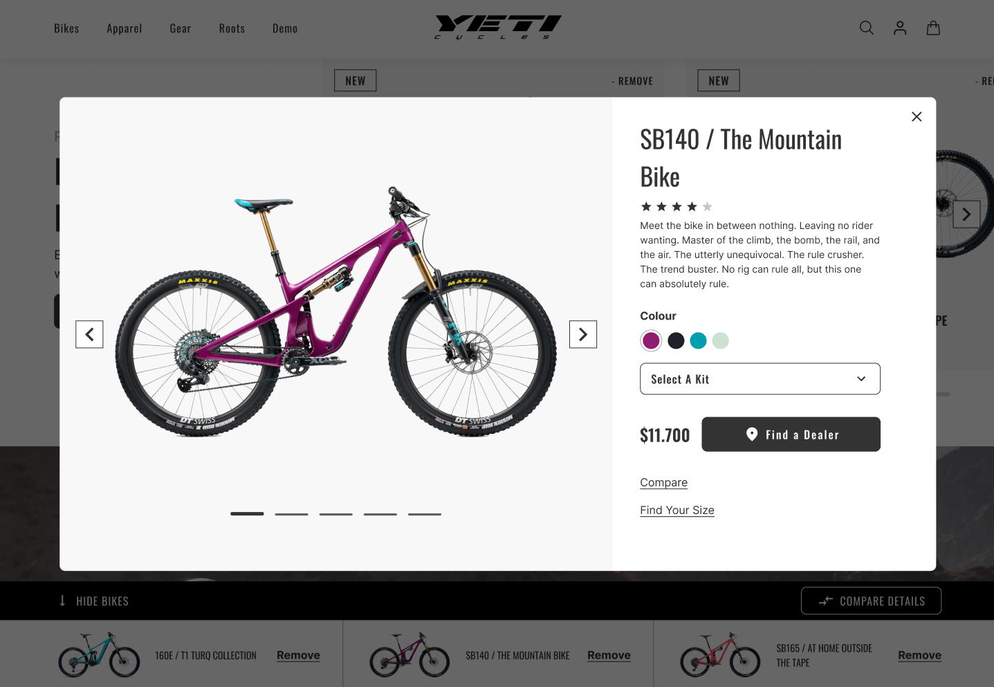
Interactive features like quick view functionality and hover effects are essential components of a modern e-commerce website. For YetiCycles.com, these features were integrated to enhance the overall user experience and make browsing more intuitive and enjoyable.
Quick View Functionality: This feature allows users to get a closer look at products without having to load separate product pages. By hovering over a product, users can access essential details and options in a popup window. This reduces the time and effort required to browse multiple products, making the shopping experience more efficient.
Benefits:
- Improved User Experience: Quick view functionality simplifies the shopping process, especially for users looking at multiple items. It reduces the need for back-and-forth navigation between product pages, which can be time-consuming and frustrating.
- Increased Engagement: Interactive elements like quick view can keep users engaged on the site for longer periods, increasing the likelihood of conversion.
- Streamlined Shopping: Users can quickly compare products and make decisions without interrupting their browsing flow.
Hover Effects: When users hover over interactive elements like buttons or links, visual transitions occur. These effects can include color changes, growth or shrinkage, and other animations that respond to user actions.
Benefits:
- Enhanced Visual Appeal: Hover effects make the site more dynamic and visually interesting, which can enhance the overall aesthetic and user experience.
- User Feedback: These effects provide immediate feedback to users, confirming their interactions with the site’s elements. This can improve usability and make the site feel more responsive.
- Highlight Key Items: Hover effects can draw attention to important elements, guiding users through their journey on the site.
Product Pages Enhancement
1. Verified Product Ratings
Including verified product ratings on the product pages of YetiCycles.com was a strategic decision aimed at building trust and confidence among potential customers. Verified ratings provide social proof that can influence purchasing decisions.
Benefits:
- Increased Trust: Verified ratings assure customers that the products are of high quality and have been positively reviewed by other buyers. This can be particularly persuasive for new visitors.
- Informed Decisions: Customers can make more informed purchasing decisions based on the experiences of others, leading to higher satisfaction and lower return rates.
2. Product Highlights and Features
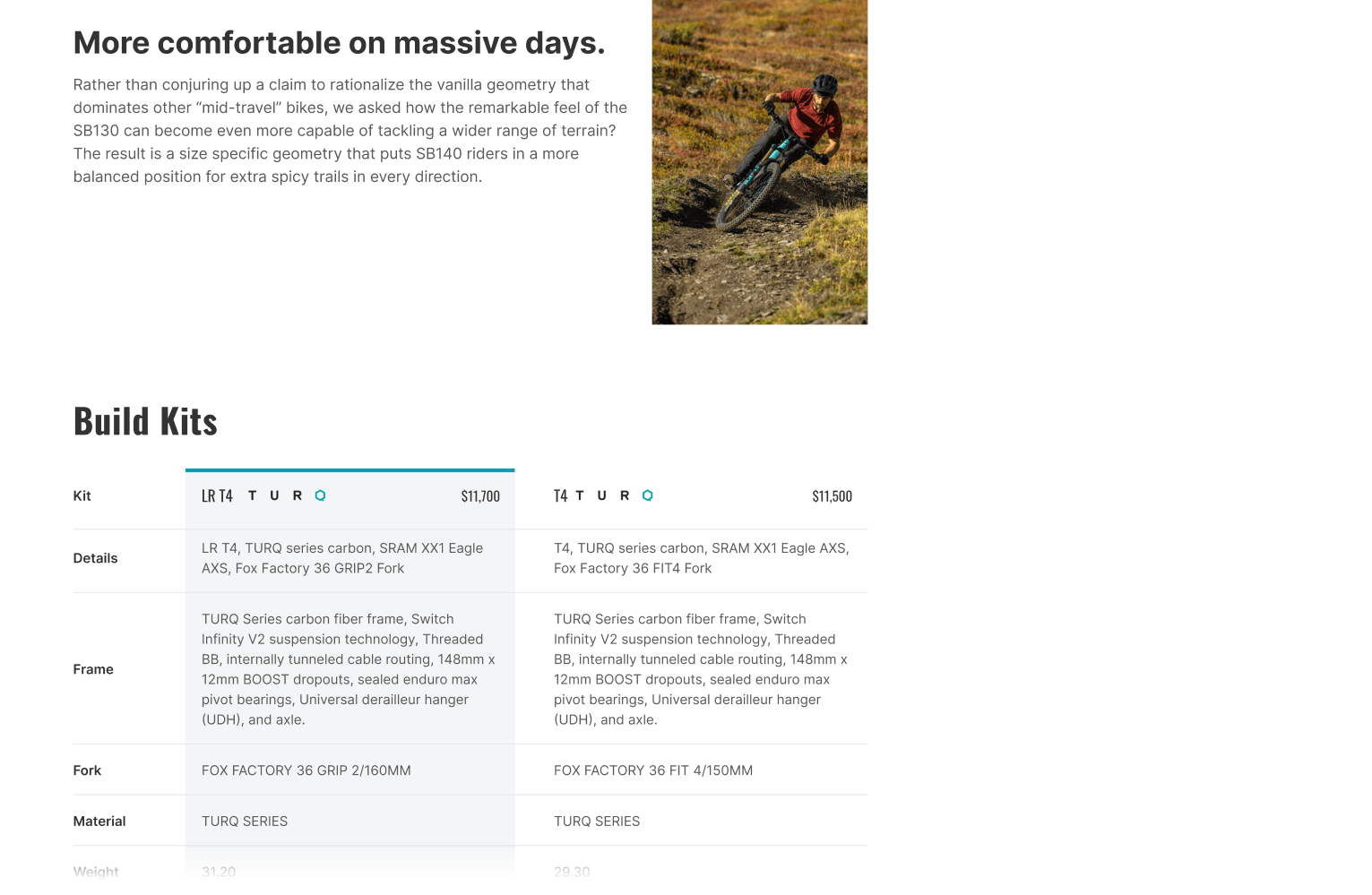
Presenting product highlights and features in a clear and concise manner is essential for keeping customers informed without overwhelming them. For YetiCycles.com, we focused on showcasing the most important attributes and benefits of each product.
Benefits:
- Clarity: Clear and concise product information helps customers quickly understand the benefits and features of a product, aiding their decision-making process.
- User-Friendly: Simplified product descriptions and highlights make the site more user-friendly, enhancing the overall shopping experience.
3. Up-Selling and Cross-Selling
Implementing up-selling and cross-selling strategies on the product pages can significantly boost sales and improve customer satisfaction. For YetiCycles.com, we integrated these techniques to showcase complementary products and higher-quality alternatives.
Benefits:
- Increased Sales: Up-selling encourages customers to purchase higher-end products, while cross-selling promotes complementary items. Both strategies can lead to increased average order values.
- Enhanced Customer Experience: By suggesting relevant products, we help customers find everything they need in one place, which can enhance their overall shopping experience.
Up-Selling Example: Showcasing higher-quality or more feature-rich versions of the product the customer is viewing, encouraging them to consider a more premium option.
Cross-Selling Example: Recommending complementary products that enhance the primary purchase, such as pairing a mountain bike with essential accessories like helmets and maintenance kits.
Navigation Enhancements
1. Mega Menu
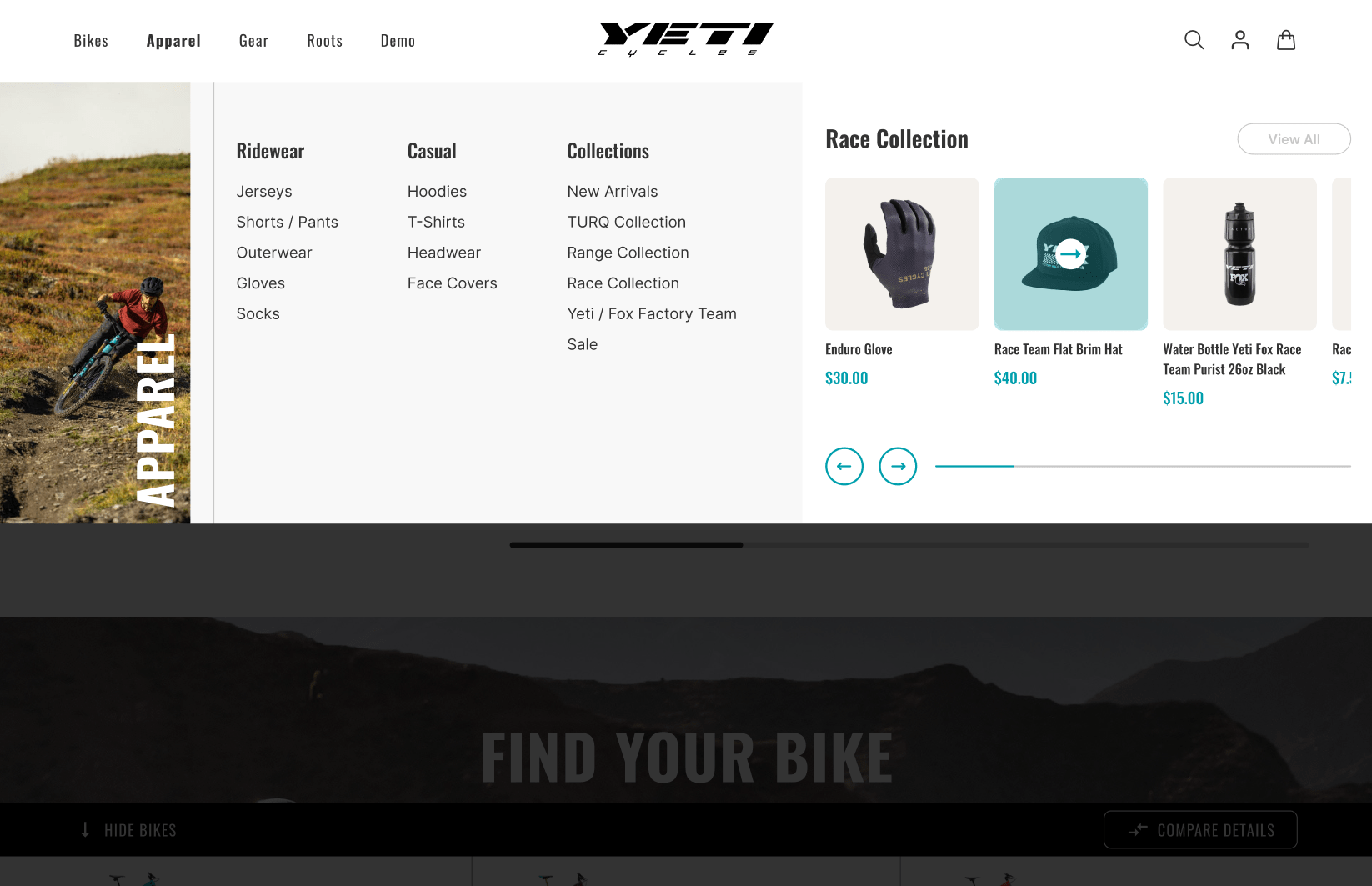
One of the standout features of the YetiCycles.com redesign is the implementation of a Mega Menu. This advanced navigation solution allows for an organized, user-friendly browsing experience, crucial for websites with a wide range of products and categories.
Benefits of a Mega Menu:
- Easy Navigation: The Mega Menu allows users to quickly find what they’re looking for without having to dig through multiple layers of dropdowns. This is especially important for e-commerce sites like YetiCycles.com that offer a vast array of products.
- Reduced Clutter: By organizing links into a structured, visually appealing format, the Mega Menu reduces visual clutter, making the website easier to navigate and more aesthetically pleasing.
- Promotes Relevant Products: With the ability to highlight specific products or categories within the Mega Menu, YetiCycles.com can guide shoppers towards featured items or promotions, enhancing the shopping experience and potentially increasing sales.
- Improved User Experience: A well-designed Mega Menu enhances the overall user experience by providing clear, accessible pathways to various sections of the site. This can lead to longer site visits and higher conversion rates.
Outdated websites often suffer from cumbersome navigation systems that frustrate users and drive them away. Implementing a Mega Menu is a practical solution that can streamline navigation, improve usability, and create a more enjoyable browsing experience for visitors.
2. Guided Navigation
Guided navigation is another critical component of the redesigned YetiCycles.com. By helping users find exactly what they are looking for quickly and easily, guided navigation enhances the overall user experience.
Benefits of Guided Navigation:
- User-Friendly: Guided navigation systems simplify the browsing process by providing clear, intuitive paths for users to follow. This reduces the likelihood of users getting lost or frustrated.
- Efficient Searching: By incorporating features like category filters and search suggestions, guided navigation helps users narrow down their options and find the most relevant products quickly.
- Increased Engagement: When users can easily find what they are looking for, they are more likely to spend time exploring the site, leading to higher engagement and potentially more purchases.
For websites still relying on outdated, convoluted navigation systems, adopting guided navigation can be transformative. It enhances the user experience, reduces bounce rates, and encourages visitors to explore more of what the site has to offer.
Category Pages Optimization
1. Search Interface
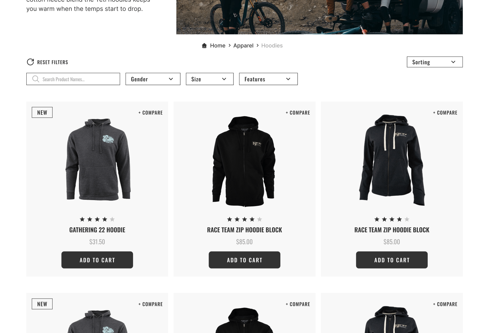
An optimized search interface is a crucial element of any e-commerce website, and YetiCycles.com is no exception. The redesigned search interface is interactive, easy to use, and visually appealing, designed to meet the needs of modern consumers who expect quick and accurate search results.
Benefits of an Optimized Search Interface:
- Enhanced User Experience: An intuitive search interface allows users to find what they’re looking for with minimal effort. Features like auto-suggestions, filters, and sorting options make the search process smooth and efficient.
- Higher Conversion Rates: According to research, visitors who use the search functionality are more engaged and significantly more likely to convert than those who do not. An optimized search interface can thus lead to higher sales.
- Improved Engagement: A seamless search experience keeps users on the site longer, encouraging them to explore more products and categories.
Outdated websites often have clunky, inefficient search interfaces that frustrate users and drive them away. By redesigning the search interface to be more user-friendly and efficient, websites can significantly enhance the overall shopping experience.
2. Filtering System
For websites with extensive product catalogs like YetiCycles.com, a robust filtering system is essential. Filters help users narrow down their choices based on specific criteria, making it easier to find the products that meet their needs.
Benefits of a Filtering System:
- Improved User Experience: Filters allow users to customize their search results according to their preferences, such as price range, product type, or brand. This makes the shopping process faster and more enjoyable.
- Higher Conversion Rates: An effective filtering system can increase conversion rates by helping users quickly find the products they’re looking for. According to studies, implementing filters can boost conversion rates by up to 26%.
- Increased Sales: By presenting users with relevant products based on their preferences, a filtering system can lead to higher sales and improved customer satisfaction.
Websites with outdated or non-existent filtering systems can greatly benefit from this feature. It not only enhances the user experience but also improves the overall efficiency of the shopping process, leading to higher engagement and increased sales.
By focusing on these critical navigation and search enhancements, the redesigned YetiCycles.com provides a seamless, enjoyable user experience that meets the needs of modern consumers. These changes demonstrate the importance of updating and optimizing website features to stay competitive in today’s digital marketplace.
Sticky Add to Cart Functionality
Definition and Purpose
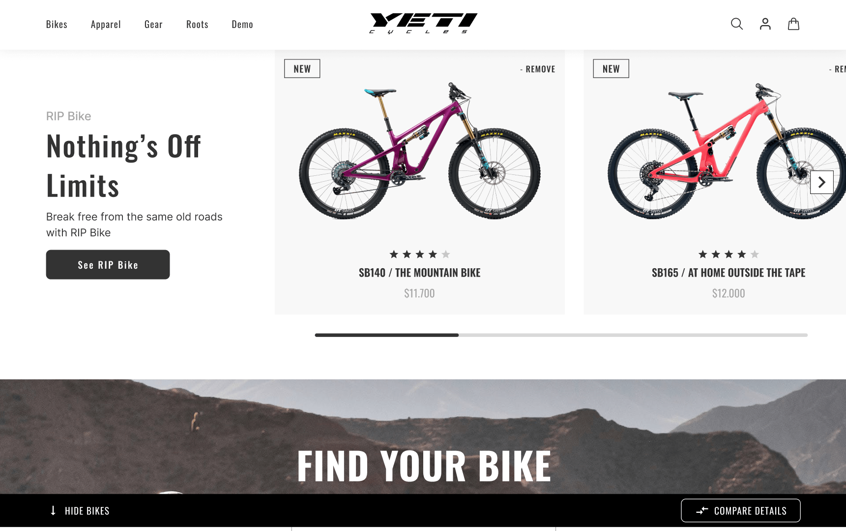
A key feature of the YetiCycles.com redesign is the implementation of the Sticky Add to Cart functionality. This feature ensures that the “Add to Cart” button is always accessible to users, regardless of how far they scroll down the product page. This persistent cart button is designed to enhance the shopping experience and increase conversion rates.
Benefits of Sticky Add to Cart:
- Enhanced Customer Experience: By keeping the Add to Cart button in view at all times, users can easily add items to their cart without having to scroll back up to find the button. This convenience reduces friction in the shopping process, making it easier and faster for customers to complete their purchases.
- Increased Conversions: The visibility of the Add to Cart button at all times can lead to higher conversion rates. Studies have shown that implementing a sticky cart button can increase orders by up to 8%. This feature helps ensure that the call-to-action is always accessible, prompting more users to complete their purchases.
- Reduced Cart Abandonment: When the Add to Cart button is always visible, users are less likely to abandon their shopping journey. This feature reduces the likelihood of customers getting distracted or frustrated by having to navigate back to the top of the page to add an item to their cart.
For outdated websites that still use static cart buttons, implementing a sticky Add to Cart functionality can be a game-changer. This simple yet effective feature can streamline the shopping experience, reduce cart abandonment, and boost overall sales.
Conclusion
The redesign of YetiCycles.com illustrates the transformative power of thoughtful, user-centric web design. By focusing on key areas such as interactive features, navigation enhancements, product page optimization, and the implementation of a sticky Add to Cart functionality, we have significantly improved the user experience, engagement, and conversion rates for this high-end mountain bike manufacturer.
A modern, well-designed website is not just a visual upgrade; it is an essential component of a successful online strategy. Outdated websites often suffer from poor user experience, low engagement, and high bounce rates, which can negatively impact a business’s bottom line. By adopting the changes and improvements highlighted in this article, businesses can ensure their websites meet the evolving needs of their users and stay competitive in today’s digital landscape.
Key Takeaways:
- Interactive Features: Enhancing the user experience with quick view functionality and hover effects can make browsing more enjoyable and efficient.
- Navigation Enhancements: Implementing a Mega Menu and guided navigation helps users find what they are looking for quickly and easily, reducing frustration and improving engagement.
- Search and Filtering Optimization: An optimized search interface and robust filtering system can significantly improve the user experience, increase engagement, and boost conversion rates.
- Sticky Add to Cart Functionality: Keeping the Add to Cart button visible at all times can enhance the shopping experience, reduce cart abandonment, and increase sales.
By focusing on these critical aspects, businesses can create a more user-friendly, engaging, and efficient online presence. A comprehensive redesign is not just an aesthetic improvement but a strategic investment in the future success of the business. YetiCycles.com’s redesign serves as a powerful example of how modernizing a website can lead to significant benefits, and it underscores the importance for all businesses to consider a similar approach to stay relevant and competitive.


