In the fast-paced world of digital commerce, a company’s online presence plays a pivotal role in shaping its reputation, driving traffic, and ultimately ensuring sustained growth. Enter xlr8performance.com – a renowned hub for aftermarket & German performance auto parts. With its promise of unbeatable prices and an array of high-quality parts, the brand has carved a niche for itself. Yet, as the digital landscape evolves, even the most reputable brands must adapt to remain relevant and provide users with an experience that’s both intuitive and memorable. Recognizing this, xlr8performance.com undertook a massive overhaul of its website, heralding a new era in its digital journey. Let’s dive deeper into the transformative redesign and explore its intricate elements.
Homepage Design: First Impressions Matter
Imagine walking into a store where the main display is outdated, cluttered, and doesn’t immediately showcase the store’s best offerings. You’d probably question the quality of the products and the store’s attention to current trends. The digital realm is no different. The homepage of a website acts as the storefront for online businesses, making the first, and often most enduring, impression on a visitor.
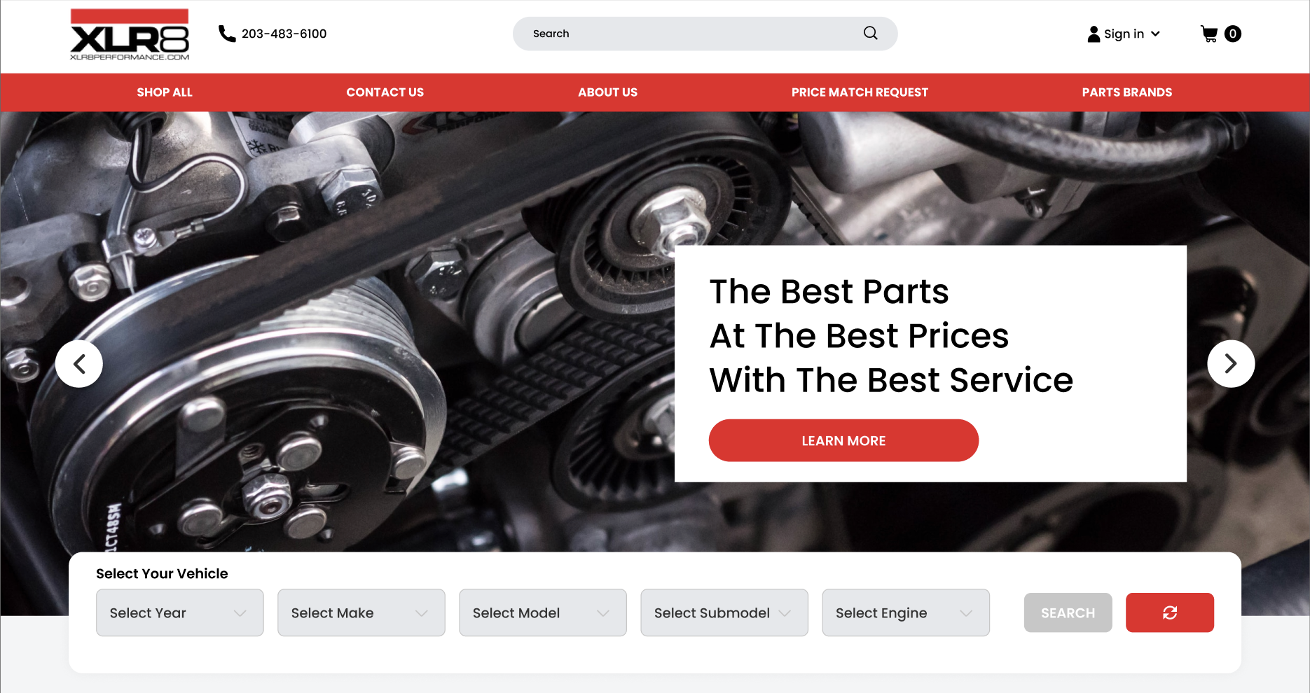
The Power of Header Banners: The moment a user lands on a website, the header banner serves as the grand welcome. It’s not just about flashy graphics or catchy slogans. The header banner encapsulates the essence of a brand – announcing its identity, values, and what it stands for. For xlr8performance.com, optimizing this space meant offering a visual and textual representation of its core promise: top-notch auto parts at unbeatable prices. In doing so, it’s not just about aesthetics; it’s a strategic move that firmly establishes brand personality right off the bat.
The Advantages of a Fresh User Interface: With the rapid advancements in technology, a design that was considered state-of-the-art a few years ago can quickly become outdated. An outdated design can subliminally signal that a brand is not keeping up with the times, potentially eroding trust. By introducing a modern UI, xlr8performance.com not only aesthetically rejuvenated its platform but also enhanced user engagement. This is crucial in the digital age, where user experience can be the differentiator between a loyal customer and a lost visitor. The revamped interface sets xlr8 apart from text-heavy, cluttered websites, offering users a seamless journey through the vast array of products.
The Art of Simplicity in Design: In the quest to provide information, many websites fall into the trap of overcomplicating their design. However, clarity and simplicity often reign supreme. By focusing on a straightforward design, xlr8performance.com ensures that visitors can effortlessly navigate and understand the offerings. Such a design philosophy not only reduces user frustration but also subtly communicates a brand’s understanding of its audience’s needs.
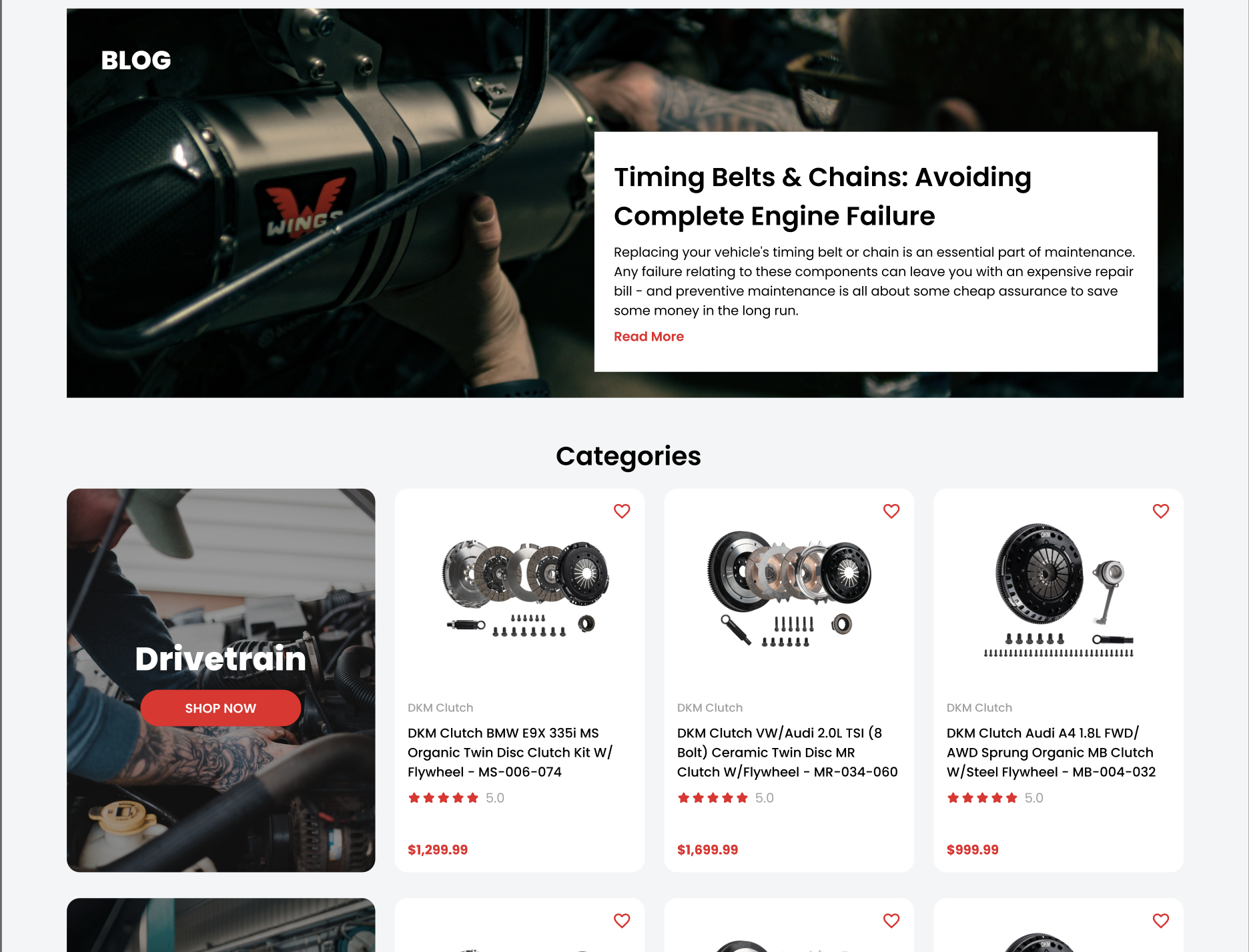
Leveraging Banner Ads for Branding: Beyond the header, banner ads strategically placed across the site can serve dual purposes. For one, they act as visual breaks, enhancing the overall aesthetics of the page. More importantly, they’re strategic touchpoints, guiding users to specific products or offers, thereby increasing the potential for conversions. However, xlr8performance.com’s use of banner ads isn’t just about selling; it’s about informing and guiding visitors through their auto parts journey.
Accessibility: Designing for Every User: Inclusivity should be at the heart of modern design. Ensuring that every user, regardless of their capabilities, can access and navigate the website is paramount. By emphasizing accessibility, xlr8performance.com reaffirms its commitment to all its users, fostering a sense of community and inclusiveness.
Value Proposition: Grabbing Attention: Amid the vast ocean of digital content, a clear value proposition acts as a beacon, drawing users in. By clearly highlighting offers such as “High quality” or “50% off”, xlr8performance.com makes it easy for visitors to identify the benefits of choosing them, all without being overly aggressive.
In essence, the homepage redesign of xlr8performance.com serves as a testament to the power of thoughtful web design. By seamlessly blending aesthetics with functionality, it sets the stage for a user experience that’s both enriching and memorable. As the digital realm continues to evolve, this redesign stands as a compelling case for why businesses, old and new, should continually reassess and adapt their online presence.
Enhancing User Experience: Quick View and Hover Effects
User experience (UX) is the heart and soul of any digital platform. It’s the sum of all interactions a visitor has with a website, determining if they’ll stay, explore further, or exit. For xlr8performance.com, enhancing UX was more than just a design goal; it was a commitment to their audience.
The Magic of Hover Effects: Think of the last time you hovered over an element on a website, only to be greeted by a delightful animation or a hint of information. Such micro-interactions, while seemingly simple, play a huge role in enhancing user engagement. They signify the responsiveness of a site, showing visitors that the platform is ‘alive’ and interactive. For xlr8performance.com, implementing hover effects wasn’t just about aesthetics, but also about assuring users of the website’s functionality and responsiveness.
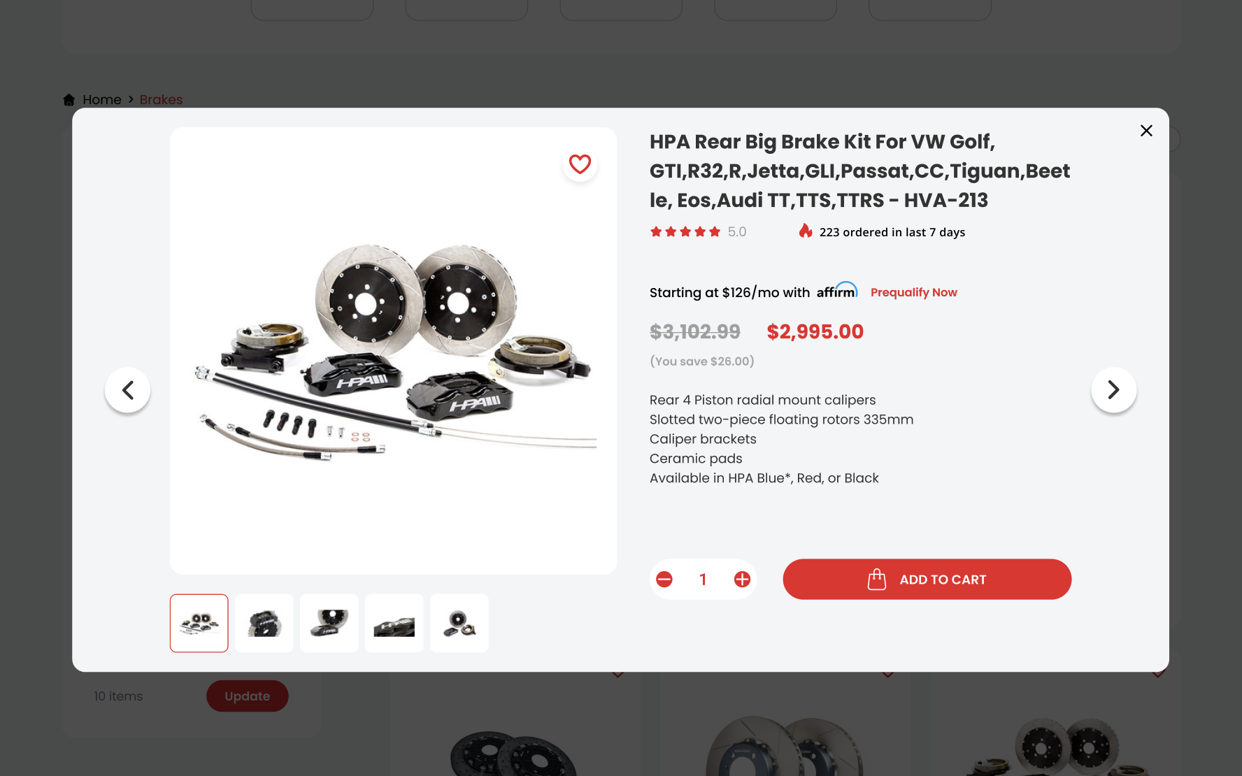
The Efficiency of Quick View Options: In the realm of e-commerce, time is often of the essence. A user doesn’t always have the luxury to dive deep into every product detail page. Enter the ‘Quick View’ feature. By allowing users to glean essential product details without diving into the full page, xlr8performance.com dramatically streamlined the shopping experience. For users juggling multiple items or those keen on quick comparisons, this feature is nothing short of a boon, making the selection process swift and hassle-free.
Imagine searching for a term on a website and being able to quickly preview the contexts in which the term appears. With Quick View windows, this becomes a reality. Users can rapidly ascertain the relevance of their search results, refining their choices and navigating with greater confidence.
Navigational Mastery with Mega Menus
In the digital age, the way visitors navigate a website can make or break the entire user experience. With vast inventories and diverse offerings, e-commerce platforms especially face the challenge of presenting their content in a manner that’s both comprehensive and user-friendly.
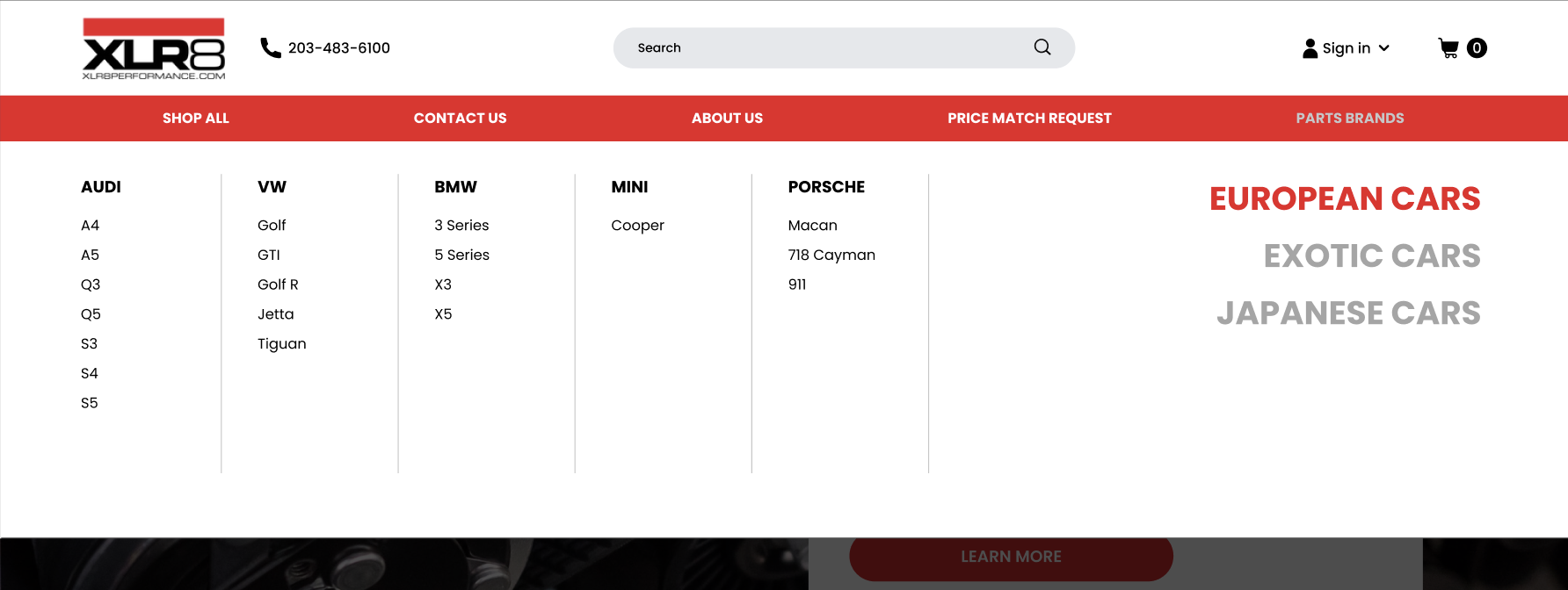
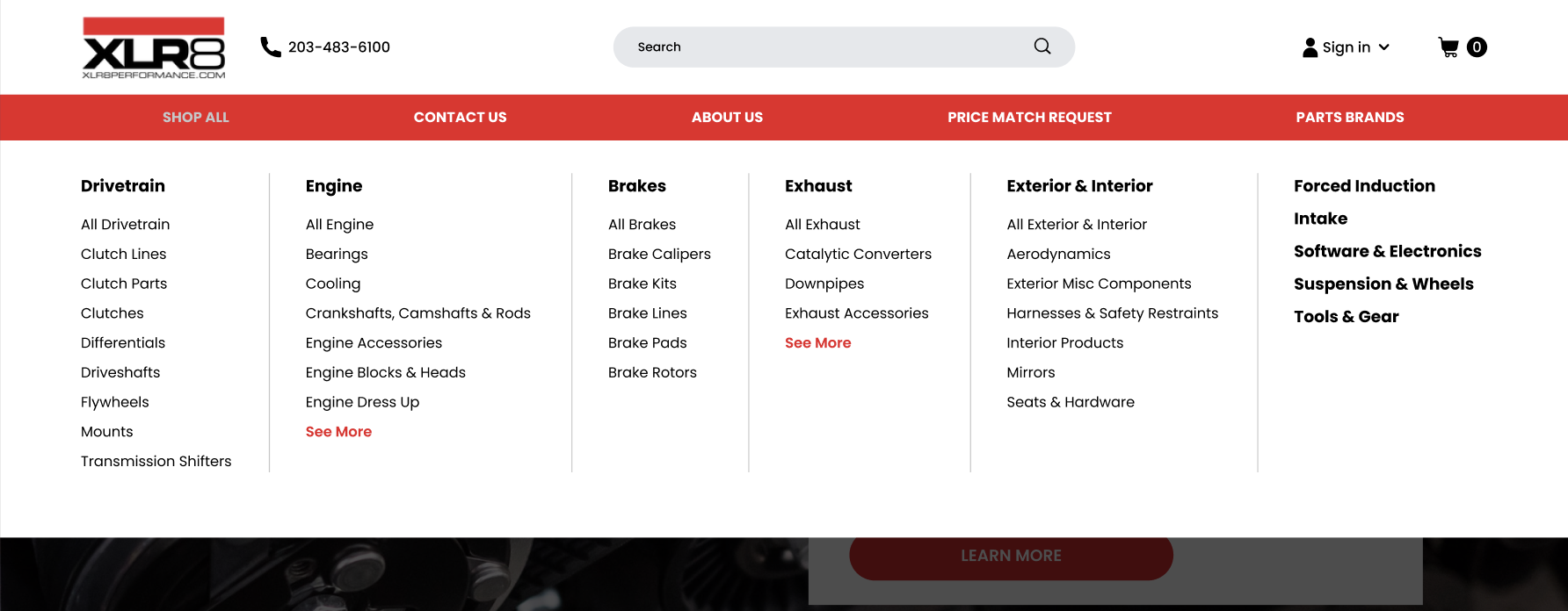
The Rise of Mega Menus: Traditional dropdowns, while functional, often falter when faced with extensive content. They can become unwieldy and challenging to navigate. Mega menus, on the other hand, are the next step in navigational evolution. For a platform like xlr8performance.com, with its vast array of auto parts, a mega menu was the logical choice. It not only declutters the navigation bar but also groups relevant items together, offering users a panoramic view of all available categories at a glance.
More than just a menu, the mega menu acts as a guide. By strategically organizing and highlighting products, xlr8performance.com can seamlessly lead visitors to their desired destination, be it a specific product category or a seasonal offer. It’s not just about finding items faster; it’s about discovering new ones that might have been overlooked in a conventional menu.
Why Mega Menus Reign Supreme: The adoption of mega menus is not a mere trend; it’s a reflection of an evolving user expectation. As websites become denser with content, users expect more efficient navigation tools. A mega menu, with its structured layout and comprehensive categories, meets this expectation head-on, offering both seasoned and new visitors an optimized browsing experience.
In conclusion, xlr8performance.com’s emphasis on hover effects, quick view options, and mega menus is not just about staying updated with current design trends. It’s a conscious effort to elevate the user experience, making the shopping journey more intuitive, efficient, and enjoyable. As the digital ecosystem continues to grow, such innovations underscore the importance of constant evolution, beckoning all websites to revisit, reassess, and rejuvenate their user experience.
Optimized Category Pages: The Art of Searching and Filtering
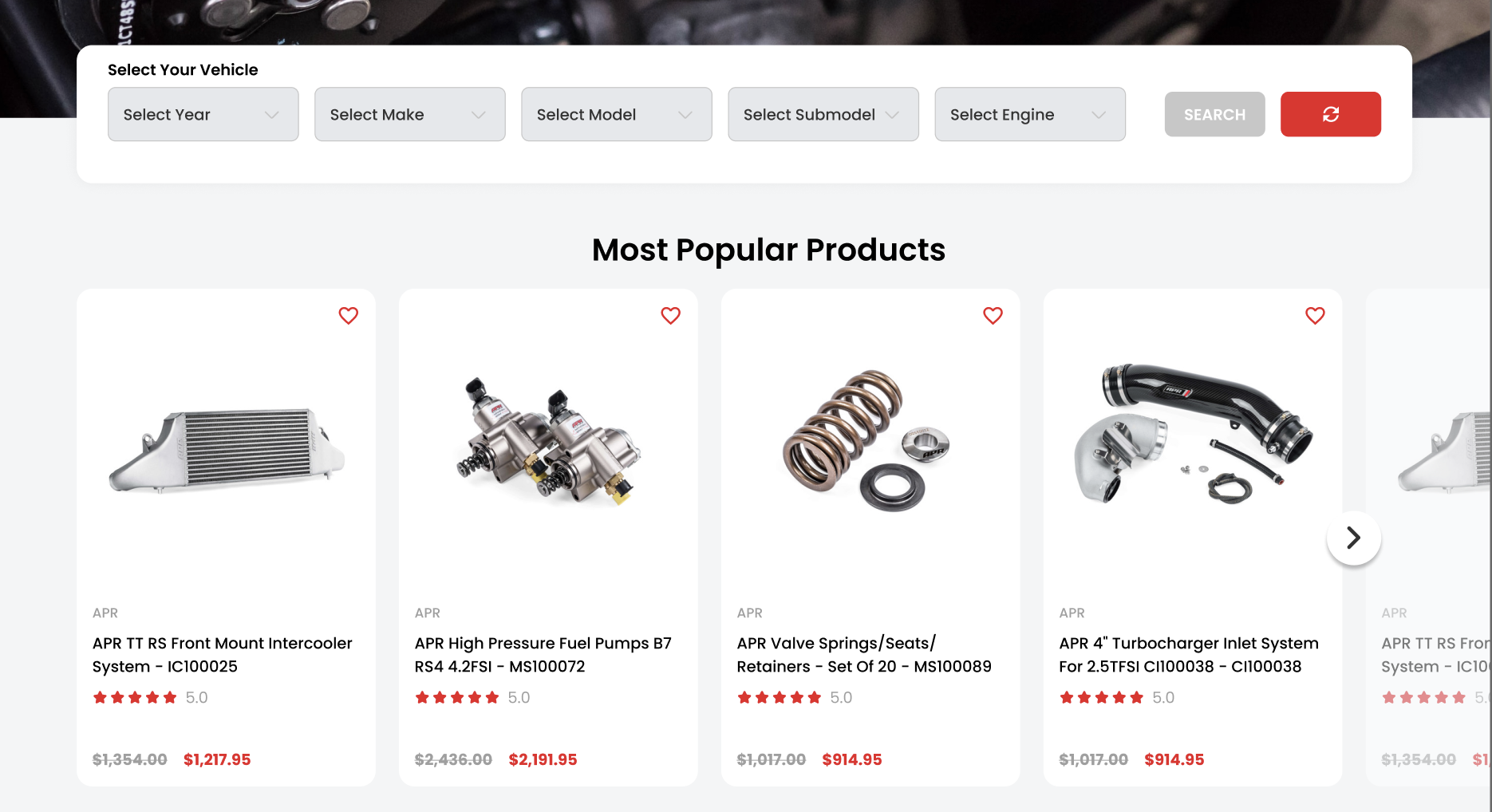
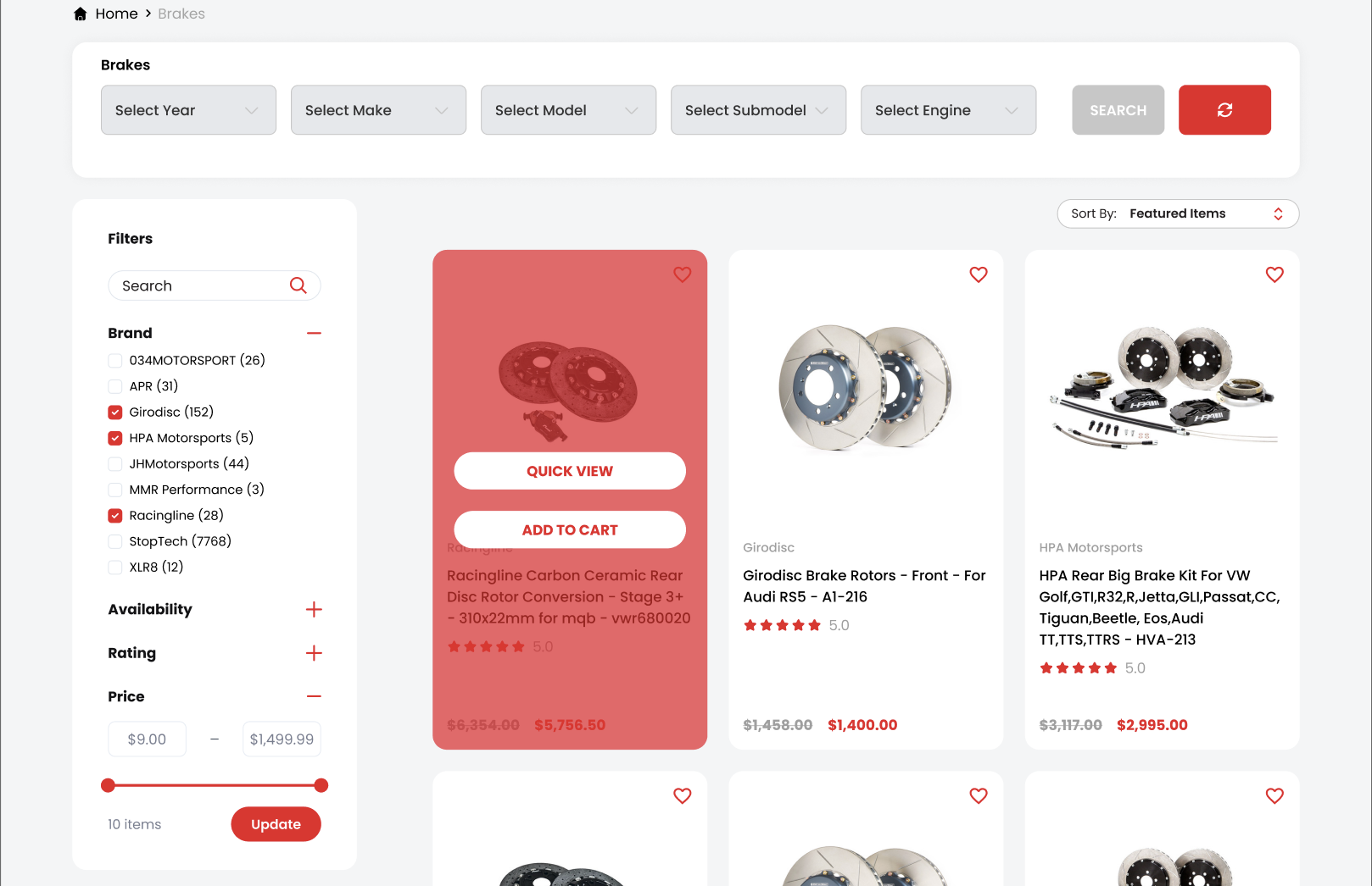
In the vast digital realm, where seconds can determine whether a user stays or strays, facilitating smooth navigation becomes paramount. The xlr8performance.com redesign recognizes the importance of streamlined search and filtering, and here’s how it empowers the user:
It’s stated that 43% of website visitors go straight to the search bar. This is not a mere coincidence. These searchers, being highly engaged, are 1.8 times more likely to convert compared to non-searchers. Recognizing this, xlr8performance.com’s search interface has been made not just functional but also interactive, pleasing to the eye, and delightfully easy to use.
For e-commerce platforms, especially one as extensive as xlr8performance.com, filtering is not just a feature; it’s a necessity. Filters empower users, allowing them to tailor their browsing experience. Whether they’re in search of a specific product category or scouting for the best deals, a robust filtering system can make or break the experience. By enhancing filter UX design, xlr8performance.com caters to a wider audience, ensuring that users find precisely what they’re looking for, thereby driving conversions and sales.
Product Pages: Showcasing Quality and Building Trust
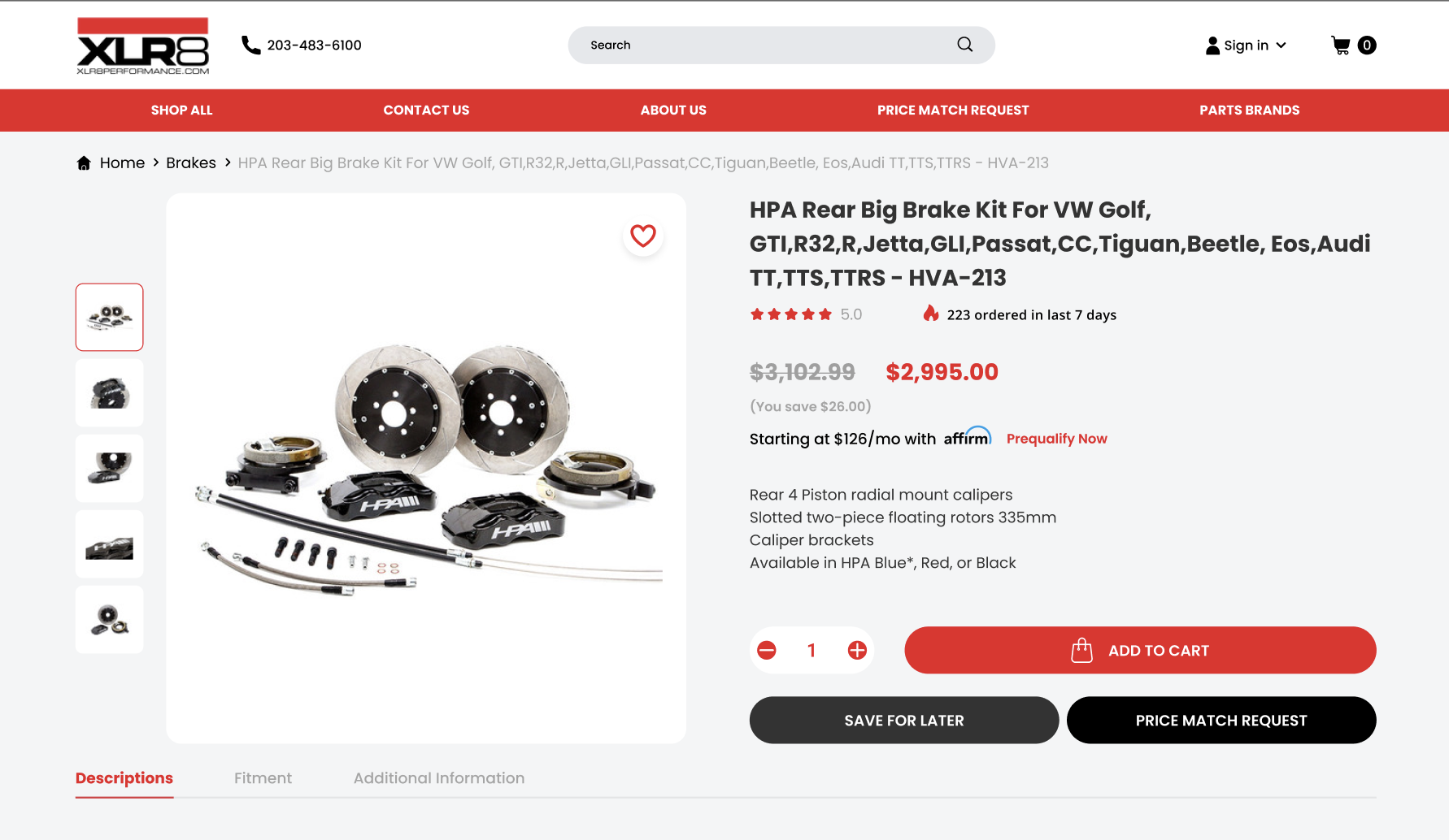
The product page is where a potential customer transitions from a curious visitor to a convinced buyer. It’s a critical juncture in the online shopping journey, and xlr8performance.com has optimized this space to inspire trust and confidence:
Verified Product Ratings and Authenticity Proof: In today’s age, where counterfeits are rampant, assuring customers of product authenticity is vital. By showcasing verified ratings and proofs of genuineness, xlr8performance.com not only asserts the quality of its offerings but also instills a sense of trust in its clientele. It’s a subtle yet potent reminder that they are investing in genuine, high-quality auto parts.
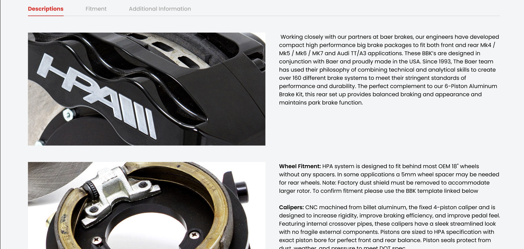
Product Highlights and Features Presentation: Bombarding customers with too much information can be overwhelming. Recognizing this, xlr8performance.com adopts a strategy of clarity and conciseness. By presenting product highlights and essential features in an easy-to-digest manner, it ensures that customers have all the information they need without feeling swamped.
Recommending complementary products is not just a sales tactic; it’s a service. It enhances the customer’s product experience and ensures they have everything they need. By showcasing related products that pair well together, xlr8performance.com aids customers in making well-informed decisions, ensuring their satisfaction is maximized.
Sticky Add to Cart: Keeping Conversions in Sight
E-commerce isn’t just about the array of products or appealing descriptions; it’s fundamentally about fostering seamless interactions. One such interaction pivotal to conversions is the ‘Add to Cart’ functionality.
With the redesign, xlr8performance.com innovatively introduces the Sticky Add to Cart feature, and here’s why it’s revolutionizing the shopping experience:
- Always Within Reach: As users scroll through product details, reviews, or related items, the Sticky Add to Cart button consistently stays within sight. This omnipresence ensures that whenever a user decides to make a purchase, the pathway to doing so is just a click away, reducing friction and hesitation.
- Boosting Conversions: By keeping the purchase pathway constantly visible, xlr8performance.com is strategically optimizing for spontaneous buying decisions. It’s not surprising that such a feature has led to an increase in orders by 8%. In essence, it acts as a gentle reminder, nudging users towards the checkout without being overly aggressive.
Conclusion
The journey of xlr8performance.com’s redesign is not just a tale of aesthetic enhancement. It is a testament to the potent combination of user-centered design and strategic thinking. Each facet of the redesign, from the engaging header banners to the intuitive Sticky Add to Cart feature, reflects a commitment to improving the user experience. It underlines the importance of staying agile in the digital realm, of being attuned to evolving user behaviors, and of the undeniable benefits of timely upgrades.
While trends in website design will continue to evolve, the core principle remains unchanged: prioritizing user experience is paramount. For businesses still navigating the waters of outdated website designs, the transformation of xlr8performance.com serves as an inspiring blueprint. It’s not just about keeping up with the times; it’s about anticipating user needs, fostering trust, and creating a seamless digital journey.
If you’re considering a similar transformative journey for your digital platform or if you have any inquiries about the innovative changes at xlr8performance.com, Contact Us today. Let’s navigate the future of digital experiences together.


