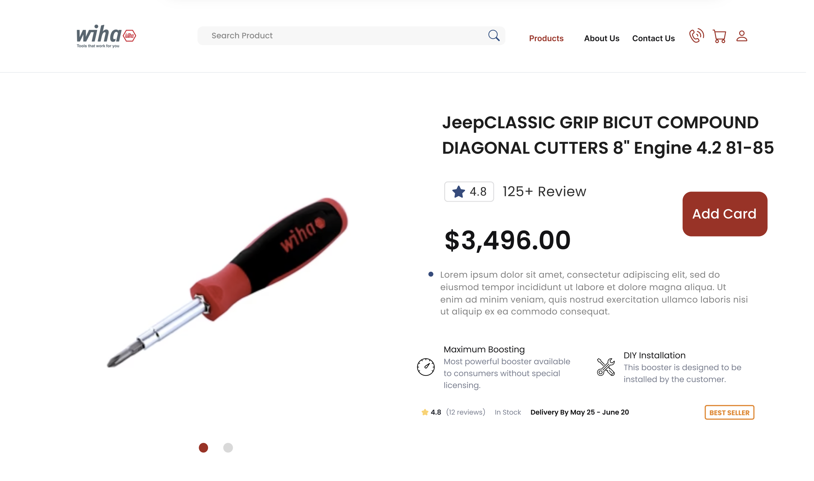
Since its establishment in 1985, Wiha Tools has been a beacon of excellence in the tool industry in the USA. Known for their robust screwdrivers, bits, pliers, and hex keys, Wiha has not just sold tools but has built a legacy. These tools, cherished by professionals worldwide, epitomize quality and endurance. As we transition into a more digital-centric world, Wiha Tools confronts the challenge of mirroring its physical reliability and prestige in the digital realm. The website redesign for Wiha Tools is an endeavor to encapsulate the essence of their brand in a virtual format, offering a seamless bridge between their revered physical products and an online presence.
The Imperative of Digital Evolution
In today’s fast-paced digital landscape, a company’s online interface is as significant as its physical products. For Wiha Tools, the website redesign transcends aesthetic enhancement—it is a strategic overhaul aimed at intensifying user engagement, showcasing product superiority, and simplifying the path from discovery to purchase. This article will delve into the intricacies of this digital transformation, exploring the meticulous changes implemented across various facets of the website including the Homepage, User Experience, Mega Menus, Category Pages, and Product Pages.
Homepage Transformation
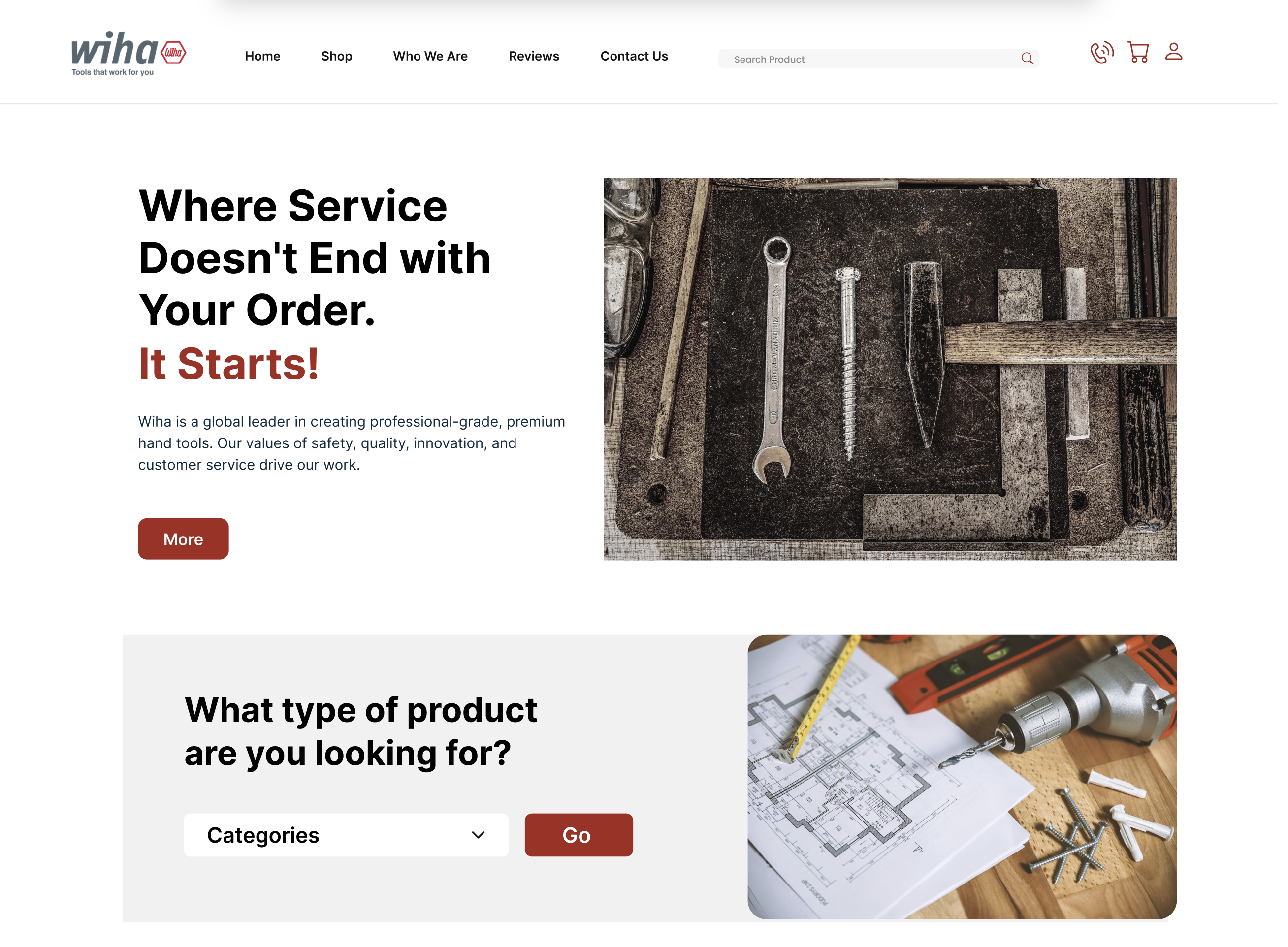
The redesigned homepage of Wiha Tools is a blend of sophistication and functionality. It serves as the digital storefront, reflecting the company’s commitment to quality and precision. The introduction of dynamic visual elements and interactive features marks a significant shift from a conventional product listing to a narrative-driven display. High-resolution images, coupled with engaging animations, offer an immersive experience, narrating the story of each tool and its craftsmanship. This new layout, while aesthetically pleasing, is meticulously organized to guide visitors seamlessly towards product categories, the latest offerings, and vital information.
Streamlining User Interaction for Enhanced Engagement
At the heart of the homepage redesign lies an intuitive and streamlined navigation system. The moment a visitor lands on the site, they are met with a clear and concise menu, directing them effortlessly to their desired section—be it a specific tool category, new arrivals, or educational resources. Interactive banners and strategically placed call-to-action buttons further enhance user engagement, inviting visitors to explore, discover, and connect with the products. Testimonials from satisfied professionals and highlights of bestsellers are strategically interspersed, providing social proof and nudging potential customers toward making informed purchase decisions. This approach not only elevates the user experience but is a crucial driver for conversion and brand loyalty.
In the next part, we will explore the enhancements in user experience, the strategic implementation of mega menus for ease of navigation, the optimization of category pages for a more efficient browsing experience, and the meticulous design of product pages to provide detailed information and interactive elements that showcase Wiha Tools’ commitment to quality and customer satisfaction.
User Experience Enhancements
The redesign of Wiha Tools’ website prioritizes an enhanced user experience (UX) at its core. Recognizing that the ease and efficiency of website navigation directly influence customer satisfaction and loyalty, significant strides have been made to streamline the user journey. The new UX design is anchored in simplicity and intuitiveness, ensuring that both seasoned professionals and casual users can navigate the site with equal ease.
Responsive Design for Seamless Cross-Device Access
In today’s digital age, users access websites from a myriad of devices, each with different screen sizes and capabilities. Wiha Tools’ website redesign embraces this diversity with a responsive design. This approach guarantees that the website adapts fluidly to any device, be it a desktop, tablet, or smartphone, maintaining consistency in user experience. The layout, text, images, and interactive elements automatically resize and reorient to offer the optimal viewing experience, ensuring that the quality and accessibility of the website are uniform across all platforms.
Incorporating User Feedback for Continuous Improvement
A unique aspect of UX enhancement is the incorporation of user feedback into the design process. Regular surveys, user testing sessions, and analysis of user behavior data have provided invaluable insights. These insights have informed various design decisions, from the placement of navigation buttons to the structuring of information. By placing the user at the center of the redesign, Wiha Tools ensures that the website not only looks appealing but also resonates with the users’ needs and preferences.
Mega Menus
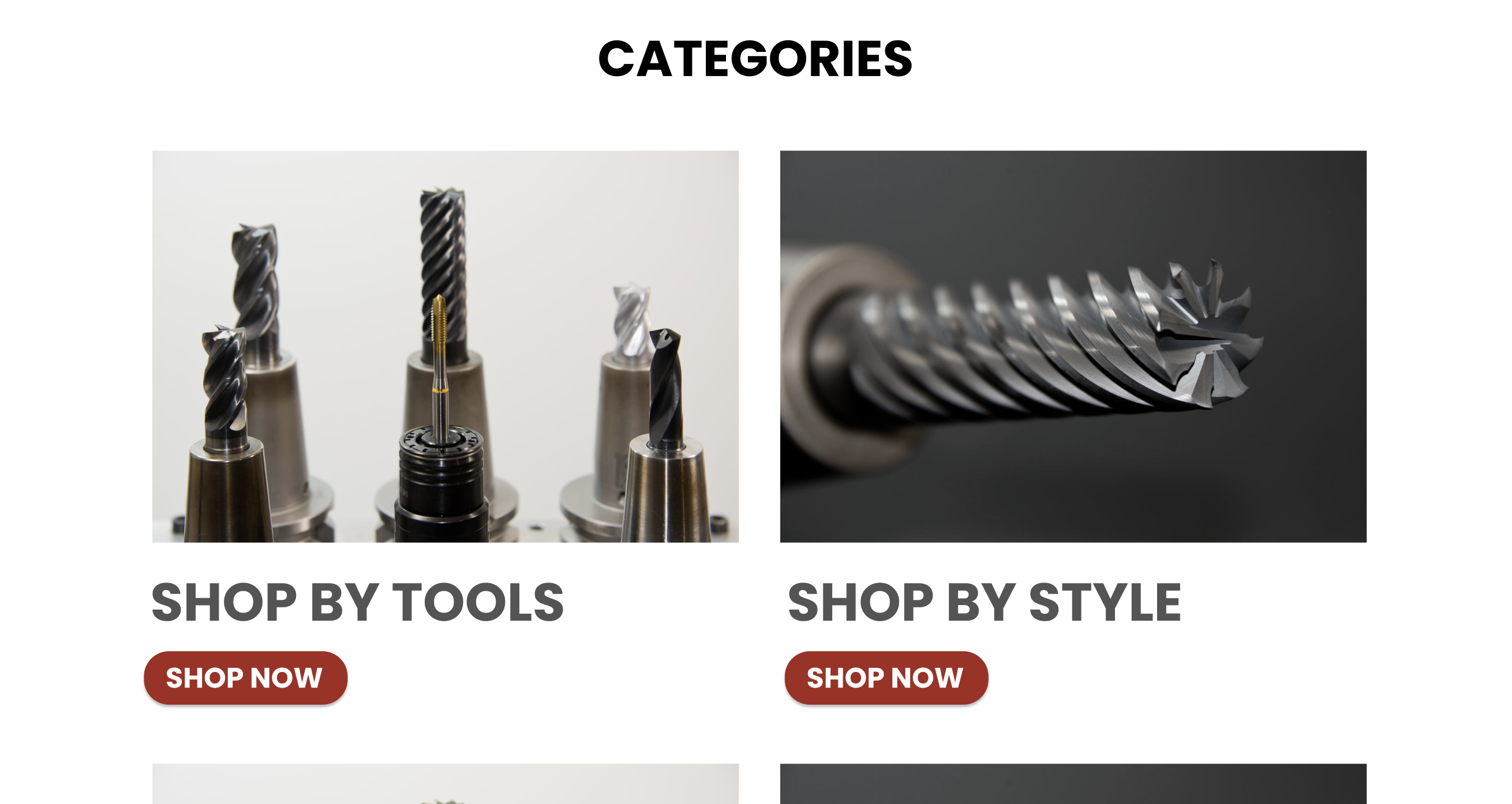
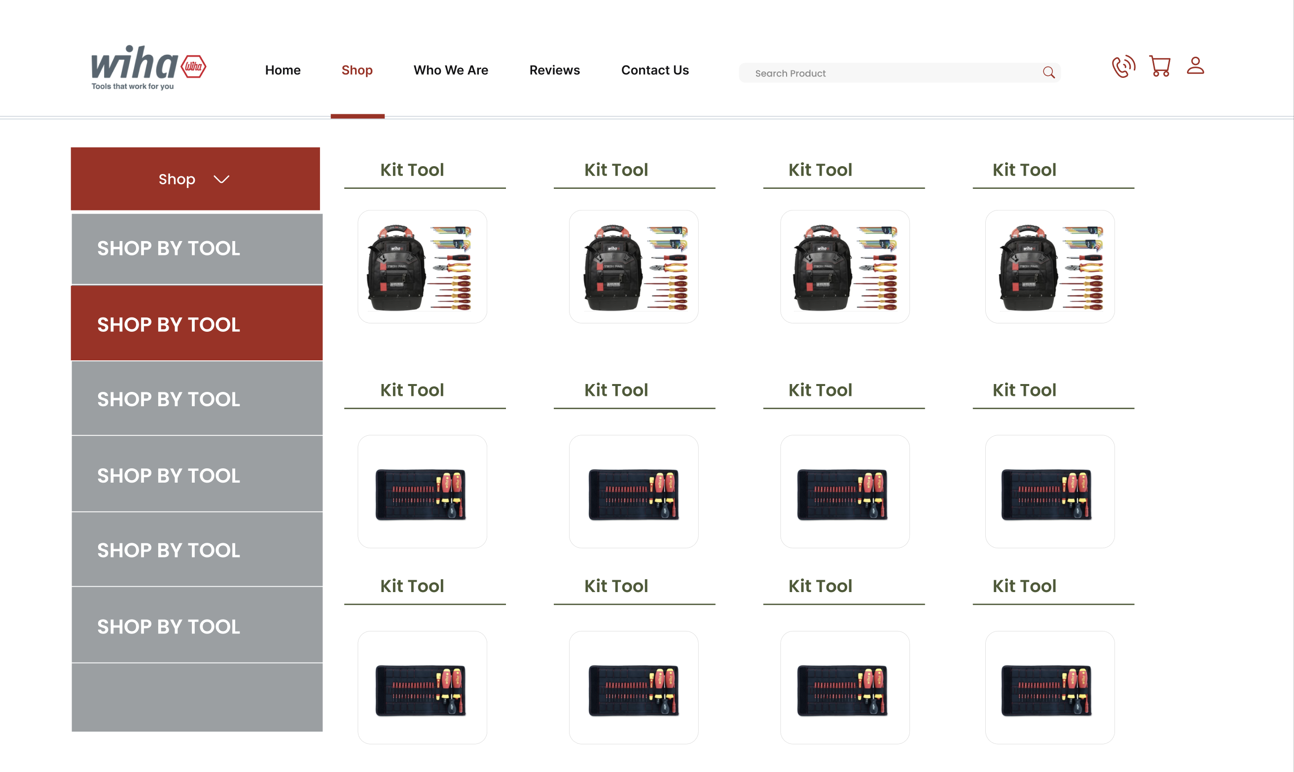
The introduction of mega menus is a pivotal aspect of Wiha Tools’ website redesign. Recognizing the breadth of Wiha’s product range, the mega menu facilitates effortless navigation through an intuitive and expansive dropdown menu. This feature is particularly crucial for a brand like Wiha, where the diversity of tools can be overwhelming. The mega menu categorizes products not just by type but also by use-case and industry, allowing users to find exactly what they need with minimal clicks.
Visuals and Descriptions: A Quick Product Overview
A standout feature of the mega menus is the integration of visuals and brief descriptions alongside the product categories. This addition transforms the menu from a simple navigational tool into an informative and engaging element of the website. For instance, hovering over the ‘Screwdrivers’ category reveals images and short descriptions of different types, making the selection process more intuitive and less reliant on technical jargon. This visual approach is particularly beneficial for users who may be unfamiliar with the extensive range of tools Wiha offers.
Optimizing for Mobile: A Focus on Accessibility
In adapting the mega menus for mobile devices, a collapsible design has been implemented. This ensures that the extensive information available in the desktop version is still accessible on smaller screens without overwhelming the user. The collapsible menus are designed to be thumb-friendly, allowing users to navigate through the entire product range with ease, regardless of the device used.
Category Page Optimization
The category pages on Wiha Tools’ website have undergone a significant transformation to enhance the user’s browsing experience. Recognizing that the ease of finding the right tool is crucial, these pages have been optimized for clarity, speed, and efficiency. The layout has been redesigned to be more intuitive, allowing users to quickly identify and navigate to the specific tools they require.
Advanced Filters and Sorting Options
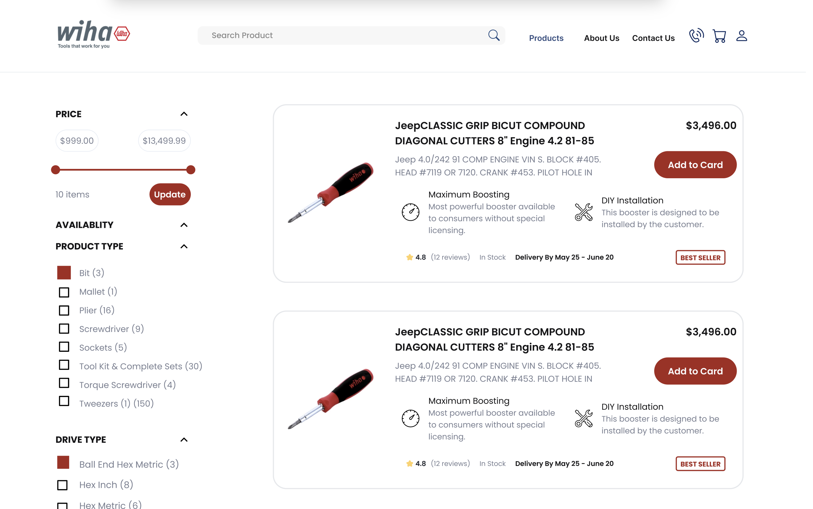
One of the key improvements is the implementation of advanced filtering and sorting options. Users can now refine their searches based on various criteria such as tool type, size, material, and application. This feature is especially beneficial for professionals who have specific requirements. The sorting options allow users to view products based on popularity, newness, price, and customer ratings, ensuring a personalized browsing experience that caters to individual preferences and needs.
Enhanced Product Listings
The product listings on the category pages have also been enhanced. Each listing now includes high-quality images and comprehensive descriptions, providing a clear and detailed overview of each tool. This visual and descriptive approach helps users make informed decisions without the need to navigate away from the page. Additionally, clear pricing, availability status, and customer ratings are prominently displayed, adding layers of transparency and trust to the user experience.
Product Page Perfection
The product pages on Wiha Tools’ website are the culmination of the user’s journey and have been meticulously redesigned. Each page serves as a detailed and informative resource for the selected tool, ensuring that all necessary information is available to assist in the purchasing decision. The layout is clean and user-friendly, highlighting key features, specifications, and benefits of the tool.
Interactive and Visual Elements
To further enhance the user experience, interactive elements such as 360-degree views and demonstration videos have been incorporated. These features allow users to see the tool in action and get a better sense of its size, shape, and functionality. This level of interaction not only aids in the decision-making process but also increases user engagement and interest.
Building Trust with Customer Reviews
An important addition to the product pages is the prominent display of customer reviews and ratings. This transparency builds trust and credibility, as potential buyers can read honest feedback from other users. Reviews are an invaluable resource, providing real-world insights into the performance and quality of the tools, which can significantly influence purchasing decisions.
Conclusion
The comprehensive redesign of Wiha Tools’ website marks a significant milestone in the company’s digital journey. This transformation goes beyond aesthetic changes, embedding a user-centric philosophy into every aspect of the online experience. From the engaging and informative homepage to the detailed and intuitive product pages, each element has been meticulously crafted to reflect Wiha’s commitment to quality and customer satisfaction.
Impact on User Engagement and Sales
The impact of these enhancements is multifaceted. Firstly, the improved user experience has led to increased engagement. Users now find it easier and more enjoyable to navigate the website, resulting in longer visit durations and more frequent return visits. Secondly, the streamlined journey from discovery to purchase, bolstered by informative product pages and efficient category navigation, has significantly improved the conversion rate. Customers are making more informed decisions with greater confidence, leading to an increase in sales and a decrease in return rates.
Building a Foundation for Future Enhancements
While the current redesign has yielded positive results, it also lays the groundwork for future improvements. The digital landscape is continually evolving, and so are customer expectations. Wiha Tools recognizes the importance of staying ahead of the curve and is committed to ongoing enhancements based on user feedback, market trends, and technological advancements. The website will continue to evolve, ensuring that Wiha remains at the forefront of digital innovation in the tool industry.
Interested in elevating your website’s impact? Contact us today to discover how our expert redesign strategies can transform your online presence and drive your business success.


