Navigating the digital realm with an outdated website, like a ship in uncharted waters, poses numerous challenges. Wholesale Marine, a beacon for boat parts and supplies aficionados, recognized that their online presence, although functional, lacked the modern, seamless experience that today’s discerning consumers demand. The initial site, rich in offerings yet somewhat cumbersome in navigation and aesthetics, reflected a common digital predicament: an interface and user experience (UX) that had fallen behind in the swift tide of technological and design advancements.
Like we always say embarking on a redesign is not merely an aesthetic endeavor but a profound commitment to enhancing every user’s journey from homepage to checkout.
This transformation extended beyond Wholesale Marine, standing as a universal call to all businesses to elevate their digital experiences by intertwining thoughtful design and user-centric functionality. As we delve into this digital metamorphosis, we’ll explore how strategic, meticulous changes in design elements can not only reshape a brand’s digital presence but also significantly buoy user engagement, trust, and loyalty in the vast, competitive digital seas.
The Power of Effective Homepage Design
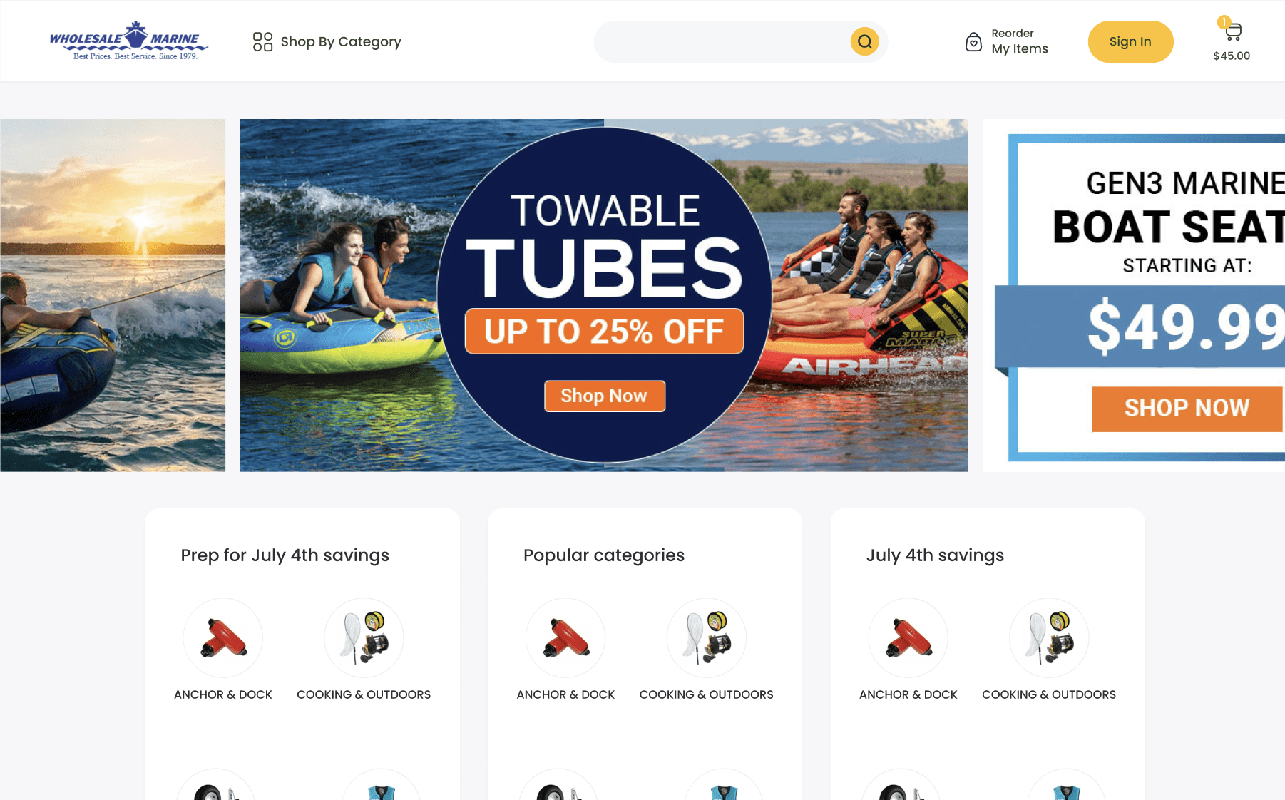
Navigating the homepage of a website is akin to stepping through the front door of a physical store. It’s an entry point, a first handshake if you will, where a user begins to form perceptions, make judgments, and decide whether to proceed further or turn away. The recent overhaul of the Wholesale Marine website became a crucial case study, exploring how an effectively designed homepage can steer the user journey in a positive, engaging direction, offering not just a catalog of products, but an immersive, intuitive digital experience.
A. The Importance of First Impressions
Statistically, it’s well-documented that user engagement and decision to stay or bounce off a website largely hinge on the initial few seconds of their arrival. Users fleetingly appraise ease of navigation, visual appeal, and immediate access to pertinent information.
In this brief window, a homepage must rise to the occasion, providing a clear, concise, and captivating overview of the brand and its offerings, just as the redesigned Wholesale Marine website now achieves. But it’s worth noting that this isn’t merely about attractiveness; it’s about crafting an interface that intuitively guides, communicates brand ethos, and smoothly transitions visitors from casual browsers to engaged customers.
B. Key Features of the New Homepage Design for Wholesale Marine
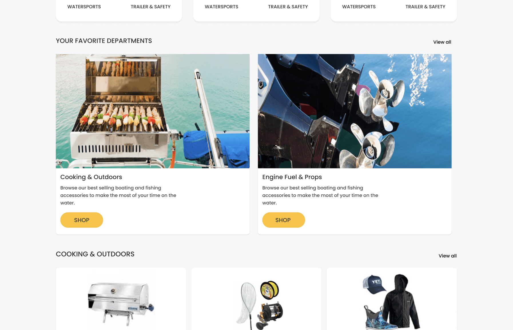
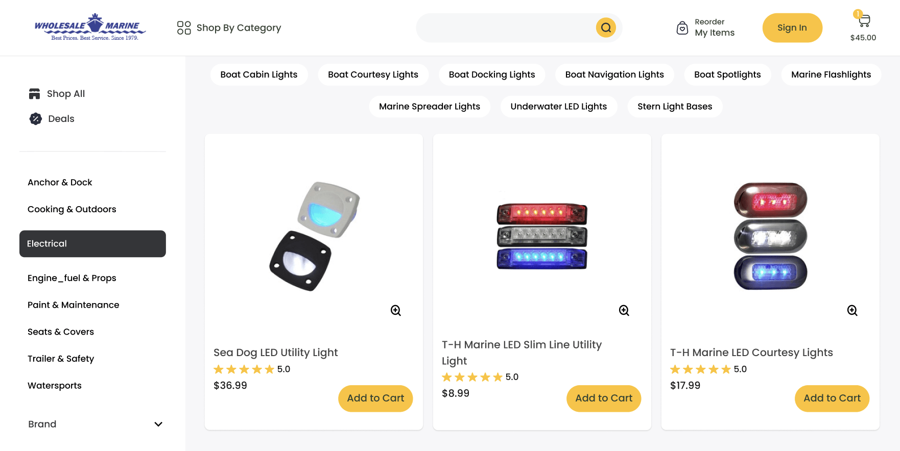
- Enhanced User Interface (UI): Molding the UI to become a catalyst for increased customer engagement and trust, the revamped homepage of Wholesale Marine eschews complexity in favor of a clean, interactive, and visually appealing interface. It’s not merely a visual playground but a carefully crafted pathway, nudging users towards desired actions without overwhelming them with excessive choices or information.
- Simplicity and Clarity: As users, our digital patience has arguably diminished over the years, prompting a need for simplicity and immediate clarity in design. This design principle was pivotal in the homepage revamp, adopting straightforward language, clear CTAs, and eliminating unnecessary elements that could muddle the user’s path or create friction in their journey.
- Accessibility for All Users: Importantly, the homepage redesign took a conscious stride towards inclusivity, ensuring that every type of user, regardless of their browsing capabilities or technological prowess, finds the interface accessible and welcoming. It’s about ensuring that the digital door is open wide, inviting everyone in with equal warmth and ease.
C. Applications and Implications Beyond Wholesale Marine
In a digital landscape that is perpetually evolving, the imperatives of a sleek, user-friendly, and accessible homepage design extend far beyond a single website. Wholesale Marine has anchored itself sturdily in digital waters with its revamped homepage, but the waves of change and technological advancement do not ebb.
For businesses navigating the same waters with outdated, cumbersome websites, the tangible uplift in user engagement, trust, and navigational ease demonstrated by Wholesale Marine is not just a distant beacon but an accessible reality. It’s a clear signal, demonstrating that investing in a thoughtful, user-centric homepage design isn’t merely a nicety but a necessity in steering towards the horizons of digital success.
Navigating with Ease: The Mega Menu Revolution
In an ocean of endless digital information, providing users with a clear, structured, and intuitive navigation system is not just a courtesy but an absolute necessity. This becomes even more pivotal for an e-commerce platform like Wholesale Marine, where myriad products and categories must be neatly and conveniently presented to visitors.
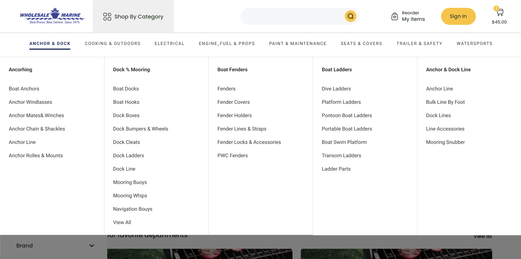
Herein lies the significance of implementing a Mega Menu – an advanced, structured navigational tool designed to guide users effortlessly through the dense forests of information, categories, and products, ensuring they reach their desired destination with minimal clicks and maximal ease.
A. The Dilemma of Conventional Dropdowns
Traditional dropdown menus, while familiar and universally used, often hit a navigational iceberg when dealing with a vast array of options. The extensive catalog of an e-commerce website, rich in categories and sub-categories, tends to stretch conventional dropdowns to their limit, often resulting in a cramped, overwhelming, and ultimately off-putting user experience.
This antiquated navigational method can inadvertently send users adrift amidst a sea of links, dampening user experience and diminishing ease of access to desired products or information.
B. Embracing a New Navigational Beacon: Mega Menu Insights
- Structured, Seamless Experience: The implementation of a Mega Menu on the Wholesale Marine website brought forth a paradigm shift, offering users a visually structured, straightforward pathway through its extensive offerings. This isn’t just about display but an exercise in user psychology, understanding that clear pathways and visually distinct categories minimize cognitive load and enhance user engagement.
- Highlighting and Guiding: Beyond mere navigation, the Mega Menu serves as a spotlight, highlighting key categories, popular products, and special offers directly to visitors, thereby serving dual purposes of facilitating easy navigation while subtly guiding users towards highlighted products and categories.
- Responsive and User-Friendly: Crafting a menu that is both expansive in its offerings and adaptably responsive ensures that the navigational ease is consistent across devices and platforms, ensuring no user is left battling the tides of a subpar browsing experience.
C. Charting the Course: Broad Applications for All Websites
Wholesale Marine’s Mega Menu revolution casts a luminous beacon to other digital platforms, navigating the often-treacherous waters of user experience and website navigation. The adoption of such a menu is not merely a tale of improved user navigation but a narration of thoughtfully engineered user experience, guiding visitors not just to their intended destination but also toward discovering new horizons within the website.
For businesses still sailing with traditional dropdowns and classic menu styles, especially those with expansive offerings, the Mega Menu presents a compelling case for recalibrating the navigational compass. The uplift in user experience, reduced navigational friction, and the subtle guiding of user pathways not only enhance user interaction but also carve a pathway towards an improved user journey, from entrance to checkout.
Building Confidence with Product Quickview and Verified Ratings
Navigating the vast ocean of e-commerce, consumers today seek not only ease but also assurance in their journey from discovery to purchase. Wholesale Marine, amidst its rich offering of boat parts and supplies, identified the pivotal role that confidence plays in the purchasing journey, leading to the introduction of a meticulously crafted Product Quickview functionality and the integration of verified product ratings. This strategy, while enhancing the user’s explorative experience, also subtly interweaves a tapestry of trust and assurance throughout their navigational journey.
A. Steering Through the Product Quickview Functionality
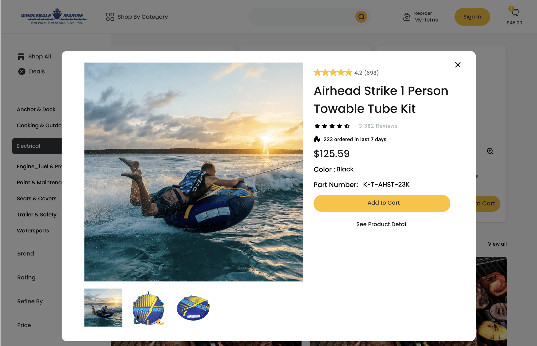
Introducing Product Quickview became a vital cog in the user journey, allowing customers to peek into the product specifics without veering off their navigational path. This minimized detour preserves user momentum and encourages exploration without demanding full-page dive-ins into each product’s detailed view.
A careful curation of information ensures that the user is greeted with the most pertinent product highlights, ensuring an informed yet non-overwhelming preview. Quickview becomes a snapshot – succinct, informative, and purposely nonintrusive.
B. The Anchoring Effect of Verified Product Ratings
- Authenticity and AssuranceIncorporating verified product ratings solidifies a bond of trust between the platform and its users. In a sea where skepticism often floats amidst online shoppers, providing genuine, verified feedback serves as a transparent, trustworthy window into the product’s performance and customer satisfaction.
- Encouraging Confident PurchasesRatings act as silent advisors, whispering reassurances and nudging users toward making confident, assured purchases. This silent, yet potent communication between past and potential customers becomes a linchpin in constructing a reliable, customer-focused shopping environment.
The Tangible Impact of a Well-Designed Website on Business
In the vast digital seascape, where countless businesses sail to vie for the attention of potential customers, a well-designed website operates as both the sails and the rudder — providing momentum and ensuring the course is set true towards desired outcomes.
The reimagining of the Wholesale Marine website stands as a testament to how meticulously considered design elements can not only alter the user’s navigational experience but also substantively impact the business by converting passing breezes into tangible, propelling winds.
A. Navigating Beyond Aesthetics: Deep-Dive into Functional Impact
Conversion Uplift: The harmonization of simplicity, user-centric design, and trust-building elements, such as verified reviews, transcends aesthetic appeal, steering toward a notable uplift in conversion rates. Users, enveloped in a seamless and trustworthy digital experience, are naturally more inclined to convert from mere visitors to customers.
User Retention: A well-designed website does not merely attract; it retains. By creating an environment that is as engaging as it is trustworthy, users are more likely to return, forging a relationship with the brand and platform.
B. Enhancing the User Experience: Seamless, Trustworthy, and Engaging
Loyalty through Engagement: By prioritizing the user’s needs, providing effortless navigation, and ensuring a stable, reliable digital environment, the redesigned website inherently nurtures a sense of loyalty. Engaged users, who find their journey respected and valued, morph into loyal customers.
Building Brand Integrity: Consistency, reliability, and a tangible demonstration of understanding user needs to fortify the brand’s integrity in the user’s perception. A website that mirrors the brand’s commitment to customer satisfaction enhances its reputation and authority in the market.
The Impact of Intuitive Web Design
Wholesale Marine’s website transformation underscores a pivotal message: intentional, user-centric web design yields tangible business benefits. The strategic integration of a user-friendly interface, a mega menu for enhanced navigation, and verifiable product ratings not only improves user experience but also boosts conversion rates and user retention by establishing a foundation of trust and reliability.
Prioritizing your user experience is not merely a design choice; it’s a strategic business decision with a wide-ranging impact.
- Business Leaders: Evaluate your current digital platforms. Is the user experience optimized to foster engagement and drive conversions?
- Designers & Developers: Implement user-centric design principles to provide clear, intuitive navigation and trustworthy user interfaces in your projects.
- Users: Consider how transparent communication and clear navigation enhance your online interactions and purchasing decisions.
Taking cues from Wholesale Marine’s redesign, it becomes evident that effective digital platforms that respect user needs and promote ease of navigation are not just beneficial; they’re essential. Contact us today to start your redesign journey!


