The first time I ever heard about Cute-Fight was during my commute to work, while listening to an episode of Jeffrey Zeldman’s “The Big Web Show“. This podcast featured Derek Powazek, the Founder and CEO of Cute-Fight. After quickly falling in love with the Cute-Fight concept, I decided to do some of my own additional research. I contacted Derek, and he very graciously agreed to an interview with me. But before we get to that, I’d like to explore the user experience side of Cute-Fight.
Getting Sucked In
When I first began my research for this article, my first task was to visit the site in question, cute-fight.com. About 25 minutes later, I found myself sinking in a quicksand of adorable cats, dogs, and even fish! I simply couldn’t help myself, it was just so, well, cute.
But why is this? Why did all productivity and self-control fly out the window when I landed on the homepage? The answer, I believe, is in the design.
The Baby-Face Bias
According to the Universal Principles of Design, the baby-face bias is “a tendency to see people and things with baby-faced features as more naïve, helpless and honest than those with mature features.” To qualify for baby-face bias, subjects typically have “round features, large eyes, small noses, high foreheads, shorter chins, and relatively lighter skin and hair.”
Can you think of anything besides babies that might qualify for the baby-face bias? How about our beloved canine companions and feline cohorts? What could possibly be more honest then man’s best friend(s)?
It’s no secret that some of the most shareable content on the web includes all things society deems adorable. This is why I believe Cute-Fight is an absolutely genius concept. Their website, design, tone, and concept revolve around one thing: fun, engaging, and ultimately highly shareable content.
So Should We Post More Cat Pictures?
Now, after you finish reading this article, I don’t recommend bombarding your users with adorable pictures of puppies and kittens. However, there are two main lessons we can learn here.
The first is, as always, about the content. Because Cute-Fight centers on a strong content strategy, it has been highly successful.
The second is that design matters. I’ve said it before and I will say it again. Design is key to any website, online game, application, etc. Without a well-researched and well-implemented design, sites like Cute-Fight would not be nearly as successful. Later in this article, we will discuss in further detail how design has played a role in Cute-Fight’s success.
What Can Go Wrong?
While baby-face bias seems to work as an effective tool when drawing users towards Cute-Fight, I wouldn’t recommend such a tactic across the board. As I mentioned, baby-face bias makes people interpret a subject as innocent and honest. In advertising, we use adults with child-like features to demonstrate honesty, but not authority. This is because the use of baby-faced professionals elicits thoughts of immaturity and inexperience, which often lead to doubt. If you are trying to demonstrate seriousness, authority and responsibility, baby-face bias is likely not for you.
What Can We Learn From Cute-Fight?
From the moment you land on Cute-Fight’s homepage, you are greeted with playful language, a friendly color scheme, and a very clear call to action.
While the language and color scheme may not quite fit your online business, the layout certainly might. Below, I have pointed out some aspects of the layout that could translate directly to almost any other site.
Lesson 1: Simple, User-Friendly Navigation
As you can see, the header contains all vital information: the logo, a subtle call to action, and all necessary elements of the navigation; yet it still remains uncluttered and user friendly. I especially like the simplicity of the unobtrusive search functionality on this site.
Lesson 2: Clear Call to Action & a Concise Explanation
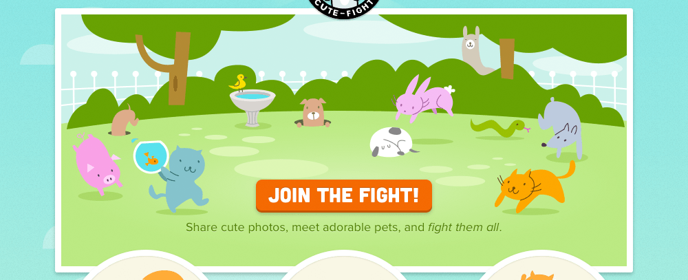
Moving down the page, we see an illustrated scene of animals sleeping, chasing, and playing. All of these animals are facing the most prominent call to action on the page, “Join The Fight!” Just as I have discussed in the past, where the subjects in your photos direct their eyes, your users will follow.
Lesson 3: Three Benefits
Why and how should we sign up? The three circles in the screenshot above explain (in less than 3-4 words each) how we can join Cute-Fight, and what benefits it will provide us. In addition, notice that all three of these circles go to the same sign-up page. The path for users has been very clearly paved. Cute-Fight wants to get you to the sign-up page, and by providing more links to it (in an organized manner) they increase their chances for a conversion.
Lesson 4: A Testimonial
Yes, you read that right. “Lesson 4: A Testimonial.” Testimonials don’t necessarily have to be written, or even human for that matter! In this case, they are mostly image-based. This screenshot shows PJ, who seems to be having plenty of fun on Cute-Fight. This would imply that any user (and their pet) might enjoy the product, and thus encourages them to sign up.
Lesson 5: Engagement for Current Members
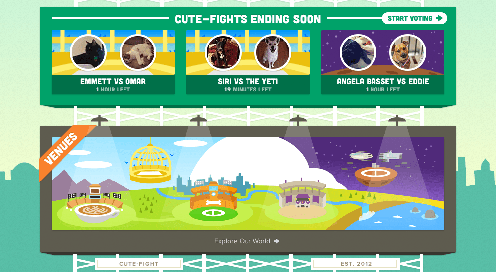
One big mistake that I see companies make is that they put all their resources into obtaining new users, but then forget about current members. In order to prevent what I like to call “what-are-we-chopped-liver?” syndrome, Cute-Fight has placed fun, engaging content for members just below their testimonials section. There are two main sections here. The first shows which cute-fights are ending soon, and encourages members to vote, and the second displays the Cute-Fight venues with the call to action “Explore Our World”. These aspects allow members to feel important, and even further encourage skeptical prospects to sign up.
Lesson 6: Footer with Important Links, Social Media and a Final Call to Action
As you know I’m a sucker for a tall footer chock-full of information. Cute-Fight’s footer does not disappoint. It provides all of the important links like FAQs and an option to send feedback, social media buttons to increase the odds of sharing, and even a final call to action to “invite a friend”.
Lesson 7: The Sign-Up Process
I’d also like to take a moment to point out this sign-up page. It has three fields. Cute-Fight requires only the most basic information to create an account. This is definitely a lesson we can learn from. Users don’t often want to spend twenty minutes on a form page only to find out their desired username is already taken. The simpler the form, the more likely it is to convert.
In addition, Cute-Fight lets you sign up via Facebook or Twitter, making the process that much less painless.
Finally, there is a small orange bird pointing toward the sign up button. Cute-Fight is not taking any chances here; they want users to be able to quickly and easily understand exactly what to do on any given page, so they will act accordingly.
Lesson 8: Continuing With Ease
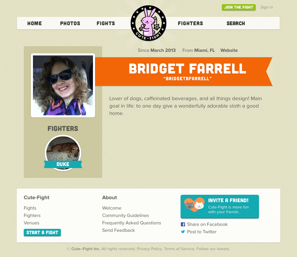
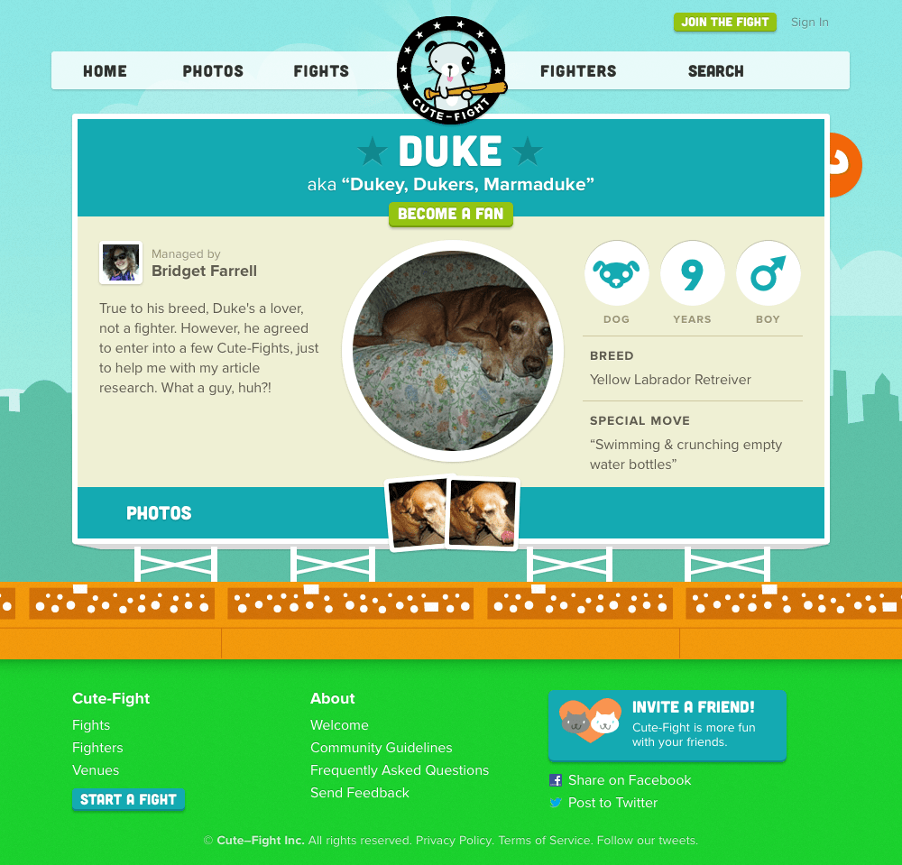
Once Cute-Fight obtains a new member, they don’t just throw usability to the wind. On the contrary, the site continues to be simple to navigate, profiles are easy to edit, and the overall experience is truly enjoyable. Just for kicks, I’ll go ahead and show you the profile I’ve set up for myself- um, purely for research purposes, of course. ;-)
And, if you’re looking for a fight, feel free to challenge my good old pup! Check out his profile below to see what you’re up against.
A Brief Interview with Cute-Fight’s Founder and CEO, Derek Powazek
First off, let’s talk a bit about you? For our readers who may not know you, what’s your story?
“I’m Derek Powazek. I’ve been making websites since 1995. Taurus. San Franciscan. Friend to all dogs.”
What is Cute-Fight?
“Cute-Fight is an online game you play with your real life pets. It’s also an active community of pet lovers like me.”
Where did the idea for Cute-Fight come from?
“Have you ever been at a party where someone pulls out their phone to show off a cute photo of their dog/cat/ferret? And then everyone else pulls out their phone to do the same? I’ve always felt that there was this undercurrent of competition in that. I thought it would be fun to make that subtext the text and turn the action of showing off photos of our pets into a game.”
The overall feel of the site is very well, cute. Where did your team draw inspiration for this site?
“My guiding principle for the site was that it should feel like a place, not a site. The same way Legend of Zelda happens in Hyrule, not in your TV. So we worked very hard to avoid the trappings of web design. And we’re still evolving. We just revamped the fighter profile pages, which was a huge project, and one of the most important pages on the site for the managers.
And all the credit really should go to James Goode (design), Chris Bishop (illustration), and Devin Hayes and Michael Irion (code). They’re the ones that made this real.”
Originally, Cute-Fight wasn’t open to the public, how do you feel this help or hurt you in the usability stages of the design process?
“Helped. In a past project, I made the mistake of going too public too fast. Community projects can be made or broken by first impressions.
In the private alpha, we learned so much from a very small group of testers, we’re so grateful to them. And in the private alpha, we were able to set their expectations. I think my introductory email to them said “shit will break” and it did.
We made lots of great changes based on their feedback. For example: Alphas Are Experiments.
The trick is figuring out when, exactly, is the right time to flip the switch from private to public. There’s a point where growth stagnates and you’ve learned all you’re going to learn and you’ve just gotta flip the switch and hope for the best. And that’s hard because there’s still so much to do. But there always is.”
What has the reaction been like since you have opened Cute-Fight to the public?
“It’s been great! We’ve got an awesome community forming, and it’s growing every day. And the more people you bring in, the more you learn about your product.”
Twitterific and Tonx Coffee have already begun sponsoring your online stadiums. I love the idea of a sponsored venue, rather than invasive advertisements. How successful has this been thus far, for both users and advertisers? Have you already begun thinking of other creative ways to make Cute-Fight more profitable for investors?
“We had the idea for sponsored venues in mind since day 1. It was important to us to show how the site would make money. And they’re the perfect analog because venues are sponsored in real life, too. So here, the sponsorship, instead of being annoying, adds to the world of the game.
Before this, I ran several magazines. JPG Magazine (a photography magazine with Devin) and Fray (a storytelling magazine with James). And in each case, the ads, no matter how well done, were at fundamentally cross-purposes with the community. The community wants to read the magazine, the advertisers want to interrupt that.
So for Cute-Fight, we wanted to create an environment where, instead of interrupting the game, the sponsors enable it. So instead of putting a billboard in your way, they build a playground for you to play in.
Still, any advertising/sponsorship is fundamentally tied to the size of the audience. We’re still building the community, so we’re not stuffing the dogbeds with cash or anything. But we’re on the right path.”
In your community guidelines, you very clearly state that Cute-Fight is made to be fun, “Don’t be a schmuck. We made Cute-Fight to make people smile. If you use this place to make people unhappy, you’re doing it wrong.” How has this policy fared so far? Have you had a lot of problems with cyber-pet-bullying?
“In addition to Cute-Fight, I also run a community consulting business called Fertile Medium, where we help companies design products for social settings. And I’m always telling them to avoid gaming, avoid scores, avoid leaderboards. But in Cute-Fight, I get to break all of that advice because it is a game.
Since we’re dealing with people’s pets, which in many cases are like their children, people can get hurt feelings. Especially since, in any Cute-Fight, one player is destined to lose.
So we made a lot of conscious design decisions to look out for people’s feelings. For example, you can only cheer (ie leave a text comment) for the fighter you voted for. This diminishes the negative smack-talking and encourages complimenting the fighter you like.
We also made a set of badges you get if you lose, and some of them are damn funny. And finally, if people cheered for your fighter, we email the cheers to you at the end of the fight. Sometimes a really nice cheer takes the sting out of a defeat.
So, to answer your question, no, we haven’t had any major problems yet. We will – you always do – but how you respond to those problems defines what kind of community you end up with.”
Do you plan on creating a separate Cute-Fight application specifically for mobile users? If so, how and when would you plan to execute this?
“Yes! The only question is when. We’re a small team with limited time, so it’s always a struggle to prioritize all the things we want to build. But, personally, a really good iOS app is at the top of my list.”
What was the biggest obstacle that Cute-Fight had to overcome thus far, and how did you resolve it?
“Time. Time is our enemy.
We’re five people and three of us have day jobs. We’re bootstrapping. So by far the biggest obstacle is finding the time to do everything we want to do and not lose momentum while also paying our bills. It ain’t easy.”
There are sites that are “similar” to Cute-Fight, but not quite as well executed, in my opinion (neopets.com, for example). How do you think that your site differs from sites like these?
“I think the main difference is that we’re building an authentic community of real people with real pets. A lot of other sites are filled with images grabbed from Google Image Search. We didn’t want that. So that’s why we require high-resolution uploads and have other safeguards in place.
Also, I think there are some sites out there that just looked at the pet market and said, well, that’s a lucrative market, let’s build something for that. But we’re all crazy pet people. I can’t walk down the street without stopping to talk to every dog. I think that authenticity comes through in the game.”
Any advice for young entrepreneurs just starting out? Or for my fellow web designers?
“Assume you’re going to fail. Most startups do. Once you lose your fear of failure, you become free to take real risks, and that’s where good ideas come from.
Find good people to work with and keep working with them as long as they’ll let you. I’ve been working with almost everyone at Cute-Fight for over a decade. Finding people you work well with is the hardest thing to do.
And, finally, over-communicate. Every problem I’ve ever had at a startup could be traced back to a fundamental misunderstanding based on a lack of clear communication. Set expectations and ask for others to do the same. Of course, I’m the son of an English teacher and a Psychologist. I think words can fix anything.”
Thanks so much for the wise words, Derek, I hope to speak with you again soon- perhaps when that Cute-Fight app is released? ;-)
The Takeaway
As I’ve mentioned several times throughout this article, the lesson here is not about using primary colors or doe-eyed mascots on your websites. The true message is to create sites that are user-friendly with truly excellent, highly shareable content. If you do these two things, and you make your site a pleasure to use, well then, you’ve hit a homerun in my book. By creating something that people want to talk about, you’ve won. And the only way to do this is to thoroughly understand your concept, and own it, just as I believe our friends at Cute-Fight have.
Have you learned any design-related lessons after reading this article? If you’re still a bit fuzzy on the details and need some expert advice, contact us today!


