WeldingMart.com is a global distributor of welding supplies, equipment, and tools. As an industry leader, WeldingMart.com understands the critical role of an effective website in enhancing customer experience and driving sales. In the competitive e-commerce landscape, an outdated website can impede customer engagement and trust. To address these issues, WeldingMart.com undertook a comprehensive website redesign to improve user experience, functionality, and business performance.
A company’s website is its digital storefront, making the first impression on potential customers. A well-designed website is essential for attracting and retaining visitors, building trust, and converting leads into customers. For e-commerce businesses like WeldingMart.com, the website’s design directly impacts user satisfaction, shopping convenience, and sales. WeldingMart.com’s redesign aimed to modernize its online presence and provide a seamless shopping experience.
Redesign Goals and Process
The primary goals of WeldingMart.com’s website redesign were to enhance user engagement, streamline navigation, and increase accessibility. The redesign focused on creating an intuitive and visually appealing interface to distinguish WeldingMart.com from competitors. The process involved research, user feedback, and collaboration with design experts to ensure the highest standards of functionality and aesthetics.
The project included a revamped homepage, improved user interface, enhanced quick view functionality, and an advanced mega menu. Each element was crafted to provide a seamless and efficient shopping experience while highlighting WeldingMart.com’s brand identity and products. Accessibility was also a priority, ensuring all users could easily navigate and interact with the site.
By investing in this redesign, WeldingMart.com improved its online presence and reinforced its commitment to providing excellent service. This article will detail the specific changes made during the redesign and how each modification contributes to a more engaging, user-friendly, and effective e-commerce platform.
Section 1: Homepage Redesign
Header Banner
The header banner on WeldingMart.com’s homepage serves as the initial point of contact for visitors, functioning as a digital billboard that announces the brand’s identity and offerings. This new banner features high-resolution images and concise messaging, designed to engage viewers immediately.
The banner highlights key products and promotions, clearly communicating the site’s value propositions. This approach is a significant upgrade from the previous text-heavy design, providing a more visually dynamic and modern experience, and setting WeldingMart.com apart from competitors with outdated interfaces.
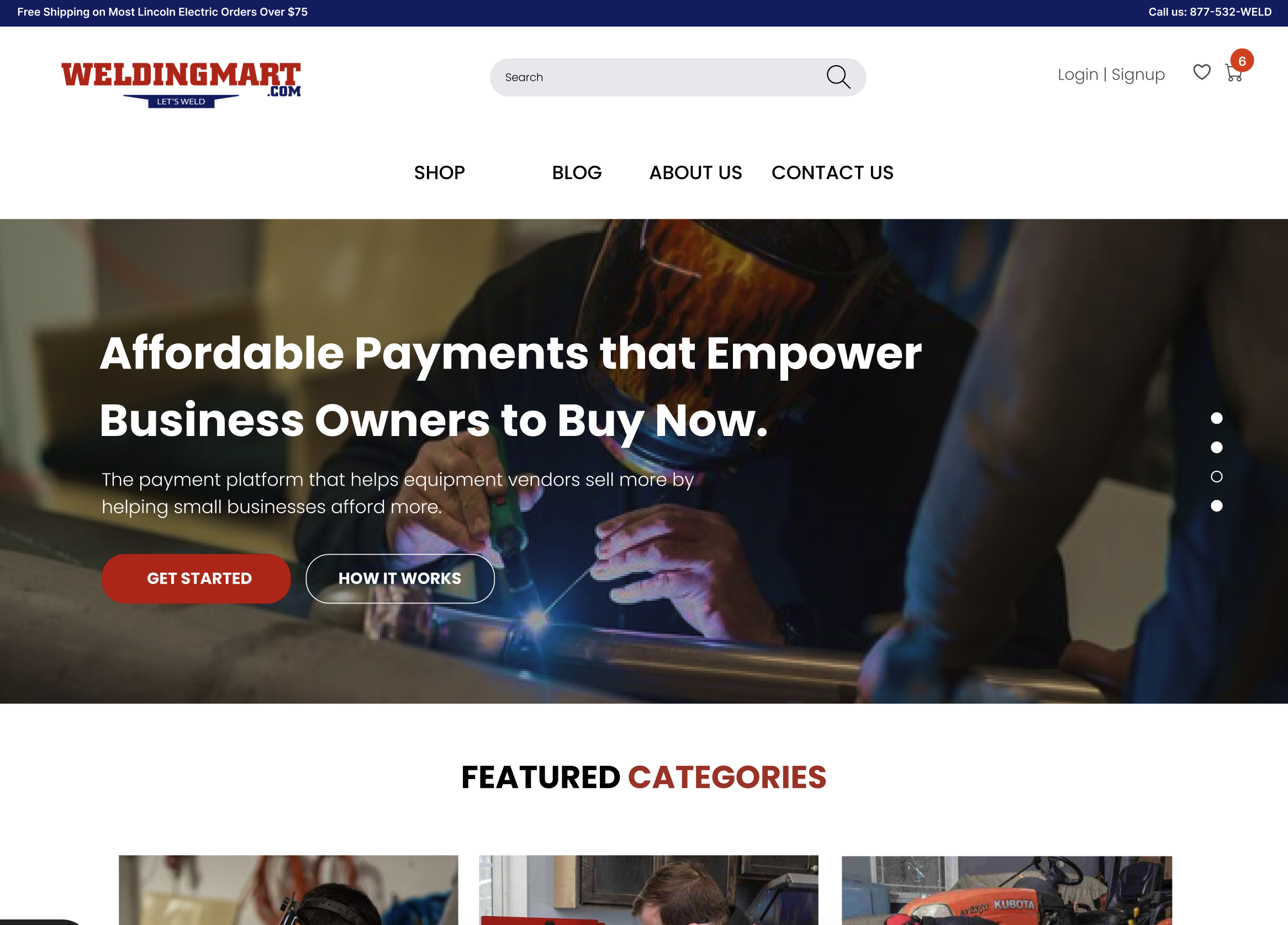
The strategic placement of the header banner ensures that visitors’ attention is immediately captured, guiding them toward essential information and promotional offers. The high-resolution images and bold typography used in the banner are designed to make a strong impact, encouraging visitors to explore further. This visual appeal is crucial for establishing a professional and trustworthy online presence, especially in a market where first impressions can significantly influence purchasing decisions.
User Interface (UI) Improvements
The new user interface focuses on enhancing engagement and building trust. The redesign emphasizes simplicity and clarity, using straightforward language and clean design elements. This minimalist approach reduces cognitive load, making navigation easier and more intuitive.
An improved UI enhances both the visual appeal and functionality of the site, ensuring a smoother and more efficient user experience. For e-commerce platforms, such improvements can lead to higher conversion rates and increased customer retention.
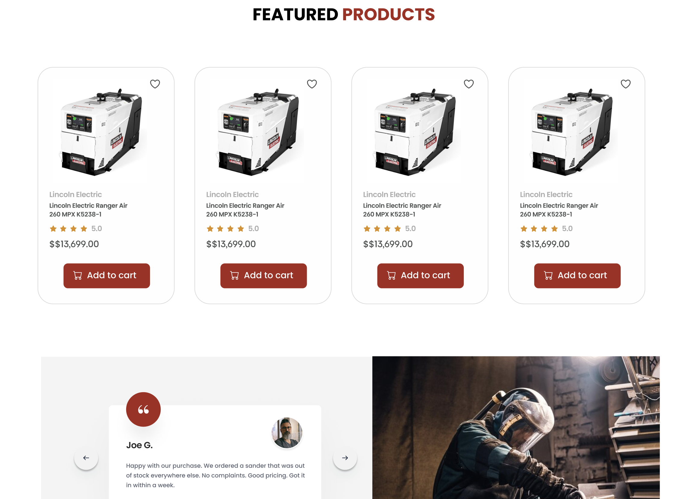
The UI redesign incorporates modern design principles, such as responsive layouts, intuitive navigation menus, and visually appealing color schemes. These elements work together to create a cohesive and user-friendly environment. By prioritizing user experience, WeldingMart.com ensures that visitors can easily find what they are looking for, leading to increased satisfaction and a higher likelihood of return visits.
Banner Ads
Banner ads are strategically placed to showcase products and promotions, linking directly to relevant pages. These ads align seamlessly with the overall site aesthetics, maintaining a cohesive look while effectively capturing visitor attention.
Featuring eye-catching graphics and clear calls to action, the banner ads drive traffic to specific products or deals. This integration boosts brand visibility and encourages users to explore more of the site, enhancing its marketing effectiveness.
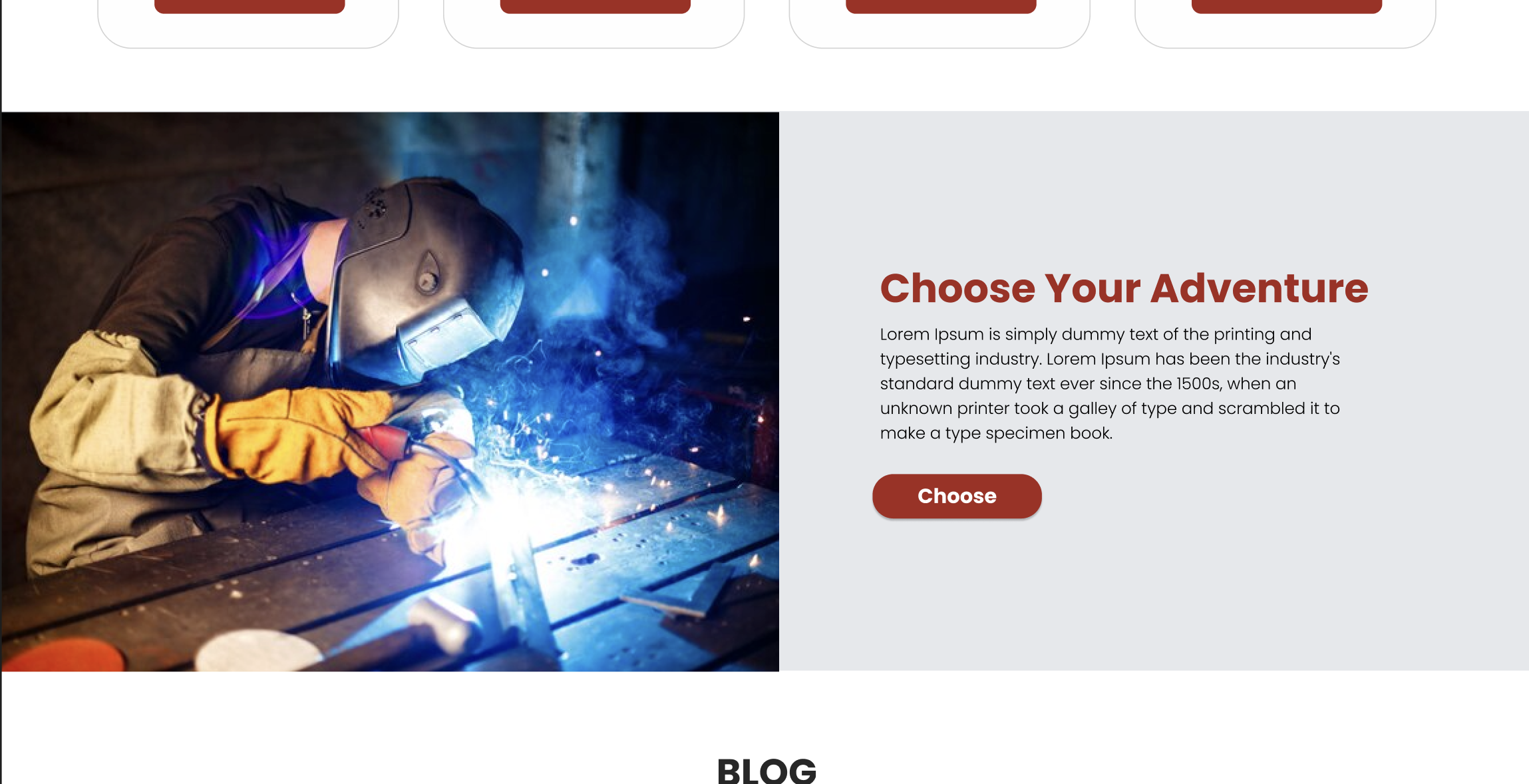
The banner ads are designed to be visually striking without being intrusive. They are integrated into the overall design in a way that feels natural and engaging, rather than disruptive. This approach ensures that users remain focused on their browsing experience while still being aware of ongoing promotions and offers.
Accessibility Improvements
Improving accessibility was a key focus, ensuring the website is usable by all visitors, including those with disabilities. Changes include optimized color contrast, increased font sizes, and simplified navigation structures.
These enhancements demonstrate a commitment to inclusivity and user-centric design. By making the site accessible to a wider audience, WeldingMart.com broadens its market reach and provides a superior user experience for all visitors.
Accessibility improvements also involve implementing ARIA (Accessible Rich Internet Applications) landmarks, which help screen readers and other assistive technologies better navigate the site. Additionally, all interactive elements, such as buttons and forms, have been designed to be easily operable using keyboard navigation, ensuring that users with mobility impairments can navigate the site effectively.
Value Proposition
The value proposition is prominently displayed with phrases like “High Quality,” “50% Off,” and “Limited Time Offer” to capture immediate attention. This clear presentation quickly communicates what sets the site apart, engaging visitors and encouraging further exploration and purchases.
The value proposition is strategically placed in high-visibility areas of the homepage, ensuring that it is one of the first things visitors see. By using bold typography and contrasting colors, these key messages stand out and draw attention. This approach not only helps in highlighting the benefits of shopping at WeldingMart.com but also encourages visitors to take immediate action, whether it’s exploring products or taking advantage of promotional offers.
Section 2: Mega Menu Design
Mega Menu vs. Regular Dropdowns
The introduction of a mega menu on WeldingMart.com represents a significant upgrade from traditional dropdown menus, especially beneficial for sites with extensive product ranges. Traditional dropdown menus often become cluttered and difficult to navigate when the number of options is large. In contrast, mega menus display all categories and subcategories at once in a well-organized layout, providing users with a clear overview of the site’s offerings.
This clear organization reduces the time users spend searching for specific products and enhances their overall experience. By displaying multiple options simultaneously, mega menus allow users to quickly identify and access the sections they are interested in, minimizing frustration and improving navigation efficiency.
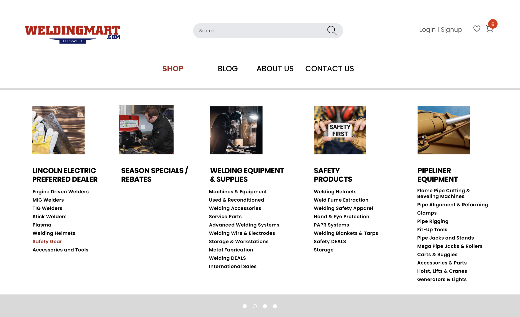
Mega menus are designed to be highly visual, incorporating images and icons alongside text to make navigation more intuitive. This visual guidance helps users quickly understand the structure of the site and locate the products they are looking for. Additionally, mega menus can feature promotional banners and highlights, drawing attention to specific categories or offers and further enhancing the user experience.
User Benefits
Mega menus offer substantial benefits by simplifying navigation and enhancing the user experience. They reduce the number of clicks needed to access different parts of the website, allowing users to find products more quickly. This streamlined access is crucial for keeping users engaged and reducing bounce rates.
Furthermore, the mega menu promotes relevant products by grouping them logically, guiding shoppers directly to what they need. This efficient navigation encourages users to explore more of the site, potentially increasing the average order value. For WeldingMart.com, the implementation of a mega menu means that customers can navigate the extensive product inventory with ease, making their shopping experience more enjoyable and efficient.
The user benefits of a mega menu are particularly evident in large e-commerce sites where the number of product categories can be overwhelming. By organizing these categories into a structured, easy-to-navigate format, mega menus help users find what they are looking for without unnecessary hassle. This efficiency not only improves the user experience but also increases the likelihood of repeat visits and purchases.
Section 3: Quick View Functionality and Hover Effects
Hover Effects
Hover effects add a layer of interactivity, making the site feel dynamic and engaging. These effects activate when users hover over elements like links, buttons, and product images, providing visual feedback through color changes, growth, shrinking, or rotation. These animations guide user actions and enhance navigation.
By clearly signaling which elements are interactive, hover effects improve the browsing experience and contribute to a polished, modern aesthetic.
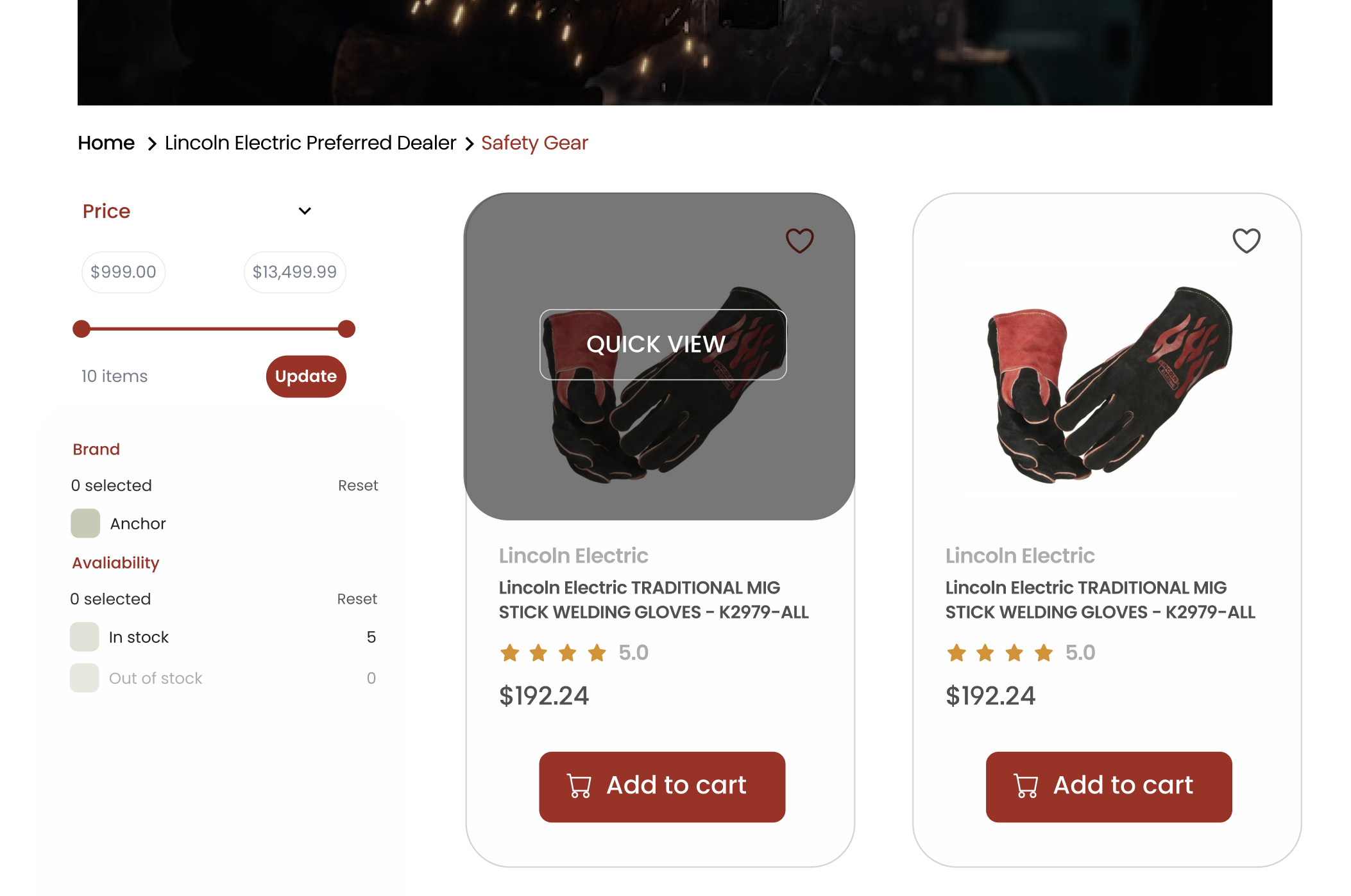
The hover effects are designed to be subtle yet noticeable, providing users with a sense of responsiveness and interaction. These visual cues help users understand which elements are clickable, reducing confusion and making navigation more intuitive. This not only improves the overall user experience but also encourages users to engage more deeply with the site.
Quick View Options
The quick view functionality allows users to preview product details without leaving the current page. By hovering over a product image or clicking a quick view button, users can access essential information such as price, features, and availability in a convenient popup.
This feature streamlines the shopping process, particularly for users browsing multiple items or comparing options, eliminating the need for constant navigation between product pages. Quick view options enhance user engagement by providing immediate access to information, reducing bounce rates, and facilitating quicker purchasing decisions.
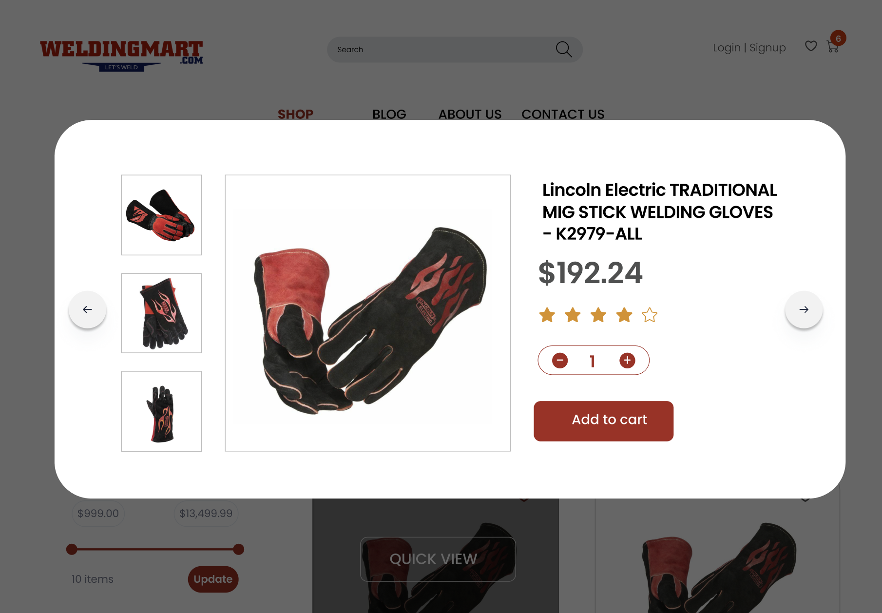
Incorporating quick view functionality demonstrates a commitment to user convenience and satisfaction, ultimately driving higher sales and customer loyalty. These enhancements reflect a modern, customer-centric approach to e-commerce.
The quick view feature is designed to be fast and responsive, ensuring that users can quickly access the information they need without any lag or delay. This seamless integration into the browsing experience helps maintain user interest and reduces the likelihood of abandonment. Additionally, the quick view popups are designed to be informative yet uncluttered, providing all the necessary details without overwhelming the user.
Section 4: Category Pages
Search Interface Optimization
Optimizing the search interface is a key component of improving user experience on e-commerce websites. For WeldingMart.com, the search bar is designed to be highly interactive, user-friendly, and visually appealing. Considering that a significant percentage of visitors use the search function immediately upon arriving, it is essential for the search interface to facilitate quick and easy product discovery.
The redesigned search interface on WeldingMart.com enhances engagement by making it easy for users to find the products they are looking for. This improvement is crucial as search users are typically more engaged and likely to convert. A seamless search experience can lead to higher conversion rates, directly impacting the site’s sales performance.
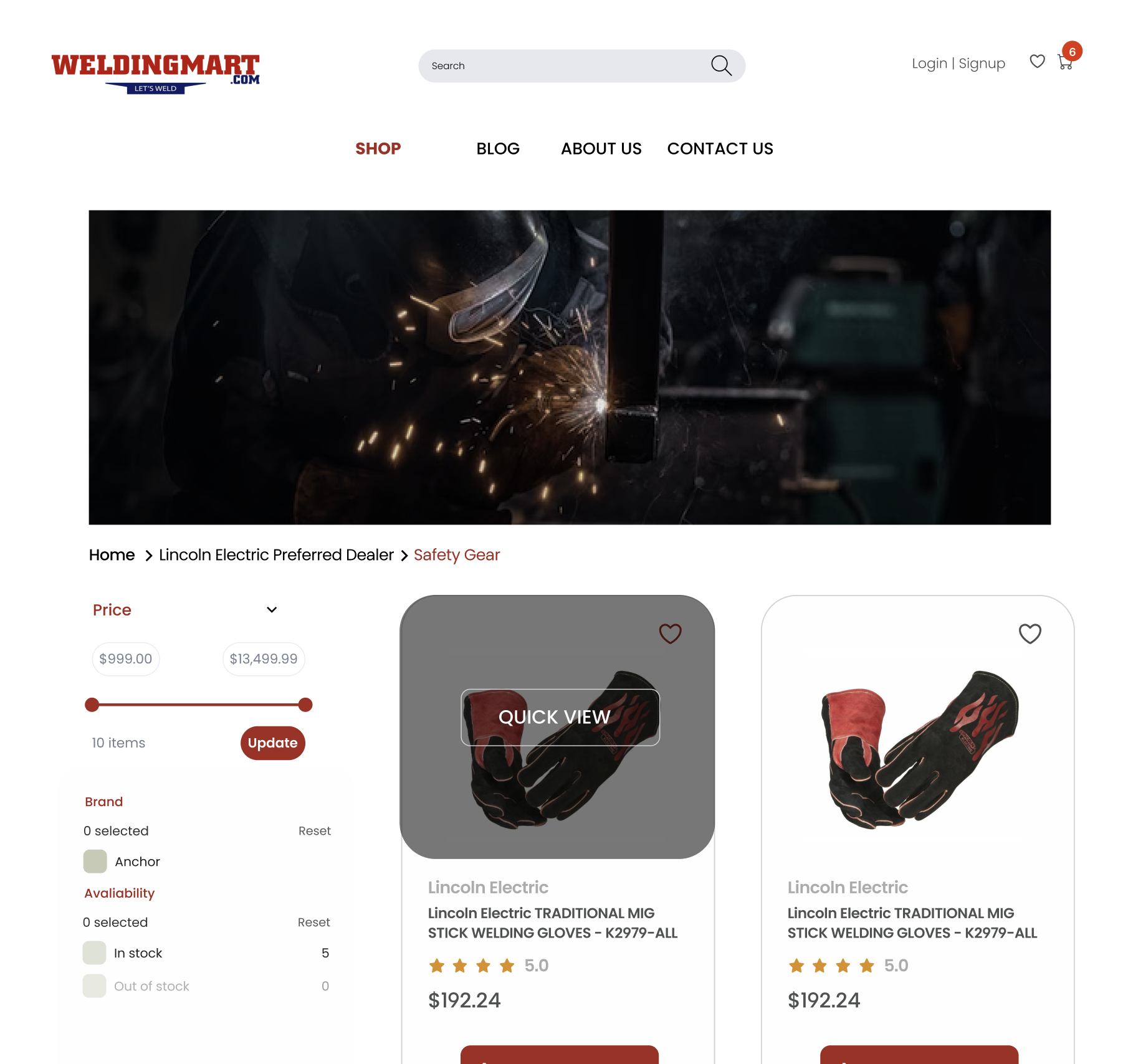
The search bar is prominently positioned on the site, ensuring that it is easily accessible from any page. It features advanced search algorithms that deliver relevant results quickly, improving the accuracy and efficiency of product searches. The search interface also includes autocomplete suggestions, which help users find what they need even faster.
Filtering System
A robust filtering system is essential for websites with extensive product inventories, like WeldingMart.com. Filters allow users to narrow down search results based on specific criteria such as price, brand, or features. This functionality is particularly important for helping users quickly find the exact products they need without feeling overwhelmed.
The new filtering system on WeldingMart.com is designed to be intuitive and visually integrated with the site’s overall design. Clear and straightforward filtering options help users refine their searches efficiently. By improving the ease and effectiveness of the filtering system, the website enhances the shopping experience, making it more likely that users will find and purchase the products they are looking for.
Implementing an effective filtering system not only improves user satisfaction but also increases the likelihood of conversions. By providing users with tools to easily navigate a large inventory, WeldingMart.com demonstrates a commitment to offering a seamless and efficient shopping environment.
The filtering system is highly customizable, allowing users to apply multiple filters simultaneously to narrow down their options precisely. This capability ensures that users can find the exact product that meets their needs, increasing the chances of a successful purchase. The filters are also designed to be responsive, providing real-time updates as users adjust their search criteria.
Section 5: Product Pages
Product Ratings and Proof
The redesigned product pages on WeldingMart.com now prominently feature verified product ratings and proofs of authenticity. These elements are crucial for building trust with customers, as they provide transparent and reliable information about product quality. Verified ratings, often from previous buyers, offer insights that help potential customers make informed purchasing decisions with confidence.
Including proof of authenticity, such as certifications or endorsements, further assures customers of the product’s credibility. This feature is especially important for high-value or technical products, where trust in quality is paramount. By showcasing these ratings and proofs, WeldingMart.com enhances its reputation and provides customers with the assurance they need to complete a purchase.
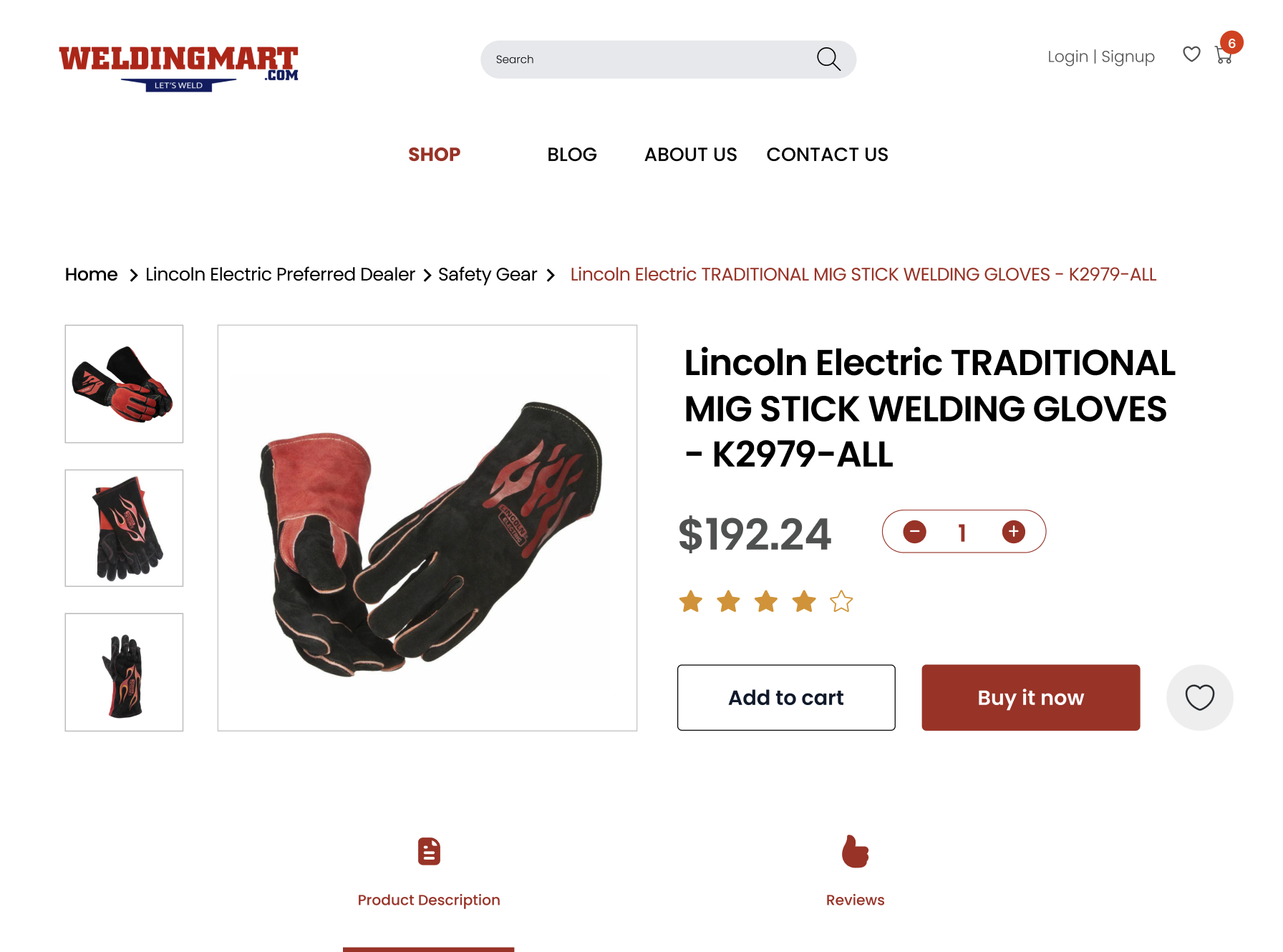
The ratings and proofs are displayed in a visually appealing manner, with star ratings, customer reviews, and certification badges prominently positioned near the product description. This layout ensures that the information is easily accessible and adds to the credibility of the product, enhancing customer trust.
Product Highlights and Features
The new design of the product pages focuses on presenting key product highlights and features in a clear and concise manner. This approach ensures that customers can quickly grasp the essential information without feeling overwhelmed. Each product page includes a well-organized layout that highlights the main benefits and specifications, making it easier for customers to compare and evaluate different products.
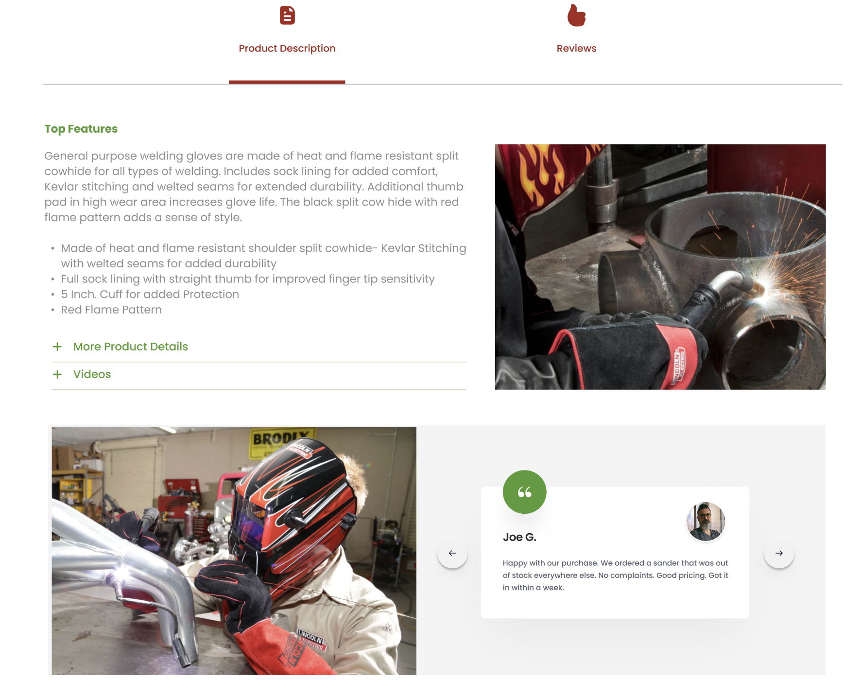
Clear presentation of product features helps in setting the right expectations and reducing potential misunderstandings. This transparency not only aids in decision-making but also reduces the likelihood of returns and customer dissatisfaction. For WeldingMart.com, this improvement means a smoother buying process and higher customer satisfaction.
Product highlights are presented using bullet points, icons, and concise descriptions, making it easy for customers to scan the page and find the information they need. Additionally, detailed specifications and feature lists are available for those who want to delve deeper into the product details, providing a comprehensive view that supports informed decision-making.
Conclusion
The comprehensive redesign of WeldingMart.com addresses critical aspects of user experience, functionality, and accessibility. The improvements made to the homepage, navigation, search, filtering, and product pages collectively enhance the site’s usability and efficiency. By focusing on user-centric design principles, WeldingMart.com has created a more engaging and intuitive platform for its customers.
For any business operating an outdated website, this case highlights the importance of investing in a thorough redesign. Modernizing the user interface, improving navigation, and ensuring accessibility are key steps that can significantly impact user engagement and sales performance. A well-executed redesign not only improves the overall customer experience but also positions the business as a leader in its industry.
WeldingMart.com’s redesign demonstrates how strategic changes can lead to tangible benefits, from increased customer trust to higher conversion rates. By continually refining and updating their online presence, businesses can stay competitive and meet the evolving needs of their customers.


