In a digital epoch where the first interaction a customer has with a business is often virtual, the impression a website leaves can be lasting and fundamentally influential. Vizard’s Guns And Ammo, a haven for firearms enthusiasts offering an array of pistols, revolvers, muzzle loaders, rifles, and shotguns, recognized this pivotal intersection between customer perception and digital presence.
When presented with a homepage, what potential buyers see, feel, and experience within the first few moments becomes a potent determiner of their ensuing actions—whether they choose to explore further or bid farewell to what could have been a seamless transaction. This understanding became the propellant for a comprehensive website redesign, transforming it from a mere digital catalog to an interactive, user-centered, and immersive online shopping environment.
From the perceptive navigation afforded by the inventive header banner to the adeptly engineered user interface, the freshly minted design of vizardsgunsandammo.com is more than an aesthetic overhaul; it is a deliberate and strategic enhancement aimed at elevating every facet of customer interaction and engagement with the brand.
Importance of Strategic Web Redesign
Embarking on the journey of a web redesign is no trivial pursuit. It demands not only a meticulous understanding of the brand and its core audience but also a strategic foresight to align functionalities with evolving consumer behaviors and technological advancements. For Vizard’s Guns And Ammo, the redesign wasn’t about merely refreshing the visuals; it was an intentional endeavor to build bridges where gaps existed between user expectation and experience.
Websites, especially eCommerce websites like Vizard’s, aren’t just storefronts anymore. They are dynamic entities that communicate a brand’s ethos, assure shoppers of their investment, and facilitate, if not augment, the purchasing journey with streamlined navigations and interactions. An outdated, clunky website isn’t merely a tech faux pas. It can inadvertently communicate stagnation, apathy towards evolving customer needs, and a lackadaisical approach to the market’s dynamism—perceptions that modern businesses can scarcely afford.
An adeptly executed web redesign, therefore, is a resonant acknowledgment of a brand’s commitment to progress, customer satisfaction, and a continuous pursuit of excellence. It accentuates the ‘how’ and ‘why’ behind a brand’s offerings, furnishing customers not just with products, but an enriched, hassle-free shopping experience.
Vizard’s new website design, with its visually appealing and interactively rich UI, doesn’t just list items for sale. It tells a story, offers a promise, and, most importantly, propels a dialogue with its audience, ensuring that their virtual journey mirrors the quality and reliability synonymous with the products on display.
Homepage Transformation
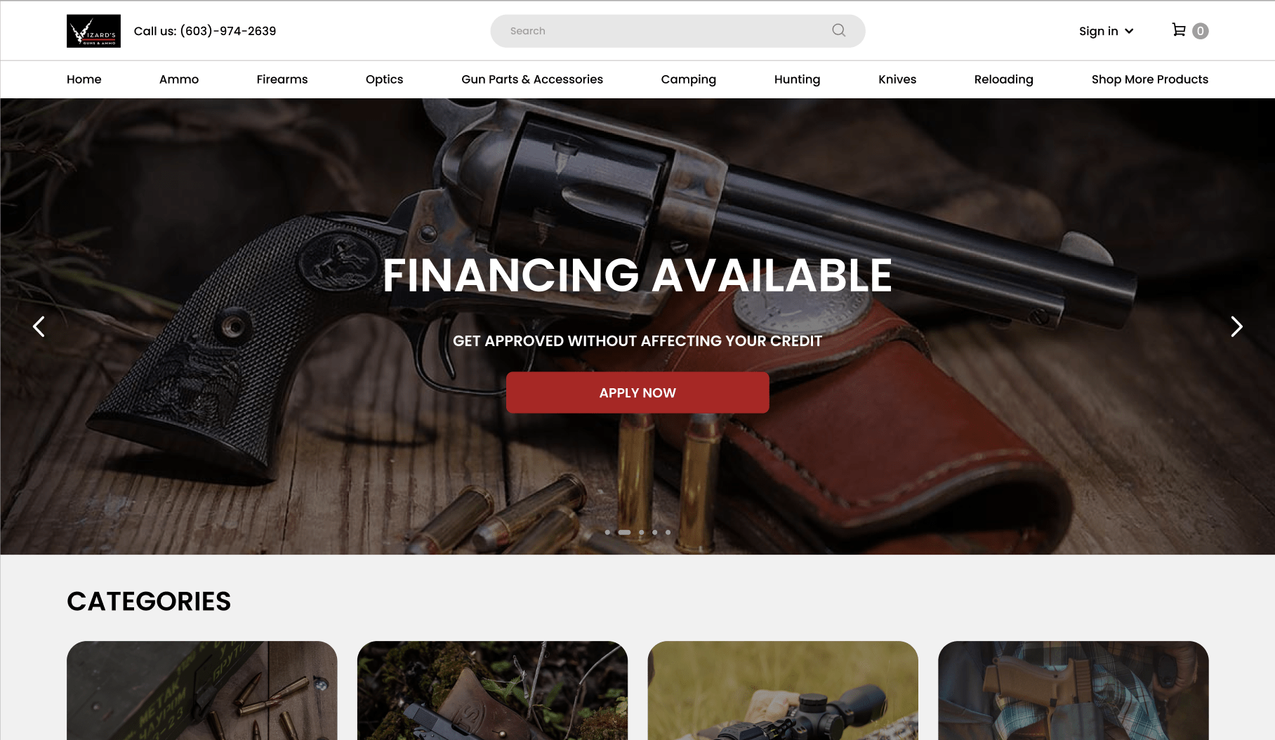
Embarking on the pivotal journey from the conventional to the exceptional, the homepage of Vizard’s Guns And Ammo underwent a transformative redesign, metamorphosing from a static page to an interactive, dynamic gateway into a world where quality, reliability, and customer satisfaction reign supreme. This transformation was conceived, not merely as a visual refresh, but as a profound reimagining of the initial touchpoint between the brand and its audience.
In digital storefronts, the header banner transcends its role as a mere visual element. It becomes the herald of the brand’s narrative, ethos, and promises, orchestrating an immediate, unspoken dialogue with the visitor. For Vizard’s, the banner doesn’t simply showcase products; it subtly interweaves the brand’s commitment to affordability, quality, and customer-centricity, guiding visitors, not just through a catalog, but an experience. This conversion of the first visual touchpoint into a potent communication tool amplifies the brand’s message, embodying its dedication to providing unbeatable prices and unmatched quality.
The revitalized User Interface (UI), distilling simplicity and interactivity into each pixel, stands as a stark contrast against many text-heavy, visually stagnant comparative websites in the digital arsenal. Its conscious design diverges from an overcrowded visual and informational space, leaning towards clarity and concise communication. The intent was to forge a space where customers could navigate, explore, and engage with ease, free from the potential pitfalls of complexity and ambiguity. With interactive, customer-friendly designs, Vizard’s not only retains its patrons but enamours them, ensuring loyalty is reciprocated with continuous, qualitative user engagement.
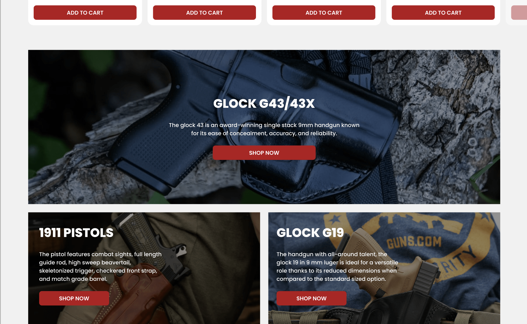
In the realm of digital interaction, banner ads serve as silent conversationalists, speaking volumes without uttering a word. Their strategic placement and design within Vizard’s new homepage don’t merely serve promotional objectives but aim to enhance the user’s navigational journey, directing them towards products and offers that align with their interests and needs. Engaging, yet unobtrusive, these banner ads are a manifestation of Vizard’s understanding of its customers’ desires for seamless, value-driven navigation.
Accessibility and intuitive navigation have been interwoven into the redesigned homepage, ensuring that every user, regardless of their technical proficiency or device specifications, finds a home at Vizard’s. It’s not merely about reaching a destination but enjoying the journey therein – a principle deeply embedded in the redesign, ensuring that the path to desired products and information is not just clear, but enjoyably discoverable.
Quick View and Hover Effects Enhancement
In an era where digital experiences are often critiqued through a lens of instantaneity and convenience, the incorporation of interactive elements like hover effects and quick-view functionality are no longer mere enhancements but foundational to robust user experience. For Vizard’s, these elements are not just features; they are silent facilitators that smooth out the digital browsing journey, ensuring it’s not just efficient but thoroughly enjoyable.
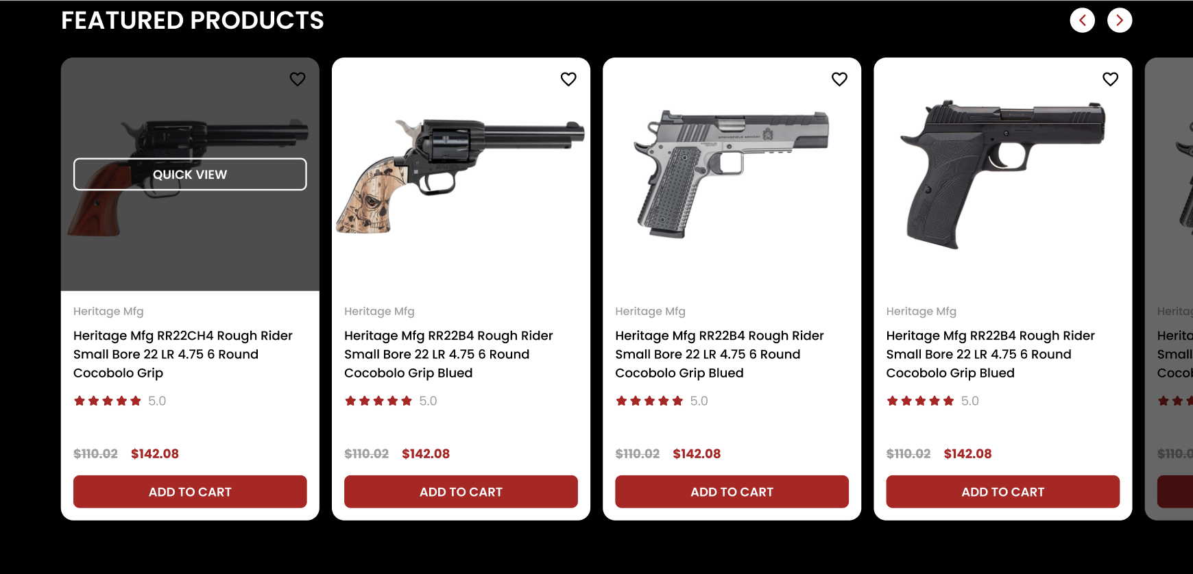
Hover effects, which trigger visual changes and prompts upon cursor placement, seamlessly amalgamate functionality with subtle entertainment. Beyond being a mere playful interaction, hover effects in the redesigned website act as unspoken guides, intuitively leading users through the digital landscape of products and information. It’s an elegant way of signifying interactivity and utility without clouding the user interface with additional textual indicators.
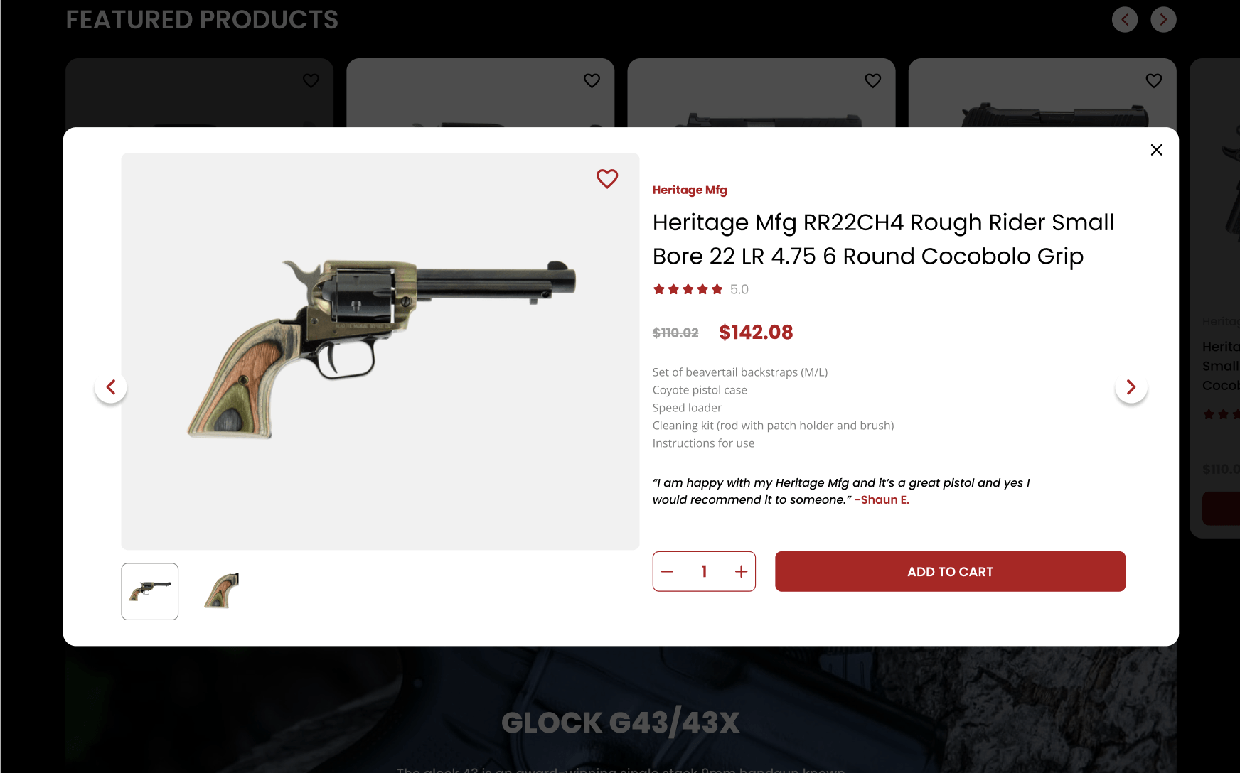
Quick view functionality, on the other hand, is the epitome of respecting the user’s time and browsing style. By enabling users to glean essential product information without necessitating navigation away from the current page, it ensures that the exploratory flow of the user is not just maintained but celebrated. This feature becomes particularly pivotal for users who are on a multi-item search, allowing them to traverse through numerous products without being encumbered by continual page reloads or navigation backtracks.
Through these enhancements, Vizard’s newly minted website becomes more than a product showcase. It transforms into an intuitive, responsive, and engaging digital environment where users are not just valued, but understood. The balance between playful interactivity and streamlined functionality ensures that the redesign not only elevates the aesthetic and interactive quality of the website but profoundly enriches the overall user journey, fortifying the bridge between what is seen and what is experienced.
Mega Menu for Improved Site Navigation
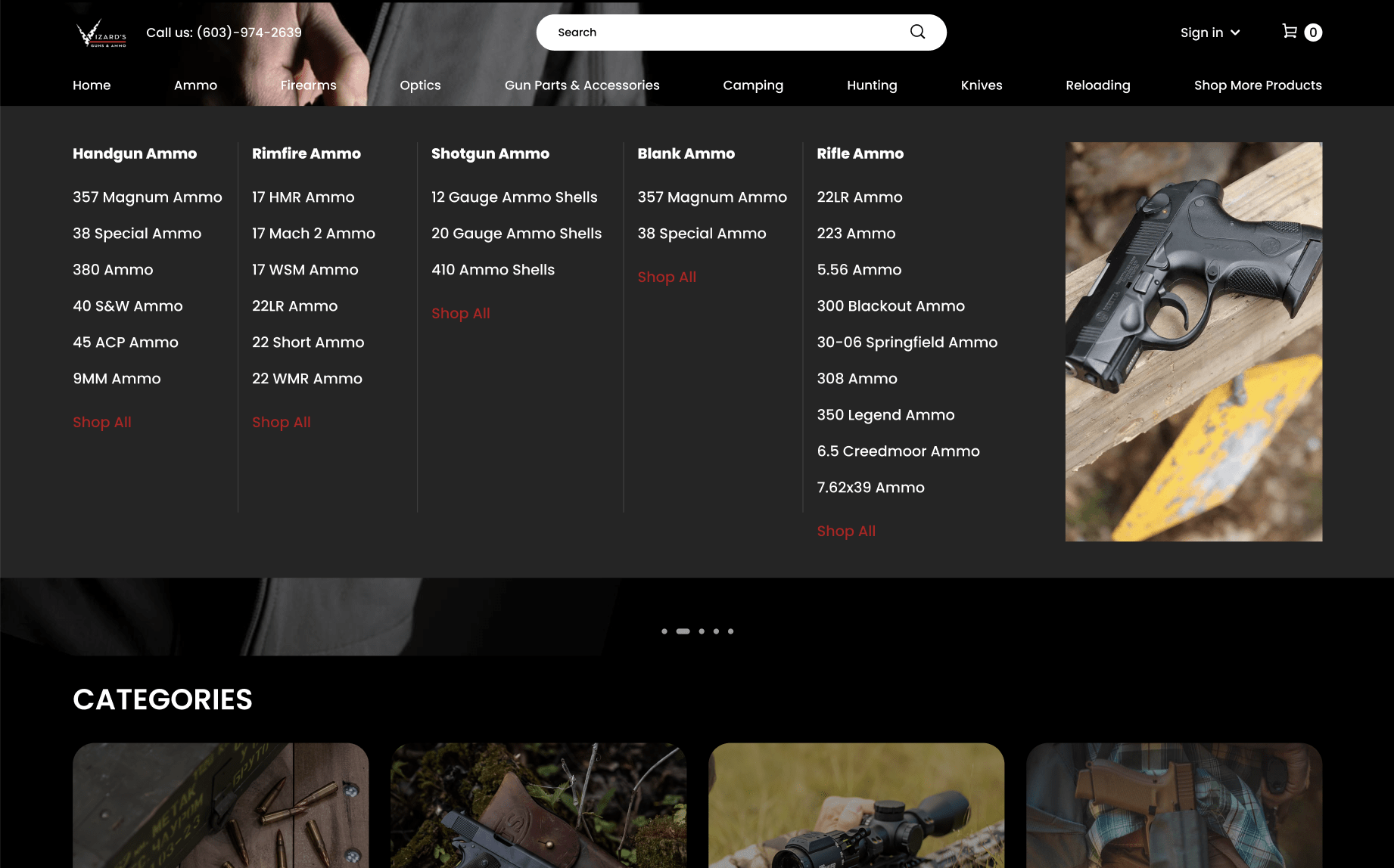
Navigating through an ocean of products and pages can be a daunting task, especially for new visitors unacquainted with the breadth of offerings at Vizard’s Guns And Ammo. Recognizing the potential for complexity and the paramount importance of smooth user navigation, the incorporation of an advanced Mega Menu became an integral piece in the puzzle of reconstructing the website.
In the digital world, the Mega Menu is not just a tool; it’s an intelligent guide that succinctly organizes and presents the multitudinous array of products and categories to visitors, eliminating the classic headache of sifting through cluttered and convoluted traditional dropdown menus. The reimagined Mega Menu at Vizard’s does not merely list items but strategically classifies them into discernible categories and subcategories, effortlessly guiding users through the extensive inventory without overwhelming them with an excess of information and options.
The Mega Menu performs a pivotal role in demystifying the comprehensive range of products and leading shoppers unerringly to their desires. With a simplified, yet detailed overview of available products and categories, it ensures that users can instantaneously traverse through the various sections without being encumbered by multiple navigational layers, optimizing their journey from the homepage to the checkout.
Moreover, the Mega Menu serves as a silent salesman, subtly highlighting featured products, new arrivals, and special offers, thereby unintrusively integrating promotional efforts within the navigational framework. Thus, it is not merely a directional tool but a strategic ally in enhancing user experience and gently nudging customer engagement.
Optimizing Category Pages
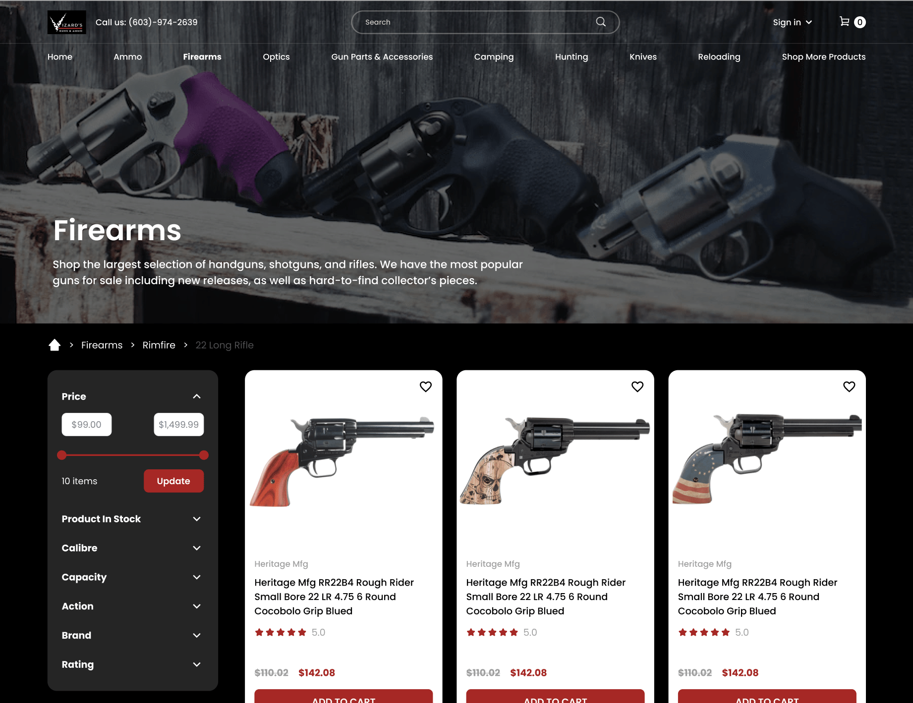
With a pulsating digital marketplace, seamless and efficient search functionality isn’t merely a convenience but a necessity, influencing not only user satisfaction but also their conversion from browsers to buyers. Citing the substantial 43% of visitors who instinctively gravitate towards the search bar upon entry, as per Forrester Research, Vizard’s recalibrated its approach towards optimizing category pages to be not just repositories of products but well-orchestrated platforms that facilitate an effortless discovery process.
It’s a universally acknowledged truth that engaged searchers, with their higher propensity to convert, necessitate a search interface that is not just functional but aesthetically harmonious and intuitively interactive. It’s not merely about locating a product but enjoying the serenity of a hassle-free search experience. Therefore, a meticulous attention was placed on constructing a search and categorization system that is as fluid as it is accurate, guiding users through their discovery process with precision and ease.
Filters, the unsung heroes of user-friendly navigation on e-commerce platforms, are paramount in streamlining the discovery journey, especially amidst a sea of varied products. Vizard’s reimagined filtering system isn’t just a tool but an intelligent assistant that aids users in effortlessly narrowing down their options, ensuring their path from desire to possession is unimpeded by unnecessary complexity. A well-optimized filtering system not only amplifies user satisfaction but also significantly impacts conversion, marrying the user’s desires with the website’s offerings in a harmonious union.
The integration of potent filters and a refined search interface on the category pages is Vizard’s silent commitment to ensuring that every visitor, regardless of their familiarity with the inventory, can navigate, explore, and discover with the utmost ease, culminating in a user experience that is not only satisfactory but delightfully memorable.
Through the chapters of Mega Menus and Category Page Optimization, Vizard’s Guns And Ammo demonstrates that in a digital world, where choices are aplenty, crafting a user journey that is seamless, enjoyable, and efficient is not just beneficial but imperative. It’s a testament to how strategic redesign, grounded in understanding and enhancing user experience, can elevate a brand from being a mere retailer to a cherished destination in the customer’s digital journey.
Product Pages and Customer Assurance
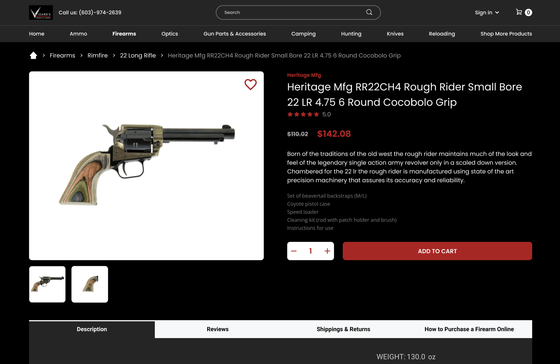
In an e-commerce environment, product pages serve as virtual salespeople, each tasked with presenting the offerings in the most authentic and compelling manner. The redesigning of product pages for Vizard’s Guns And Ammo was guided by a singular principle: transparency breeds trust.
By introducing verified product ratings and providing genuine proof of product quality, the revamped product pages communicate a silent promise of authenticity and reliability to every visitor.
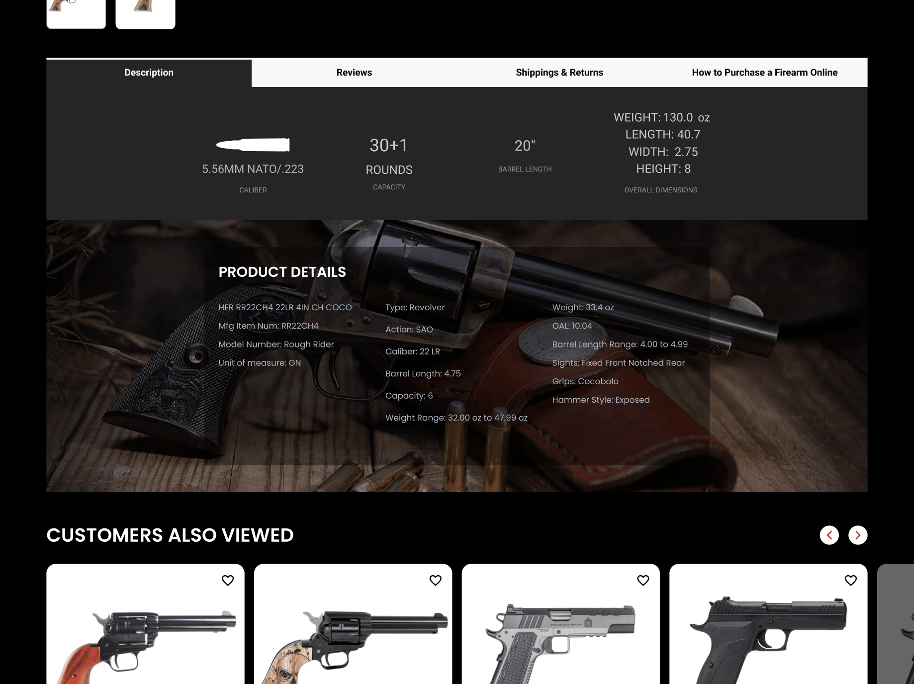
In a sector such as firearms and ammunitions where purchase decisions are significantly influenced by trust and reliability, highlighting product features, advantages, and unique selling propositions transparently is paramount.
This is why recommendations and highlighting complementary products (up-selling and cross-selling strategies) have been seamlessly woven into the product pages, ensuring customers not only understand the product they are viewing but also its potential enhancements and alternatives, leading to an enriched shopping experience.
Sticky Add-to-Cart Implementation
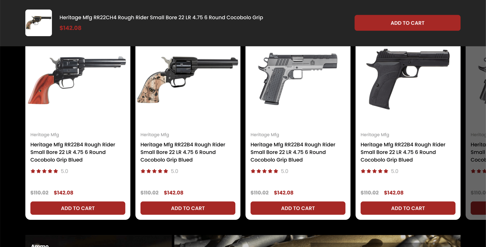
A sophisticated simplicity governs the introduction of the sticky ‘Add to Cart’ feature in Vizard’s redesigned interface. Imagine perusing a vast, detailed catalog of products and having a personal assistant trailing silently, ready to note down any item that catches your fancy, without prompting. The sticky ‘Add to Cart’ feature plays this role, ensuring that as users scroll through the product details, the option to finalize their purchase is always within easy reach, thereby simplifying the transition from choice to purchase.
The underlying psychology is straightforward yet potent: reduce friction, enhance convenience, and you invariably boost conversions. By ensuring that the purchase option consistently remains within visible proximity, the sticky button subtly encourages progression through the sales funnel without being overbearing or disruptive to the browsing experience.
Overall Impact of the Redesign on Vizard’s Guns And Ammo
The synthesis of all these intricate, well-thought-out design elements culminated in a virtual space that doesn’t merely sell but communicates, understands, and facilitates. Post-redesign, Vizard’s Guns And Ammo isn’t just a retail platform; it’s a user-oriented experience that aligns with, and caters to, the varied needs, preferences, and expectations of its diverse clientele.
While concrete data on sales, user engagement, and customer acquisition would provide a quantitative assessment of the redesign, the qualitative impact is embedded in every interaction users have with the platform. The intuitive navigation, seamless search and discovery, transparent product representation, and frictionless purchase pathway collectively craft an experience that goes beyond mere transactional interactions, building a rapport with visitors that extends beyond the digital space.
In the end, a website is more than a sales platform; it is a digital embodiment of a brand’s values, offerings, and commitments. Through strategic, user-oriented redesigns, brands like Vizard’s not only enhance their digital presence but elevate the very experiences they offer to their customers. It serves as a compelling case study for any enterprise looking to recalibrate its digital strategy, shedding light on how a well-executed redesign can transform user interaction, engagement, and conversion, thereby crafting a digital journey that is as rewarding for the brand as it is for the customer.
Considering a redesign project but don’t know where to start? Let’s navigate through the complexities together, ensuring your website not only mirrors your brand authentically but also enhances user engagement and drives conversions. Begin your transformative journey with us, and turn the daunting into doable. Connect with us today!


