TileOutlets.com is a business specializing in a wide array of tiling options, including ceramic tile, porcelain tile, stone, LVT, and mosaics, with locations in Fort Myers, Sarasota, Tampa, and an online store. A website redesign can be transformative, enhancing both user experience and business outcomes. The recent redesign of TileOutlets.com was undertaken with specific goals in mind: to improve customer engagement, increase trust in the brand, and streamline the shopping process.
The first impression is paramount in online retail. A well-designed homepage can capture attention and encourage visitors to explore further. By reimagining the user interface, we aimed to create an engaging and trustworthy environment that stands out from outdated, text-heavy websites. The new design emphasizes simplicity and clarity, making it easier for customers to find what they are looking for and enjoy their shopping experience.
An effective redesign is not just about aesthetics; it’s about functionality and accessibility. Ensuring that the website is easy to navigate and accessible to all users is essential. The updated features, including interactive elements and a streamlined layout, were carefully chosen to enhance usability and encourage repeat visits. This redesign is a testament to how a modern, well-thought-out website can significantly benefit a business, making it a vital consideration for any e-commerce platform looking to stay relevant and competitive.
Category Pages
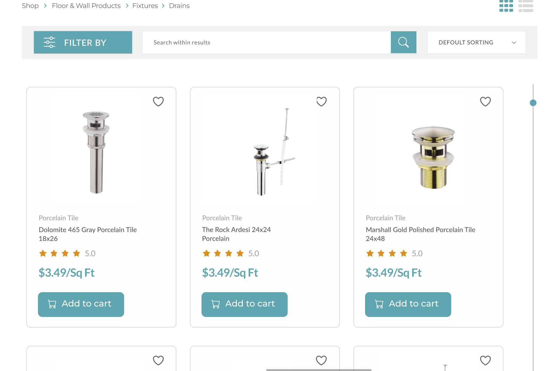
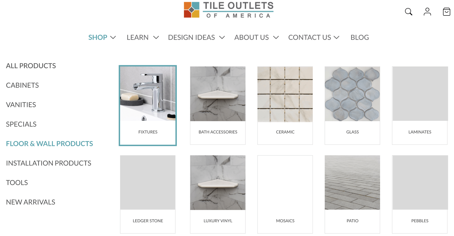
Category pages are pivotal in the shopping journey of any e-commerce website. For TileOutlets.com, these pages were redesigned to optimize product search and improve user experience, catering to the needs of both casual browsers and determined buyers. According to Forrester Research, 43% of website visitors head directly to the search bar, indicating that an effective search functionality is crucial.
The redesigned category pages feature an intuitive and interactive search interface. This interface is not only aesthetically pleasing but also easy to use, allowing customers to find products quickly and efficiently. By making the search process seamless, we have enhanced user engagement and increased the likelihood of conversions. Searchers are 1.8 times more likely to convert than non-searchers, highlighting the importance of a well-designed search function.
Additionally, the implementation of a robust filtering system on the category pages addresses the common challenge of navigating large product catalogs. Filters enable users to narrow down their options based on various criteria, such as material, price, and style. This feature is beneficial for both the user and the business. For users, it simplifies the shopping process, making it quicker and more enjoyable. For TileOutlets.com, it broadens the reach to a wider audience and can significantly boost sales. Studies have shown that even the simple act of adding filters can increase conversion rates by 26%.
The redesign also focuses on making the category pages interactive and engaging. Clear, high-quality images and concise product descriptions help customers make informed decisions without feeling overwhelmed. The goal is to present a variety of products in a way that is both visually appealing and easy to navigate, enhancing the overall user experience.
By updating the category pages, TileOutlets.com not only improves the shopping experience for its customers but also positions itself as a modern and efficient e-commerce site. This redesign serves as an example of how thoughtful changes to key elements of a website can lead to significant improvements in user satisfaction and business performance. Outdated websites can benefit immensely from such updates, ensuring they meet the evolving expectations of today’s online shoppers.
Product Pages
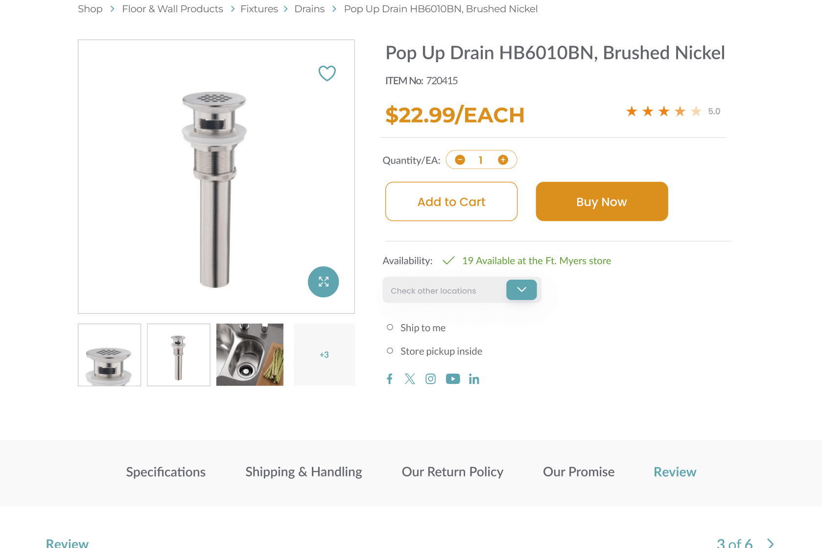
Product pages are the heart of any e-commerce website. For TileOutlets.com, these pages were redesigned to enhance user trust and facilitate informed purchasing decisions. A critical aspect of the redesign was the integration of verified product ratings. These ratings serve as social proof, helping customers feel confident about their choices by showcasing genuine feedback from other buyers. High-quality ratings and reviews can significantly influence purchasing decisions, as they provide assurance about the product’s authenticity and quality.
Another key change was the clear presentation of product highlights and features. The goal was to provide essential information in a concise and easily digestible format. Overloading customers with too much information can be counterproductive, leading to confusion and decision paralysis. By focusing on the most important product details, we ensure that customers can quickly understand the value and benefits of each item. This streamlined approach not only aids in decision-making but also enhances the overall shopping experience.
The redesigned product pages also incorporate strategic recommendations for up-selling and cross-selling. Up-selling involves presenting customers with higher-quality or premium versions of the products they are viewing, while cross-selling suggests complementary items that enhance the main product’s utility. For instance, a customer looking at tiles might see suggestions for related tools or installation materials. These recommendations are subtly integrated into the product pages, making them helpful rather than intrusive. This strategy not only boosts sales but also enriches the customer’s shopping experience by offering relevant product suggestions.
In summary, the redesign of TileOutlets.com’s product pages focuses on building trust, providing clear and concise product information, and strategically recommending additional items. These enhancements are crucial for any e-commerce site looking to improve user satisfaction and increase sales. Outdated websites can benefit immensely from similar updates, ensuring they meet modern shoppers’ expectations and needs.
Homepage Redesign
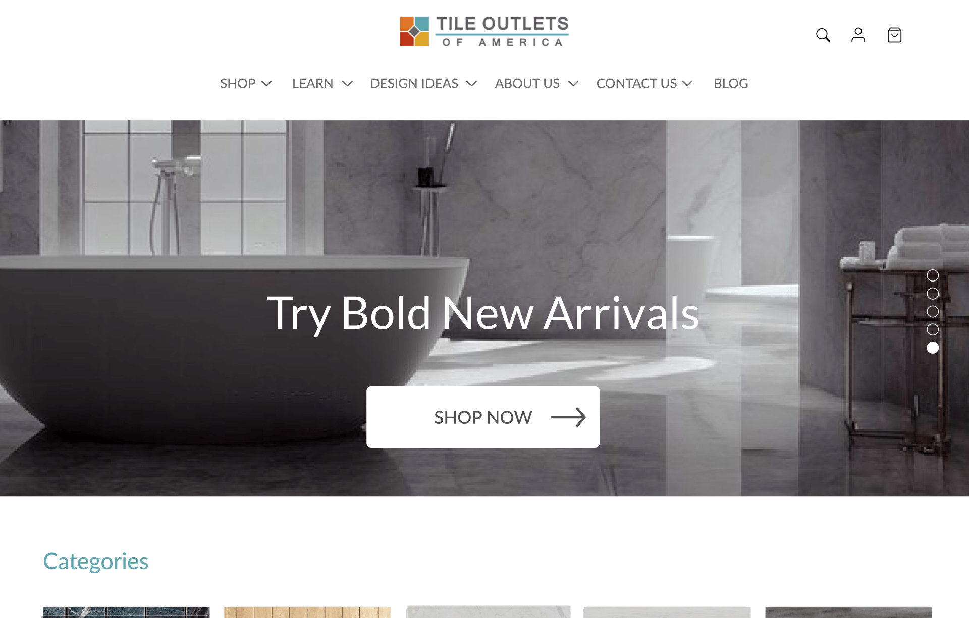
The homepage is the gateway to an e-commerce website, making it a crucial component of the redesign for TileOutlets.com. A prominent feature of the new homepage is the header banner, which serves as a major marketing opportunity. This banner is the first thing visitors see and sets the tone for the entire site. It effectively communicates the brand identity and personality of TileOutlets.com, making a strong first impression. The banner showcases key messages, promotions, and high-quality visuals, drawing visitors in and encouraging them to explore further.
A significant part of the redesign was the overhaul of the user interface (UI). The new UI is designed to increase customer engagement and build trust in the brand. Modern, visually appealing interfaces can significantly improve user retention, as they provide a more enjoyable and intuitive browsing experience compared to outdated, text-heavy sites. By adopting a clean, simple design with clear language, the homepage ensures that visitors can easily navigate and find the information they need without feeling overwhelmed or confused.
Banner ads, strategically placed on the homepage, also play a crucial role in the redesign. These ads are designed to be visually appealing and effective, linking to specific products or promotions. They serve as a measurable and efficient medium to increase brand awareness and drive traffic to particular sections of the website. Each banner ad is crafted to capture attention and guide visitors towards making a purchase, thereby enhancing the overall marketing strategy.
Accessibility is another critical aspect of the homepage redesign. Ensuring that the interface is usable and visible to all types of users, including those with disabilities, is essential. The design incorporates elements that facilitate easy navigation and interaction, ensuring that every visitor can access the site’s features and information effortlessly. This inclusive approach not only broadens the potential customer base but also aligns with best practices in web design.
The homepage prominently features the value proposition of TileOutlets.com, showcasing the unique selling points of the products and services offered. Attractive offers and prices, such as “High Quality” or “50% Off,” are highlighted to immediately catch the viewer’s eye. This approach ensures that the most important information is front and center, making it clear why customers should choose TileOutlets.com over competitors.
In conclusion, the homepage redesign of TileOutlets.com focuses on creating a strong first impression, improving user engagement, and making navigation intuitive and accessible. These changes are vital for any e-commerce site aiming to stay competitive and relevant in today’s digital market. Updating outdated websites with similar enhancements can significantly improve user experience and drive business growth.
Quick View Functionality and Hover Effects
The integration of quick view functionality and hover effects on TileOutlets.com significantly enhances the user experience, making the shopping process more efficient and enjoyable. Quick view functionality allows customers to preview product details without leaving the category or search results page. This feature is particularly beneficial for users who are exploring multiple products, as it eliminates the need to load individual product pages and navigate back and forth. By providing essential product information in a pop-up window, quick view makes shopping faster and more convenient, which can lead to higher conversion rates.
Hover effects, on the other hand, add a layer of interactivity that makes the website more engaging. When users hover over elements like product images or buttons, these elements respond with subtle animations such as color changes, scaling, or rotations. These visual cues not only enhance the aesthetic appeal of the site but also indicate that the site is responsive and dynamic. This responsiveness can reassure users that the website is modern and well-maintained, encouraging them to spend more time exploring and shopping.
Both quick view functionality and hover effects contribute to an improved user shopping experience. Quick view options streamline the selection process, allowing users to compare products easily and make faster decisions. This is especially useful for customers who are browsing a large number of items and need to quickly gather information about each product. Hover effects, meanwhile, provide immediate feedback to user actions, creating a sense of engagement and interactivity. These enhancements can make a significant difference in user satisfaction and loyalty.
For outdated websites, incorporating features like quick view and hover effects can transform the user experience. These changes not only make the site more user-friendly but also convey a sense of professionalism and attention to detail. As a result, users are more likely to trust the site, return for future purchases, and recommend it to others. Updating a website with these interactive elements is a strategic move that can lead to increased customer engagement and higher sales.
Mega Menu Design
The implementation of a mega menu on TileOutlets.com addresses the challenge of navigating a website with a vast array of products and categories. Mega menus provide a comprehensive overview of all available options in a single, organized layout. This design allows users to quickly and easily find the specific products or categories they are interested in without scrolling through long lists or multiple pages.
A well-designed mega menu enhances the user experience by reducing clutter and promoting relevant products. For TileOutlets.com, the mega menu is designed to highlight major product categories, subcategories, and featured items, guiding shoppers directly to what they are looking for. This not only improves navigation but also helps users discover new products they might not have initially considered.
Mega menus are particularly advantageous over traditional dropdown menus when dealing with extensive product lists. Regular dropdowns can become unwieldy and difficult to navigate as the number of options increases. In contrast, mega menus display categories in a structured and visually appealing format, making it easier for users to scan and select their desired options. For e-commerce websites like TileOutlets.com, this can lead to higher user satisfaction and reduced bounce rates.
The advanced mega menu solution used in the redesign of TileOutlets.com not only enhances usability but also supports the website’s overall marketing strategy. By featuring top products and promotions within the menu, the site can effectively capture user interest and drive sales. This approach ensures that key items are prominently displayed, increasing their visibility and potential for purchase.
For outdated websites, upgrading to a mega menu can provide significant benefits. It simplifies navigation, reduces user frustration, and showcases a wide range of products in an organized manner. Such an update can make the site more appealing and functional, encouraging users to spend more time browsing and ultimately increasing the likelihood of conversions. A modern, efficient navigation system like a mega menu is essential for any e-commerce site aiming to enhance user experience and stay competitive in the market.
Conclusion
Outdated websites can greatly benefit from similar updates. A modern, user-centric design not only meets the evolving expectations of today’s online shoppers but also positions the business as professional and trustworthy. Enhancing the user experience through thoughtful design changes can lead to increased user satisfaction, higher conversion rates, and sustained business growth.
In conclusion, the redesign of TileOutlets.com showcases the essential elements of a successful e-commerce website: engaging visuals, intuitive navigation, reliable product information, and interactive features. These improvements are not just cosmetic but strategic, addressing core user needs and business objectives. For any e-commerce site looking to stay relevant and competitive, a comprehensive redesign is an investment that can yield substantial returns in terms of user engagement, loyalty, and sales.


