In today’s fast-paced digital landscape, a company’s website is more than just a virtual storefront—it’s the heartbeat of its online presence and a critical touchpoint for its customers. With the evolution of design trends and technological advancements, e-commerce websites must remain agile, adapting to the ever-changing demands of discerning consumers. ThePondGuy.com, known for its commitment to providing comprehensive pond, lake, and water garden solutions, is no stranger to these imperatives. By embarking on a thorough website redesign, this leading brand illustrates how transformative changes can supercharge a company’s online interface, ensuring it not only meets but exceeds, contemporary standards.
The Homepage: The First Impression
A visitor’s first encounter with a website sets the tone for their entire experience. The homepage, thus, carries the onus of capturing and retaining attention, succinctly conveying the brand’s ethos, and directing the user seamlessly through the website.
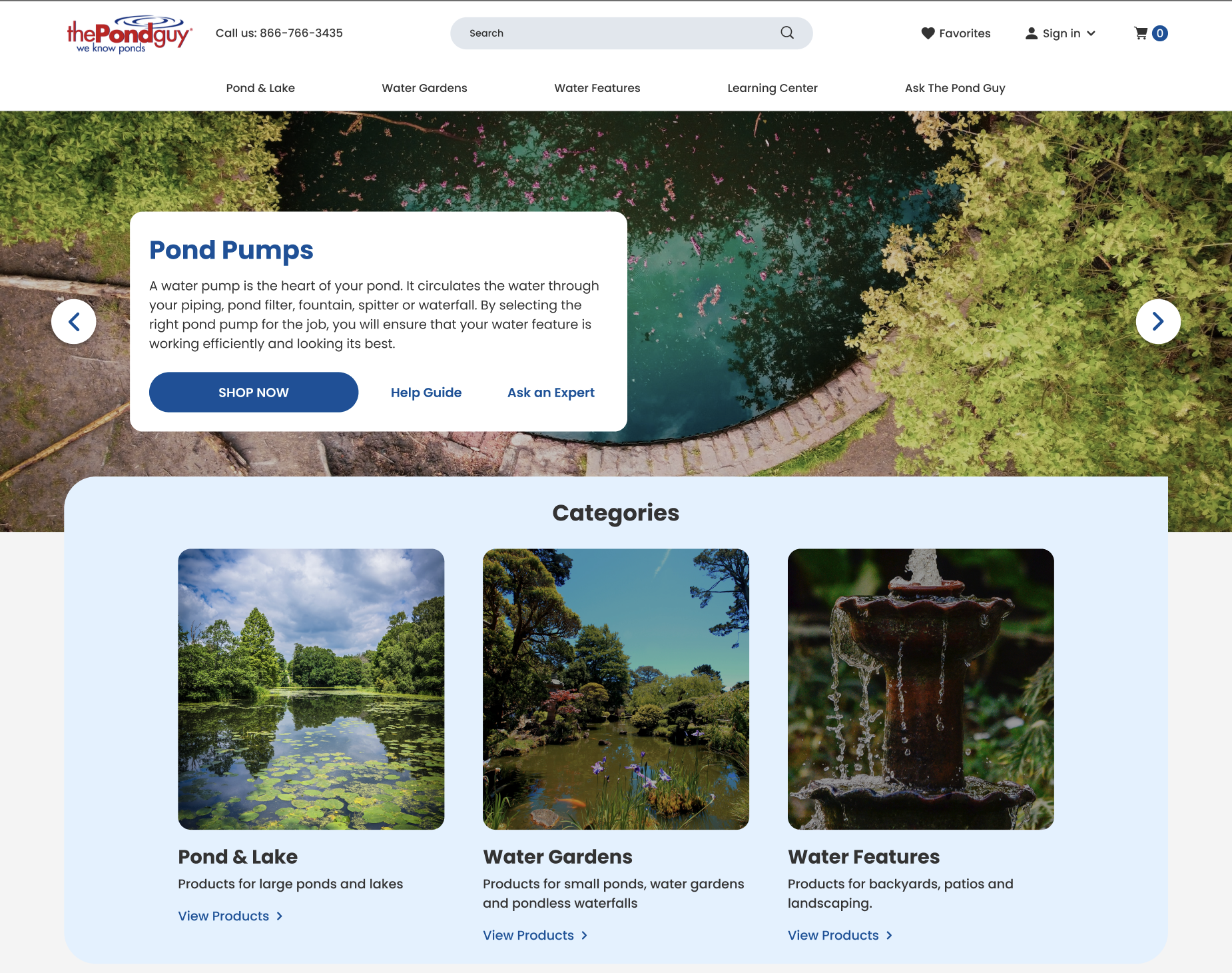
The cornerstone of any homepage is its header banner. At its core, it’s not just a graphical representation but a brand’s powerful proclamation. When users land on ThePondGuy.com, they’re immediately greeted with a vibrant and inviting banner that encapsulates the brand’s essence, announcing not just the products but the passion and commitment behind them. The redesigned banner, informed by best practices, not only announces who ThePondGuy.com is but also what it stands for—quality, expertise, and a commitment to healthy aquatic environments.
But what truly sets the redesigned website apart is its revamped user interface. In an age where online visitors have countless options at their fingertips, websites drowning in dense text or saddled with archaic designs risk alienating their audience. ThePondGuy.com’s fresh interface, with its intuitive layout and crisp visuals, fosters increased engagement and fortifies user trust. The idea isn’t merely about looking contemporary but offering an elevated user experience that distinguishes the brand from a sea of outdated competitors.
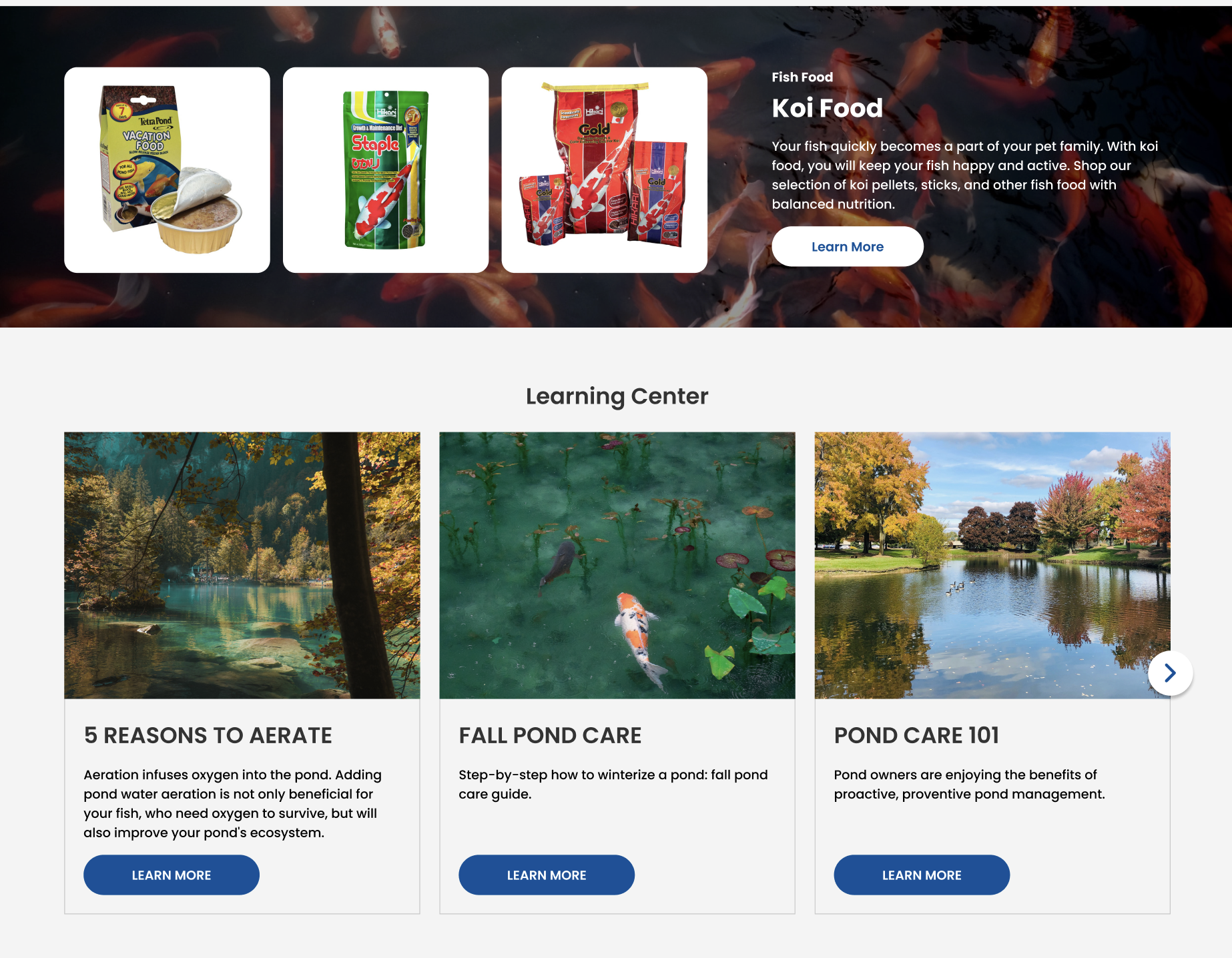
Every element on the homepage, from banner ads showcasing prime products to a clearly articulated value proposition, is thoughtfully curated. These are not just ornamental additions but strategic tools amplifying the brand’s message, ensuring every user—whether a first-time visitor or a loyal customer—understands the unmatched value ThePondGuy.com brings. In this digital age, it’s not just about having an online presence, but ensuring that presence is accessible, engaging, and continually optimized. The redesigned homepage of ThePondGuy.com stands as a testament to this belief, urging all businesses to recognize the immense potential a well-crafted homepage possesses.
Interactive User Experience: Quick View & Hover Effects
In the labyrinth of online commerce, ease of navigation and interactive elements can distinguish a memorable website from a forgettable one. The user’s journey, from landing on the page to finalizing a purchase, should be an experience, not just a transaction. ThePondGuy.com’s redesigned website embodies this philosophy through the introduction of innovative functionalities: Quick View and Hover Effects.
Hover effects, while seemingly minute, play a pivotal role in enhancing a site’s interactivity. As visitors glide their cursors over various elements, subtle transitions provide visual feedback—a nod to the user that the website is alive and responsive. ThePondGuy.com’s implementation of these effects elevates the browsing experience, adding a layer of finesse that signals attention to detail and modern design acumen.
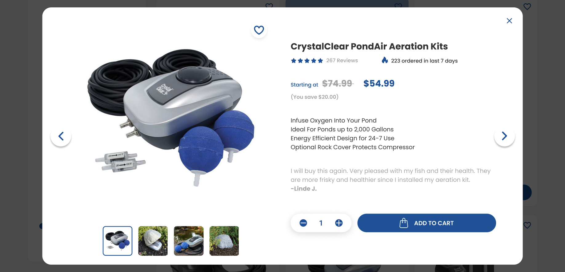
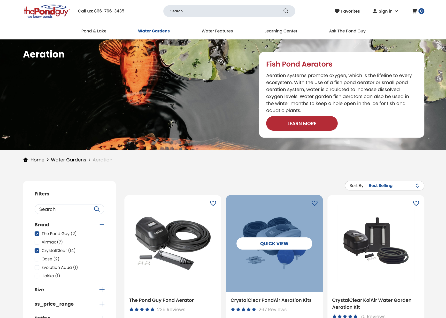
But where the redesign truly shines is in its Quick View functionality. In the bustling world of e-commerce, time is a treasured commodity. With Quick View, users can glean key product details without navigating away from their current page—a convenience that streamlines the shopping experience. For users who are keen on exploring multiple products or meticulously choosing their selections, this feature transforms the browsing process, making it efficient and user-centric. In a sense, it replicates the experience of quickly scanning products on a physical shelf, offering details at a glance without the need for cumbersome navigation.
Navigational Mastery with Mega Menus
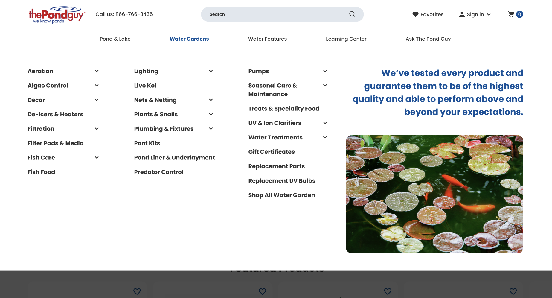
A website’s menu isn’t just a list—it’s the roadmap guiding visitors through the brand’s offerings. With the burgeoning amount of content on e-commerce websites, traditional dropdown menus can often become convoluted, hindering the user’s quest for specific products or information. Addressing this, ThePondGuy.com heralded a new era in user navigation with the introduction of Mega Menus.
Mega Menus are expansive dropdowns that display options in structured, comprehensible groups. More than just a list, they offer a visual journey, presenting categories, subcategories, and even promotional content cohesively. The benefits are manifold. Not only do they curtail clutter, but by laying out choices in a visually segmented fashion, Mega Menus guide users effortlessly to their destinations.
For websites with a vast expanse of products and categories, like ThePondGuy.com, Mega Menus are not just a design choice; they’re a strategic move towards improved user experience. It reflects a brand’s commitment to ensuring that its offerings are accessible, organized, and easy to navigate.
In the larger scheme of digital commerce, redesigning a website is not about mere aesthetics—it’s a mission to marry form and function, ensuring that every design choice echoes the brand’s commitment to its users. ThePondGuy.com’s foray into interactive design elements and robust navigational structures exemplifies this, setting a benchmark for contemporary e-commerce websites.
Optimizing Category Pages for Maximum Engagement
As the saying goes, “The details are not the details; they make the design.” This sentiment is particularly true when it comes to the category pages of an e-commerce website. Serving as the primary directories of a site’s offerings, these pages determine the fluidity of a user’s browsing journey. At ThePondGuy.com, a comprehensive redesign sought to refine this experience, taking into account both form and function.
Research indicates that a staggering 43% of users head straight to the search bar upon entering an e-commerce site. This isn’t mere happenstance; it’s an unequivocal testament to the intent of these visitors. They’re not mere window shoppers; they’re on a mission. Recognizing this, the redesigned category pages of ThePondGuy.com focus on streamlined, interactive, and aesthetically pleasing search interfaces.
However, an e-commerce website’s onus extends beyond facilitating search. With a plethora of products, it becomes imperative to categorize and filter these effectively. An optimized filtering system, as incorporated in the redesign, isn’t just a tool—it’s a bridge connecting users to their desired products. It’s not about limiting their view, but enhancing it, presenting a curated selection tailored to their preferences. Such a meticulous design choice doesn’t just augment user experience; it propels engagement and fosters an environment conducive to conversions.
Perfecting the Product Page for Enhanced Trust & Sales
Every product tells a story. In the digital realm, the product page is the stage where this narrative unfolds. ThePondGuy.com’s redesigned product pages resonate with this ethos, ensuring that each product isn’t just showcased but celebrated.
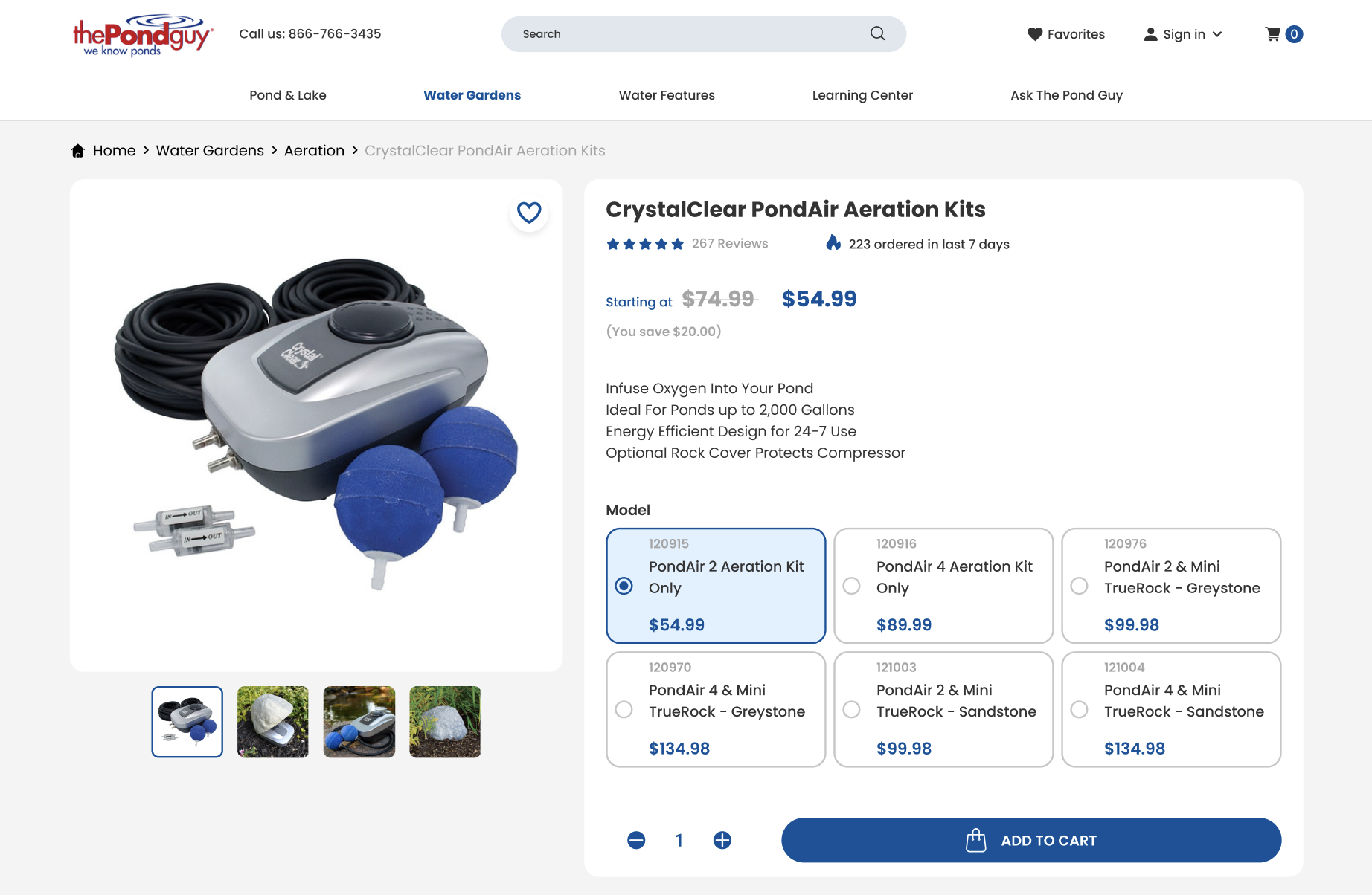
A critical factor influencing online purchases is trust. In the absence of tactile experiences, users rely on tangible markers of authenticity and quality. Recognizing this, verified product ratings have been prominently integrated into the redesign, serving as badges of credibility. Such elements reassure potential customers, signaling that they are making a well-informed choice.
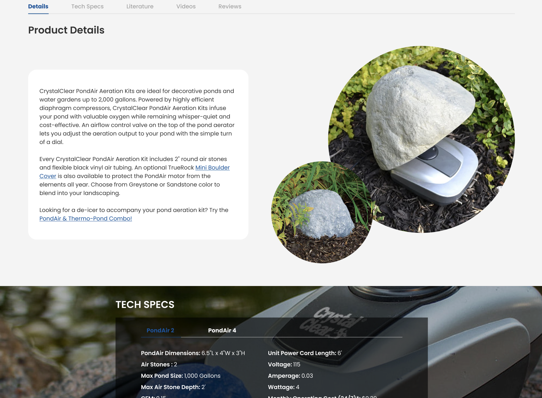
But trust is just one facet of the equation. Equally crucial is clarity. With the plethora of information available, the challenge is to present product highlights in a digestible format. Overwhelming users is counterproductive. ThePondGuy.com’s redesigned product pages strike this delicate balance, detailing features succinctly without diluting their significance.
The cherry on top? Thoughtful up-sell and cross-sell strategies. Rather than aggressive sales pitches, the design incorporates subtle prompts, nudging users towards complementary products or superior variants. It’s akin to having a seasoned salesperson recommend additions that might enhance the value of one’s purchase.
The digital space is ever-evolving, and stagnation equates to obsolescence. While ThePondGuy.com’s revamp is a testament to their forward-thinking approach, it’s also a clarion call for all eCommerce websites. Redesign isn’t just about aesthetics; it’s a commitment to users, a pledge to continually optimize their experience. In this dynamic landscape, adaptability isn’t just beneficial—it’s imperative.
The Sticky Add-to-Cart Functionality
In the bustling aisles of a digital marketplace, one feature has recently emerged as a frontrunner in enhancing the shopping experience: the Sticky Add to Cart button. At a glance, it seems like a simple UI feature, but its implications for user experience and conversions are profound.
So, what exactly is the Sticky Add to Cart button? As users scroll through product details on a webpage, this functionality ensures the add-to-cart button remains constantly visible, effectively “sticking” with the user as they navigate the page. The result? A persistent, subtle reminder that streamlines the journey from interest to purchase.
ThePondGuy.com’s integration of this feature is more than just a design choice—it’s a strategic decision. In the e-commerce realm, even minor friction can deter potential customers. By maintaining constant access to the add-to-cart function, this feature minimizes steps, reduces friction, and capitalizes on impulsive buying behaviors. It’s no surprise then that introducing such functionality has led to an impressive 8% uptick in orders.
Conclusion
The digital realm is never static; it’s a constantly evolving tapestry of innovations, trends, and user expectations. ThePondGuy.com’s comprehensive redesign isn’t merely about keeping pace with this evolution—it’s about setting the benchmark. From interactive user interfaces to strategic product page enhancements, each design choice mirrors a commitment to superior user experience, trust-building, and enhanced conversions.
Yet, this transformative journey isn’t exclusive to ThePondGuy.com. It’s a clarion call to e-commerce stores everywhere. An outdated website isn’t just aesthetically dated—it risks alienating users, eroding trust, and forfeiting potential revenue. In the digital age, adaptability and responsiveness aren’t optional; they are the linchpins of success.
For businesses wondering about the way forward, ThePondGuy.com’s redesign provides not just inspiration but a roadmap. The question isn’t whether to embark on such a journey but when. And as this transformation showcases, the rewards of a thoughtful redesign are well worth the endeavor.
Considering a similar transformative journey for your website? Dive deeper into the intricacies of modern design and its benefits. Contact us to elevate your digital presence and stay ahead of the curve.


