TarpsPlus.com, a leading supplier of various tarps in North America, has long been known for its extensive range of products, including poly tarps, canvas tarps, hay tarps, truck tarps, vinyl tarps, and mesh tarps. As the company grew and evolved, so did the need for a digital presence that reflected its stature and quality. The decision to undertake a comprehensive website redesign was driven by a desire to enhance user experience, increase customer engagement, and ultimately boost sales.
The previous website, while functional, lacked the modern features and aesthetic appeal necessary to captivate today’s discerning online shoppers. A refresh was not just about updating the look but also about improving functionality, accessibility, and usability. The redesign aimed to create an inviting, user-friendly environment that would not only attract new customers but also retain existing ones by offering a seamless, enjoyable browsing experience.
Product Pages Redesign
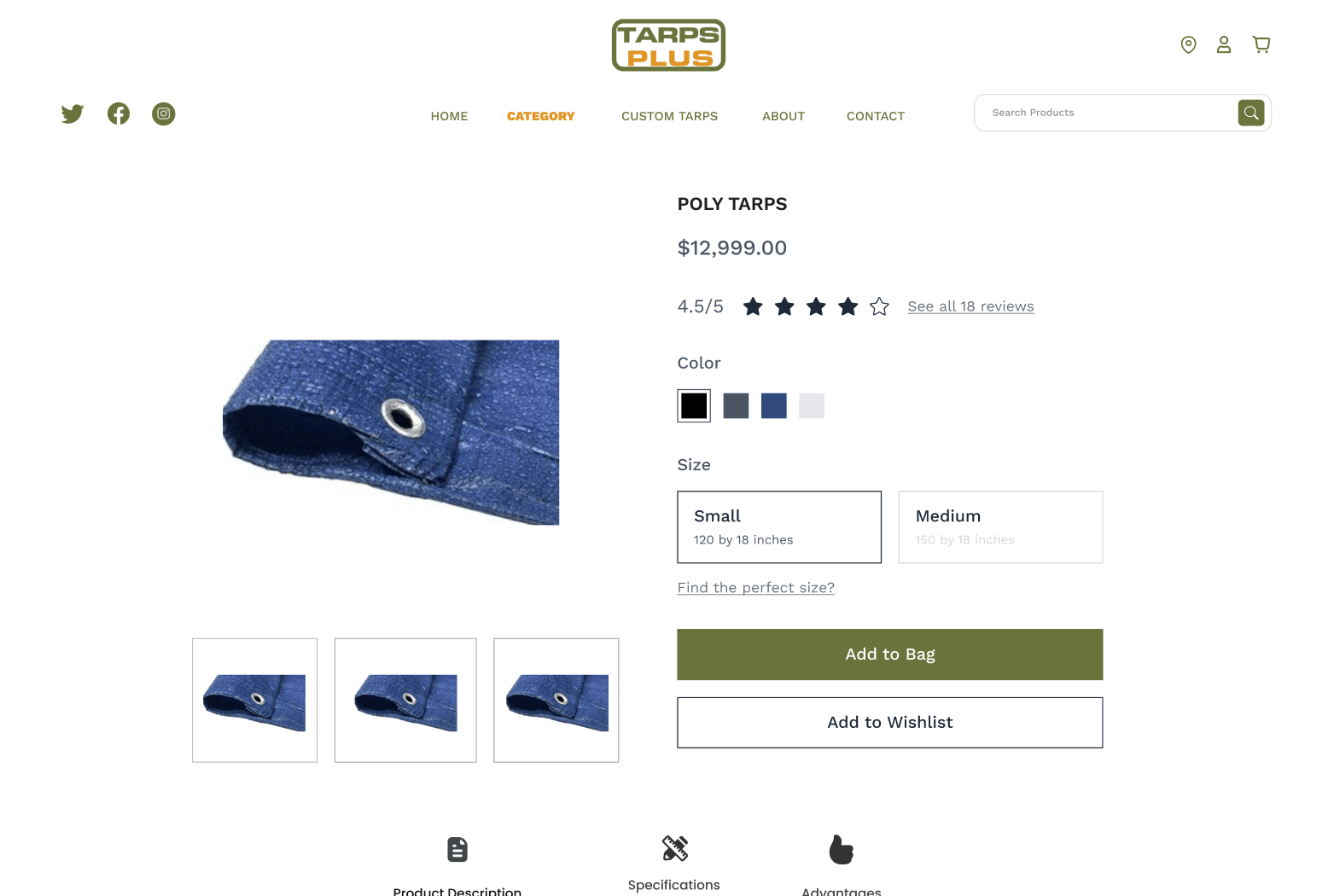
The product pages on TarpsPlus.com underwent a significant transformation to better serve customers and provide a richer, more informative shopping experience. One of the standout features added was verified product ratings. This addition was crucial in building trust and confidence among customers, reassuring them that the products they are purchasing are of high quality and have been positively reviewed by other buyers. Displaying these ratings prominently on the product pages helps potential customers make informed decisions, increasing the likelihood of purchase.
Moreover, the redesigned product pages focused on presenting product highlights and features in a clear, concise manner. Rather than overwhelming visitors with too much information, key details are emphasized to capture attention quickly. This approach ensures that customers can easily grasp the essential benefits of each product without feeling bogged down by excessive text. By striking this balance, the redesign effectively enhances the user experience, making it easier for shoppers to find and understand the products they need.
Another strategic enhancement was the incorporation of up-selling and cross-selling techniques. By showcasing similar products of higher quality (up-selling) or complementary products that enhance the primary purchase (cross-selling), the website not only increases the average order value but also provides added value to customers. For instance, a customer looking at a tarp might also see recommendations for tie-down straps or tarp repair kits. This thoughtful curation of related products enriches the shopping experience, encouraging customers to consider additional items they might not have initially thought of.
The redesign also addressed the speed and efficiency of the product pages. Faster load times and a more intuitive layout mean that customers can navigate through the site with ease, finding what they need quickly and without frustration. This improvement is particularly important for mobile users, who make up a significant portion of online shoppers. Ensuring that the product pages are fully optimized for mobile devices guarantees that all customers, regardless of how they access the site, enjoy a smooth and efficient browsing experience.
In summary, the redesign of the product pages on TarpsPlus.com represents a thoughtful, user-centric approach to e-commerce. By enhancing trust through verified ratings, simplifying the presentation of product information, and strategically implementing up-selling and cross-selling, the new design not only meets but exceeds customer expectations. These changes demonstrate the importance of continually evolving and updating online platforms to stay relevant and competitive in a rapidly changing digital marketplace.
Homepage Redesign
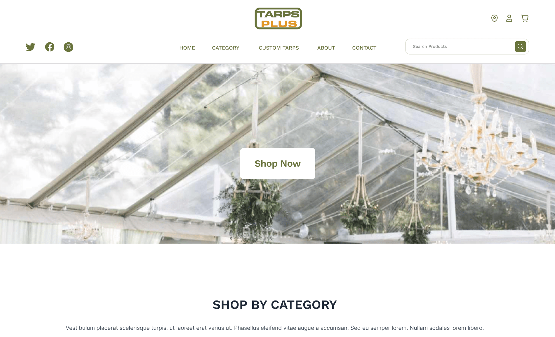
The homepage of TarpsPlus.com was meticulously redesigned to make a powerful first impression and set the tone for the entire user experience. A key element of this redesign was the header banner, which serves as the primary visual and informational touchpoint for visitors. Recognizing its importance, we crafted a header banner that immediately communicates the brand’s identity and personality. This visual centerpiece is not just an aesthetic choice but a strategic move to capture visitors’ attention, convey key messages, and invite them to explore further.
A brand-new user interface (UI) was developed with the primary goal of increasing customer engagement and trust. Modern, clean, and intuitive, the new UI distinguishes TarpsPlus.com from its competitors, many of which still rely on outdated, text-heavy designs. By incorporating interactive elements and visually appealing graphics, the redesigned homepage encourages visitors to spend more time on the site, thereby increasing the likelihood of conversion and fostering loyalty.
The redesign also prioritized simplicity. A clutter-free interface, clear language, and intuitive navigation ensure that visitors can find what they need without confusion or frustration. By eliminating unnecessary elements and focusing on essential information, the new design offers a more pleasant and efficient browsing experience.
Banner ads were strategically integrated into the homepage, serving as effective tools for showcasing products and promotions. These ads are designed to be eye-catching yet unobtrusive, driving traffic to specific product pages and special offers. Their inclusion is part of a broader strategy to use measurable and effective advertising mediums that enhance brand visibility and engagement.
Accessibility was another critical focus area. The new homepage design ensures that all elements are accessible and visible to every type of user, including those with disabilities. This commitment to inclusivity not only broadens the potential customer base but also reflects the company’s dedication to providing an excellent user experience for everyone.
Lastly, the value proposition of TarpsPlus.com is prominently displayed, highlighting the high quality of products and competitive pricing. Phrases like “High Quality” and “Limited Time Offer” are strategically placed to grab attention and drive home the benefits of shopping with TarpsPlus.com. By making the value proposition the focal point, the redesign ensures that visitors immediately understand the advantages of choosing TarpsPlus.com for their tarp needs.
Category Page Redesign
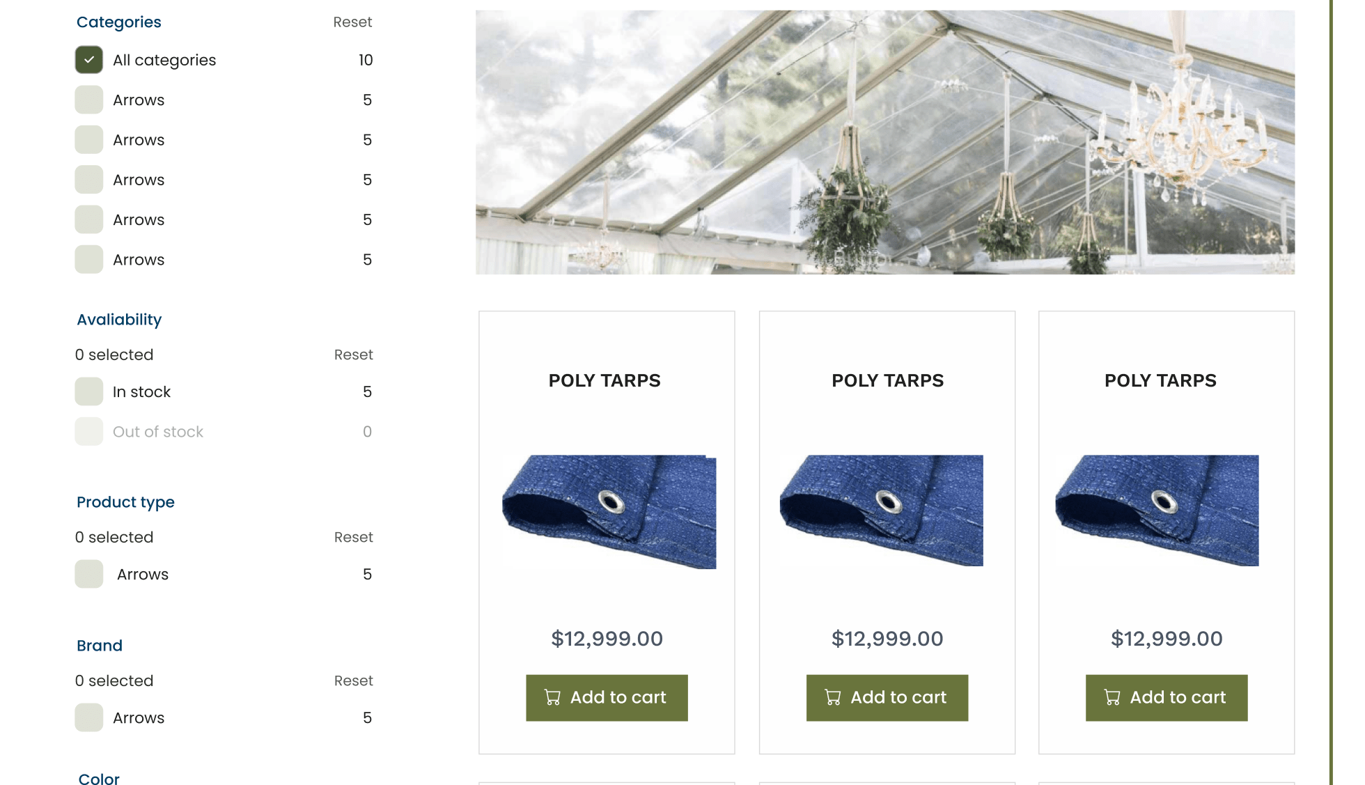
The category pages on TarpsPlus.com underwent a significant overhaul to enhance usability and streamline the product discovery process. According to research, a substantial portion of e-commerce visitors head directly to the search bar, making it a crucial component of the user experience. With this in mind, the search functionality was redesigned to be interactive, easy to use, and aesthetically pleasing, significantly improving user engagement.
A well-designed search interface is essential for helping users find products quickly and efficiently. By making the search bar prominent and user-friendly, we cater to those who prefer a direct approach to finding what they need. This redesign ensures that searchers, who are statistically more likely to convert, can effortlessly navigate the extensive product catalog of TarpsPlus.com.
Filtering systems were also a major focus of the category page redesign. For websites with a large number of products, an effective filtering system is not just a convenience but a necessity. The new filtering options allow users to narrow down their choices based on various criteria such as size, material, and price. This feature enhances the overall user experience by making product discovery more manageable and tailored to individual preferences.
The importance of a robust filtering system cannot be overstated. It not only improves user satisfaction but also has a direct impact on conversion rates. By presenting a variety of products in an organized and accessible manner, the new filtering system helps users find exactly what they are looking for, thereby increasing the likelihood of purchase. Even the simple act of adding filters can significantly boost a website’s conversion rate, making it a critical component of the redesign.
The category pages were also optimized for visual appeal and ease of use. A clean, uncluttered layout with high-quality images and clear product descriptions ensures that users can quickly scan through the options and make informed decisions. This design approach reduces friction in the shopping process, encouraging users to explore more products and spend more time on the site.
In conclusion, the redesign of the category pages on TarpsPlus.com demonstrates a commitment to providing a superior user experience. By enhancing the search functionality, implementing a powerful filtering system, and optimizing the overall layout, we have created a more intuitive and engaging shopping environment. These improvements are essential for any e-commerce site looking to stay competitive and meet the evolving needs of its customers.
Conclusion
The comprehensive redesign of TarpsPlus.com has brought significant enhancements to its digital presence, reflecting the company’s dedication to offering a superior user experience. By focusing on key areas such as the homepage, category pages, and product pages, we have created a website that not only meets but exceeds modern standards for usability, accessibility, and aesthetics.
The redesigned homepage, with its impactful header banner and user-friendly interface, immediately captures the essence of the brand and engages visitors. Simplifying navigation and prioritizing essential information ensures a seamless experience that retains users’ attention and encourages them to explore further.
Category pages have been transformed to facilitate quick and efficient product discovery. The improved search functionality and robust filtering options empower users to find exactly what they need with minimal effort. These changes are not merely cosmetic but have a profound impact on user satisfaction and conversion rates.
Product pages now offer a richer, more informative shopping experience. Verified product ratings build trust, while a clear presentation of features and strategic use of up-selling and cross-selling enhance the value proposition for customers. Faster load times and mobile optimization further ensure that all users enjoy a smooth and efficient browsing experience.
In a competitive digital market, an outdated website can hinder growth and customer satisfaction. By embracing modern design principles and focusing on user-centric improvements, businesses can significantly enhance their online presence and drive success.


