StoneTooling.com is a leading retailer specializing in high-quality equipment, setting materials, and diamond tools. In today’s fast-paced digital world, having an outdated website can severely hinder a business’s ability to attract and retain customers. Recognizing this, we embarked on a comprehensive redesign of StoneTooling.com to ensure it not only meets but exceeds modern web standards. This article delves into the significant changes made and explains how these improvements can substantially benefit any business.
A website redesign is more than just a visual upgrade; it’s a strategic move to enhance user experience, streamline navigation, and ultimately boost sales. For StoneTooling.com, the goal was to create an intuitive, engaging, and aesthetically pleasing platform that reflects the company’s commitment to quality and innovation. By focusing on key areas such as the homepage, quick view functionality, mega menus, category pages, and product pages, we aimed to deliver a seamless and enjoyable shopping experience for all users.
Category Pages
Category pages play a crucial role in eCommerce, acting as the gateway to various product offerings. For StoneTooling.com, optimizing these pages was essential to enhance user experience and drive conversions.
One of the standout features of the redesigned category pages is the improved search interface. Research shows that 43% of website visitors head straight to the search bar, and these searchers are 1.8 times more likely to convert than non-searchers. To capitalize on this behavior, we made the search interface interactive, easy to use, and aesthetically pleasing. This ensures that users can quickly and efficiently find the products they are looking for, reducing frustration and increasing satisfaction.
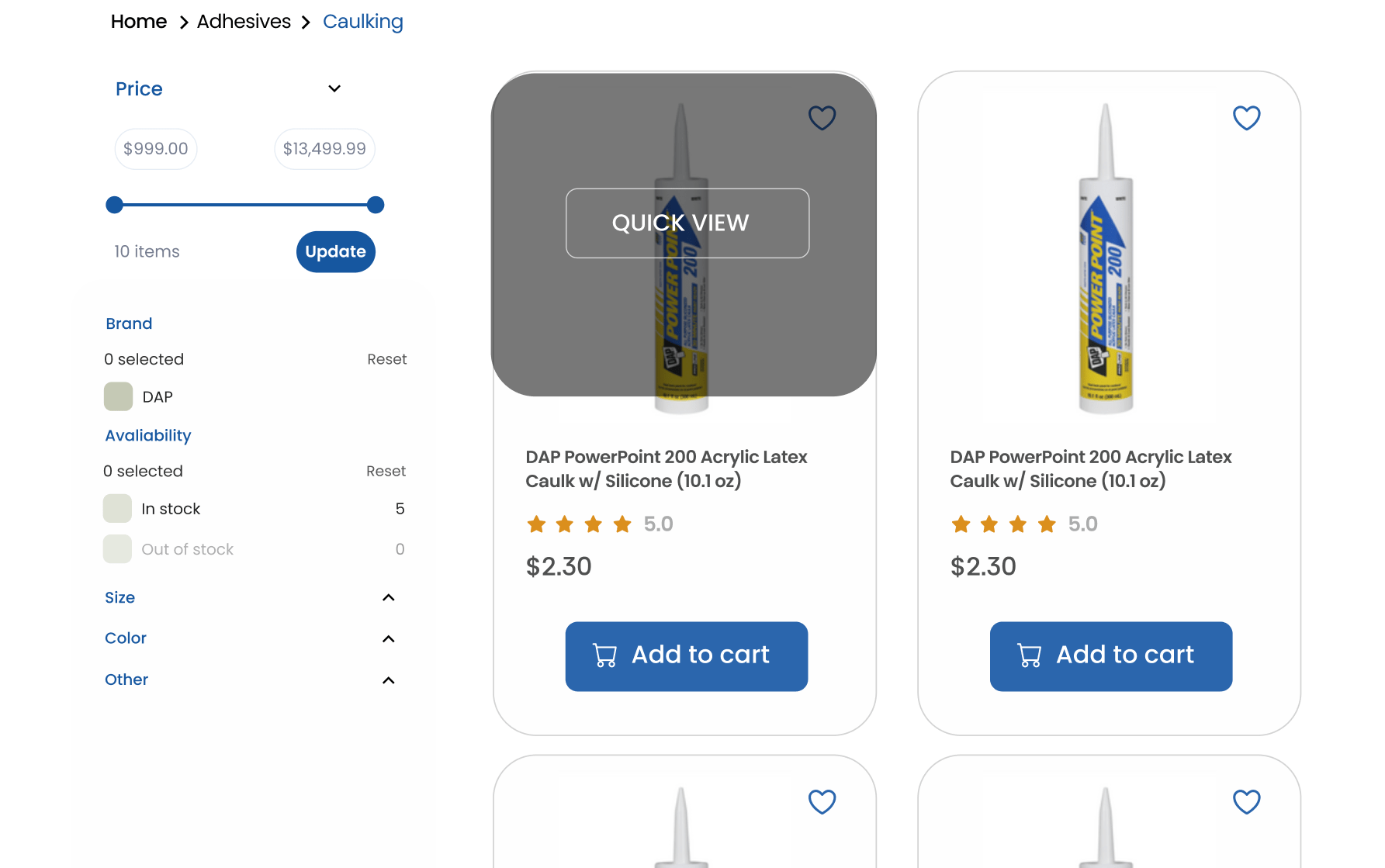
In addition to the search functionality, we implemented a robust filtering system. For websites with extensive product inventories like StoneTooling.com, filters are indispensable. They allow users to narrow down their choices based on specific criteria such as price, brand, or product type. This not only improves the user experience by making navigation more manageable but also broadens the audience reach and increases sales. In fact, adding a filtering system can increase a website’s conversion rate by 26%. By addressing common issues with filter UX design, we were able to produce significant results, making it easier for customers to find exactly what they need.
The new category pages also emphasize a clean and organized layout, showcasing products in a way that is both visually appealing and functional. High-quality images, concise product descriptions, and clear calls to action ensure that users can make informed decisions quickly. By reducing clutter and focusing on essential information, we created a user-friendly environment that encourages exploration and purchase.
Overall, the redesign of StoneTooling.com’s category pages exemplifies how thoughtful design and user-centric features can transform an eCommerce site. By prioritizing ease of use, aesthetic appeal, and functionality, we have not only improved the user experience but also set the stage for increased engagement and higher conversion rates. This approach can serve as a valuable blueprint for other businesses looking to update their websites, demonstrating that a well-executed redesign can lead to substantial benefits.
Homepage Redesign
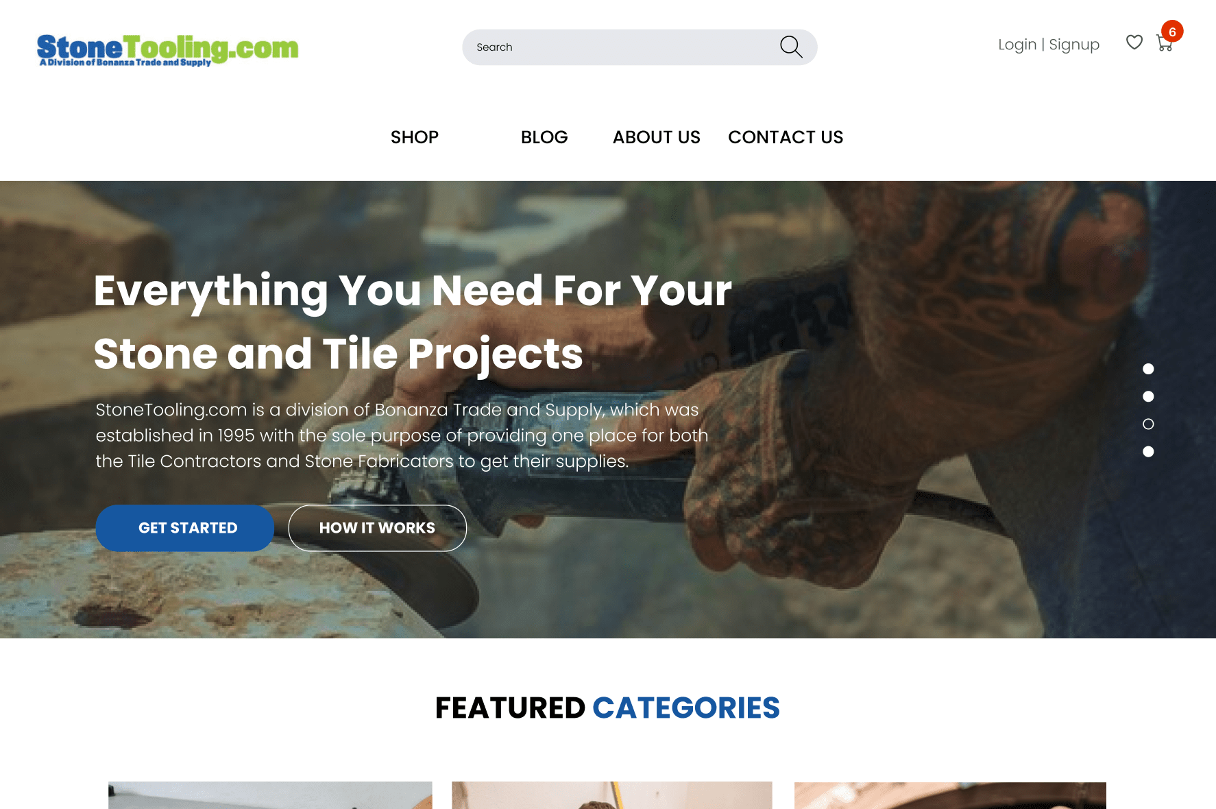
The homepage of StoneTooling.com serves as the first point of contact for many visitors, making it a critical element in creating a positive impression. Our redesign focused on several key areas to ensure the homepage is both visually captivating and functionally superior.
Header Banner
The header banner is a powerful marketing tool, acting as a large billboard that immediately communicates the brand’s identity and core message. For StoneTooling.com, we crafted a banner that is bold and clear, instantly conveying the high quality and reliability of their products. This banner not only grabs attention but also sets the tone for the rest of the site, inviting users to explore further.
New User Interface (UI)
We introduced a brand-new user interface designed to enhance customer engagement and build trust. The new UI is sleek and modern, significantly different from outdated, text-heavy websites. By incorporating interactive elements and visually appealing designs, we have created an environment that encourages users to stay longer and explore more. This increase in engagement can lead to higher conversion rates and greater customer loyalty.
Simplicity in Design
Simplicity is a core principle in effective web design. We ensured that StoneTooling.com’s homepage uses clear language and straightforward interfaces, avoiding unnecessary elements that could confuse visitors. A simple, clean design helps users quickly understand the offerings and find what they need without frustration.
Banner Ads
Banner ads are strategically placed to showcase key products and promotions. These ads link directly to relevant product pages, providing a seamless transition for users interested in specific items. By using banner ads effectively, we can drive traffic to targeted areas of the site and increase overall sales.
Accessibility
Ensuring accessibility for all users is paramount. We designed the homepage to be easily navigable for everyone, including those with disabilities. Key elements are clearly visible and easy to interact with, ensuring that every visitor can access the information they need without difficulty.
Value Proposition
A strong value proposition is essential in capturing the attention of visitors. We highlighted StoneTooling.com’s value proposition prominently on the homepage, showcasing attractive offers such as high quality, competitive prices, and limited-time discounts. These compelling offers are designed to draw users in and encourage them to take action.
Product Pages
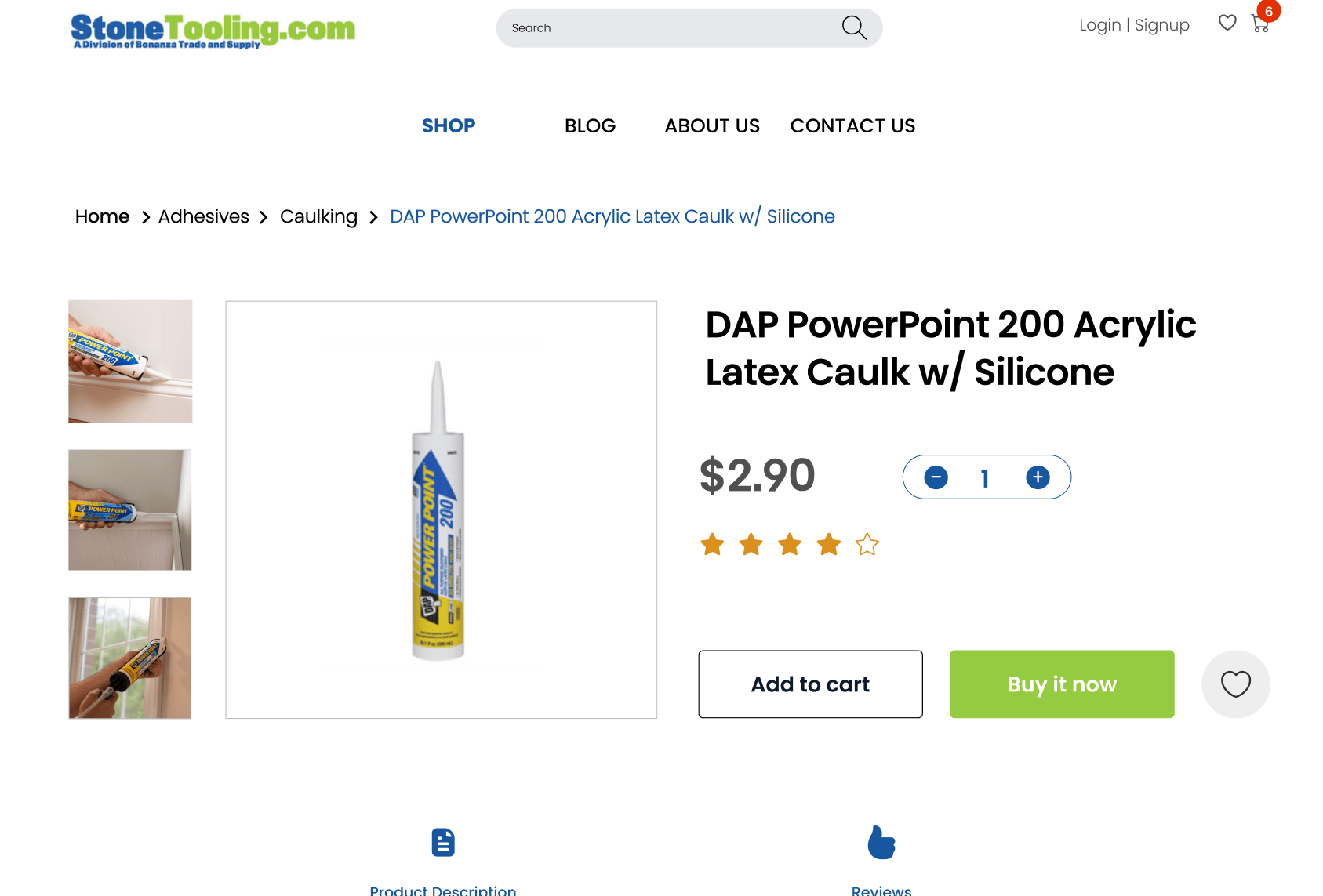
Product pages are where purchasing decisions are made, making their design and functionality crucial to the success of an eCommerce site. For StoneTooling.com, we focused on creating product pages that build trust and facilitate informed decision-making.
Product Ratings and Proof
One of the key additions to the product pages is the inclusion of verified product ratings. These ratings provide social proof and help reassure customers about the quality and authenticity of the products. By displaying honest feedback from other buyers, we can build trust and confidence, encouraging more conversions.
Highlighting Features Without Overwhelming
We carefully balanced the presentation of product highlights and features. Each product page now includes clear, concise information that emphasizes key benefits without overwhelming the user with too much detail. This approach helps customers quickly grasp the value of the product, making it easier for them to make a purchase decision.
Up-Selling and Cross-Selling
To enhance the shopping experience and increase sales, we implemented effective up-selling and cross-selling strategies. Up-selling involves recommending higher-quality alternatives to the product a user is viewing, while cross-selling showcases complementary items that enhance the product experience. For instance, customers browsing for diamond blades might see recommendations for premium blades or complementary accessories like safety gear and maintenance tools. This not only increases the average order value but also provides customers with a more comprehensive shopping experience.
In summary, the redesign of StoneTooling.com’s homepage and product pages was driven by the goal of creating a user-friendly, engaging, and trustworthy site. By focusing on these areas, we have significantly improved the overall user experience and set the stage for increased customer satisfaction and sales. This comprehensive approach to web design can serve as an effective model for other businesses seeking to update their online presence and stay competitive in the digital marketplace.
Quick View Functionality and Hover Effects
Enhancing the user experience was a primary goal in the redesign of StoneTooling.com, and the implementation of quick view functionality and hover effects played a significant role in achieving this.
Hover Effects
Hover effects are subtle yet powerful tools that improve the interactivity and responsiveness of a website. When users hover over an element, such as a link or button, the element responds with visual transitions. For StoneTooling.com, we incorporated hover effects that change colors, grow, shrink, or rotate, depending on the element. These effects make the website feel more dynamic and engaging, providing an enjoyable browsing experience that encourages users to explore more deeply. Effective hover effects not only enhance the aesthetic appeal but also demonstrate that the website is modern and well-maintained.
Quick View Options
The quick view functionality is designed to streamline the shopping process. By allowing users to view product details without leaving the current page, quick view options make browsing more efficient and less cumbersome. For StoneTooling.com, this means customers can quickly access important information about multiple products without the need to navigate back and forth between product pages.
This functionality is particularly beneficial for users who are comparing several items or making multiple purchases. Quick view windows display essential product details such as images, descriptions, prices, and availability, all within an easy-to-navigate pop-up. This approach reduces the number of clicks and page loads, enhancing the overall user experience and making the shopping process faster and more convenient. By simplifying the path to purchase, quick view functionality can lead to increased customer satisfaction and higher conversion rates.
Mega Menu Design
Navigating a website with a large number of pages and products can be challenging. To address this, we implemented a sophisticated mega menu design for StoneTooling.com.
Advanced Mega Menu Solution
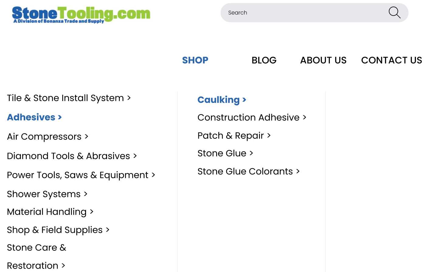
The new mega menu offers a premium solution for organizing and accessing the website’s extensive content. Unlike traditional drop-down menus, which can become cluttered and difficult to read with too many options, the mega menu displays categories and subcategories in a clean, organized layout. This design allows users to quickly locate the sections they are interested in, reducing the time and effort required to find specific products.
Ease of Navigation
The mega menu enhances navigation by grouping related items together, making it easier for users to understand the website’s structure. For instance, under the “Tools” category, users might find subcategories such as “Diamond Tools,” “Hand Tools,” and “Power Tools.” Each subcategory further expands to show specific products, ensuring that users can drill down to exactly what they need with minimal clicks.
Reducing Clutter
By using a mega menu, we significantly reduced the clutter on StoneTooling.com. This not only improves the visual appeal of the site but also makes it more user-friendly. Visitors can see a broader overview of available products and services at a glance, helping them to make quicker decisions. The mega menu design also allows for promotional banners and featured product placements, guiding users towards special offers and new arrivals seamlessly.
Promoting Relevant Products
The mega menu design also provides an opportunity to promote relevant products and special offers. By strategically placing promotional content within the menu, we can highlight popular items, seasonal deals, or new arrivals without overwhelming the user. This method of subtle promotion can drive traffic to specific products and increase sales, all while maintaining a clean and organized navigation structure.
In conclusion, the addition of quick view functionality, hover effects, and a sophisticated mega menu design has significantly enhanced the usability and appeal of StoneTooling.com. These features not only improve the overall user experience but also provide tangible benefits in terms of increased engagement and higher conversion rates. For any business with an outdated website, implementing these design improvements can lead to a more efficient, enjoyable, and profitable online presence.
Conclusion
The comprehensive redesign of StoneTooling.com demonstrates the significant impact that thoughtful, user-centric design can have on a business. By focusing on key elements such as the homepage, quick view functionality, hover effects, mega menus, category pages, and product pages, we have created a platform that is not only visually appealing but also highly functional and engaging.
Enhanced User Experience
One of the most notable benefits of the redesign is the enhanced user experience. The new design prioritizes ease of use, accessibility, and intuitive navigation, making it simpler for customers to find and purchase the products they need. The addition of quick view functionality and interactive hover effects provides a more dynamic and enjoyable shopping experience, encouraging users to explore the site and engage with its content more deeply.
Increased Engagement and Conversion Rates
By incorporating a modern, interactive user interface and a sophisticated mega menu, we have significantly improved customer engagement. Visitors can now easily navigate through the extensive product catalog, find relevant items, and access important information quickly. These improvements are designed to keep users on the site longer and guide them smoothly through the purchasing process, ultimately leading to higher conversion rates.
Building Trust and Credibility
The redesigned product pages, with their verified product ratings and clear presentation of features, help build trust and credibility with customers. When users see genuine reviews and detailed product information, they feel more confident in their purchasing decisions. This trust is crucial for converting visitors into loyal customers who return to the site for future purchases.
Streamlined Shopping Process
The streamlined shopping process, facilitated by the quick view functionality and improved search and filtering systems, makes it easier for customers to find exactly what they need without unnecessary clicks and page loads. This efficiency not only enhances the shopping experience but also reduces the likelihood of cart abandonment, contributing to increased sales and customer satisfaction.
A Blueprint for Success
The redesign of StoneTooling.com serves as a blueprint for other businesses with outdated websites. It illustrates the importance of staying current with web design trends and technologies to remain competitive. By focusing on user experience, accessibility, and effective navigation, businesses can create a more engaging and efficient online presence that meets the needs of modern consumers.
In conclusion, the changes made to StoneTooling.com have transformed it into a powerful, user-friendly eCommerce website. These enhancements demonstrate that investing in a well-executed website redesign can lead to substantial benefits, including improved user experience, higher engagement and conversion rates, and increased customer trust and loyalty. For any business looking to stay relevant and competitive, a comprehensive website redesign is not just beneficial—it is essential.


