Spartan Tool, a leader in drain cleaning equipment, recognized the need to modernize their online presence to better serve their customers and stay competitive in the digital age. The decision to undertake a comprehensive website redesign was driven by the desire to enhance user experience, improve customer engagement, and boost overall business performance. This article delves into the meticulous redesign process, showcasing the significant improvements and the rationale behind each change.
A website serves as the digital face of a business, and for e-commerce companies like Spartan Tool, it is crucial that this face is not only welcoming but also functional and user-friendly. The redesign aimed to address the limitations of the old site, streamline navigation, and introduce features that would make shopping easier and more enjoyable for customers. By adopting a modern design approach, Spartan Tool set out to create a website that reflects their commitment to quality and customer satisfaction.
Homepage Redesign
Header Banner
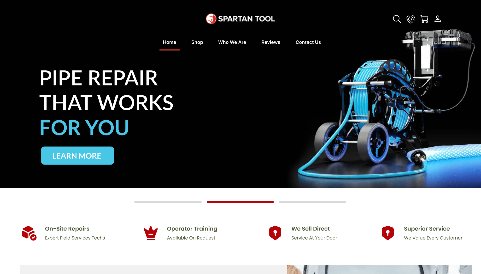
The header banner is the focal point of the homepage and the first element that visitors encounter. It is a powerful tool for making a strong first impression. For Spartan Tool, the new header banner was designed to clearly communicate the brand identity and core values. It serves as a digital billboard, announcing who they are and what they offer. This strategic placement ensures that visitors immediately understand the company’s offerings and are drawn in by the professional and engaging presentation.
By focusing on a visually appealing and informative header banner, the redesign enhances the initial interaction with visitors. A well-crafted banner can significantly boost customer engagement and trust, as it sets the tone for the rest of the browsing experience. This approach distinguishes Spartan Tool from competitors with outdated, text-heavy websites, offering a more inviting and professional first impression.
New User Interface
The overhaul of Spartan Tool’s user interface was a pivotal aspect of the redesign. The new interface was crafted to increase customer engagement and trust. An attractive and user-friendly design encourages visitors to explore the website, interact with products, and ultimately make purchases. By adopting modern design principles, Spartan Tool can now offer a seamless browsing experience that keeps customers on the site longer and fosters loyalty.
An essential aspect of the new interface is its simplicity. Clear, straightforward navigation and clean design elements reduce confusion and make it easier for customers to find what they need. This simplicity not only enhances the user experience but also builds confidence in the brand’s professionalism and reliability.
Banner Ads
Banner ads are strategically placed throughout the website to promote specific products and offers. These ads are designed to be visually appealing and immediately draw the viewer’s attention. By embedding advertisement images on web pages, Spartan Tool can effectively showcase their products and link directly to relevant pages. This targeted approach helps increase brand awareness and drives traffic to key areas of the site, supporting sales and marketing goals.
Accessibility
Ensuring that the website is accessible to all users was a key priority in the redesign. An accessible interface means that every visitor, regardless of their abilities, can navigate and use the site effectively. This includes considerations for visual impairments, cognitive challenges, and other accessibility needs. By prioritizing accessibility, Spartan Tool demonstrates their commitment to inclusivity and provides a better experience for all customers.
Key accessibility features include clear navigation paths, easily readable text, and alternative text for images. These elements ensure that the site is not only usable but also enjoyable for a diverse audience, thereby widening the potential customer base and enhancing overall satisfaction.
Value Proposition
The value proposition is prominently displayed to capture the attention of visitors and communicate the unique benefits of Spartan Tool’s products and services. This section highlights attractive offers, such as “High quality” or “50% off,” and is designed to be the first thing that viewers see. By making the value proposition clear and compelling, Spartan Tool effectively communicates the advantages of their offerings, encouraging visitors to explore further and consider making a purchase.
The new homepage design emphasizes the importance of presenting information in a way that is both visually appealing and easy to understand. By focusing on these key elements, Spartan Tool’s redesigned homepage not only improves the user experience but also enhances the overall effectiveness of the site as a business tool.
Quick View Functionality and Hover Effects
Hover Effects
Hover effects play a crucial role in modern web design by enhancing the user experience and making interactions more engaging. For Spartan Tool, implementing hover effects was a strategic move to create a more dynamic and interactive browsing experience. When a user hovers over an element, such as a link or button, it responds with transition effects like changing color, growing, shrinking, or rotating. These subtle yet effective animations provide visual feedback, making the site feel more responsive and alive.
The importance of hover effects lies in their ability to highlight key items on the web page, guiding users’ attention to important elements. This interactive approach not only makes navigation intuitive but also keeps users engaged, encouraging them to explore more of the site. The redesign leverages hover effects to enhance usability and enjoyment, making Spartan Tool’s website both functional and visually appealing.
Improved Shopping Experience
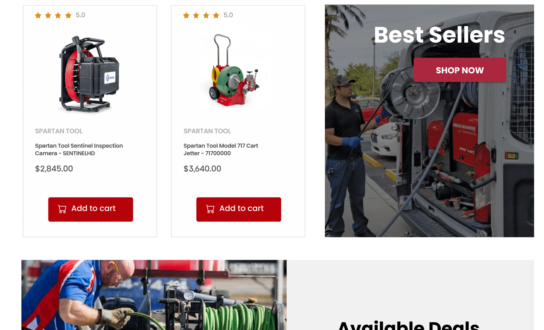
Quick view functionality is another significant addition to the redesigned website. This feature allows users to view product details without having to load separate product pages. For visitors looking for multiple items or comparing products, quick view options streamline the shopping process, saving time and reducing the need for excessive navigation.
The quick view feature provides a concise snapshot of essential product information, enabling users to make informed decisions quickly. This efficiency is particularly beneficial for users who are browsing through a large inventory or are in a hurry. By simplifying the shopping experience, Spartan Tool can cater to the needs of their customers more effectively, increasing satisfaction and likelihood of purchase.
Efficiency in Shopping
With quick view functionality, Spartan Tool has made it easier for users to find and order items. This feature reduces the back-and-forth clicking between product and category pages, allowing customers to add items to their cart directly from the quick view window. It’s a practical solution that improves the overall shopping experience, making it more efficient and user-friendly.
The ability to quickly navigate through product details helps users determine if a product meets their needs without leaving the current page. This streamlined process not only enhances the user experience but also increases the chances of conversion by reducing barriers to purchase. The redesign’s focus on quick view functionality demonstrates Spartan Tool’s commitment to creating a hassle-free and enjoyable shopping environment.
Mega Menu Design
Introduction to Mega Menus
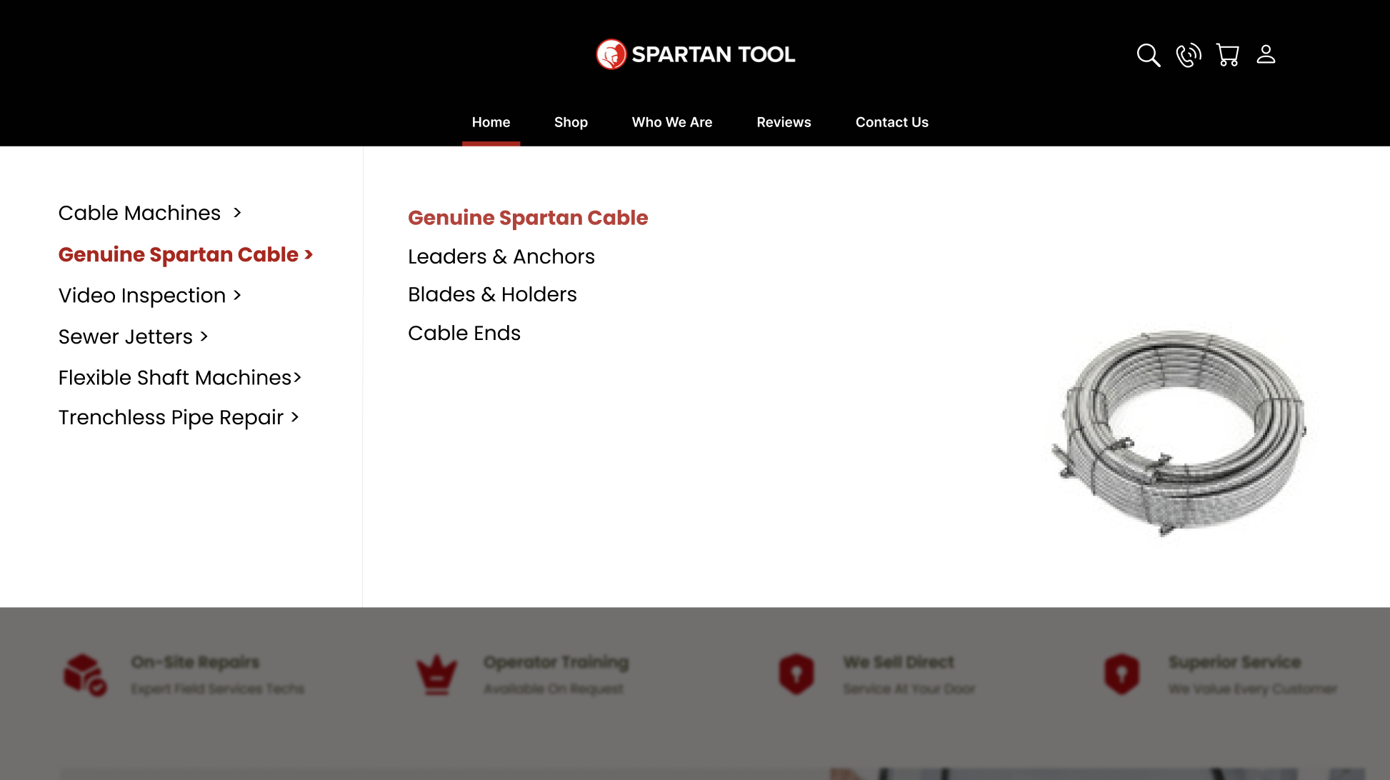
The introduction of a mega menu is a key feature in Spartan Tool’s redesign, aimed at improving site navigation and reducing clutter. Mega menus offer a comprehensive yet organized way to present numerous options and categories, making it easier for users to find what they are looking for quickly. For websites with extensive content, like Spartan Tool, this approach is particularly effective in enhancing usability.
Mega menus display a wide array of options in a structured format, allowing users to see all available categories at a glance. This design choice eliminates the confusion and frustration often associated with traditional drop-down menus, which can become unwieldy with too many options. By adopting a mega menu, Spartan Tool ensures that their customers can navigate the site effortlessly, finding relevant products and information with ease.
Advantages over Dropdown Menus
Traditional drop-down menus can become cumbersome when dealing with a large number of pages or categories. In contrast, mega menus offer a cleaner and more user-friendly alternative. They organize information into columns and sections, making it easy for users to scan and select the desired option. This method not only improves navigation but also enhances the overall user experience by providing clear and accessible pathways to various parts of the website.
For Spartan Tool, the mega menu promotes relevant products and guides shoppers to exactly what they need. It reduces the time users spend searching for products, leading to a more efficient and enjoyable browsing experience. By minimizing clutter and presenting information in an organized manner, the mega menu helps users focus on their shopping goals without unnecessary distractions.
Implementation for Large Websites
E-commerce websites often have a vast array of products and categories, necessitating an efficient and intuitive navigation system. Spartan Tool’s mega menu addresses this need by offering a premium advanced solution that caters to the complexity of their product range. The implementation of a mega menu is particularly advantageous for large websites, where traditional navigation methods may fall short.
The mega menu not only simplifies navigation but also enhances the site’s visual appeal by organizing content in a logical and aesthetically pleasing manner. It supports Spartan Tool’s goal of providing a superior user experience, ensuring that customers can easily find and access the products they need. The redesign’s focus on a mega menu underscores the importance of efficient navigation in modern web design, offering a clear path for other outdated websites to follow.
By incorporating hover effects, quick view functionality, and a mega menu, Spartan Tool’s redesigned website sets a new standard for user-friendly design. These features collectively enhance the shopping experience, making it more engaging, efficient, and enjoyable for customers. The redesign serves as a model for other e-commerce sites looking to modernize their online presence and better meet the needs of their users.
Category Pages Design
Search Interface Optimization
An optimized search interface is a crucial component of Spartan Tool’s redesigned category pages. Research shows that a significant portion of website visitors head straight to the search bar. For Spartan Tool, this meant prioritizing a search experience that is interactive, easy to use, and aesthetically pleasing. The new design ensures that users can quickly and efficiently find the products they need, enhancing their overall browsing experience.
A well-designed search interface boosts engagement by allowing users to locate specific items without navigating through multiple pages. This not only saves time but also increases the likelihood of conversion, as searchers are generally more intent on making a purchase. By simplifying the search process and making it visually appealing, Spartan Tool can better meet the needs of their customers and drive higher sales.
Filtering System
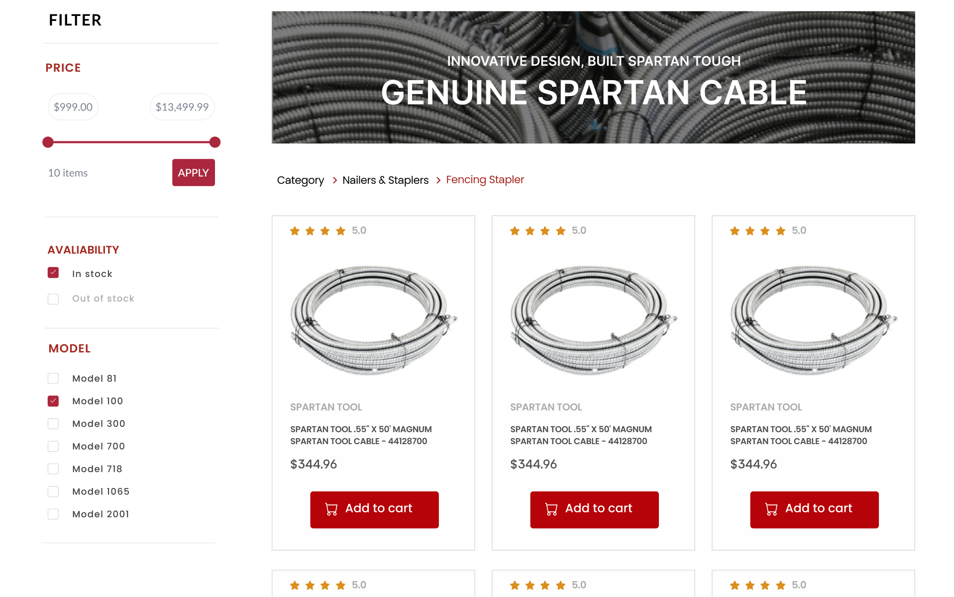
A robust filtering system is essential for any e-commerce website, especially those with a large inventory. Spartan Tool’s redesign incorporates a comprehensive filtering system that allows users to narrow down their search results based on various criteria such as product type, price range, and customer ratings. This feature enhances the user experience by making it easier to find relevant products quickly.
Filters improve user satisfaction by presenting a curated selection of products that match their specific needs and preferences. This targeted approach not only enhances the shopping experience but also increases the likelihood of conversion. The addition of an effective filtering system demonstrates Spartan Tool’s commitment to providing a seamless and efficient shopping experience, which is crucial for retaining customers and driving repeat business.
Enhanced User Experience
The redesigned category pages prioritize user experience by ensuring that the interface is intuitive and easy to navigate. By implementing interactive and visually appealing design elements, Spartan Tool makes it easier for users to browse through categories and find the products they need. This focus on usability is critical in today’s digital world, where consumers expect quick and hassle-free online shopping experiences.
The improved category pages not only enhance user satisfaction but also contribute to higher engagement and conversion rates. By providing a seamless and enjoyable browsing experience, Spartan Tool can better meet the needs of their customers and set a standard for other e-commerce websites to follow.
Product Pages Design
Product Ratings and Verification
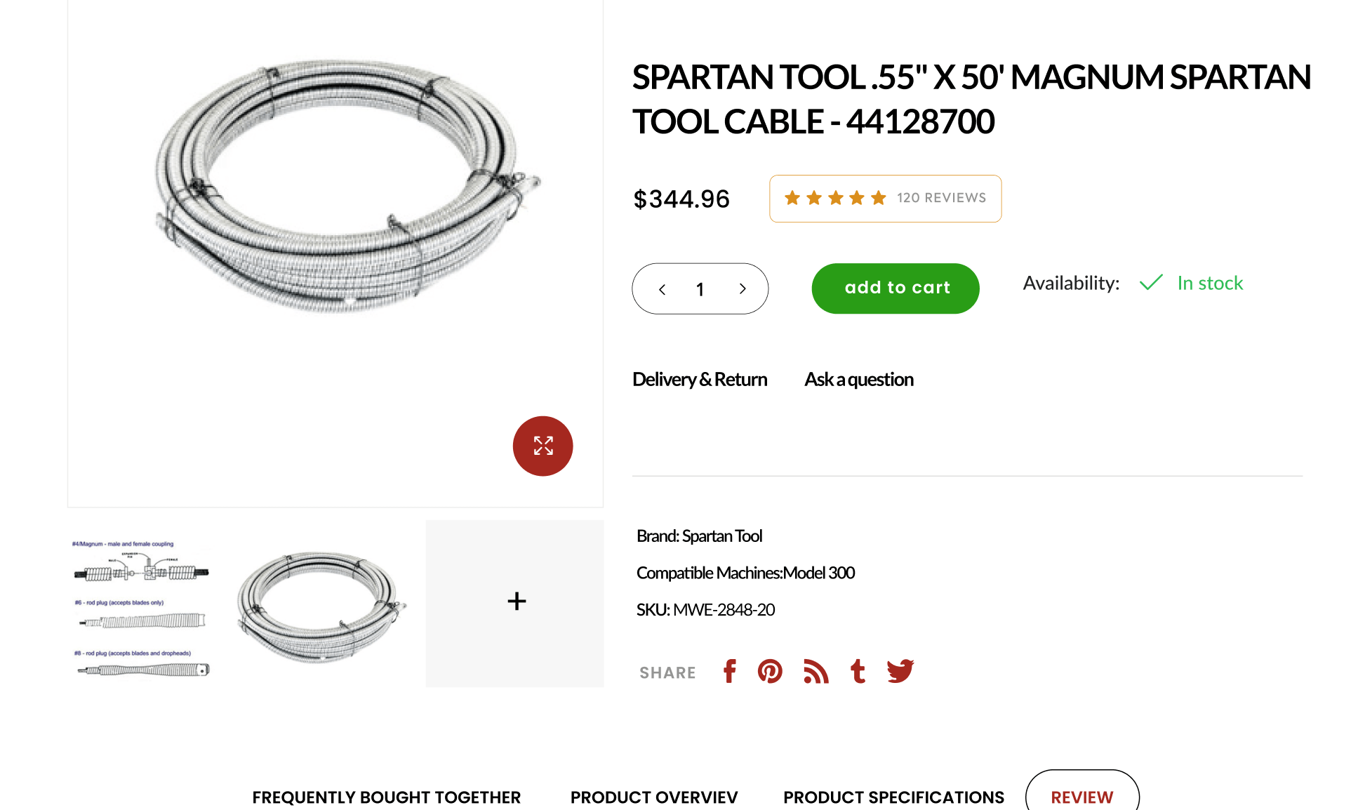
Product ratings and verification play a significant role in building trust and credibility. The redesigned product pages on Spartan Tool’s website prominently feature verified ratings and reviews, giving customers the confidence that they are purchasing high-quality and authentic products. This transparency helps potential buyers make informed decisions and reduces the likelihood of returns or dissatisfaction.
By showcasing verified ratings, Spartan Tool reinforces their commitment to quality and customer satisfaction. This approach not only builds trust but also enhances the overall shopping experience, as customers can rely on the feedback from other buyers to guide their purchase decisions. Incorporating verified ratings into product pages is a powerful way to boost credibility and encourage more sales.
Presenting Product Highlights
The presentation of product highlights and features is crucial for informing and persuading potential buyers. Spartan Tool’s redesigned product pages focus on showcasing the most important aspects of each product without overwhelming the user with excessive information. Key features, benefits, and specifications are presented clearly and concisely, making it easier for customers to understand the value of the products.
This streamlined approach helps users quickly grasp the essential details and make confident purchase decisions. By avoiding information overload, Spartan Tool ensures that customers have a positive shopping experience and are more likely to complete their purchases. The focus on clear and effective communication of product highlights is a key element of the redesign, aimed at improving user satisfaction and conversion rates.
Up-Selling and Cross-Selling
Strategic up-selling and cross-selling are integral to the redesigned product pages. Up-selling involves showcasing higher quality or more advanced versions of the products that customers are viewing, while cross-selling presents complementary items that enhance the overall product experience. For example, a customer looking at a drain snake might see recommendations for compatible accessories or maintenance tools.
These strategies not only increase the average order value but also enhance the customer’s experience by providing additional options and solutions. By carefully curating and presenting relevant products, Spartan Tool can help customers find everything they need in one place, making the shopping process more convenient and satisfying. The focus on up-selling and cross-selling underscores the importance of providing a comprehensive and user-friendly shopping experience.
Boosting Trust and Confidence
The redesigned product pages are designed to build trust and confidence among customers. By presenting product highlights clearly, featuring verified ratings, and offering strategic up-sell and cross-sell options, Spartan Tool creates a shopping environment that is both informative and reassuring. This approach helps customers feel confident in their purchase decisions and fosters loyalty to the brand.
Overall, the redesign of Spartan Tool’s product pages emphasizes the importance of clarity, credibility, and user experience. By addressing these key areas, Spartan Tool sets a new standard for e-commerce websites, demonstrating how thoughtful design can significantly enhance customer satisfaction and drive business success.
Conclusion
By addressing key elements such as the homepage, quick view functionality, hover effects, mega menu design, category pages, and product pages, the new site offers a seamless, engaging, and efficient shopping experience for customers.
The improved homepage, with its impactful header banner and user-friendly interface, sets a strong first impression and builds trust. The integration of hover effects and quick view functionality adds an interactive dimension, making the site more enjoyable and intuitive to navigate. The introduction of a mega menu ensures that users can easily find what they need, while the enhanced search interface and filtering system on the category pages streamline the browsing process. The product pages, featuring verified ratings and strategic up-sell and cross-sell options, help customers make informed decisions and discover additional products that meet their needs.
This comprehensive redesign underscores the importance of staying current with web design trends and technologies. Outdated websites often struggle to meet the evolving expectations of modern users, leading to frustration and lost business opportunities. By embracing a user-centric approach and incorporating contemporary design elements, businesses can significantly improve their online presence and better serve their customers.
The benefits of a well-executed redesign extend beyond aesthetics. A modern, functional website enhances usability, increases engagement, and fosters customer loyalty. It creates a positive impression, encouraging visitors to explore more and make purchases with confidence. Moreover, an updated website can adapt more readily to future technological advancements, ensuring long-term relevance and effectiveness.
Spartan Tool’s redesign serves as a compelling example for other businesses considering a similar overhaul. By prioritizing user experience and leveraging modern design principles, companies can create websites that not only attract but also retain customers. The result is a stronger online presence, improved customer satisfaction, and ultimately, a more successful business.
In conclusion, the redesign of Spartan Tool’s website highlights the critical role of thoughtful, user-focused web design in today’s digital age. By addressing the needs and preferences of modern users, Spartan Tool has set a new standard for e-commerce sites, demonstrating how a well-designed website can significantly enhance the overall customer experience and drive business growth. For any business with an outdated website, considering a comprehensive redesign is not just beneficial but essential for staying competitive and meeting the expectations of today’s savvy online shoppers.


