SABRERED.com, known as SABRE, stands out as the #1 safety brand specializing in self-defense tools such as pepper spray, pepper gel, and stun guns. The essence of their mission is to provide top-notch safety products while educating users through free product training and safety tips. Given the critical nature of their products, having a well-designed, user-friendly website is essential for engaging customers and conveying trust.
The recent redesign of SABRERED.com aimed to elevate the user experience, enhance customer engagement, and ultimately boost sales. The focus was on incorporating modern design principles, ensuring accessibility, and reflecting the brand’s identity more effectively. This comprehensive redesign not only aligns with contemporary design standards but also addresses the growing expectations of online consumers for a seamless and intuitive shopping experience.
Homepage Redesign
Header Banner
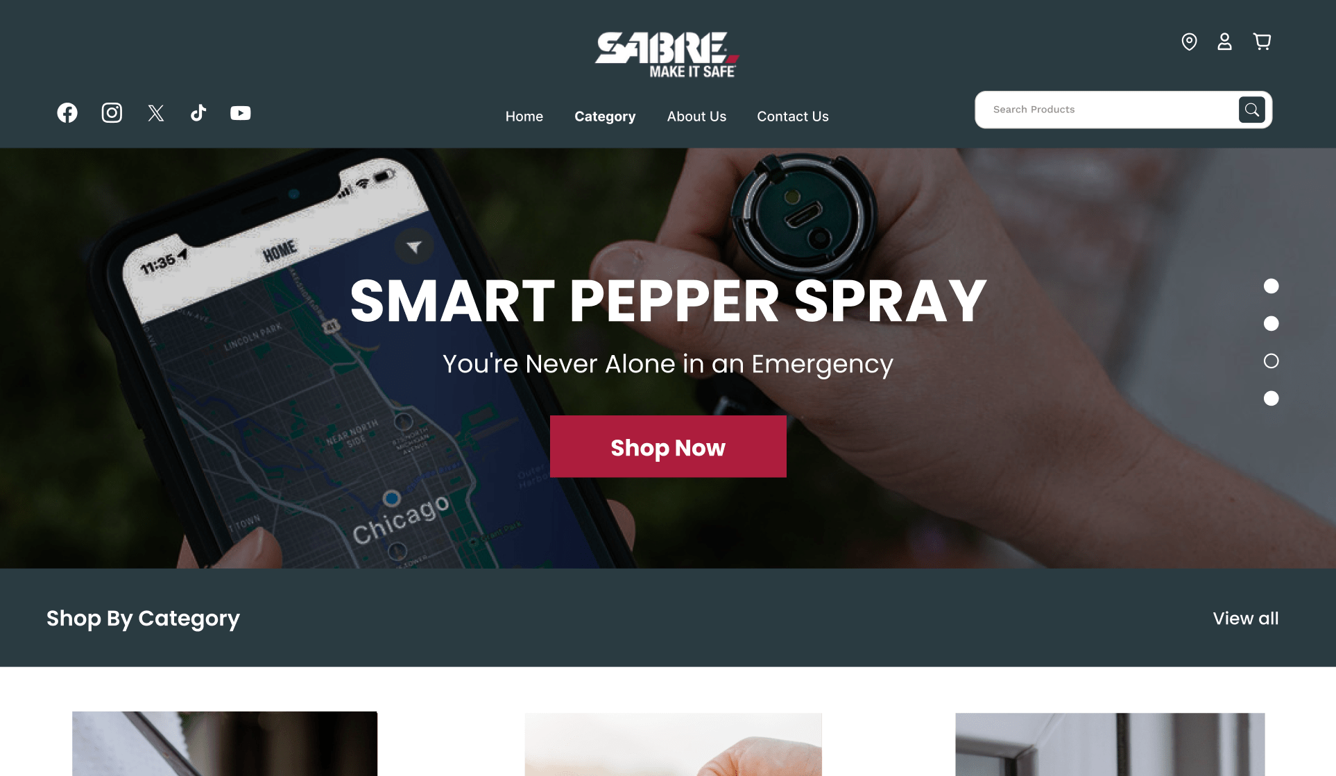
The header banner serves as a pivotal element of the homepage, acting as the first impression visitors get upon arriving at the site. For SABRERED.com, the redesigned banner now effectively communicates the brand’s identity and the core offerings of SABRE. This prominent space showcases key products and promotional messages, immediately capturing the attention of visitors and guiding them towards the main highlights of the site.
User Interface Improvements
The revamped user interface (UI) is designed to increase customer engagement and build trust. Unlike outdated, text-heavy websites, the new UI is clean, intuitive, and visually appealing. This simplicity ensures that visitors can easily navigate the site, find the information they need, and interact with products without feeling overwhelmed. By removing unnecessary elements and focusing on clarity, the design fosters a more enjoyable and efficient user experience.
An engaging UI is crucial for retaining customers and encouraging loyalty. With interactive and visually pleasing designs, SABRERED.com now stands out from competitors, offering a modern shopping environment that users are more likely to revisit. The updated UI also emphasizes the quality of SABRE’s products, reinforcing the brand’s reputation for reliability and safety.
Accessibility Enhancements
Ensuring accessibility was a key consideration in the redesign. The new interface is designed to be inclusive, making it usable for people with various abilities. This includes optimizing contrast, providing clear navigation paths, and incorporating assistive technologies. By prioritizing accessibility, SABRERED.com not only complies with modern web standards but also opens its doors to a wider audience, ensuring that everyone can benefit from their safety products and educational resources.
Value Proposition and Call-to-Action
The homepage now prominently features the value proposition, highlighting SABRE’s high-quality products and attractive offers. This section is designed to catch the viewer’s eye with compelling messages such as “High quality,” “50% off,” or “Limited time offer.” By making these elements visually dominant, the site effectively communicates the benefits of SABRE’s products, encouraging visitors to explore further and make a purchase.
Interactive Features
Hover Effects and Quick View Functionality
One of the standout features of the SABRERED.com redesign is the implementation of hover effects and quick view functionality. These interactive elements significantly enhance the user experience by making the website more engaging and intuitive.
Hover effects occur when a user hovers their cursor over an element, such as a button or link, triggering a visual response. This can include changes in color, size, or even animation. For SABRERED.com, hover effects are used strategically to highlight key items and navigation elements. This not only makes the website visually dynamic but also helps users understand which elements are interactive, improving overall usability.
Quick view functionality is another critical enhancement. It allows users to preview product details without leaving the current page. When a visitor hovers over a product image, a quick view window appears, displaying essential information such as product specifications, price, and availability. This feature is particularly beneficial for users who are browsing multiple products, as it streamlines the shopping process by reducing the need to click back and forth between product pages. As a result, users can make faster, more informed purchasing decisions.
By integrating these interactive features, SABRERED.com provides a more enjoyable and efficient shopping experience. These enhancements not only keep users engaged but also reduce friction in the purchasing process, leading to higher conversion rates. For any outdated website, adopting similar interactive elements can significantly improve user satisfaction and drive business growth.
Mega Menu Design
Introduction to Mega Menu
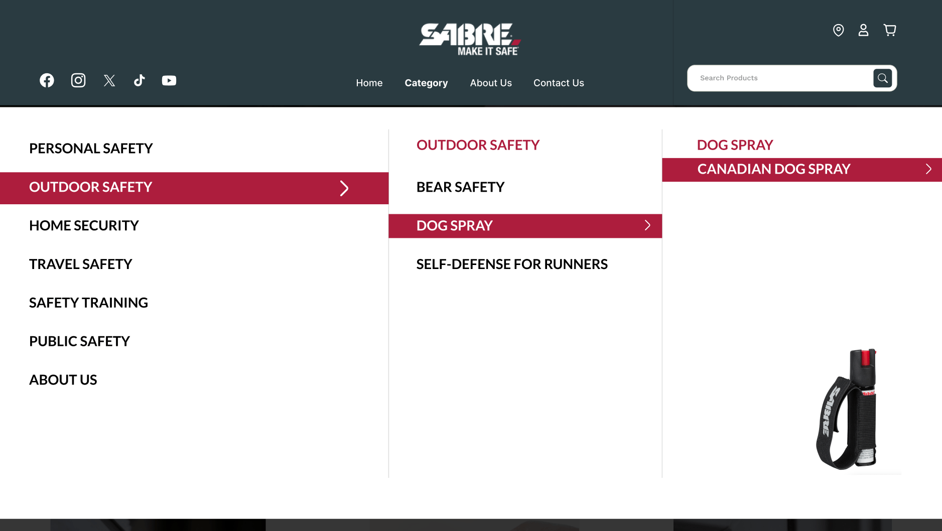
The introduction of a mega menu on SABRERED.com marks a substantial improvement in website navigation. Unlike traditional drop-down menus, which can become cumbersome and difficult to navigate as the number of options grows, a mega menu provides a clear, organized way to display a large volume of information. This is particularly advantageous for e-commerce sites like SABRERED.com, which offer a wide range of products and categories.
Enhanced Navigation
The mega menu on SABRERED.com allows users to quickly and easily find the products or information they are looking for. By grouping related items together and providing visual cues, the mega menu helps users navigate the site efficiently. This reduces the time and effort required to locate specific products, enhancing the overall user experience.
In addition to simplifying navigation, the mega menu reduces clutter by consolidating multiple navigation options into a single, comprehensive menu. This makes the website look cleaner and more organized, further improving usability. The design also allows for the inclusion of promotional banners and featured products within the menu itself, guiding users towards high-priority items or special offers.
Benefits of Mega Menus Over Traditional Dropdowns
Mega menus offer several advantages over traditional dropdown menus, especially for websites with extensive content. They are easier to scan and interact with, reducing the cognitive load on users. This is crucial for keeping visitors engaged and preventing frustration. For SABRERED.com, the mega menu not only enhances user satisfaction but also promotes relevant products, increasing the likelihood of conversions.
Furthermore, the mega menu supports the overall goal of creating a seamless and intuitive user experience. By providing clear pathways to various sections of the site, it helps users find what they need quickly and encourages them to explore more products. This can lead to increased time spent on the site and higher sales.
Category Pages
Search Interface Optimization
A critical aspect of the SABRERED.com redesign is the optimization of the search interface. According to Forrester Research, 43% of website visitors head straight to the search bar when they arrive on an e-commerce site. This statistic underscores the importance of a robust and user-friendly search function.
The new search interface on SABRERED.com is interactive, easy to use, and aesthetically pleasing. These elements are vital for providing a seamless user experience. An intuitive search bar helps users find the products they need quickly, reducing the frustration of navigating through multiple pages. This increased efficiency not only enhances user satisfaction but also boosts the likelihood of conversion.
By focusing on simplicity and clarity, the optimized search interface ensures that users can easily type in their queries and receive accurate results. This is particularly important for a site like SABRERED.com, which offers a wide range of self-defense products. An effective search function means customers can quickly locate the exact items they are looking for, improving their overall shopping experience.
Filtering System
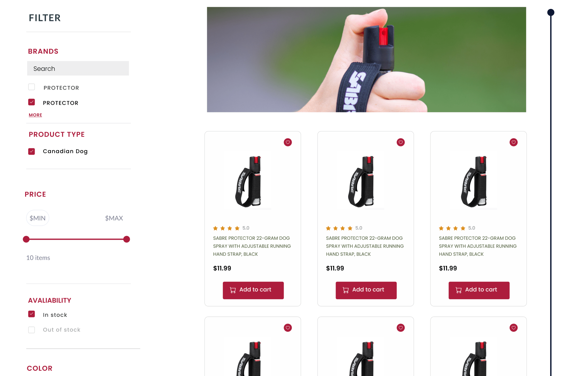
Another significant improvement in the redesign is the enhanced filtering system. For an e-commerce website with a large number of products, an effective filtering system is crucial. Filters allow users to narrow down their search results based on specific criteria such as price, category, and features. This not only makes the shopping process more manageable but also helps users find products that meet their specific needs.
The new filtering system on SABRERED.com is designed to be user-friendly and highly functional. It presents a variety of options that enable customers to refine their searches efficiently. This is especially beneficial for users who have specific requirements or preferences. By offering advanced filtering capabilities, the site caters to a wider audience and increases the chances of conversion.
Improving the filtering system can have a powerful impact on user experience. Studies have shown that adding and optimizing filters can increase a website’s conversion rate by up to 26%. For SABRERED.com, this means more satisfied customers and higher sales. Any business with an outdated website should consider implementing or upgrading their filtering system to provide a better user experience and drive sales growth.
Product Pages
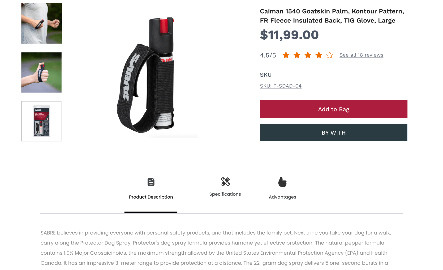
Verified Product Ratings
The redesigned product pages on SABRERED.com include verified product ratings, which play a crucial role in building customer trust. Product ratings provide social proof, helping potential buyers make informed decisions. When customers see positive reviews from other users, they feel more confident in the quality and reliability of the products.
By showcasing verified ratings, SABRERED.com ensures that the feedback displayed is authentic and trustworthy. This transparency is essential for maintaining the credibility of the brand. In an era where consumers heavily rely on online reviews, having a robust system for displaying verified ratings can significantly influence purchasing decisions.
Product Highlights and Features
Presenting product highlights and features in a clear and concise manner is another key aspect of the redesign. The new product pages focus on providing essential information without overwhelming the user. This includes detailed descriptions, high-quality images, and key features of each product.
By emphasizing the most important aspects of the products, SABRERED.com helps users quickly understand the benefits and make informed choices. This approach not only enhances the shopping experience but also reduces the likelihood of returns, as customers are more likely to be satisfied with their purchases.
Up-Selling and Cross-Selling
The redesigned product pages also incorporate effective up-selling and cross-selling strategies. Up-selling involves showcasing higher-quality or more expensive versions of a product, while cross-selling suggests complementary items that enhance the user’s experience with the product.
For example, a product page for a pepper spray might suggest higher-end models with additional features or recommend related items such as carrying cases and holsters. These suggestions are seamlessly integrated into the product pages, making it easy for users to explore additional options without feeling pressured.
By implementing these strategies, SABRERED.com not only increases the average order value but also improves customer satisfaction by offering products that genuinely meet their needs. This holistic approach to product presentation ensures that users have a comprehensive understanding of their options and can make well-informed purchasing decisions.
The redesign of SABRERED.com’s category and product pages illustrates the importance of creating a user-centric shopping experience. By optimizing the search interface, enhancing the filtering system, and improving product presentation, the site offers a more engaging and efficient experience for its users. These changes demonstrate how thoughtful design improvements can lead to higher customer satisfaction and increased sales. Any business with an outdated website should consider adopting similar strategies to stay competitive and meet the evolving expectations of online consumers.
Conclusion
The comprehensive redesign of SABRERED.com showcases the transformative power of modern web design principles in enhancing user experience, engagement, and overall business performance. By focusing on user-centric design elements, the site now offers a seamless, intuitive, and visually appealing experience that aligns with the expectations of contemporary online consumers.
Benefits of the Redesign
The header banner now effectively captures the essence of SABRE’s brand, making a strong first impression and guiding users to key products and offers. This strategic use of prime digital real estate ensures that visitors immediately understand the value and quality of SABRE’s offerings.
The interactive features, such as hover effects and quick view functionality, significantly improve user engagement by making the browsing experience more dynamic and efficient. These elements not only enhance usability but also make the site more enjoyable to navigate, thereby increasing the likelihood of conversion.
The implementation of a mega menu has greatly improved site navigation, allowing users to quickly find the information or products they need. This streamlined approach reduces clutter and highlights relevant content, making the site more accessible and user-friendly.
Enhancements to the search interface and filtering system on category pages ensure that users can easily locate the products they are looking for. These improvements cater to the needs of both casual browsers and those with specific requirements, increasing overall user satisfaction and engagement.
On product pages, the inclusion of verified product ratings, clear highlights and features, and effective up-selling and cross-selling techniques provide users with all the information they need to make confident purchasing decisions. These changes not only boost trust but also enhance the overall shopping experience.
Importance of Modern Web Design
The redesign of SABRERED.com underscores the importance of keeping web design up to date with current standards and user expectations. A modern, well-designed website is not just about aesthetics; it plays a crucial role in how users interact with a brand and make purchasing decisions. For businesses operating in the digital age, investing in a comprehensive website redesign is essential to stay competitive and meet the evolving needs of their customers.
Outdated websites often suffer from poor usability, slow performance, and a lack of engagement, all of which can negatively impact a brand’s reputation and sales. By contrast, a thoughtfully redesigned website can significantly improve user satisfaction, drive higher engagement, and ultimately lead to increased sales and customer loyalty.


