In today’s fast-paced digital era, having a robust and visually appealing online presence is crucial for businesses across all industries. RSCI.com, a leading provider of industrial supplies, equipment, tools, parts, and services, recognized the need to revamp its website to better serve its diverse customer base. The goal of the redesign was to enhance user experience, increase customer engagement, and ultimately drive higher conversion rates. By focusing on intuitive design, streamlined navigation, and modern aesthetic appeal, the new RSCI.com website aims to set a benchmark for excellence in the industrial supply sector.
A comprehensive website redesign involves more than just visual updates. It requires a strategic approach to understand the unique needs of the target audience, ensuring that every element of the site contributes to a seamless and engaging user journey. The redesign of RSCI.com was driven by the objective to create a user-centric platform that not only showcases the company’s extensive product range but also builds trust and loyalty among its customers.
Homepage Redesign
The homepage of a website serves as the digital front door to a business, making it a critical component of any redesign project. For RSCI.com, the new homepage design was crafted with the aim of making a powerful first impression, effectively communicating the brand’s identity, and providing an intuitive entry point for users.
Header Banner
One of the standout features of the new RSCI.com homepage is the prominent header banner. This element acts as the biggest marketing opportunity on the page, capturing the attention of visitors the moment they arrive. The banner is not just a visual attraction; it sets forth the brand identity and personality, delivering a clear and compelling message about who RSCI.com is and what it offers. By strategically using high-quality images and succinct messaging, the header banner establishes an immediate connection with users, encouraging them to explore further.

User Interface (UI) Enhancements
A modern and engaging user interface is essential for fostering a positive user experience. The redesigned UI for RSCI.com focuses on simplicity and clarity, avoiding the clutter and text-heavy layouts that plague many outdated websites. By adopting a clean and minimalist design, the new interface enhances customer engagement and builds trust in the product quality. Visitors are greeted with a visually appealing and easy-to-navigate homepage that differentiates RSCI.com from its competitors.
Interactive and visually attractive UI designs play a significant role in retaining customers and promoting brand loyalty. The intuitive layout and visually distinct elements guide users effortlessly through the site, making it easier for them to find the information and products they need. This not only improves user satisfaction but also increases the likelihood of repeat visits and conversions.
Simplicity and Accessibility
Simplicity in design is paramount for effective communication. The new RSCI.com homepage employs clear language and straightforward interfaces, ensuring that users are not overwhelmed by unnecessary elements or complicated designs. This approach minimizes confusion and enhances the overall user experience, making it easy for visitors to understand the offerings and navigate the site.
Accessibility is another critical aspect of the redesign. The new interface is designed to be inclusive, catering to users of all abilities. Key elements are strategically placed to ensure that every visitor can access the information they need without difficulty. This commitment to accessibility reflects RSCI.com’s dedication to providing a user-friendly experience for all its customers.
Value Proposition and Banner Ads
The value proposition is prominently displayed on the new homepage, showcasing RSCI.com’s services and products with attractive offers and prices. Elements like “High quality,” “50% off,” or “Limited time offer” are highlighted to grab the viewer’s attention instantly. This strategic placement ensures that the value proposition is the first thing users notice, compelling them to explore further.
Banner ads, integrated seamlessly into the homepage design, serve as an effective medium to increase brand visibility. These advertisement images are carefully crafted to align with the overall aesthetic of the site, enhancing the user experience while promoting key products and services. By linking directly to relevant pages, these ads drive traffic and facilitate a smooth user journey.
The comprehensive redesign of RSCI.com’s homepage demonstrates the significant impact that thoughtful and strategic design changes can have on user engagement and satisfaction. By prioritizing visual appeal, simplicity, and accessibility, the new homepage sets a high standard for excellence in the industrial supply industry, offering a compelling example for other businesses looking to modernize their online presence.
Quick View Functionality and Hover Effects
The redesign of RSCI.com places a strong emphasis on enhancing the overall user experience through the introduction of quick view functionality and dynamic hover effects. These features significantly improve the usability and interactivity of the website, making it more engaging and efficient for visitors.
Enhanced User Experience
Hover effects are a powerful tool in modern web design, providing instant visual feedback when users interact with various elements on a page. On RSCI.com, hover effects are employed to highlight key items, such as buttons and links, by changing colors, sizes, or even adding subtle animations. This not only makes the site more enjoyable to navigate but also clearly indicates which elements are interactive, thereby improving user engagement and satisfaction.
The addition of quick view options further enhances the shopping experience. When a user hovers over a product, a quick view window appears, offering a snapshot of the item without requiring the user to load a new page. This feature allows customers to quickly assess product details, availability, and pricing, streamlining the decision-making process. By minimizing the need to click back and forth between product pages, the quick view functionality reduces friction in the shopping journey, making it easier and faster for users to find and purchase the items they need.
Efficiency in Navigation
Quick view functionality is particularly beneficial for users who are comparing multiple products or searching for specific features. Instead of navigating away from the current page, users can access essential information at a glance, enabling them to make informed choices more efficiently. This seamless experience encourages users to spend more time on the site and increases the likelihood of conversions.
Hover effects also contribute to a more interactive and visually engaging experience. They provide immediate feedback, making the site feel more responsive and alive. For example, when a user hovers over a product image, it might enlarge slightly or reveal additional details, enticing the visitor to explore further. These subtle yet effective interactions enhance the overall user experience and demonstrate that the website is both functional and modern.
Mega Menu Implementation
The introduction of a mega menu on RSCI.com marks a significant improvement in site navigation, addressing the challenges of organizing and presenting a vast array of products and services. This advanced navigation tool simplifies the browsing experience and ensures users can quickly find what they are looking for.
Advanced Navigation
Mega menus offer a comprehensive solution for websites with extensive content, allowing for the clear and organized presentation of multiple categories and subcategories. On RSCI.com, the mega menu is designed to provide an intuitive and efficient navigation experience. It reduces clutter by consolidating various options into a single, expandable menu, making it easier for users to locate specific products or information without feeling overwhelmed.
The mega menu not only improves the user experience but also enhances the website’s overall aesthetic by maintaining a clean and streamlined interface. This organization allows for the prominent display of featured products, promotions, and important links, guiding users to relevant content quickly and effortlessly.
Promoting Relevant Products
One of the key benefits of a mega menu is its ability to promote relevant products and services effectively. By categorizing items logically and displaying them in a visually appealing manner, the mega menu helps users discover new products and related items they might not have considered otherwise. This targeted approach can lead to increased sales and improved customer satisfaction.
In comparison to traditional dropdown menus, mega menus are far superior in handling a large number of options. Regular dropdowns can become difficult to read and navigate when they contain too many items, leading to a frustrating user experience. Mega menus, on the other hand, present a structured and user-friendly solution, accommodating a wide range of categories without sacrificing usability.
The mega menu on RSCI.com leverages this advantage by providing clear and concise access to various product categories, special offers, and essential links. This strategic organization not only enhances the browsing experience but also supports the overall goal of the redesign: to create a user-centric platform that meets the needs of both commercial and consumer customers.
The implementation of quick view functionality, hover effects, and a mega menu on RSCI.com underscores the importance of a thoughtful and strategic approach to web design. These features collectively contribute to a more engaging, efficient, and user-friendly experience, setting a new standard for excellence in the industrial supply sector. By embracing modern design principles and focusing on the needs of the user, RSCI.com has transformed its online presence into a powerful tool for driving business success.
Category Pages and Search Optimization
For an industrial supply website like RSCI.com, category pages and search functionality are critical components that significantly influence user experience and conversion rates. The redesign focused on creating interactive, user-friendly, and aesthetically pleasing category pages and search interfaces to ensure a seamless product discovery process.
Importance of Search Functionality
Search functionality is a vital feature for any e-commerce site, particularly for one with a vast inventory like RSCI.com. Research shows that a substantial portion of website visitors immediately use the search bar, and these searchers are almost twice as likely to convert compared to non-searchers. Recognizing this, the redesign of RSCI.com prioritized optimizing the search interface to make it highly effective and user-friendly.
The new search bar is prominently placed and designed to be interactive, offering real-time suggestions and auto-complete options as users type. This intuitive design helps users quickly find the products they are looking for, reducing frustration and enhancing the overall shopping experience. By making the search process as straightforward and efficient as possible, RSCI.com ensures that users can easily access the information they need, leading to higher engagement and conversion rates.
Implementing Filtering Systems
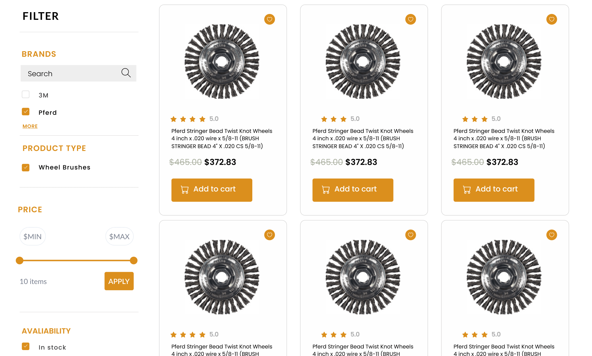
Filtering systems are indispensable for websites with extensive product catalogs. They allow users to narrow down their search results based on various criteria, such as price, brand, size, and more. The redesign of RSCI.com includes a robust and intuitive filtering system that enhances the user experience by making it easier to find specific products.
Filters are strategically placed and designed to be easy to use, with clear labels and options that update dynamically as users make their selections. This interactive filtering system not only improves the efficiency of the search process but also increases user satisfaction by providing a customized shopping experience. By offering a variety of filter options, RSCI.com caters to a wide audience with diverse needs, improving the likelihood of users finding exactly what they are looking for.
Optimizing Category Pages
The category pages on RSCI.com have been redesigned to be both functional and visually appealing. Each category page is organized logically, with clear headings and subcategories that guide users through the product offerings. High-quality images and concise product descriptions ensure that users can quickly understand the features and benefits of each item.
Additionally, the layout of the category pages is designed to be responsive, providing an optimal viewing experience across different devices. This ensures that whether users are browsing on a desktop, tablet, or smartphone, they will have a consistent and enjoyable experience. By prioritizing usability and aesthetics, the new category pages make it easier for users to explore the product range and find what they need, ultimately driving higher engagement and sales.
Product Pages Redesign
The product pages on RSCI.com play a crucial role in converting visitors into customers. The redesign aimed to create product pages that build trust, highlight key features, and facilitate informed purchasing decisions.
Product Ratings and Authenticity
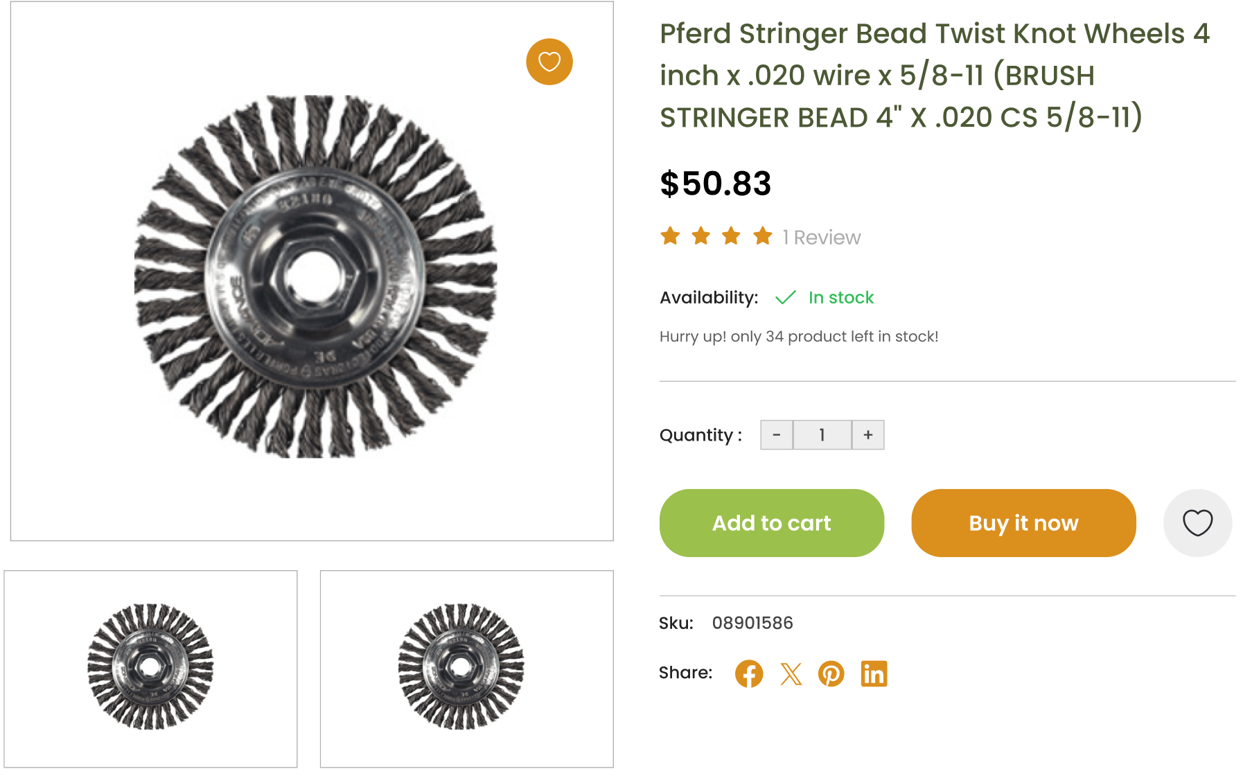
Trust is a critical factor in online shopping, especially for industrial supplies where quality and reliability are paramount. To build trust, the redesigned product pages prominently feature verified product ratings and customer reviews. These ratings provide social proof and help potential buyers feel confident in their purchasing decisions.
In addition to ratings, the product pages highlight authenticity by showcasing certifications and guarantees. This assurance of quality and authenticity is particularly important for industrial products, where customers need to be certain that they are purchasing genuine and high-quality items. By emphasizing these elements, RSCI.com enhances customer confidence and encourages repeat business.
Highlighting Product Features
Effective product pages need to present key features and benefits clearly without overwhelming the user. The redesigned product pages on RSCI.com strike a balance between providing comprehensive information and maintaining a clean, uncluttered layout. Key product highlights, such as specifications, benefits, and usage instructions, are prominently displayed, ensuring that users can quickly understand the value of the product.
To enhance the user experience further, the product pages incorporate high-quality images, detailed descriptions, and, where applicable, instructional videos. This multimedia approach caters to different user preferences and helps potential buyers make informed decisions. By presenting product information in an engaging and accessible way, RSCI.com increases the likelihood of conversions and customer satisfaction.
Up-Selling and Cross-Selling Opportunities
The redesign also includes strategic up-selling and cross-selling features. Similar products of higher quality are suggested as up-sell options, while complementary items are highlighted as cross-sell opportunities. For instance, a product page for a particular tool might suggest higher-end alternatives or related accessories that enhance the product’s functionality.
These recommendations are integrated seamlessly into the product pages, providing additional value to the user without being intrusive. By showcasing related products, RSCI.com not only increases the average order value but also enhances the overall shopping experience by helping customers discover items that meet their needs and preferences.
The thoughtful redesign of RSCI.com’s category and product pages demonstrates the importance of user-centric design in enhancing the online shopping experience. By focusing on usability, trust-building elements, and strategic product recommendations, the new design sets a standard for excellence in the industrial supply sector, encouraging other businesses to adopt similar improvements to meet the evolving needs of their customers.
Conclusion
The redesign of RSCI.com highlights the transformative potential of a thoughtfully executed website overhaul. By focusing on user experience, accessibility, and modern design principles, the new site not only meets but exceeds the expectations of both commercial and consumer audiences. This comprehensive redesign serves as a testament to the significant impact that an updated and user-centric website can have on business performance.
Each element of the redesign—from the engaging homepage with its dynamic header banner and intuitive UI, to the efficient quick view functionality and interactive hover effects—contributes to a cohesive and compelling user experience. The advanced mega menu implementation ensures seamless navigation, making it easy for users to find the products and services they need without feeling overwhelmed. These improvements collectively enhance customer engagement, increase trust, and drive higher conversion rates.
The optimization of category pages and search functionality demonstrates the importance of making product discovery as effortless as possible. By providing a robust filtering system and a highly responsive search interface, RSCI.com empowers users to quickly and efficiently locate the items they seek. This user-centric approach not only improves satisfaction but also boosts the likelihood of repeat visits and purchases.
On the product pages, the emphasis on verified ratings, authenticity, and clear feature highlights builds trust and facilitates informed decision-making. The strategic incorporation of up-selling and cross-selling opportunities further enhances the shopping experience by offering relevant product recommendations that add value for the customer.
For businesses with outdated websites, the RSCI.com redesign offers a clear example of the benefits of investing in a modern, user-focused web presence. A well-designed website is not just a digital storefront; it is a critical tool for engaging with customers, building trust, and driving sales. By prioritizing usability, accessibility, and visual appeal, businesses can significantly improve their online performance and better meet the needs of their customers.
In conclusion, the redesign of RSCI.com is a powerful demonstration of how a strategic and user-centric approach to web design can lead to substantial improvements in customer engagement and business success. As digital expectations continue to evolve, it is imperative for businesses to regularly assess and update their online presence to remain competitive and relevant in today’s market.


