RefrigiWear, a leader in providing durable and warm workwear, embarked on a digital transformation journey to enhance its online presence. The goal was to create a website that mirrored the quality and functionality of their products. The redesign focused on delivering an intuitive, user-friendly experience that catered to the needs of customers seeking extreme weather gear.
The primary objectives of the redesign were to:
- Improve Aesthetic Appeal: Align the website’s look with the rugged, durable nature of RefrigiWear products, using winter-themed graphics and a color scheme that resonates with outdoor enthusiasts.
- Streamline User Experience: Ensure that the website is easily navigable and accessible, making it simpler for users to find and purchase products.
- Enhance Mobile Responsiveness: With a significant portion of traffic coming from mobile devices, a key focus was to optimize the site for mobile users.
- Boost Performance and Speed: Improve site loading times and overall performance to reduce bounce rates and enhance user engagement.
Homepage Transformation for RefrigiWear
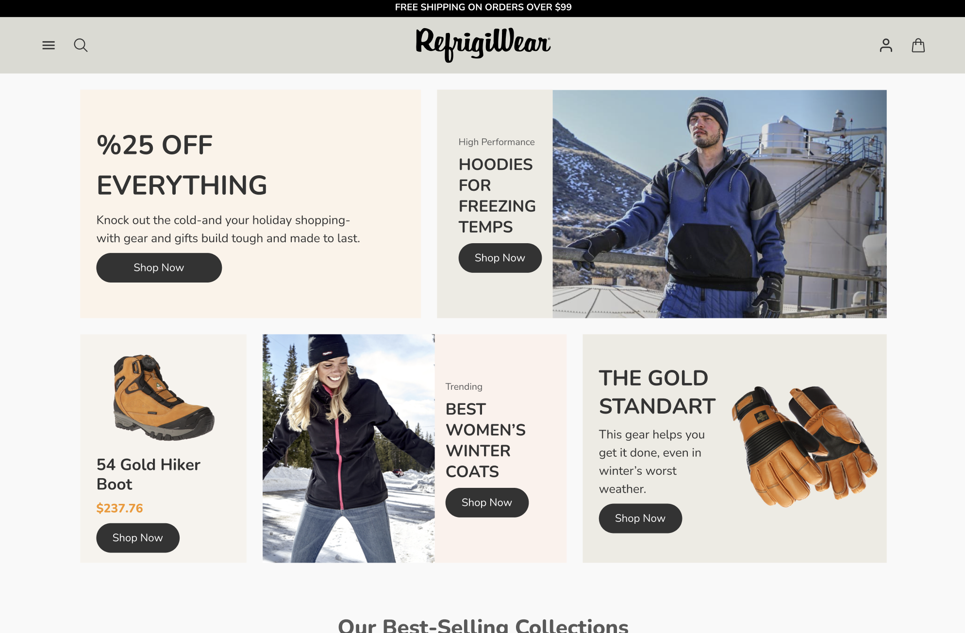
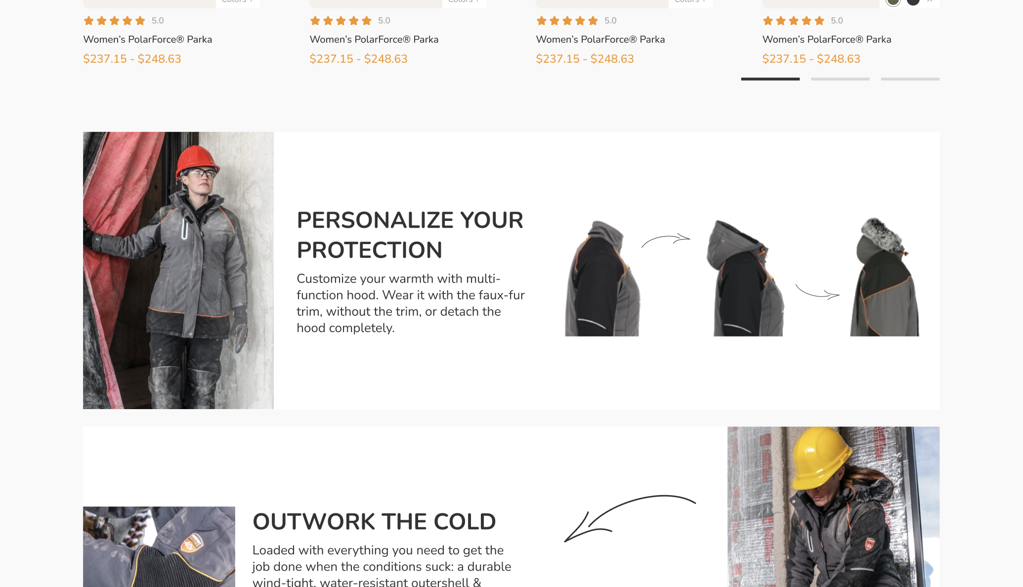
The homepage of RefrigiWear was transformed to immediately captivate visitors with a winter-inspired aesthetic. High-quality images showcasing the ruggedness and warmth of the clothing were used to create a strong visual impact. The color palette was carefully chosen to evoke the feeling of winter, with shades of blue and grey, accented with white to mimic snowy conditions. This visual theme not only reflected the brand’s identity but also resonated with the target audience of outdoor workers and winter sports enthusiasts.
Streamlined Navigation
Navigation on the homepage was overhauled to offer an intuitive user experience. A clear, concise menu was implemented, allowing users to easily understand and explore the product range. Key areas such as Men’s, Women’s, Accessories, and Special Offers were prominently displayed. This reorganization meant that users could find what they were looking for in fewer clicks, enhancing their overall experience on the site.
Showcasing Products and Offers
The homepage was designed to serve as a dynamic display window for RefrigiWear’s products and promotions. Featured products, new arrivals, and seasonal offers were strategically placed to catch the user’s attention.
These sections were regularly updated to keep the content fresh and engaging. The layout was optimized to ensure that these elements were not only visually appealing but also functionally accessible, leading to higher engagement and conversion rates.
User Experience Enhancements
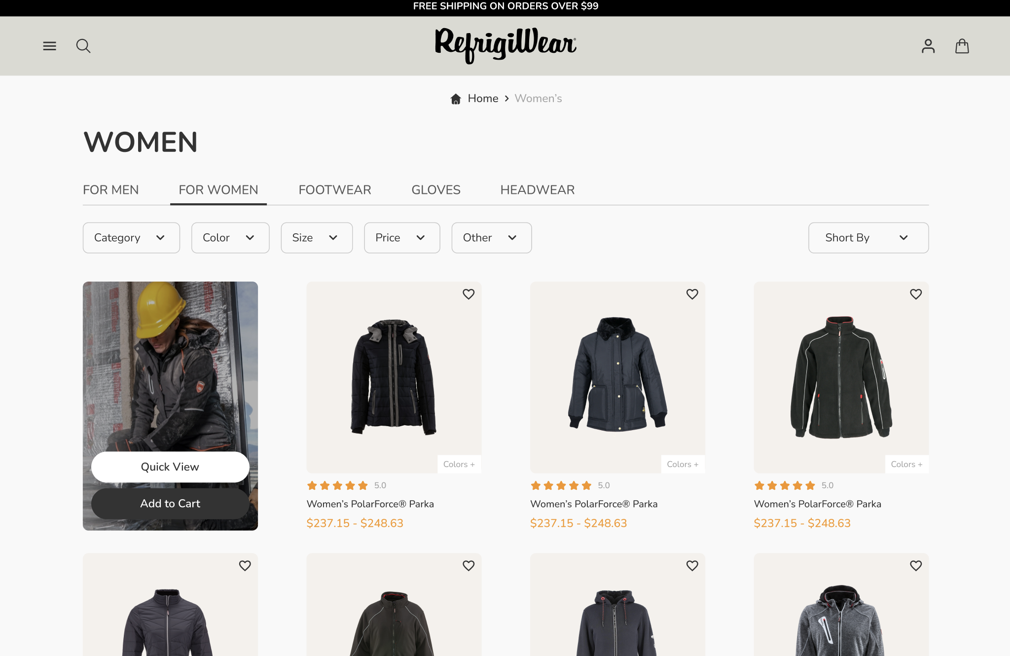
RefrigiWear’s website redesign placed significant emphasis on creating a user-friendly navigation experience. The new design introduced a structured, hierarchical layout, allowing users to easily browse through categories and subcategories. This structure was particularly beneficial for first-time visitors, guiding them seamlessly through the site’s offerings. Bread-crumb navigation was also integrated, enabling users to track their journey and easily backtrack if needed.
Mobile Responsiveness for On-the-Go Users
Acknowledging the growing trend of mobile shopping, RefrigiWear’s redesign focused heavily on mobile responsiveness. The new site was built with a mobile-first approach, ensuring that all features, including menus, product pages, and checkout processes, were optimized for smaller screens. The layout adapted fluidly across different devices, providing a consistent experience whether on a smartphone, tablet, or desktop. This responsiveness not only improved user satisfaction but also catered to the increasing number of users who shop while on the move.
Site Speed and Performance Enhancement
In the digital world, speed is crucial. The redesigned RefrigiWear site was optimized for faster loading times, ensuring that pages and images loaded quickly, even on slower internet connections. This improvement was achieved through optimized coding, compressed images, and efficient content delivery networks. Faster site performance reduced bounce rates and encouraged users to spend more time exploring the products, ultimately leading to increased sales.
Mega Menu Implementation
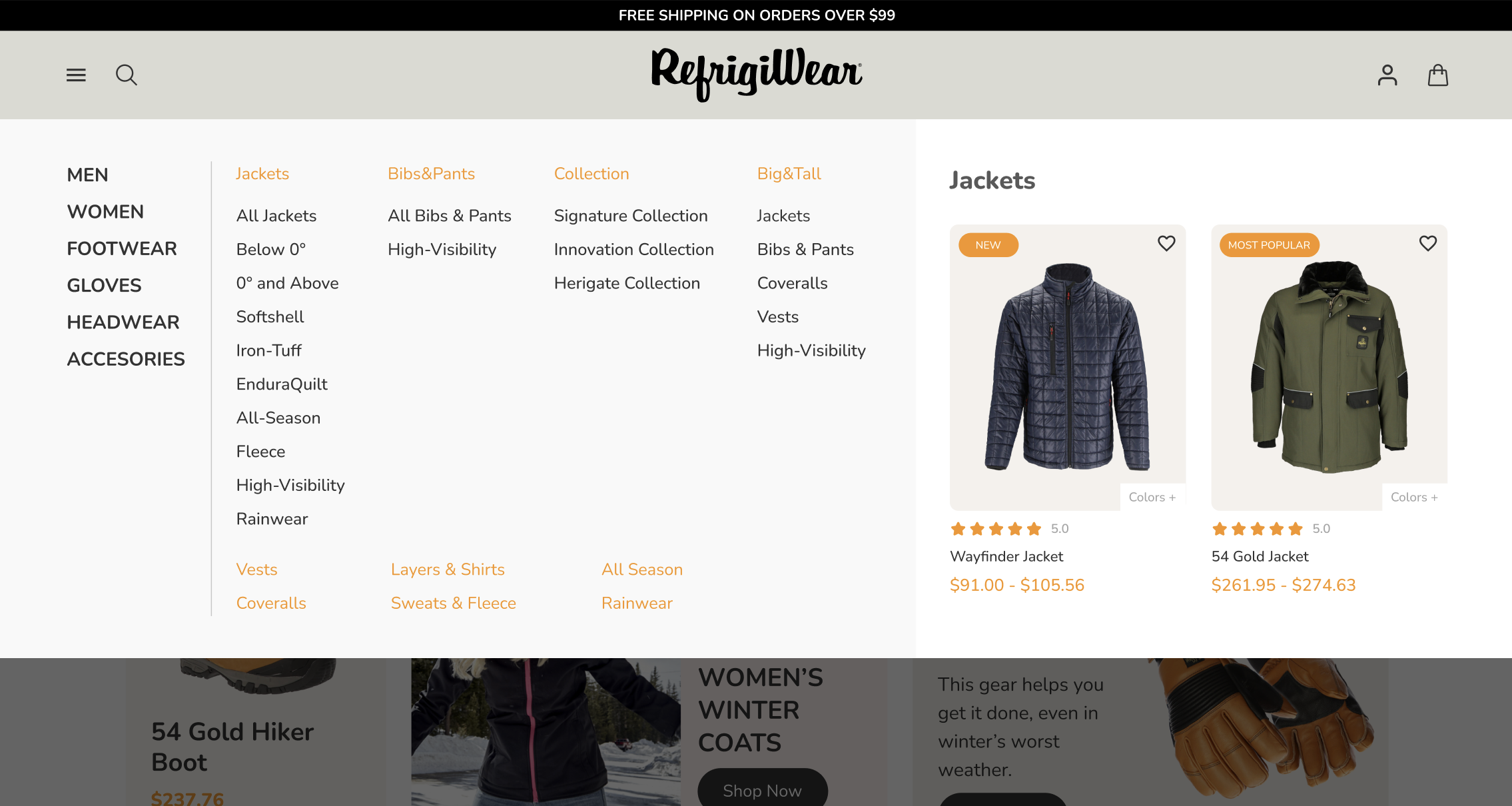
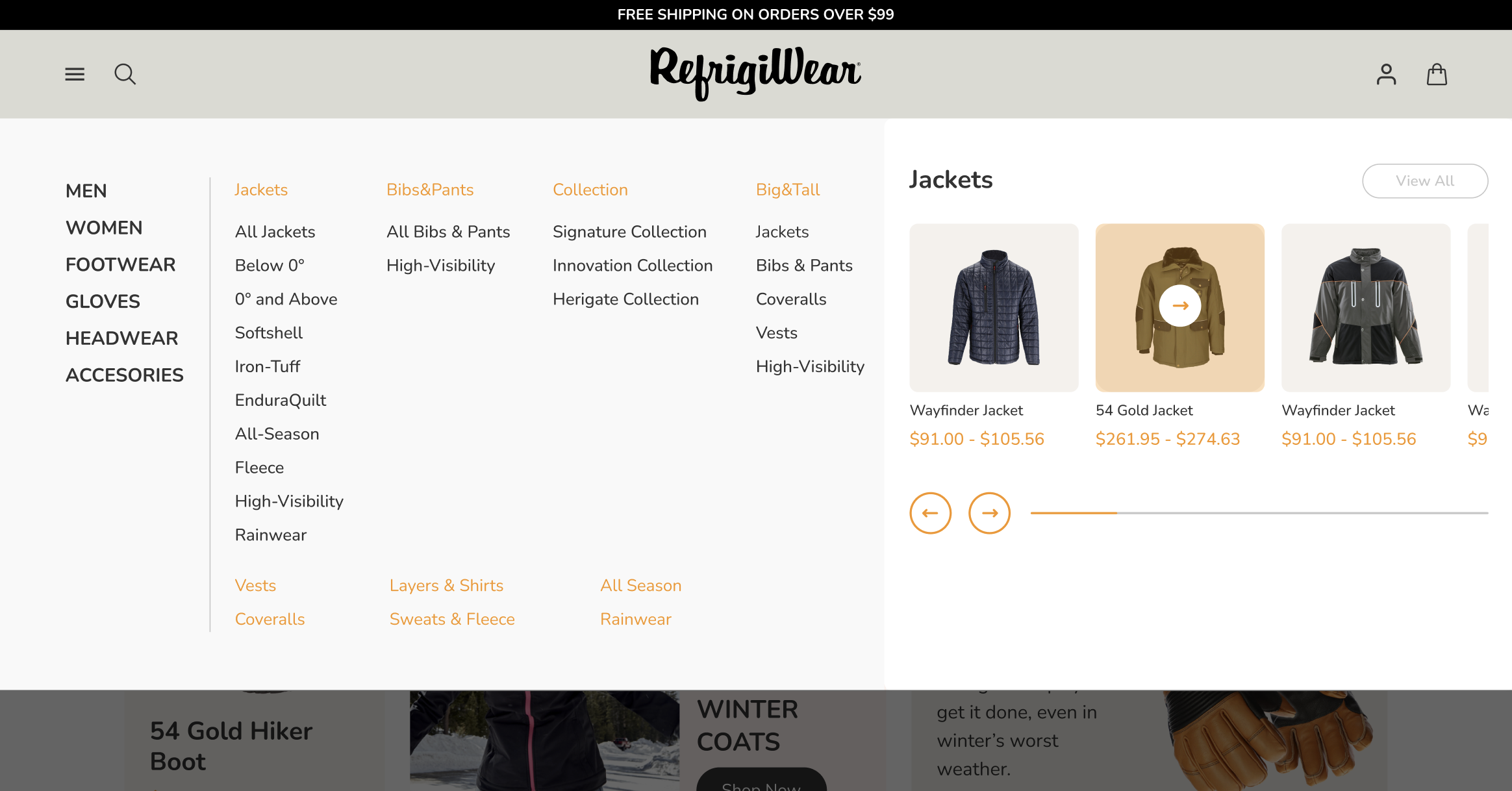
The introduction of mega menus was a pivotal part of the redesign, especially given the extensive range of products offered by RefrigiWear. These menus provided a comprehensive overview of all categories and subcategories at a glance, making it easier for users to find specific items. This approach was particularly useful for new visitors who might not be familiar with the full range of RefrigiWear’s offerings.
Visual Elements in Menus
To make the mega menus more engaging, visual elements such as icons and images were incorporated. These visuals served as quick references, helping users to identify categories without needing to read through text. For example, an icon of a jacket could quickly direct users to the outerwear section. This visual approach not only enhanced the aesthetic appeal of the site but also improved the speed and efficiency of the navigation process.
Simplifying User Pathways
The redesign focused on simplifying the user journey to specific products. With mega menus, users could navigate directly from the homepage to the exact item or category they were interested in, reducing the number of clicks required to reach their destination. This direct approach streamlined the shopping experience, making it more efficient and user-friendly.
Category Page Optimization
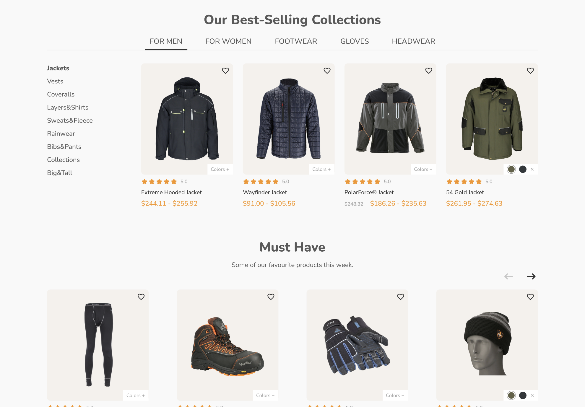
The redesigned category pages on RefrigiWear’s website introduced advanced filtering and sorting options, greatly enhancing the product search experience. Customers could now easily narrow down their choices by various parameters such as size, color, price range, and specific features like waterproofing or insulation levels. This capability made it significantly easier for customers to find exactly what they were looking for, reducing the time and effort spent on searching.
High-Quality Images and Detailed Descriptions
Each product on the category pages was showcased with high-resolution images, giving customers a clear view of the items. Zoom-in functionality was added to allow detailed inspection of the materials and craftsmanship. Alongside these images, comprehensive product descriptions, including key features, materials used, and care instructions, provided customers with all the information they needed to make informed decisions.
Layout Emphasizing Key Products and New Arrivals
The layout of the category pages was strategically designed to highlight key products and new arrivals. These items were placed in prominent positions to capture the attention of visitors. The layout was also dynamically adjustable, allowing for the showcasing of seasonal or promotional items at the top of the page, thus aligning with current marketing campaigns or seasonal demands.
Product Page Perfection
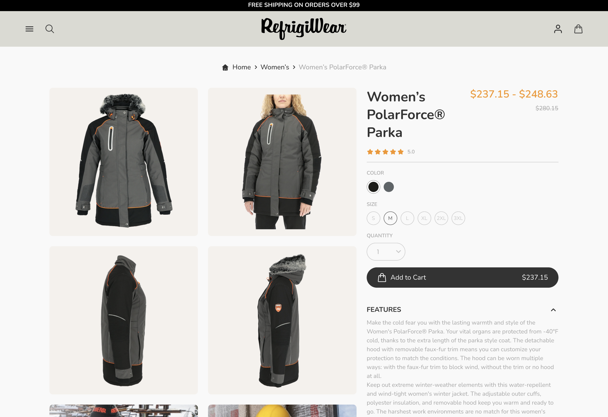
On the product pages, RefrigiWear took product visualization to the next level. High-resolution images, along with 360-degree views and video demonstrations, were implemented. This approach allowed customers to get a comprehensive view of the products, closely mimicking the in-store experience. The ability to see products in action, particularly important for outdoor and workwear gear, significantly boosted customer confidence in their purchases.
Detailed Specifications and Customer Reviews
Each product page was enriched with detailed specifications, including material composition, size guides, and care instructions. This information helped customers make informed decisions based on their specific needs.
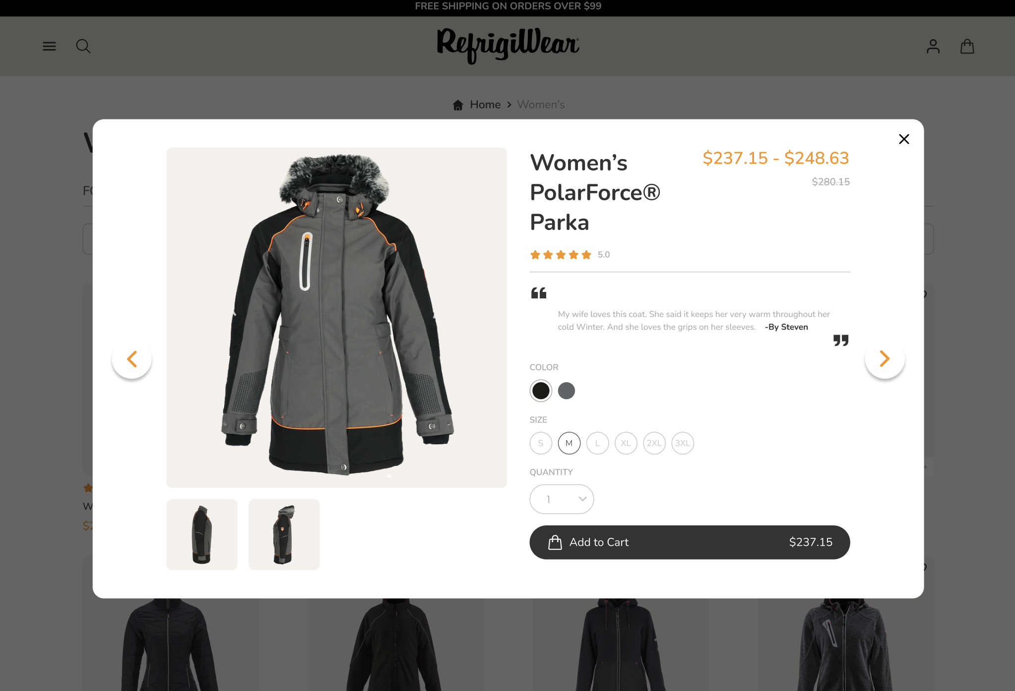
Additionally, the integration of customer reviews provided real-world insights into the product’s performance, fit, and quality, further aiding in the decision-making process.
Enhanced Add-to-Cart Experience
The add-to-cart process was streamlined to ensure a smooth and hassle-free experience. Options for size and color were made easily accessible, and real-time stock information was provided to inform customers about product availability.
The addition of a quick-add feature allowed customers to add items to their cart without leaving the product page, thus simplifying the purchase process and encouraging continued shopping.
Impact of Sticky Add to Cart
The introduction of a sticky add-to-cart feature was a strategic move in RefrigiWear’s website redesign. This feature, which keeps the add-to-cart button visible as the user scrolls through the product page, was analyzed for its impact on user behavior. Data indicated a noticeable increase in conversion rates, as the feature made it more convenient for users to make a purchase decision without scrolling back up to the top of the page.
Impact on Conversion Rates and User Engagement
The sticky add-to-cart button significantly enhanced user engagement. Customers found it easier to add items to their cart, leading to a more streamlined shopping experience. This convenience translated into higher conversion rates, as the simplified process encouraged users to proceed to checkout without second thoughts. The feature was especially effective on mobile devices, where screen space is limited, and ease of navigation is crucial.
Strategies for Further Optimization
RefrigiWear continues to analyze user interaction with the sticky add-to-cart feature to identify areas for further optimization. This includes testing different positions and designs for the button to see which variations perform the best. The company also plans to implement personalized recommendations in this space, suggesting related products or accessories that customers might be interested in.
Conclusion
The comprehensive redesign of RefrigiWear’s website marked a significant step in aligning its online presence with the quality and functionality of its products. The transformation focused on enhancing visual appeal, streamlining user experience, and improving site performance. The introduction of mega menus, optimization of category and product pages, and the innovative sticky add-to-cart feature all contributed to a more engaging and efficient shopping experience for customers.
These enhancements have not only elevated the brand’s online image but also resulted in tangible benefits such as increased user engagement, higher conversion rates, and improved customer satisfaction. RefrigiWear’s commitment to continuous improvement and adaptation to evolving digital trends sets a standard for eCommerce excellence in the outdoor and workwear apparel industry.
As RefrigiWear moves forward, the company continues to monitor and refine its digital strategies, ensuring that its online platform remains a robust, user-friendly, and effective tool for connecting with its customer base and driving business growth.


