Update: 10/11/2011 New Animation; Making Internet Marketing Fun with Wufoo and CSS3
Dont have CSS3 animation capable browsers? Watch a video of the animation.
Inspiration
Searching YouTube for inspiration I stumbled on to the intro of the classic 1967 spider-man cartoon series. While watching I realized that the animation was very basic. It was the paper doll sort of animation that lends itself perfectly to css3. Hmmm… “I could something like that with a little css3”, I thought.
Character & background art
CSS3-MAN
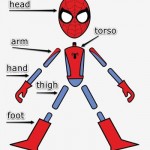
The character art was created in adobe illustrator and copy/pasted into photoshop for export. When designing a character for animation. Carefully plan all the pieces that will compose your character. I decided on simple shapes and built each part of the body separately, like a marionette. This allowed me to re-use some graphics. By building the character like a marionette. I was able to simplify the animation process.
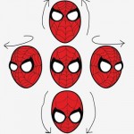
As previously stated, the graphics originated in illustrator. Vectors paths and points make it simple to adjust the artwork. For instance, If you need spidey looking up or down. Simply adjust the position of the eyes and webbing on the head shape to complete the illusion. You can clean up any extra lines by simply moving the point or deleting it.
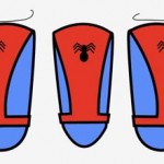
Same applies for the torso, legs and arms. By adjusting the orientation of the chest design and belt we can fake the rotation of a 2d element. Moving the arms and/or legs a little behind and a little in front of the torso creates the illusion of a subtle 3rd dimension.
BACKGROUND
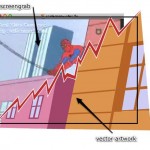
The cityscape’s were also created in illustrator. But they started as plain screen-grabs. I captured certain parts of the video as it played. Then pasted them into illustrator. I created another layer above the screen-grab. Drawing paths over the screen-grabs images. Using it like tracing paper. When graphics were done, I trashed the screen-grab layer.
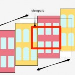
Just like the character. When creating these cityscape graphics you must think a little in advance about how the pieces must fit together. Background images used for scrolling and zooming should be 2 or 3 times wider and/or taller to allow for panning left, right, up, or down. The same applies for zooming in and out. Now we have our finished character and background graphics. We can begin setting up our graphics for animation.
Complex CSS3 character animation and rigging
CHARACTER RIGGING
One of the trickiest parts to creating these css3 character animations is the rigging of joints or skeleton so that they hinge and rotate believably. The most important property is the transform-origin property. The transform-origin property uses x,y coordinates to determine the point from which animation or transformations occur. (If you want a full explanation of css3 animation properties please read my last article.) In order to determine the accurate transform-origin point for our arm and leg graphics we’re going to use a simple trick.
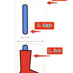
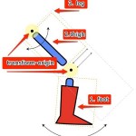
Notice how the foot graphic (1) is much wider than the thigh graphic (2). It would be impossible to match up the transform-origin point on these two pieces.
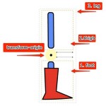
However, If we match the width of the thigh (2) with the width of the foot (1)… That’s it! By increasing the width of the canvas area of the thigh to match the width of the foot we can accurately match the rotation points of these “hinges” using the css3 transform-origin property. By giving the thigh image a wider canvas area we can move the thigh graphic left or right to line it up with the foot graphic.
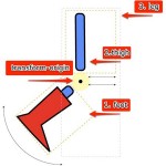
We can now ascertain that these two pieces will have the exact rotation points via css3 transform origin. By setting the transform-origin for foot to (x) number of pixels from the left we can guarantee that the foot will rotate from exactly where the bottom of the shin is located.
Now we can apply the same transform origin coordinates to the top of the leg div (which wraps around thigh & foot). By rotating the leg div we rotate its children too. This means that the leg div rotates both the thigh and foot graphics at the same time. Mimicking the functionality of a skeleton. Which allows us to have the foot moving along its own rotation path while also rotating along the path of the whole leg. Its important to nest items because this allows you to have multiple animation paths without having to recalculate their position constantly. If I rotate the thigh and foot without first wrapping them in a leg div how would I also make the foot rotate upon the axis of the leg? It would be near to impossible. And it would look horrible. By nesting and breaking down the animations into their major body parts and just animating one major body part at a time and utilizing the animation of children I can achieve complex (for css) animation combinations. Creating the illusion of the character zooming in required that the images be created at a bigger size. Then implementing them into the html mark-up at a smaller size. There are two ways to do this. Using the scale transform property or using the image width property. By increasing the image width over a key-framed animation you give it the illusion of growing or zooming into the screen. We can make a 500 pixel wide image then insert it into the html at 5% of its size. We are then able to make it smaller or bigger by increasing the height or width via css3.
Complex Character Animation
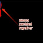
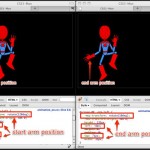
When building a character composed of precisely placed elements. Being able to visually construct the character is essential. When we first place all the different pieces for our character into the html. They are all jumbled up together. Firefox 3.x has implemented css3 moz-transform-origin and moz-rotate. Which means I can use firebug developer tool to visually position the character’s body parts where they belong. This makes setting up the start and end positions/rotations for the characters pose simple. To begin, we set up the characters body parts in the start position. I just adjust the values to where I need them in order to get the proper first position. I visually adjust the rotation and position values of the graphic using firebug.
This allows me to gain pixel perfect precision over where I want the graphic placed. Using firebug like this takes the guesswork out of animating something as technical as different body parts. I just visually adjust the values to where I need them to get the proper first position. We then place those coordinates into the css. Now we have to figure out the end positions for our animation. We use the same technique. Adjusting the values to accommodate the end position and plug those values into the css as well. Finally, I place these values in the ‘start’ and ‘end’ parts of the css3 keyframe function. Then we check the animation in webkit. Webkit does the rest of the magic on its own. By using firefox and chrome together I was able to find the start and end points to each body part and then allow @keyframes to fill in the blanks.
Putting it all together
Believe it or not, the biggest road block I encountered when creating this css3 cartoon was switching the scenes at the correct moment to coincide with the css3 animation. I used jquery’s built in delay function to flip through the scenes and activate the next scene. As I’m writing this I realize that I probably could have pulled off the scene switching with css3 animation as well. But I’m not sure – as I haven’t thought it all the way through. We used the built in animation delay function on css3 to begin animating the scenes just as they were activated by jQuery. Another challenge I had was that I had no control over when the animation started. I had to preload all the elements. Because there was no way to start all of the animations on just one click throughout the entire flick. And if all the elements are not loaded when the animations start running it gets jumpy. Including the audio soundtrack was almost too easy. I just inserted a simple html 5 audio tag. (Gosh, I’m falling for html 5). Anthony Calzadilla is a real cool dude at Optimum7.
You can see examples of our custom programming work using css here.


