There are thousands of online businesses that do over 10 Million Dollars in revenue, and that still suffer from usability issues that significantly affect their conversions. Powerfulsignal.com was one of those businesses. Our team of expert BigCommerce designers worked on this design to maximize usability and conversion elements.
The user interface (UI) of the website as well as the search results pages, was a challenge. Combined with user experience (UX), a good UI design can make a huge difference in customer engagement and satisfaction. It can also help to build trust in the quality of your product. This was our goal while redesigning Powerfulsignal.com
We did this to set this site apart from its competitors. Interactive and visually appealing UI elements were used to keep customers engaged and also keep them coming back.
Why We Focused on UI & UX Design
We focused on elements of the user interface that will:
- Increase customer engagement with the product pages
- Increase customer trust in the products (Trust building elements such as reviews, authority, etc.)
- Separate this business from outdated and text-heavy competitive websites
With these interactive and engaging UI designs, Powerfulsignal.com will have a better chance of retaining its customers and convincing them to stay loyal to the brand.
Consider the Design of Each Element, Not Just Overall Aesthetic
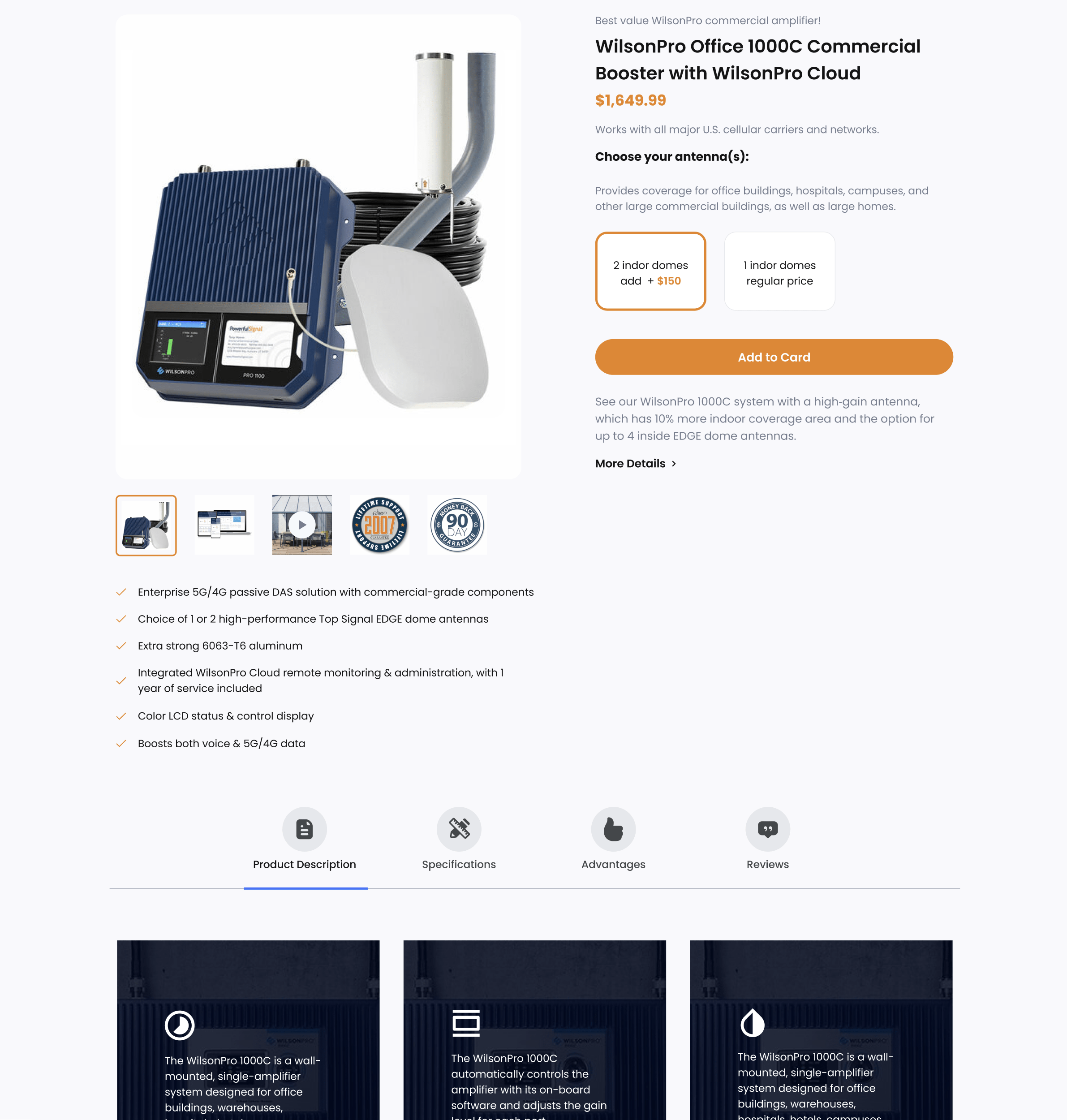
Most business owners might not be aware, but the design of a website can have a profound impact on how user-friendly it is. Something as simple as the shape of a button can make a big difference in how easy it is to navigate a site or prominent calls to action can push for key conversions such as add to cart or checkout.
The same is true for colors, typography, and the distribution of information.
By making small changes to these elements, we can dramatically improve the user experience on your site. As a result, visitors will be more likely to stay on your site longer and return in the future.
So, if you’re looking for ways to keep people coming back to your site, start by taking a closer look at the design. With a little effort, you can make your site more user-friendly and attractive to visitors. ****
The Difference that “Sticky Add to Cart” Makes on a Website
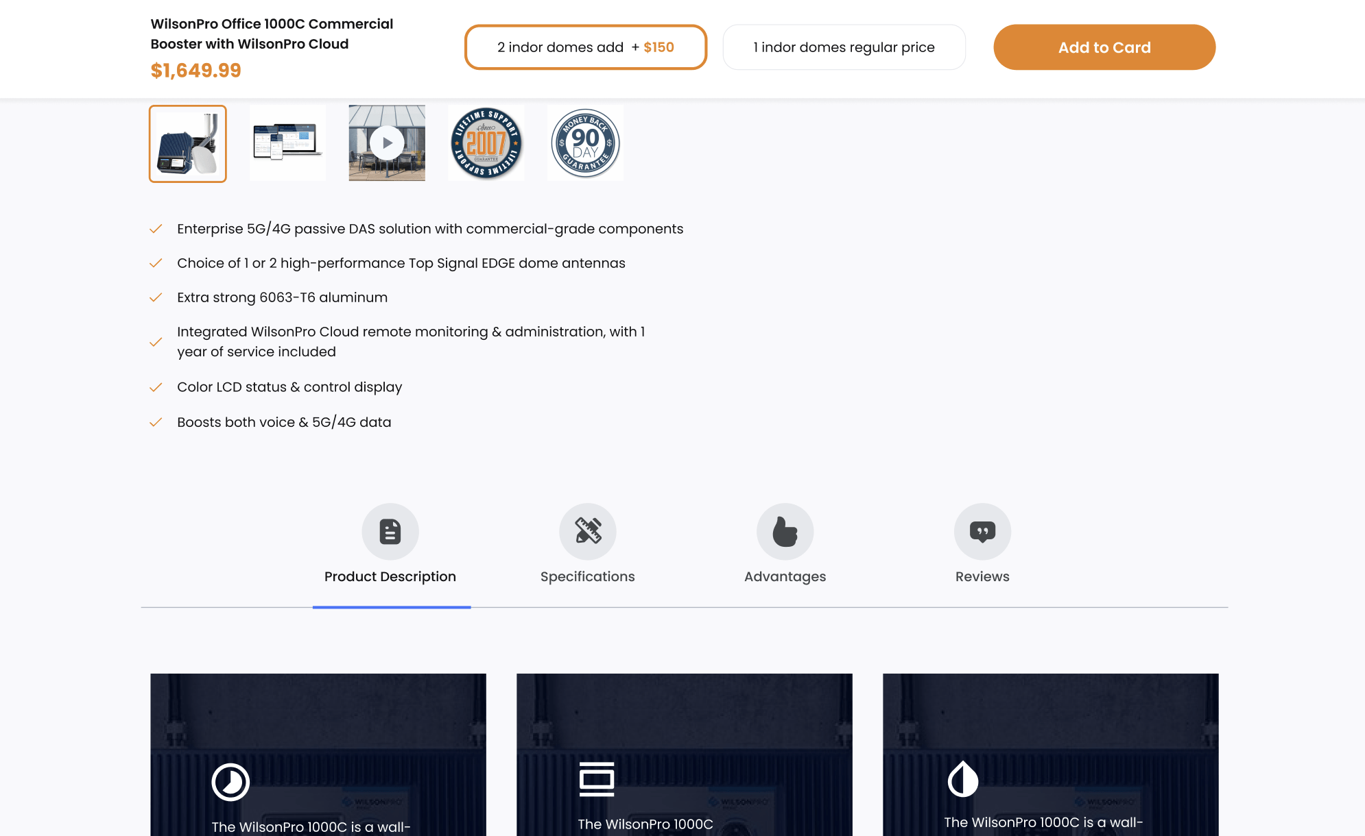
Sticky Add to Cart is a bar that enhances the customer experience and increases conversions with a persistent, add-to-cart functionality. The cart button follows the customer around as they scroll down the page looking for more information about the product.
When used correctly, sticky add-to-cart can be an effective way to increase conversions on your product pages. In fact, one study found that sticky, add-to-cart buttons increased orders by 8%.
By making it easy for customers to add items to their cart, you can encourage them to complete their purchase instead of navigating away from the page. As a result, a sticky add-to-cart button is an essential tool for any online retailer looking to boost sales and conversion rates.
Importance of Responsive Design for PowerfulSignal.com
If you’re running a business in the 21st century, then you need to have a website that looks modern and loads quickly while being mobile-friendly. If you’re not yet using responsive design on your website, then you’re behind the times.
In the past few years, Google’s Mobile-First Indexing has been gradually taking over the web and is now becoming the standard. This means that your website must be designed to be mobile-friendly in order to rank well in search results.
People are using their mobile devices more than ever to browse the web; if your site isn’t designed for mobile devices, they’ll likely leave and never come back. Therefore, it’s one of the most important aspects of having a successful website in today’s market.
Responsive Design is the Best Way to Maintain a Mobile-Friendly Site
Responsive design is not only important for ranking well in search results, but it’s also essential for providing a good user experience.
A responsive design automatically adjusts your website’s layout to fit any screen size, whether it’s a desktop computer, a laptop, a tablet, or a smartphone.
Having a top-notch, mobile-friendly website and satisfying user experience will keep the visitors coming and give them more reasons to stick around. Don’t lose out on potential customers and website visitors by failing to design your site for responsive design.
A Category Page Should Be Easy to Navigate and Filter
When creating category pages on a website, it is important to think about what kind of information will be most useful to visitors. Including too much information can make the page cluttered and confusing, while leaving out important details can make it difficult for users to find what they are looking for.
A good rule of thumb is to include only the most essential information on the page and to make sure that this information is clearly organized and easy to find. In addition, it is important to consider what kind of information your users are likely to be looking for when they visit the page.
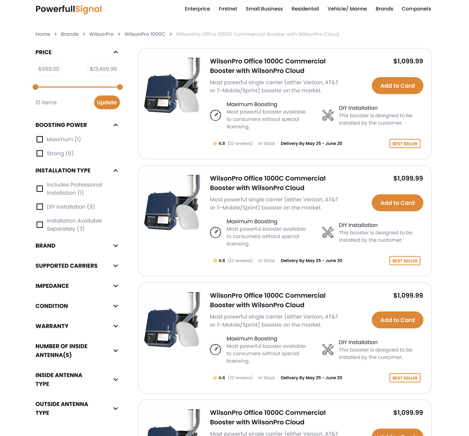
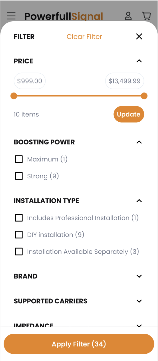
Having a filter functionality on your category pages can be important for saving time and frustration, making for a better overall user experience. By allowing users to filter through different options, they can narrow down their choices and find exactly what they are looking for.
Filter Functionality is necessary for all eCommerce sites, but it’s especially crucial for those of you with extensive product catalogs. You need to be able to improve the product findability so your customers can locate what they’re looking for as fast and painlessly as possible.
By thinking carefully about what kind of information will be most useful to visitors, you can create category pages that are both informative and user-friendly.
Filter Functionality on Mobile
When browsing for products on a phone, it is important to show only relevant filters. This is because the small real estate of the phone screen can make it difficult to see all the available options.
If there are no relevant filters, don’t display them at all. This will help to reduce clutter and make it easier for users to find what they are looking for.
In addition, only displaying relevant filters can help to improve the overall performance of the phone by reducing the amount of data that needs to be processed.
As a result, only showing relevant filters is a good way to improve the user experience on a phone. If your content affords many filters, make sure that you put emphasis on the most important ones.
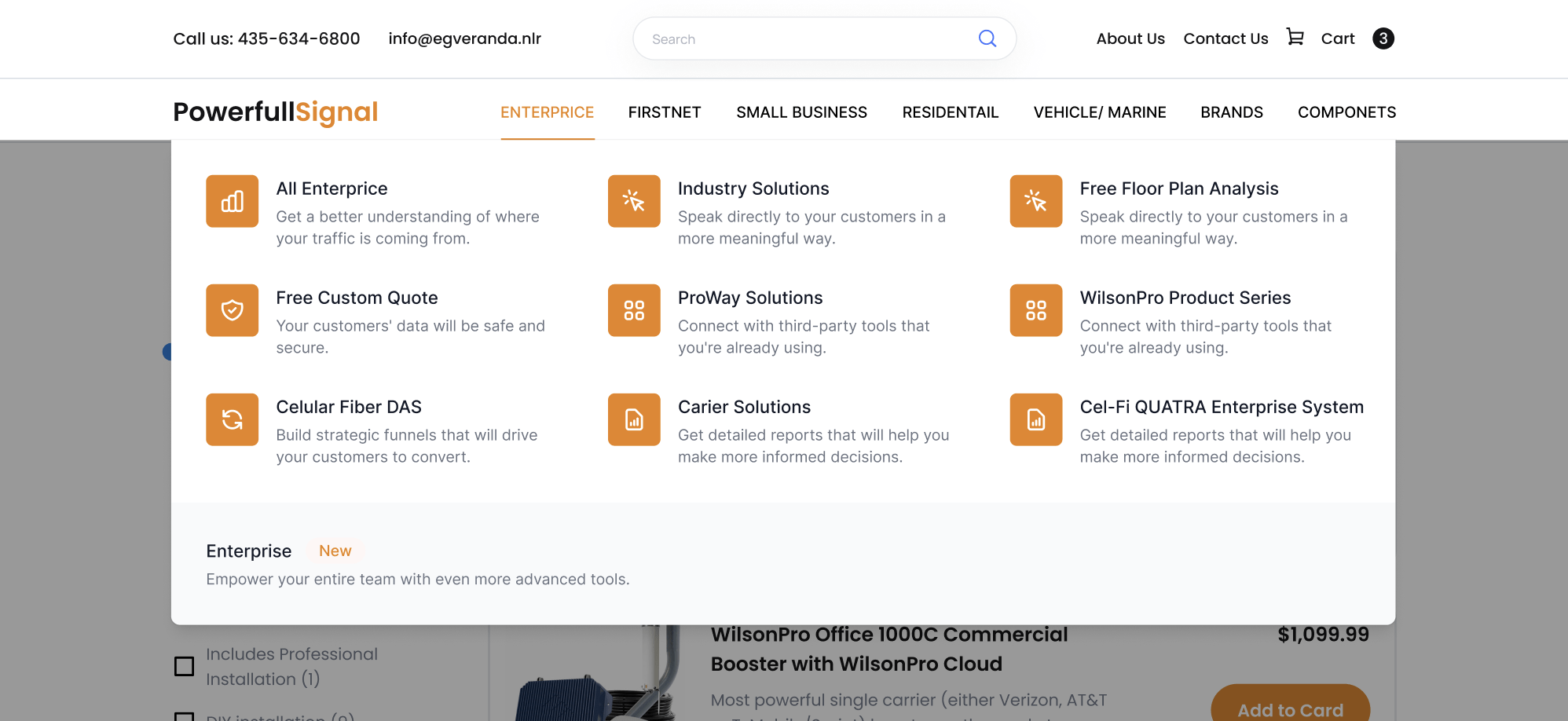
Building a Proper Mega Menu for PowerfulSignal.com
Have you ever been to a website with so many options that you couldn’t find what you were looking for? If you have, then that site probably needed a mega menu.
Mega menus are drop-down menus on websites with a large number of pages and options. They are easy to read and make it easy for users to find what they’re looking for.
eCommerce pages can take advantage of mega menus to display categories of products. This is especially useful if the products are too numerous to list on the homepage.
A well-designed mega menu can be a powerful tool for eCommerce retailers. Not only does it allow shoppers to navigate quickly and easily, but it also helps to reduce clutter and promote relevant products.
By carefully planning the layout of the menu, retailers can guide shoppers to exactly what they are looking for.
For example, a retailer selling a wide variety of products may choose to organize the mega menu by category. This makes it easy for shoppers to find what they are looking for, and it also helps to prevent them from becoming overwhelmed by too many options.
Organize Your Products According to Your Unique Needs
On the other hand, a retailer selling a limited number of products may choose to organize the mega menu by brand or price.
This helps shoppers narrow down their options and make a purchase decision more quickly.
Regardless of how it is organized, a well-designed mega menu can be a valuable asset for any eCommerce retailer.
Optimum7 Knows How To Improve Conversions With Design
When we set out to design the new PowerfulSignal.com, we had a few goals in mind. First, we wanted to create a design that was clean and modern. We wanted the site to be easy to navigate and easy on the eyes.
Second, we wanted to make sure that the site was mobile-friendly. More and more people are shopping on their phones, and we wanted to make sure that they had a good experience. Finally, we wanted to design the site in a way that would help to increase conversions.
We started by researching other design and marketing agencies. We looked at what they were doing right and what they were doing wrong. We took note of the design trends that were popular at the time. We went through a SOW development process.
Then, we got to work.
If you want to do a rework on your website design but find it too big of a project to tackle alone, Optimum7 stands by your side. With our years of experience as a development and design agency, we helped countless eCommerce businesses tackle projects that were too big to finish alone. Contact us and let’s start talking about your store.


