In the digital era, a company’s website often serves as the first point of contact with its customers, setting the stage for their entire experience with the brand. Portacool, a leader in industrial portable evaporative coolers, recognized the significance of this digital handshake and embarked on a comprehensive website redesign. This initiative was more than a facelift; it was a strategic move to enhance user engagement, build trust, and clearly differentiate Portacool from its competitors in a crowded online marketplace. This article delves into the transformative journey of Portacool’s website redesign, showcasing how thoughtful design changes can not only revitalize a brand’s online presence but also create a more engaging, accessible, and user-friendly platform for customers.
Homepage Design Transformation
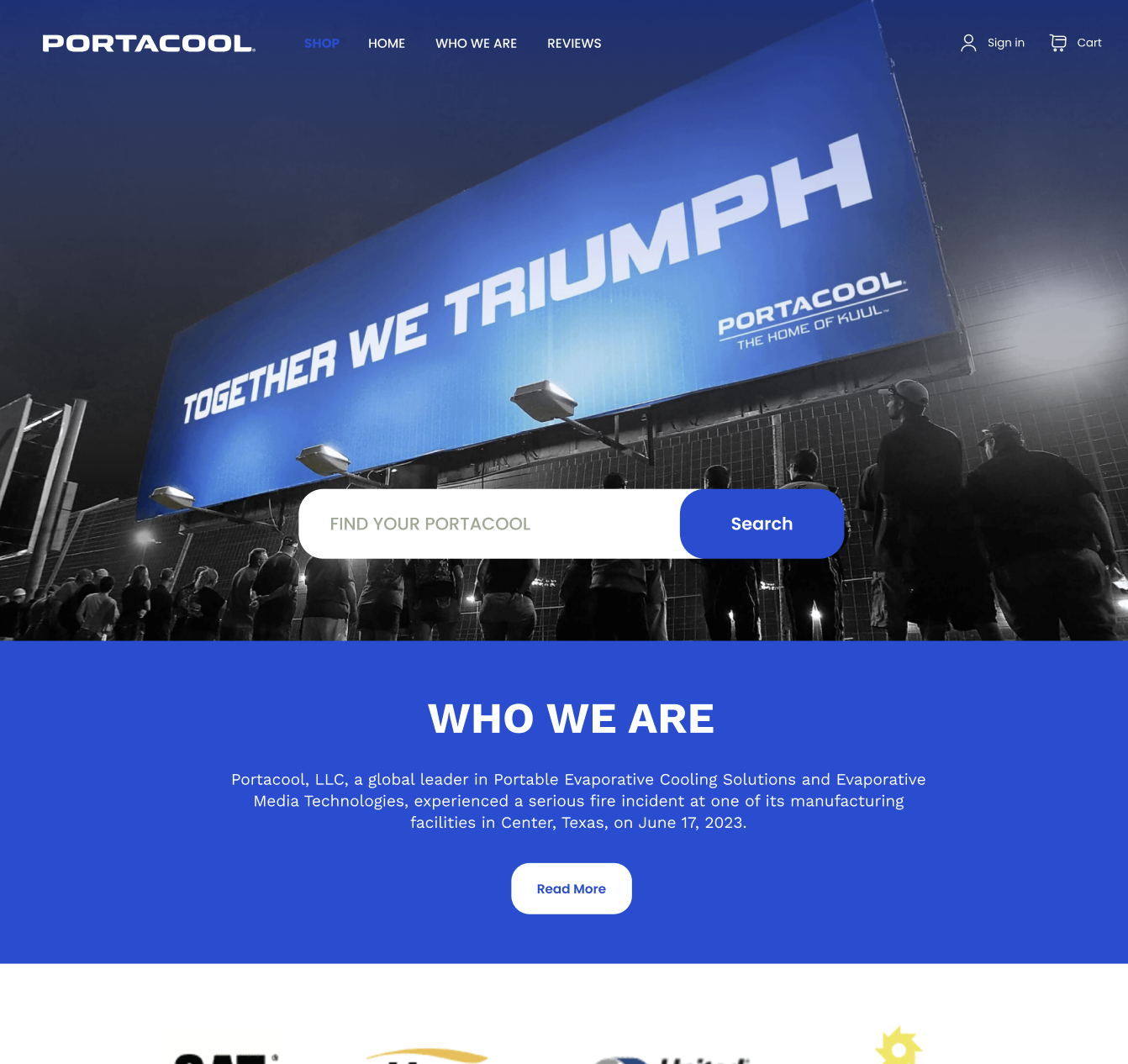
The redesign of Portacool’s website commenced with a critical element: the header banner. Often likened to a digital billboard, the header banner is the first visual encounter a visitor has with a website. It’s not just an image; it’s a declaration of a brand’s identity and ethos. In the case of Portacool, the header banner was strategically designed to be more than just aesthetically pleasing; it was crafted to encapsulate the essence of the brand – innovative, reliable, and customer-centric. This revamped banner not only grabs attention but also establishes a tone for the user’s journey through the site.
Revolutionizing User Interface
The new user interface (UI) of Portacool’s website is a paradigm shift from the conventional. A focus was placed on increasing customer engagement and trust – two pillars essential for online success. The redesigned UI stands out by shedding the complexity and clutter often found in industrial websites. By embracing simplicity and clarity, the website speaks directly to the needs and preferences of its users, making their experience both enjoyable and efficient.
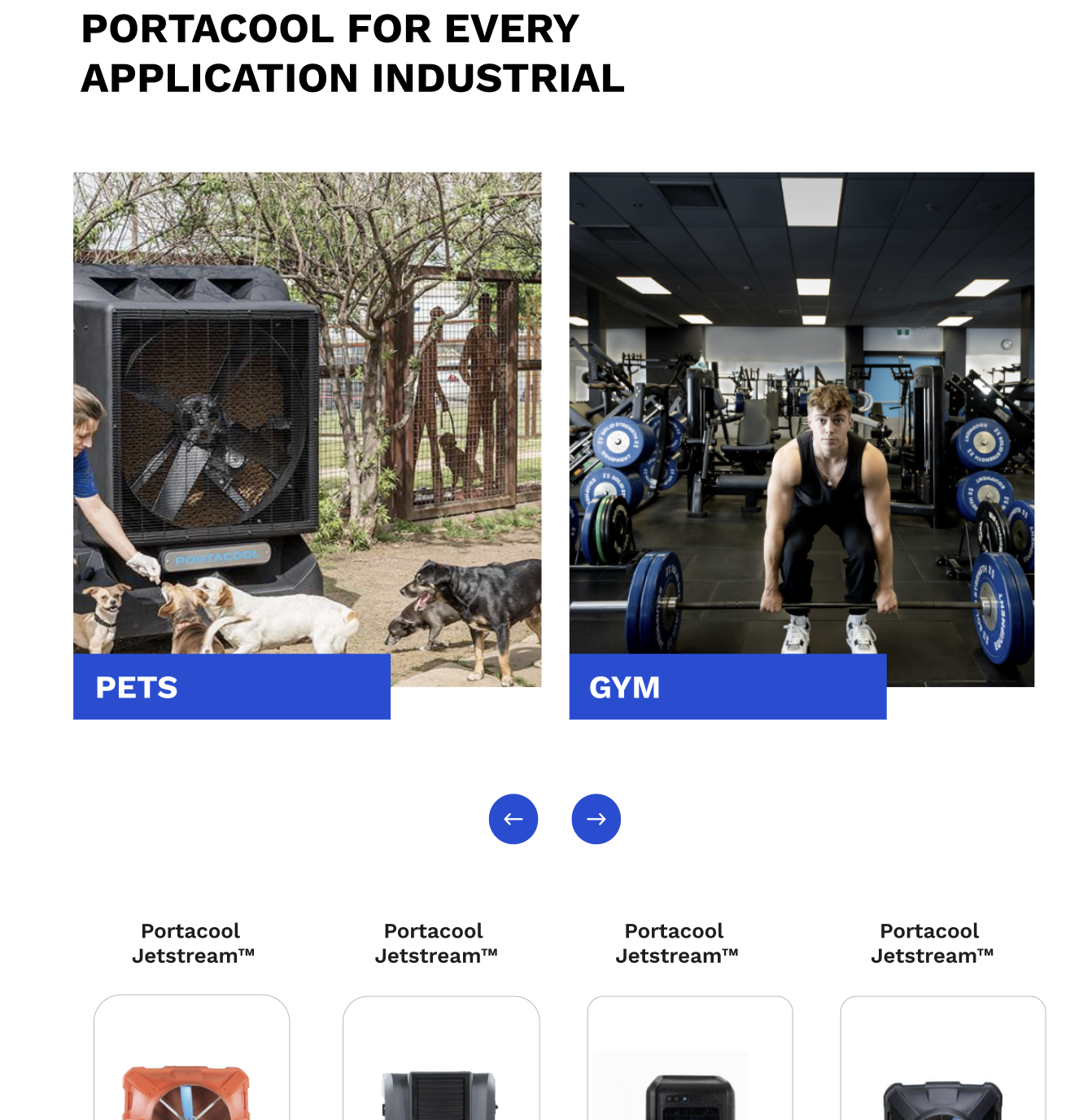
An intuitive and visually appealing interface does more than just please the eye. It builds a bridge of trust between the brand and its customers. When users navigate through a well-designed, easy-to-use website, their confidence in the product’s quality and the company’s credibility naturally increases. This aspect is particularly crucial for Portacool, whose products are vital in ensuring safe and comfortable work environments.
The Strategic Use of Banner Ads
Banner ads, a staple in digital marketing, were thoughtfully integrated into the redesign. These aren’t just promotional tools; they are storytelling elements that convey the value and application of Portacool’s products. By incorporating these ads into the website’s design, Portacool leverages an effective medium to enhance brand awareness and product understanding. The key here is balance – ensuring that these ads inform and intrigue rather than overwhelm.
Elevating the Value Proposition
At the heart of the homepage lies the brand’s value proposition. In the redesign, this was not just highlighted but celebrated. Phrases like “High quality” and “Limited time offer” are strategically placed to catch the user’s eye immediately. By making these elements prominent, the website effectively communicates what Portacool stands for and what it offers to its customers, thereby establishing a compelling reason for users to explore further.
Through these thoughtful design changes, Portacool’s website has transformed into a dynamic and engaging platform. This redesign journey exemplifies how modernizing a website can significantly enhance user experience and brand perception, serving as a beacon for businesses with outdated digital presences. The key takeaway is clear: in the fast-paced digital world, staying current with web design is not just a cosmetic preference; it’s a business necessity.
Optimizing Category Pages for User Engagement
In the digital shopping experience, the ability to find products quickly and efficiently is paramount. Recognizing this, the Portacool website redesign places significant emphasis on optimizing the search functionality. A compelling search interface does more than locate products; it enhances user engagement and can be a decisive factor in conversion rates.
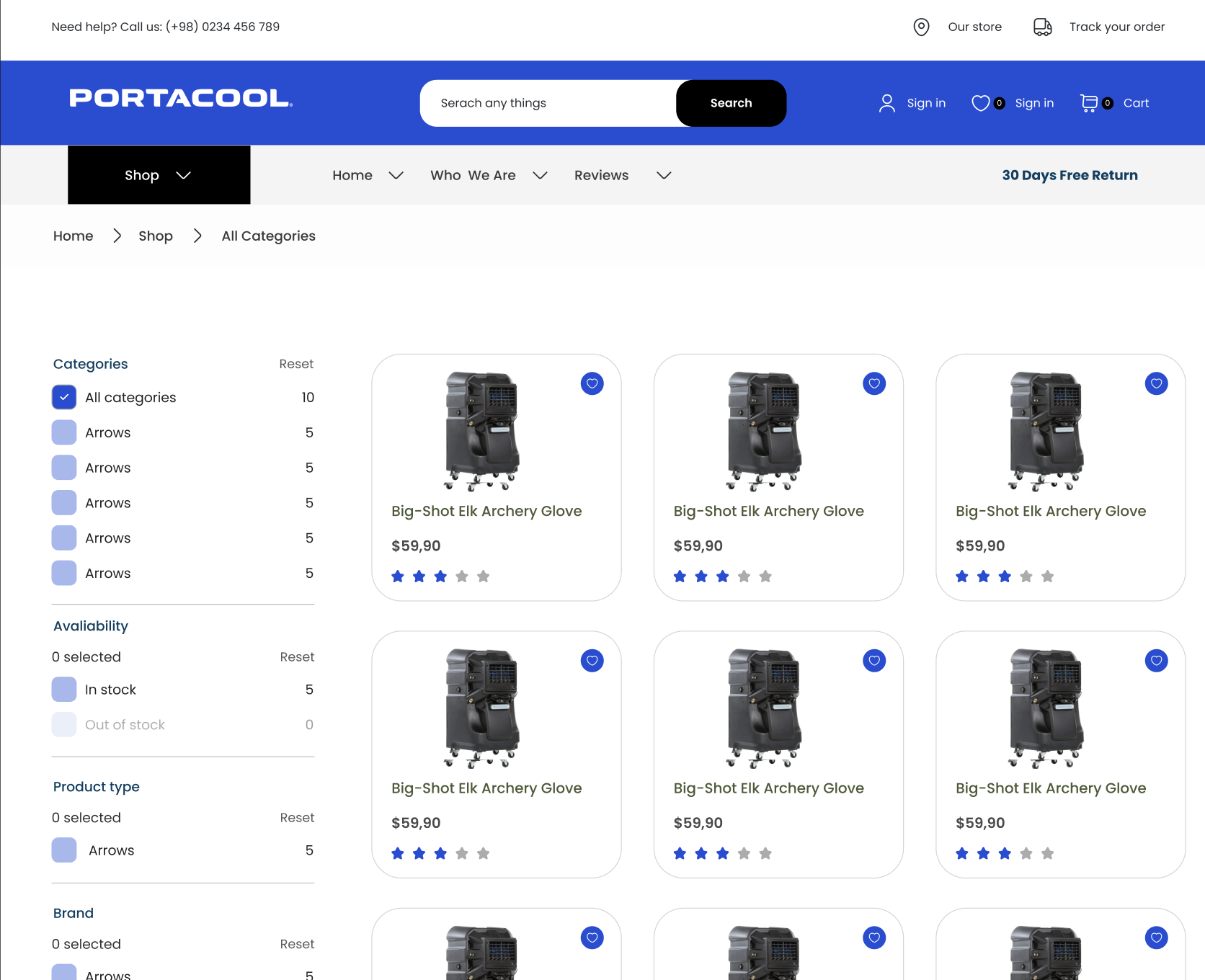
The search bar in Portacool’s redesigned website is not just a utility; it’s an interactive feature that invites engagement. It’s designed to be visually appealing and intuitive to use, encouraging visitors to start their shopping journey there. This is particularly important considering Forrester Research’s finding that a significant portion of e-commerce website visitors head straight to the search bar.
Powering Up with Advanced Filtering
An advanced filtering system is indispensable for e-commerce sites, especially those with a vast array of products like Portacool. The redesigned website’s filtering system is a testament to the power of good UX design. It goes beyond basic categorization, allowing users to refine their search based on various parameters like size, price, features, and more.
This level of detail in filtering not only aids in the discovery of products but also enhances the
shopping experience by making it more personalized and efficient. Users no longer have to sift through irrelevant products, saving time and reducing frustration. The impact of a well-designed filtering system is profound – it not only improves the usability of the website but also can significantly increase conversion rates. Studies have shown that even simple improvements in filter design can lead to substantial gains in a website’s performance.
The Portacool website’s filtering system is a clear demonstration of how understanding and addressing user needs can lead to a more successful online platform. It shows that when a website is easy to navigate and tailored to user preferences, it not only satisfies the current customer base but also attracts new users who appreciate the streamlined experience.
Revamping Product Pages
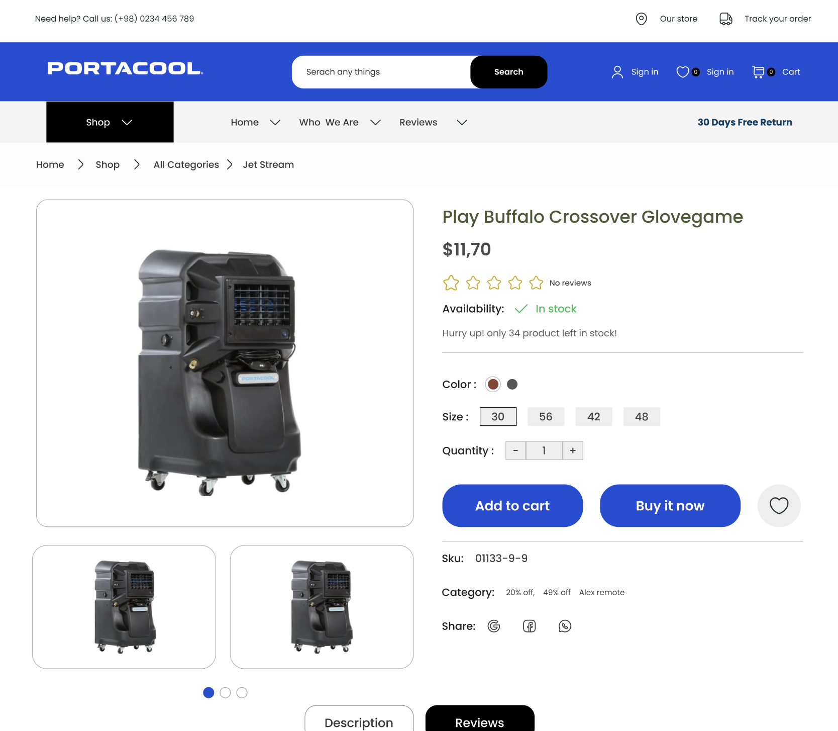
In the redesigned product pages of Portacool’s website, a notable feature is the addition of verified product ratings and authenticity proofs. This integration serves a dual purpose. Firstly, it provides potential customers with a sense of assurance about the quality and reliability of the products. Verified reviews act as a testament to the product’s performance, directly influencing the purchasing decisions of new customers. Secondly, showcasing authenticity proofs underscores the brand’s commitment to quality and transparency, fostering a deeper level of trust between Portacool and its customers.
Highlighting Product Features and Recommendations
The product pages also adopt a strategic approach to presenting product highlights and features. Rather than overwhelming visitors with information, the redesign focuses on succinctly presenting the most critical aspects of each product. This approach ensures that customers can quickly grasp the unique selling points and benefits, aiding in a more informed and confident purchase decision.
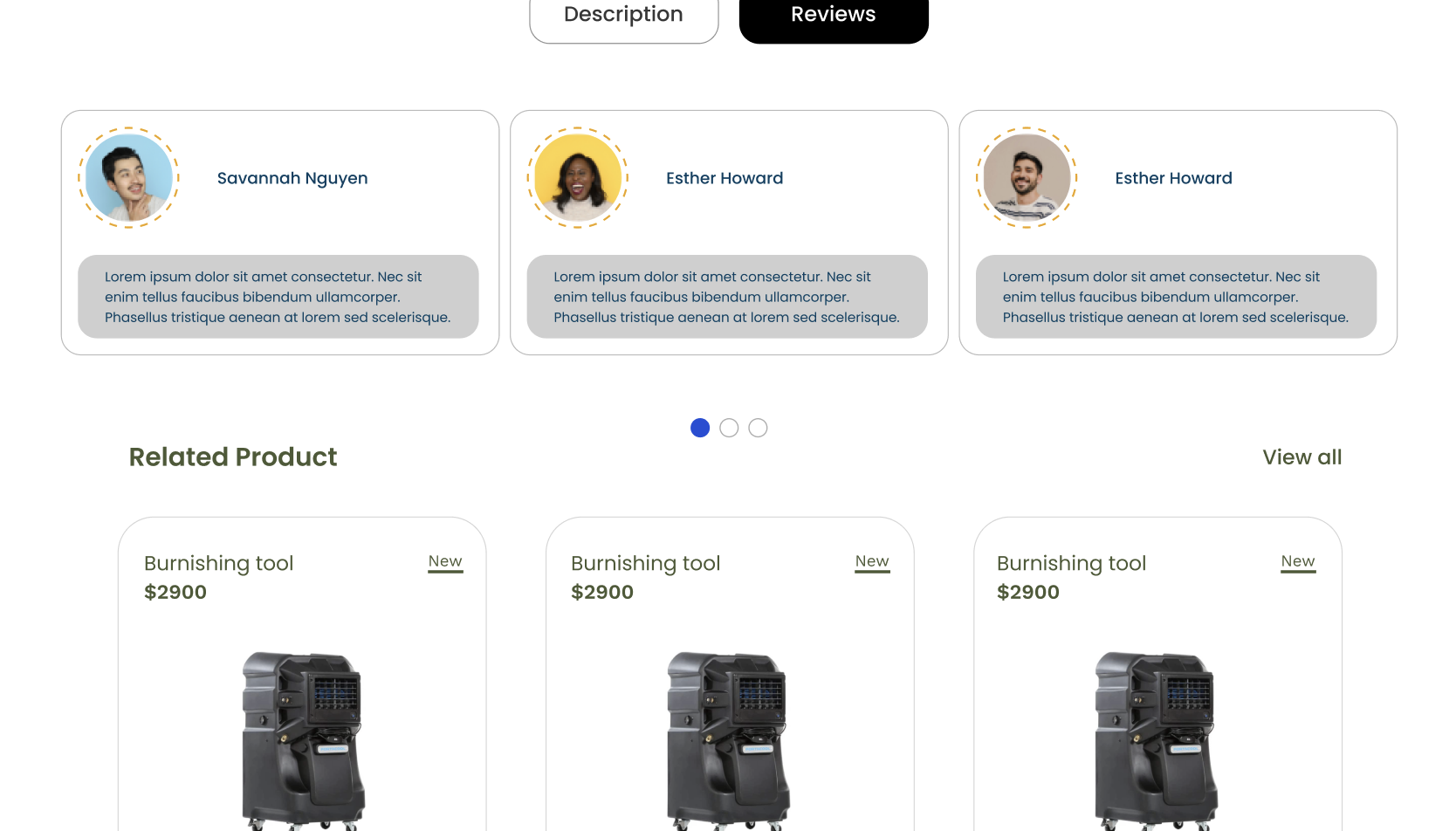
Additionally, the website leverages the power of product recommendations. By suggesting related products or higher-quality alternatives (up-selling), Portacool’s website not only enhances the shopping experience but also opens up opportunities for increased sales. For instance, recommending complementary products alongside the main item (cross-selling) can significantly enhance the overall product experience for the customer.
Conclusion
The redesign of Portacool’s website, with its focus on interactive elements and optimized user experience, sets a benchmark for modern web design in the industrial sector. It goes beyond the traditional boundaries of website design by integrating functionality that anticipates and responds to user needs. This transformation highlights the significance of evolving with technological advancements and user expectations.
For businesses with outdated websites, the message is clear: embracing a redesign is not just about keeping up with trends; it’s about staying relevant, competitive, and accessible in a rapidly changing digital world. A website is not just a platform; it’s a digital embodiment of a brand, and its design should reflect the brand’s commitment to its customers. The Portacool case is a compelling example of how a thoughtful and user-centric redesign can revolutionize a brand’s online presence, paving the way for enhanced engagement, customer satisfaction, and business growth.


