A company’s online presence can significantly impact its success. PKSafety.com, known as “The Worker Safety Specialists,” offers industrial safety products and support. This article delves into the various aspects of this redesign, showcasing how each change contributes to improved functionality, user engagement, and overall business growth.
A website redesign is not just about updating the visual aesthetics; it’s about enhancing the overall user experience, making navigation intuitive, and ensuring that the site effectively communicates the brand’s values and offerings. For PKSafety.com, the goal was to create a more engaging, user-friendly platform that would serve their customers better and set them apart from competitors with outdated, text-heavy websites.
Homepage Redesign
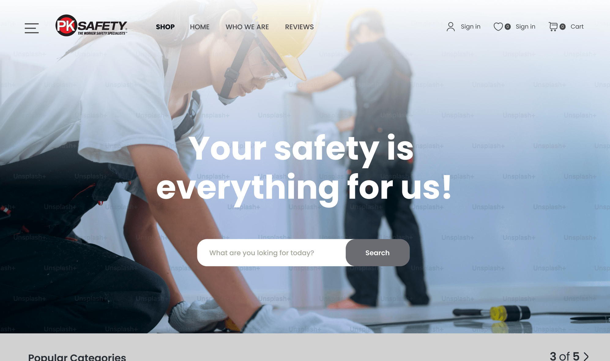
The header banner is one of the most critical elements of a homepage, acting as a digital billboard that introduces visitors to the brand. For PKSafety.com, the new header banner was designed to be visually striking and informative. This prominent feature immediately conveys the brand’s identity and core message. By incorporating high-quality images and concise, compelling text, the banner captures visitors’ attention, encouraging them to explore further.
The redesigned banner not only enhances the visual appeal but also sets a professional tone, fostering trust and confidence in the brand. This strategic change ensures that visitors understand PKSafety.com’s commitment to safety and quality from the moment they land on the page.
User Interface (UI)
The overhaul of PKSafety.com’s user interface was driven by the need to improve customer engagement and trust. A modern, clean UI design distinguishes the site from competitors and offers a more enjoyable browsing experience. The new interface emphasizes simplicity and clarity, using straightforward language and avoiding unnecessary elements that could confuse visitors.
A well-designed UI is essential for retaining customers and encouraging repeat visits. By making the site easy to navigate and aesthetically pleasing, PKSafety.com ensures that users can find the information they need quickly and efficiently. This user-friendly approach not only improves satisfaction but also builds trust in the brand’s reliability and professionalism.
Value Proposition
Highlighting the value proposition effectively is crucial for capturing the interest of visitors. PKSafety.com’s redesign places the value proposition front and center, using bold text and engaging visuals to showcase key offers and promotions. Statements like “High quality” and “50% off” are prominently displayed, immediately drawing attention and enticing visitors to learn more.
By making the value proposition a focal point, the redesign helps visitors quickly understand the benefits of choosing PKSafety.com. This approach not only enhances the user experience but also increases the likelihood of conversions, as potential customers are more likely to engage with a site that clearly communicates its advantages.
The homepage redesign for PKSafety.com exemplifies how thoughtful, strategic changes can transform a website into a powerful tool for business growth. Each element, from the header banner to the value proposition, has been meticulously crafted to enhance user experience, build trust, and set the brand apart from competitors. This comprehensive approach serves as a valuable example for any business looking to revitalize its online presence and achieve greater success.
Quick View Functionality and Hover Effects
Hover effects are a subtle yet powerful way to enhance user interaction and engagement on a website. When users hover over elements like buttons, links, or images on PKSafety.com, they experience visually appealing transitions such as color changes, size adjustments, or slight movements. These effects are not merely decorative; they serve to highlight key items and provide immediate feedback, indicating that the elements are interactive and responsive.
The implementation of hover effects on PKSafety.com enriches the browsing experience, making it more intuitive and enjoyable. These dynamic interactions capture users’ attention and guide them seamlessly through the site. By incorporating such effects, PKSafety.com ensures that visitors can easily identify clickable items and navigate the website with greater ease, ultimately leading to higher engagement and satisfaction.
Quick view functionality significantly improves the shopping experience by allowing users to preview product details without leaving the current page. On PKSafety.com, users can hover over a product and access a quick view window that displays essential information such as price, specifications, and availability. This feature is especially beneficial for customers who are browsing multiple products, as it reduces the need for constant page loading and back-and-forth navigation.
The quick view functionality streamlines the decision-making process, making it faster and more efficient for users to find and select products. This convenience not only enhances user satisfaction but also increases the likelihood of conversions. By providing a seamless and efficient shopping experience, PKSafety.com meets the needs of its customers more effectively, demonstrating a commitment to user-centered design.
Mega Menu Design
Mega menus are a sophisticated solution for websites with a large number of pages and product categories. Unlike traditional drop-down menus, which can become cumbersome and difficult to navigate, mega menus offer a clean, organized way to present a wealth of information. On PKSafety.com, the mega menu allows users to access various sections of the site quickly and easily, reducing clutter and improving navigation.
The new mega menu design on PKSafety.com categorizes products and information logically, making it simple for users to find what they are looking for. This intuitive structure helps users discover relevant products and content without feeling overwhelmed. The mega menu not only enhances the user experience but also promotes additional products and services, guiding shoppers to explore more of what PKSafety.com has to offer.
Implementation on PKSafety.com
The mega menu on PKSafety.com has been tailored to the specific needs of its users. It features clearly defined categories and subcategories, each with descriptive labels that help users quickly locate their desired products. This design minimizes the time users spend searching and maximizes their efficiency, leading to a more satisfying shopping experience.
Incorporating a mega menu has proven to be a strategic advantage for PKSafety.com. Users benefit from a more streamlined and organized navigation system, which enhances their overall interaction with the site. This thoughtful redesign showcases the importance of adapting modern web design principles to improve usability and meet the evolving expectations of customers.
By embracing these enhancements, PKSafety.com sets a high standard for user experience in the industrial safety sector. The addition of hover effects, quick view functionality, and a mega menu demonstrates a clear understanding of user needs and preferences. These changes not only make the site more attractive and engaging but also ensure that it operates efficiently and effectively. This comprehensive approach to redesign serves as a valuable model for any business aiming to update its website and improve customer satisfaction.
Product Pages
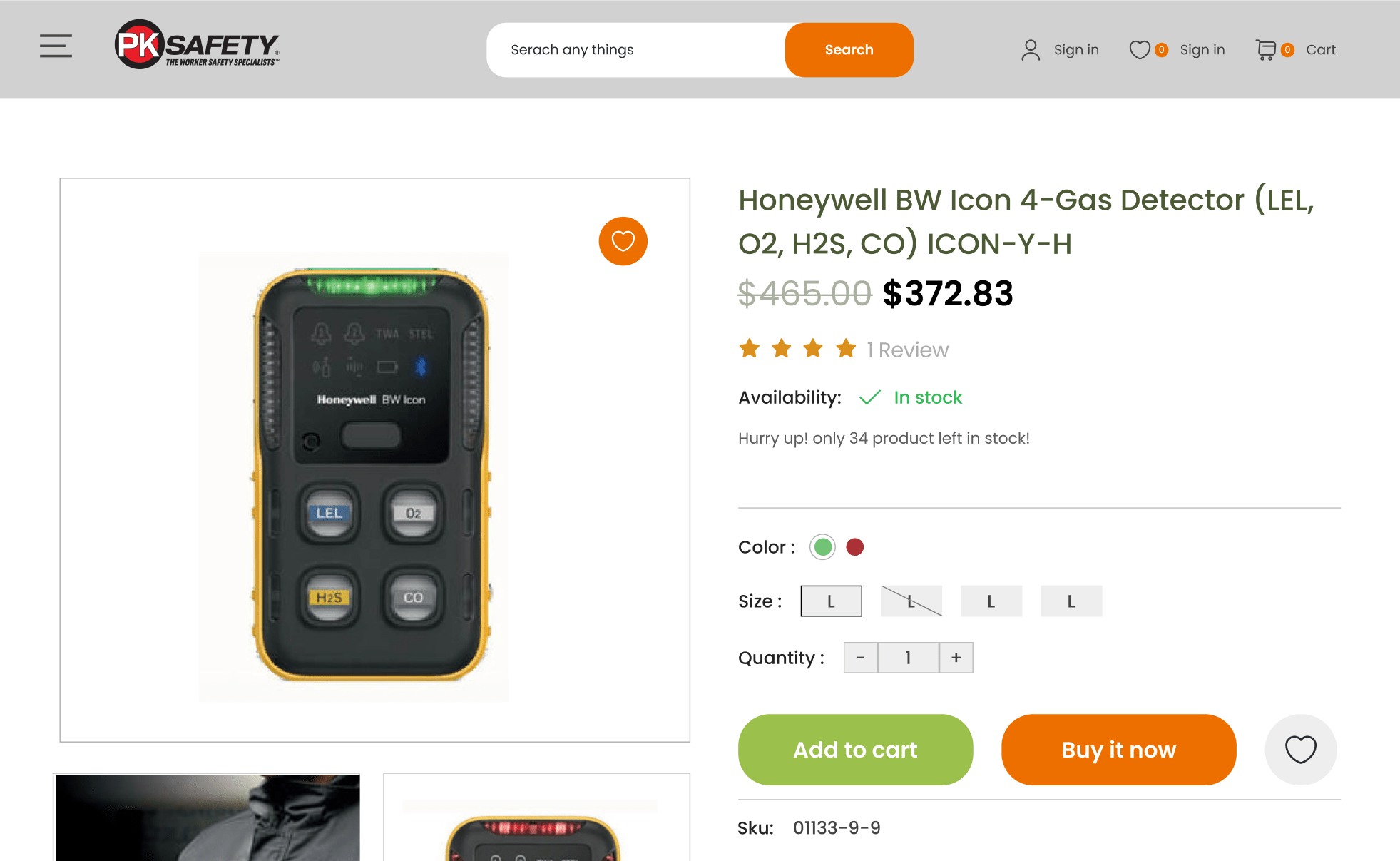
Product pages on PKSafety.com have been meticulously redesigned to enhance user trust and decision-making. One of the key elements introduced is verified product ratings. These ratings provide potential customers with genuine feedback from other buyers, offering a transparent view of the product’s quality and performance. By showcasing real customer experiences, PKSafety.com builds credibility and reassures users about their purchase decisions.
In addition to ratings, the product pages highlight certifications and proof of authenticity for select products. This information ensures that customers are aware of the high standards and reliability of the items they are considering. Such transparency is crucial in the industrial safety sector, where product quality can directly impact user safety. By providing verified ratings and proof, PKSafety.com not only boosts customer confidence but also underscores its commitment to quality and integrity.
Product Highlights and Features
Presenting product highlights and features effectively is another critical aspect of the redesigned product pages. PKSafety.com focuses on delivering essential information without overwhelming the user. Key features and benefits are prominently displayed, using concise and clear language to ensure that users can quickly grasp the most important details.
This approach helps customers make informed decisions with ease. By avoiding information overload and emphasizing the most relevant aspects, PKSafety.com ensures that users can efficiently evaluate whether a product meets their needs. This streamlined presentation not only improves the user experience but also enhances the likelihood of successful purchases.
Up-Selling and Cross-Selling
To further enhance the shopping experience, PKSafety.com has integrated up-selling and cross-selling techniques into the product pages. Up-selling involves suggesting higher-quality alternatives to the products being viewed, while cross-selling showcases complementary items that can enhance the primary product’s usability.
For example, a user viewing a pair of safety gloves might see recommendations for superior models or related products such as safety goggles and ear protection. These suggestions are strategically placed to be helpful rather than intrusive, guiding users to consider options that may better meet their needs or improve their overall safety setup. This thoughtful integration of up-selling and cross-selling not only increases average order values but also provides a more comprehensive shopping experience.
Category Pages
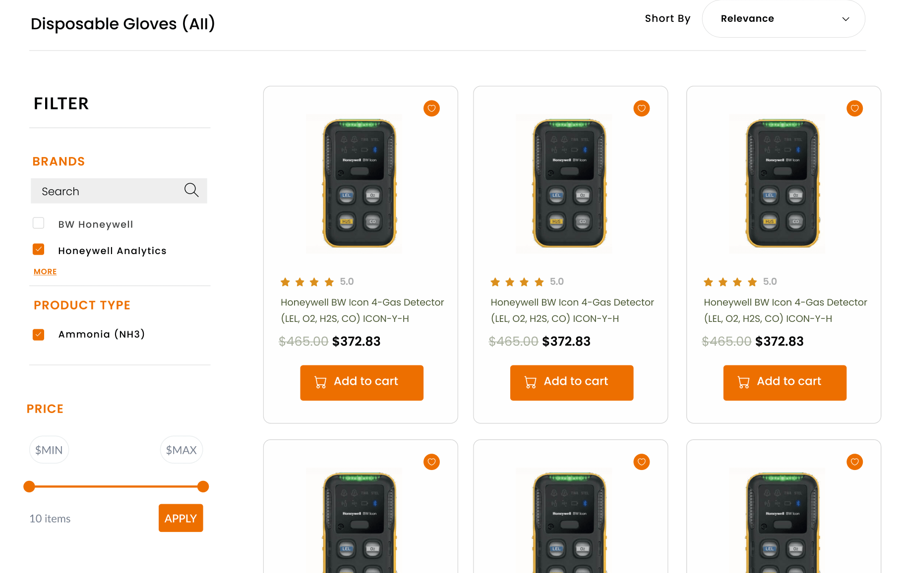
The category pages on PKSafety.com have been redesigned with a keen focus on improving the search interface. Statistics show that a significant portion of website visitors immediately use the search bar to find specific products. Recognizing this behavior, PKSafety.com has made its search interface more interactive, easy to use, and visually appealing.
An optimized search interface allows users to quickly locate the products they need, reducing frustration and improving the overall user experience. By ensuring that the search function is both efficient and intuitive, PKSafety.com caters to users’ needs more effectively, enhancing satisfaction and engagement.
Filtering System
A robust filtering system is essential for any e-commerce site, particularly those with extensive product ranges. PKSafety.com’s redesigned filtering system allows users to narrow down their search results based on various criteria such as product type, price range, and customer ratings. This feature is crucial for helping users find exactly what they are looking for without having to sift through irrelevant items.
Filters enhance user experience by making the browsing process more manageable and personalized. By offering a variety of filtering options, PKSafety.com ensures that users can tailor their search to their specific requirements, leading to a more efficient shopping process. The improved filtering system not only increases user satisfaction but also boosts conversion rates, as customers are more likely to find and purchase the products they need.
Enhanced User Experience
The overall user experience on category pages has been significantly enhanced. PKSafety.com has focused on creating a seamless and aesthetically pleasing interface that guides users effortlessly through their product search. The layout is clean and organized, making it easy for users to navigate through different categories and find relevant products.
In addition to visual improvements, the functionality of category pages has been optimized to load quickly and provide real-time updates as users adjust their filters or search criteria. This responsiveness is crucial for maintaining user engagement and satisfaction, as it minimizes waiting times and ensures a smooth browsing experience.
By redesigning the category pages with these enhancements, PKSafety.com sets a new standard for user-centric design in the industrial safety market. These improvements not only make the site more appealing and efficient but also demonstrate a commitment to meeting the evolving needs of customers. This thoughtful approach to redesign serves as an exemplary model for other businesses seeking to update their websites and improve their online presence.
Conclusion
These changes are not merely aesthetic; they represent a thoughtful approach to web design that prioritizes user needs and behaviors. By making the site more accessible, engaging, and easy to navigate, PKSafety.com has positioned itself as a leader in the industrial safety sector. This redesign serves as a model for other businesses, illustrating how modernizing an online presence can lead to increased customer satisfaction, higher conversion rates, and sustained business growth.
In a digital age where user expectations are continually evolving, it is crucial for businesses to regularly assess and update their websites. The success of PKSafety.com’s redesign highlights the importance of staying current with design trends and user experience best practices. For any business looking to enhance its online presence, a comprehensive redesign is not just beneficial; it is essential. By embracing these changes, companies can ensure they remain competitive, relevant, and responsive to their customers’ needs.


