In today’s fast-paced digital landscape, a business’s website is often the first point of contact with potential customers. MaxTool.com, a leading provider of tools, equipment, and much more, recognized the necessity of modernizing its online presence to meet the evolving expectations of its users. A comprehensive website redesign can significantly enhance user experience, improve engagement, and ultimately drive sales. This article delves into the meticulous redesign process of MaxTool.com, highlighting the key changes and the rationale behind them. By examining this case study, businesses can gain insights into the tangible benefits of a well-executed website overhaul and understand why updating an outdated website is crucial for staying competitive.
Homepage Redesign
Header Banner
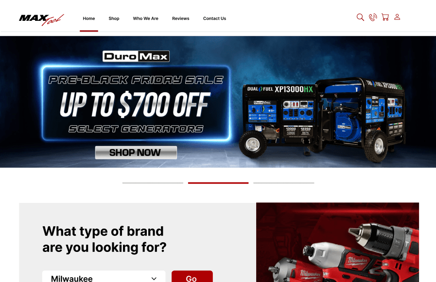
The homepage header banner is the most prominent marketing opportunity on any website, serving as the digital equivalent of a storefront window. For MaxTool.com, the new header banner was designed to immediately convey the brand’s identity and core values.
This vibrant, eye-catching element not only captures visitors’ attention but also sets the tone for their entire browsing experience. By prominently displaying key messages and promotions, the banner serves as a powerful tool to communicate MaxTool’s offerings and engage visitors from the moment they land on the site.
New User Interface
The user interface (UI) redesign was a pivotal component of the MaxTool.com overhaul. An intuitive, aesthetically pleasing UI is critical for retaining visitors and building trust. The new design emphasizes simplicity and clarity, avoiding unnecessary elements that could confuse users. This streamlined approach ensures that customers can easily navigate the site, find the products they need, and make purchases with confidence. A modern UI also distinguishes MaxTool from competitors with outdated, text-heavy websites, making it clear that MaxTool is committed to providing a superior user experience.
Banner Ads
Banner ads play a crucial role in online marketing, offering a measurable and effective way to promote products and brands. On MaxTool.com, strategically placed banner ads were incorporated to highlight special offers and new arrivals. These visually appealing ads are designed to blend seamlessly with the overall site aesthetic while driving traffic to specific product pages. By integrating banner ads into the homepage, MaxTool can continually engage visitors with fresh, relevant content, encouraging repeat visits and boosting sales.
Accessibility
Ensuring that a website is accessible to all users, including those with disabilities, is not just a legal requirement but also a moral imperative. The redesigned MaxTool.com homepage was developed with accessibility in mind, featuring high-contrast text, easily navigable menus, and alternative text for images. These enhancements make the site usable for a broader audience, demonstrating MaxTool’s commitment to inclusivity. Accessible design is not only beneficial for users but also enhances the site’s overall functionality and user experience.
Value Proposition
A clear and compelling value proposition is essential for capturing the interest of visitors and converting them into customers. The new MaxTool.com homepage prominently displays the company’s unique selling points, such as high-quality products, competitive prices, and limited-time offers. These elements are designed to immediately catch the eye of visitors, encouraging them to explore further. By effectively communicating its value proposition, MaxTool can differentiate itself from competitors and build a loyal customer base.
In summary, the homepage redesign of MaxTool.com exemplifies how a well-planned and executed overhaul can transform a website into a powerful marketing tool. Each change was made with the user in mind, focusing on enhancing engagement, improving accessibility, and clearly conveying the brand’s value. This case study serves as a reminder of the importance of keeping a website up-to-date to meet modern standards and user expectations.
Category Pages Optimization
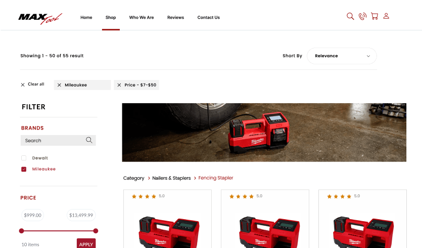
Category pages are essential for helping customers navigate a website and find the products they need efficiently. For MaxTool.com, optimizing these pages was a critical aspect of the redesign, focusing on improving the search interface and the filtering system to enhance user experience.
Search Interface
According to Forrester Research, 43% of website visitors immediately head to the search bar on e-commerce websites. Recognizing this, the redesigned MaxTool.com search interface is interactive, easy to use, and visually appealing. The intuitive design helps users find products quickly, increasing engagement and satisfaction. Engaged searchers are 1.8 times more likely to convert than non-searchers, making a robust search feature a significant driver of sales. An optimized search bar ensures that customers can easily locate the tools and equipment they need, streamlining their shopping experience.
Filtering System
For websites with extensive product ranges, like MaxTool.com, a robust filtering system is indispensable. The redesigned filtering system allows users to narrow down product selections based on various criteria such as price, brand, and specifications. This functionality not only improves the user experience but also increases the likelihood of conversions. Research shows that adding filters can boost a website’s conversion rate by 26%. By fixing issues with filter design and usability, MaxTool.com ensures that customers can find exactly what they’re looking for without frustration, leading to higher satisfaction and repeat business.
Product Pages Enhancement
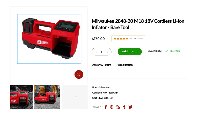
Product pages are where customers make their purchasing decisions, so their design and functionality are crucial. MaxTool.com’s product pages were enhanced to build trust, highlight key features, and promote additional relevant products through up-selling and cross-selling techniques.
Product Ratings and Proof
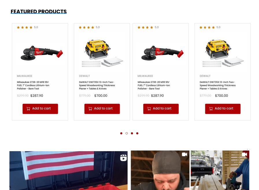
Adding verified product ratings and reviews was a significant improvement. Customers rely heavily on reviews to make informed decisions. Verified ratings provide assurance of product quality and reliability, helping customers feel confident in their purchases. This transparency builds trust and can significantly influence buying behavior. By showcasing genuine customer feedback, MaxTool.com demonstrates a commitment to quality and customer satisfaction.
Mega Menu Implementation
Effective navigation is a cornerstone of a successful e-commerce website, and the mega menu implementation for MaxTool.com was a strategic enhancement aimed at improving user experience and facilitating easier access to a wide range of products.
Advanced Mega Menu
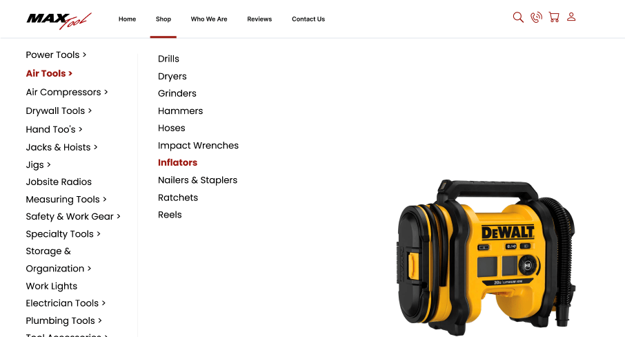
The redesigned MaxTool.com features a sophisticated mega menu that offers a premium navigation solution. Unlike traditional dropdown menus, which can become cumbersome and difficult to read as options increase, a mega menu organizes content into comprehensive, easy-to-navigate sections. This approach allows customers to quickly find the categories and products they are interested in without feeling overwhelmed.
Benefits of Mega Menus
Mega menus reduce visual clutter and streamline the navigation process. By grouping related items together and using clear headings, users can easily scan the menu to find what they need. This not only speeds up the shopping process but also enhances overall user satisfaction. For MaxTool.com, implementing a mega menu meant that customers could effortlessly explore the extensive product offerings, from power tools to safety equipment, with minimal effort.
Additionally, mega menus provide an excellent opportunity to promote relevant products and special offers. By strategically placing high-interest items and promotions within the menu, MaxTool.com can guide customers towards featured products, increasing the likelihood of higher sales and customer engagement. This organized and visually appealing structure helps in maintaining a clean and professional website look while ensuring that important content is easily accessible.
Quick View Functionality and Hover Effects
Enhancing user experience through interactive elements is crucial for retaining customers and encouraging them to explore more products. The implementation of quick view functionality and hover effects on MaxTool.com significantly improved the shopping experience by making product interactions more dynamic and efficient.
Quick View Functionality
Quick view functionality allows customers to preview product details without navigating away from the current page. This feature is particularly beneficial for users who are browsing multiple items and want to quickly compare products without the hassle of loading multiple product pages. By providing essential information such as price, key features, and images in a pop-up window, quick view makes the shopping process faster and more convenient.
For MaxTool.com, this functionality means that customers can make informed decisions more quickly, leading to higher conversion rates. It also reduces the frustration of having to click back and forth between pages, creating a smoother and more enjoyable shopping experience. Quick view helps in keeping customers engaged, reducing bounce rates, and increasing the likelihood of completing a purchase
Importance of Interactive Elements
Both quick view functionality and hover effects contribute to a more dynamic and responsive website. They help to create a seamless user experience, reducing the steps needed to find and understand product details. For businesses with outdated websites, incorporating these interactive elements can significantly enhance usability and customer satisfaction.
In conclusion, the mega menu implementation and the addition of quick view functionality and hover effects on MaxTool.com demonstrate how thoughtful design changes can greatly improve the usability and appeal of a website. By making navigation easier and interactions more engaging, these updates ensure that customers have a positive shopping experience, which is essential for maintaining competitiveness in the digital marketplace.
Conclusion
The comprehensive redesign of MaxTool.com exemplifies how strategic website updates can transform user experience and drive business success. Each change, from the homepage enhancements to the implementation of advanced navigation tools, was made with the user in mind. These improvements not only modernized the site but also made it more accessible, engaging, and user-friendly.
Enhancing User Experience
One of the most significant benefits of the redesign is the enhanced user experience. A modern, intuitive user interface combined with dynamic elements like quick view functionality and hover effects ensures that visitors can easily find and interact with products. These features make the shopping process more efficient and enjoyable, reducing frustration and increasing the likelihood of conversions. For any business, a user-centric design is essential for retaining customers and encouraging repeat visits.
Improving Accessibility and Navigation
The redesigned homepage, with its accessible design and advanced mega menu, makes it easier for all users to navigate the site. Accessibility features ensure that users with disabilities can fully engage with the content, reflecting MaxTool’s commitment to inclusivity. The mega menu’s organized structure reduces clutter and allows customers to quickly locate the products they need, enhancing overall site usability.
Interactive elements like banner ads, quick view functionality, and up-selling and cross-selling techniques are designed to keep visitors engaged and encourage them to explore more products. These features not only enhance the shopping experience but also help increase average order values and overall sales. Effective use of these tools can significantly boost a website’s performance and profitability.
For businesses with outdated websites, the MaxTool.com redesign serves as a powerful reminder of the importance of staying current with web design trends and user expectations. A well-maintained, modern website is more likely to attract and retain customers, compete effectively in the market, and adapt to changing technological landscapes. Regular updates and redesigns are essential to ensure that a website remains relevant and functional.
Final Thoughts
In summary, the redesign of MaxTool.com highlights the profound impact that thoughtful, user-focused changes can have on a website’s effectiveness. By prioritizing user experience, accessibility, and engagement, businesses can create a powerful online presence that drives customer satisfaction and business success. Updating an outdated website is not just a cosmetic change; it’s a strategic investment in the future of the business. The MaxTool.com case study underscores the value of continuous improvement and innovation in web design, encouraging all businesses to consider the benefits of a well-executed website overhaul.


