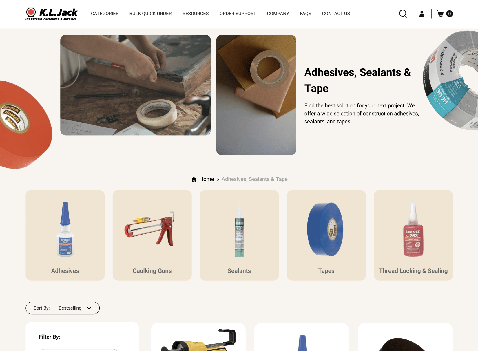
KL Jack has stood as a beacon for industrial fasteners and supplies for over four decades. With an impressive inventory boasting over 30 million pieces in stock, their legacy is undisputed. However, in the constantly evolving world of digital commerce and online branding, even giants need to adapt and reinvent. This principle underscores the significance of KL Jack’s website redesign.
At the dawn of the internet age, websites were simple, static, and served merely as online business cards. But as the internet grew, so did the expectations of its users. Today, a website is not just a point of contact—it’s a dynamic platform that can make or break the first impression, drive customer engagement, and cement brand loyalty.
Redesigning a website isn’t just about giving it a fresh coat of paint. It’s about reassessing the brand’s values, understanding the evolving needs of its clientele, and ensuring that the digital experience is seamless, engaging, and above all, intuitive. KL Jack’s redesign is a testament to this philosophy. It’s a deep dive into modern design paradigms that prioritize user experience, accessibility, and engagement.
However, let’s be clear—this isn’t about blindly chasing the latest design trends. It’s about recognizing the shifts in user behavior, the advancements in design technology, and the broader changes in the digital marketplace. It’s about acknowledging that, to stay relevant and competitive, businesses must evolve. Not just KL Jack, but any brand with an online presence, especially those with legacy websites, should periodically revisit their digital strategies. Not as a nod to the aesthetics of the times, but as a commitment to their users and a nod to the future.
In the upcoming sections, we will unpack the intricate layers of KL Jack’s website overhaul, delving into the rationale behind each design choice, and highlighting the tangible benefits they bring.
For businesses still contemplating a redesign, consider this: in a world where attention spans are shrinking, and choices are abundant, your website is often your first and sometimes only chance to communicate your brand’s value. Don’t let an outdated design narrate your story.
Importance of Homepage Design
Imagine walking into a store: the ambiance, the decor, and the arrangement—every element speaks volumes about the brand. It sets the tone for your experience and guides your journey through the store. The digital realm is no different. In this space, your homepage is the first step inside the store.
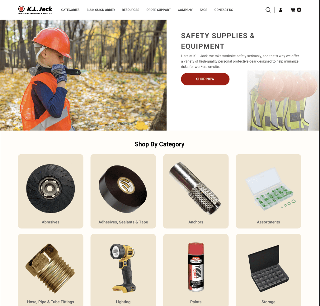
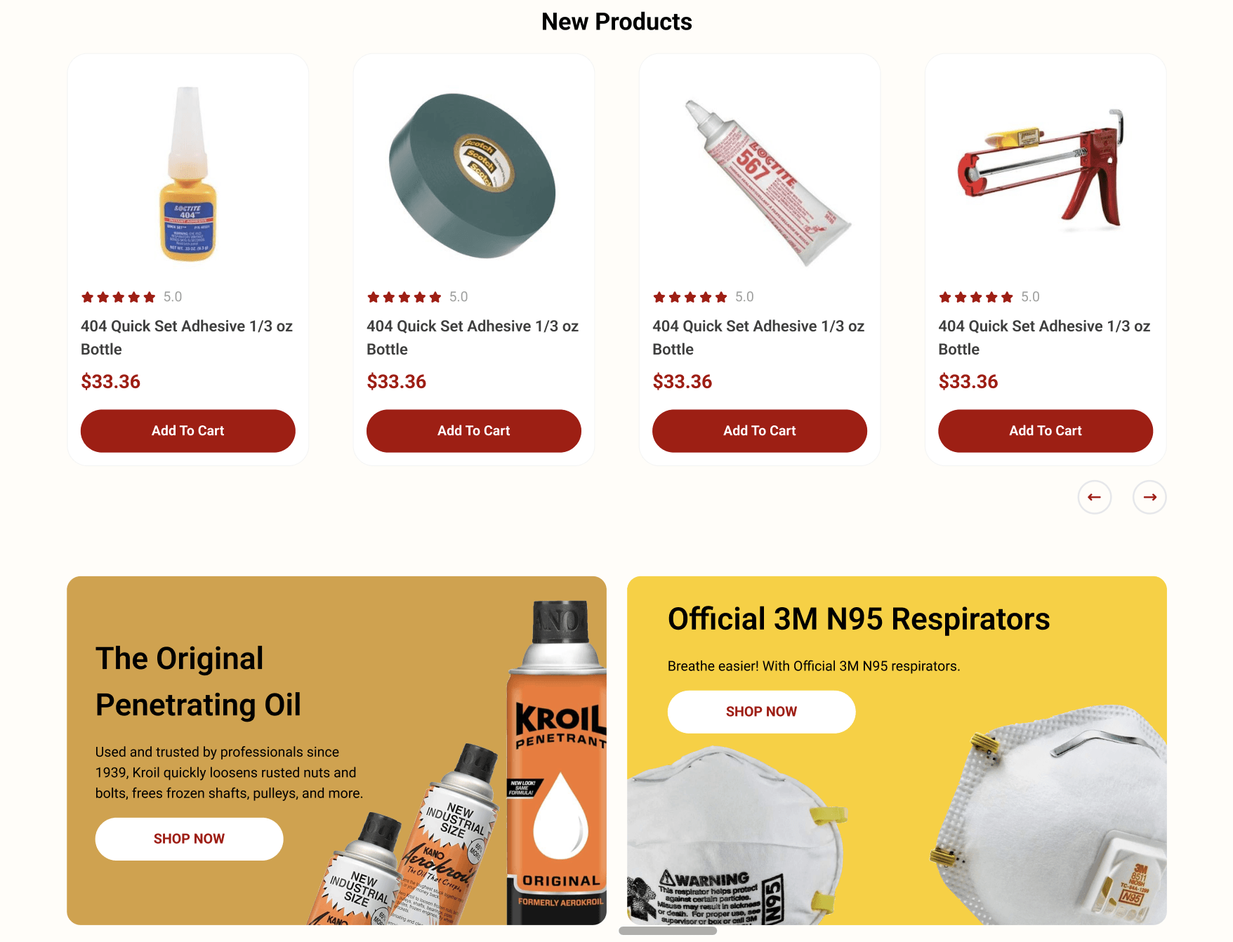
It’s the digital storefront, the handshake, and the introductory “hello.” KL Jack recognized this vital role the homepage plays and transformed theirs into an immersive experience, balancing brand identity, user experience, and modern aesthetics.
I. The Role of Header Banners
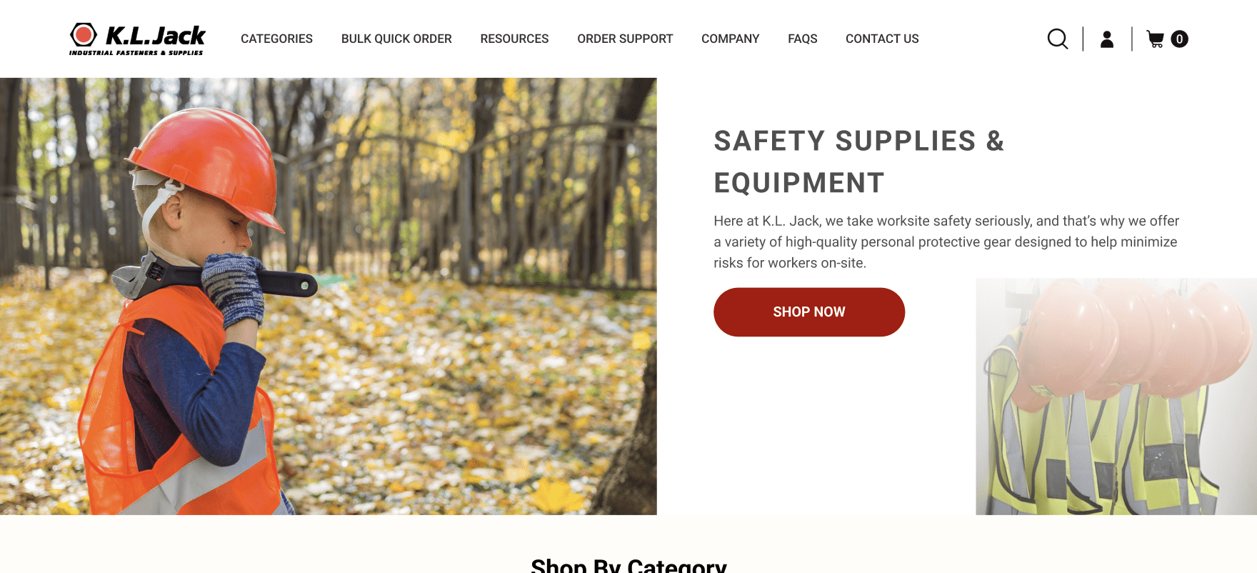
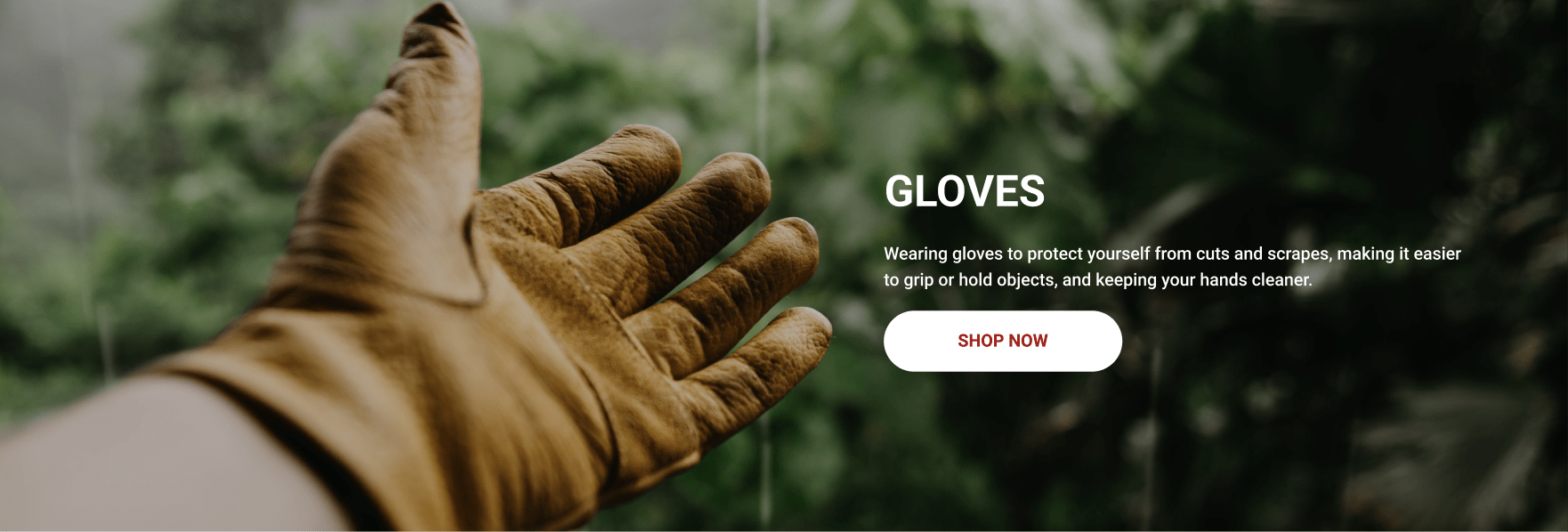
In the world of visual storytelling, the header banner is the protagonist. It’s the first visual cue a visitor gets, akin to a storefront window display. It doesn’t merely announce what the brand is about—it encapsulates its essence, its promise, and its unique value. KL Jack’s new header banner isn’t just a static image; it’s a dynamic billboard that narrates the brand’s legacy, ethos, and offerings. In an age where users decide within seconds whether to explore further or leave, the header banner acts as the anchor, subtly urging them to delve deeper.
Real-world data and analytics often highlight the immense potential a well-designed header holds. By simply optimizing this space, brands can experience a notable uptick in user engagement, retention, and conversion. However, it’s not just about being visually striking—it’s about being relevant, resonant, and reflective of the brand’s core values.
II. Simplistic and Engaging User Interface
The mantra for the modern digital age could very well be “less is more.” With information overload being a real challenge, websites that prioritize simplicity, clarity, and intuitive design often stand out. KL Jack’s redesigned homepage is a masterclass in this approach. By trimming the excess and focusing on essential elements, the new design ensures that visitors aren’t overwhelmed but are engaged.
It’s not uncommon for brands, especially those with a rich legacy like KL Jack, to have a treasure trove of information. But in the digital space, presentation is paramount. Outdated websites often feel like cluttered warehouses, whereas modern sites, like KL Jack’s, feel like curated galleries. This transformation is not just an aesthetic upgrade—it’s a strategic decision to enhance user trust, engagement, and brand perception.
III. Accessibility Matters
The digital world should be inclusive, and a well-designed homepage is the first step in that direction. KL Jack’s homepage is not just designed for the average user; it’s crafted keeping in mind the diverse spectrum of its audience. Accessibility isn’t an afterthought—it’s integrated into the core design philosophy. Key elements are positioned strategically, ensuring that every user, regardless of how they interact with the site, has a seamless experience.
In the broader context, embracing accessibility is not just about complying with standards; it’s about acknowledging and valuing every visitor. As brands like KL Jack lead the way, it becomes evident that true digital progress lies in universally welcoming designs.
IV. Banner Ads and Their Effectiveness
Integrating banner ads on a homepage might seem counterintuitive for some, especially when the focus is on clean design. However, when done right, they serve as effective tools to spotlight offers, products, or features without disrupting the user journey. KL Jack’s approach to banner ads is strategic, ensuring they enhance the user experience by providing value, be it in the form of exclusive offers or essential information.
It’s a delicate balance—integrating commercial elements without diluting the brand experience. But the redesigned KL Jack homepage showcases how, with thoughtful design, banner ads can be more than just advertisements; they can be integral parts of the brand story.
In summary, a homepage is more than just a digital address. It’s the brand’s handshake, its story, and its promise—all rolled into one. As we can see from the new design, revisiting and redesigning this space isn’t about mere aesthetics; it’s about staying attuned to the changing digital landscape, user behaviors, and the brand’s own evolving story. In this digital age, it’s not just about having a presence; it’s about making that presence felt, understood, and valued.
Navigating with Mega Menus
The digital ecosystem is vast, intricate, and brimming with information. Imagine navigating such a vast expanse without clear signposts or a map. The challenge is real, especially for websites that house a plethora of content, categories, or products. For sites like KL Jack, with a vast inventory and diverse offerings, the challenge isn’t just about presenting products—it’s about presenting them accessibly, logically, and intuitively. Enter the concept of Mega Menus.
I. Understanding the Mega Menu Evolution
Traditional drop-down menus were once the staple of website navigation. Simple and straightforward, they served the purpose when websites were modest in their scope. However, as digital platforms expanded and content proliferated, the humble drop-down menu started revealing its limitations. It’s here that mega menus emerged as a robust solution, addressing the contemporary needs of expansive websites.
II. Why Mega Menus?
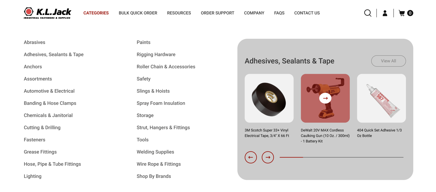
A mega menu, as the name suggests, is a comprehensive, structured, and visually coherent navigation panel. It provides users with an overview at a glance, offering direct access to multiple categories or sub-categories within a site. The advantages are manifold:
- Clarity: Unlike traditional drop-downs, which often lead users down a rabbit hole of endless sub-menus, mega menus lay everything out clearly. The user can see the breadth and depth of options without multiple clicks.
- Efficiency: By presenting various sections and sub-sections concurrently, mega menus reduce navigation time. Users can jump to their desired section without navigating through a maze.
- Enhanced User Experience: A well-designed mega menu isn’t just functional—it’s aesthetic. With the ability to integrate images, icons, and even brief descriptions, mega menus can be both informative and visually appealing, enhancing the overall user experience.
III. Mega Menus and eCommerce
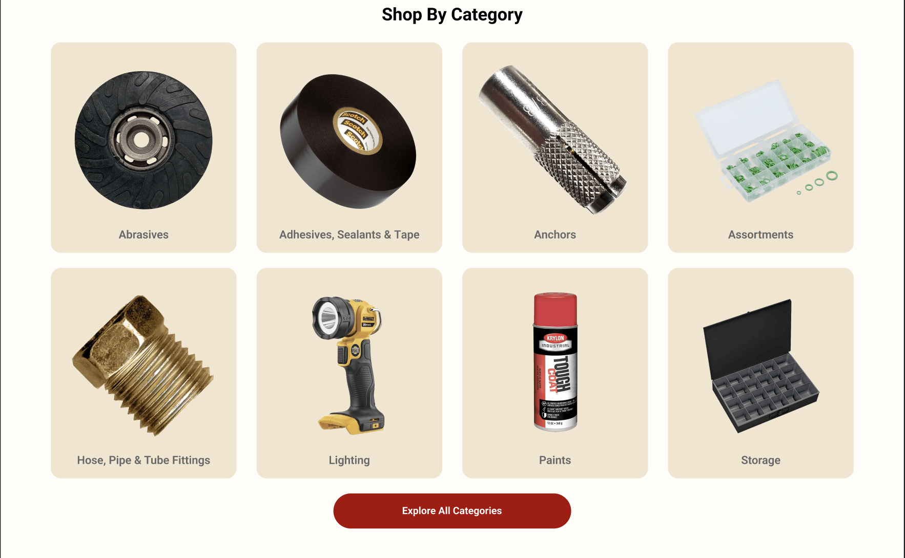
KL Jack’s business model, with its expansive product range, benefits immensely from the mega menu approach. Especially in the e-commerce realm, where quick and efficient navigation can significantly influence a purchasing decision, mega menus are not just an add-on—they’re a necessity. By categorizing products logically and presenting them visually, mega menus streamline the shopping journey. They help in reducing decision fatigue, ensuring users find what they’re looking for without feeling overwhelmed.
Enhancing User Experience on Category Pages
Diving into the world of e-commerce can be likened to exploring a vast digital marketplace. Each aisle or category, much like in a brick-and-mortar store, promises a new discovery, a new product, a new experience. But what if these aisles were convoluted, messy, or hard to navigate? That’s where the design and functionality of category pages come into play, and why KL Jack placed a particular emphasis on refining this crucial touchpoint in their digital journey.
I. Recognizing the Role of Category Pages
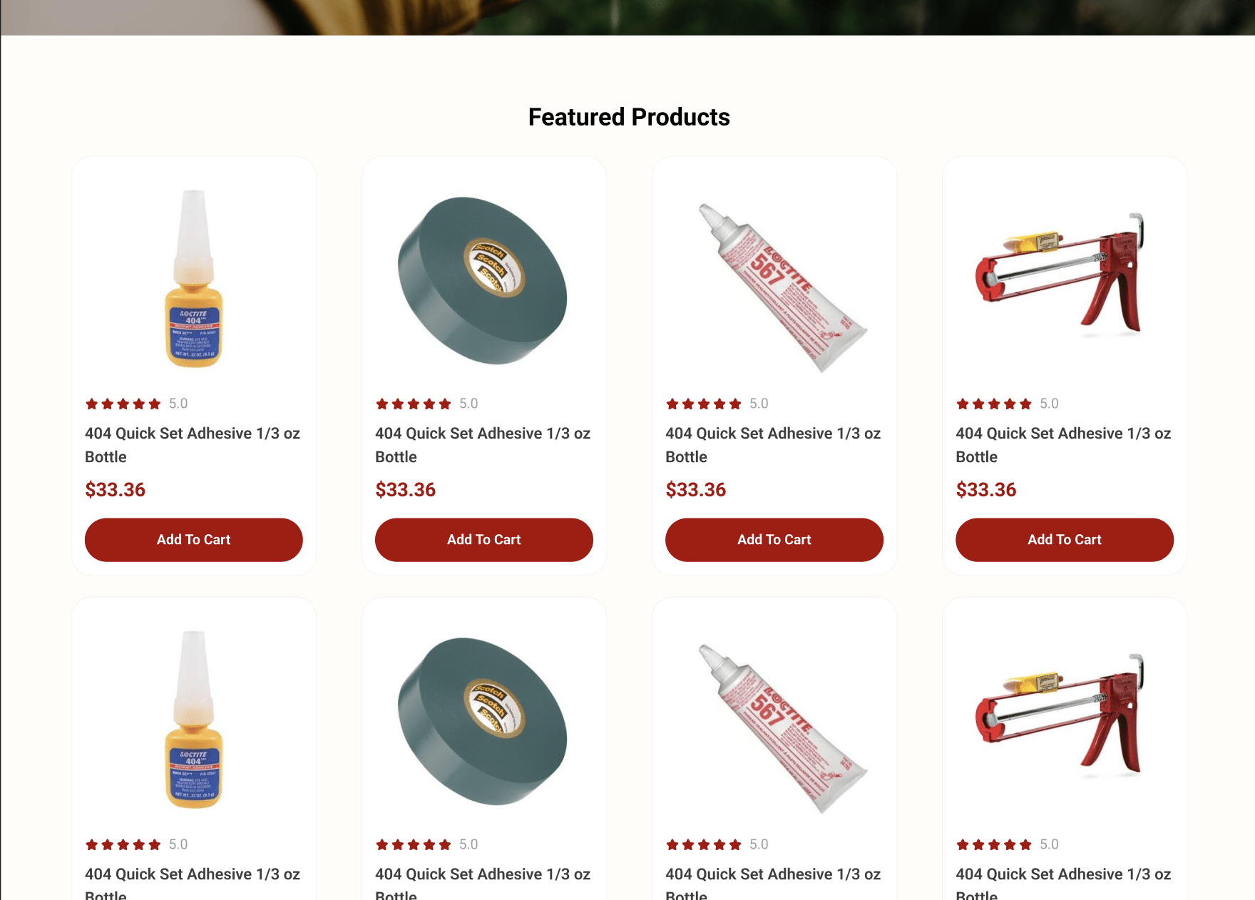
Category pages are more than just intermediary steps between the homepage and the product page. They are, in essence, the compass guiding users through a brand’s diverse offerings. When done right, they can elevate the user experience, making product discovery not just easy but enjoyable.
II. The Power of Optimized Search Interfaces
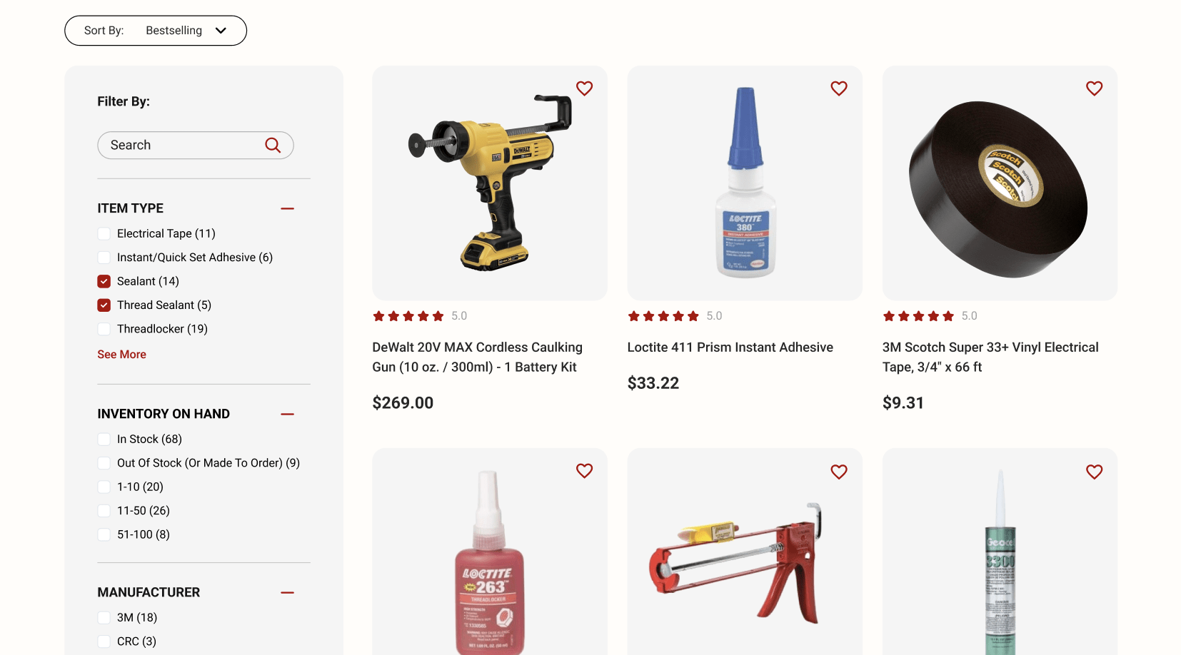
Forrester Research’s insights offer a compelling testament to the importance of an effective search interface, revealing that a significant chunk of website visitors naturally gravitate toward the search and filter bar. It isn’t just a tool—it’s an integral part of the user’s exploration journey.
KL Jack has tapped into this behavior by ensuring their search interface is:
- Interactive: Engaging users from the get-go and prompting them to dive deeper into their product exploration.
- Easy to Use: Minimizing friction and making the search experience smooth and intuitive.
- Aesthetically Pleasing: Marrying form with function, so that users are drawn to use the search function, not just out of necessity, but due to its appealing design.
III. Embracing the Potential of Filters
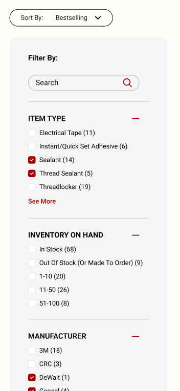
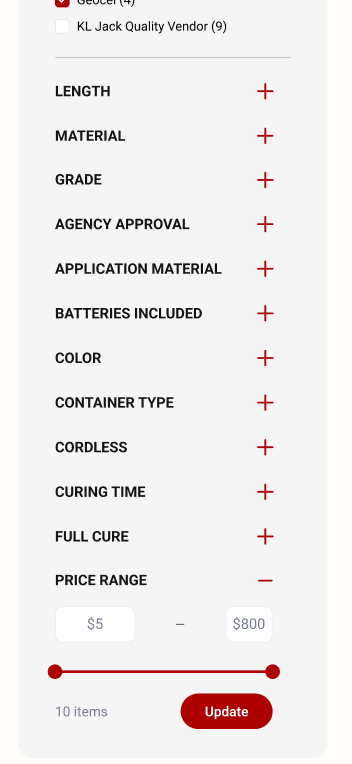
With an extensive array of products, filters become the unsung heroes of the e-commerce world. They help users navigate vast product lists, allowing them to pinpoint exactly what they’re looking for. But KL Jack didn’t stop at merely adding filters—they optimized them.
Intuitive filters present the dual advantage of product diversity and a streamlined user experience. When users can efficiently sort through categories, brands, price ranges, and more, they’re not just finding products—they’re discovering what KL Jack truly has to offer. As various studies suggest, even a simple addition or optimization of filters can significantly drive conversions.
Product Pages: Building Trust and Boosting Sales
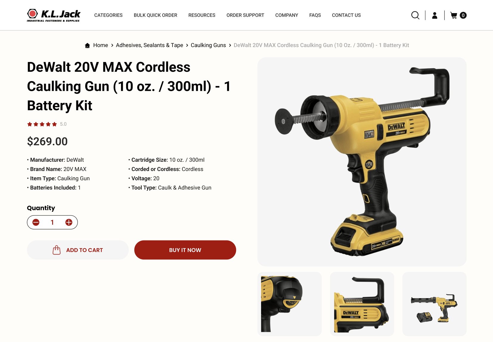
In the vast marketplace of the internet, a product page is where the magic happens. It’s the final frontier, the stage where products are showcased, and where decisions are made. For KL Jack, understanding the nuances and potential of product pages was pivotal, ensuring that when a visitor lands on one, it isn’t just informative but influential.
I. Leveraging Verified Product Ratings
In today’s digital age, trust is currency. Customers lean heavily on reviews and ratings, relying on the experiences of peers to guide their choices. By integrating verified product ratings, KL Jack not only assures potential customers of product quality but also provides tangible evidence of the same. This transparency fosters trust, nudging the user closer to making a purchase decision.
II. Showcasing Product Highlights
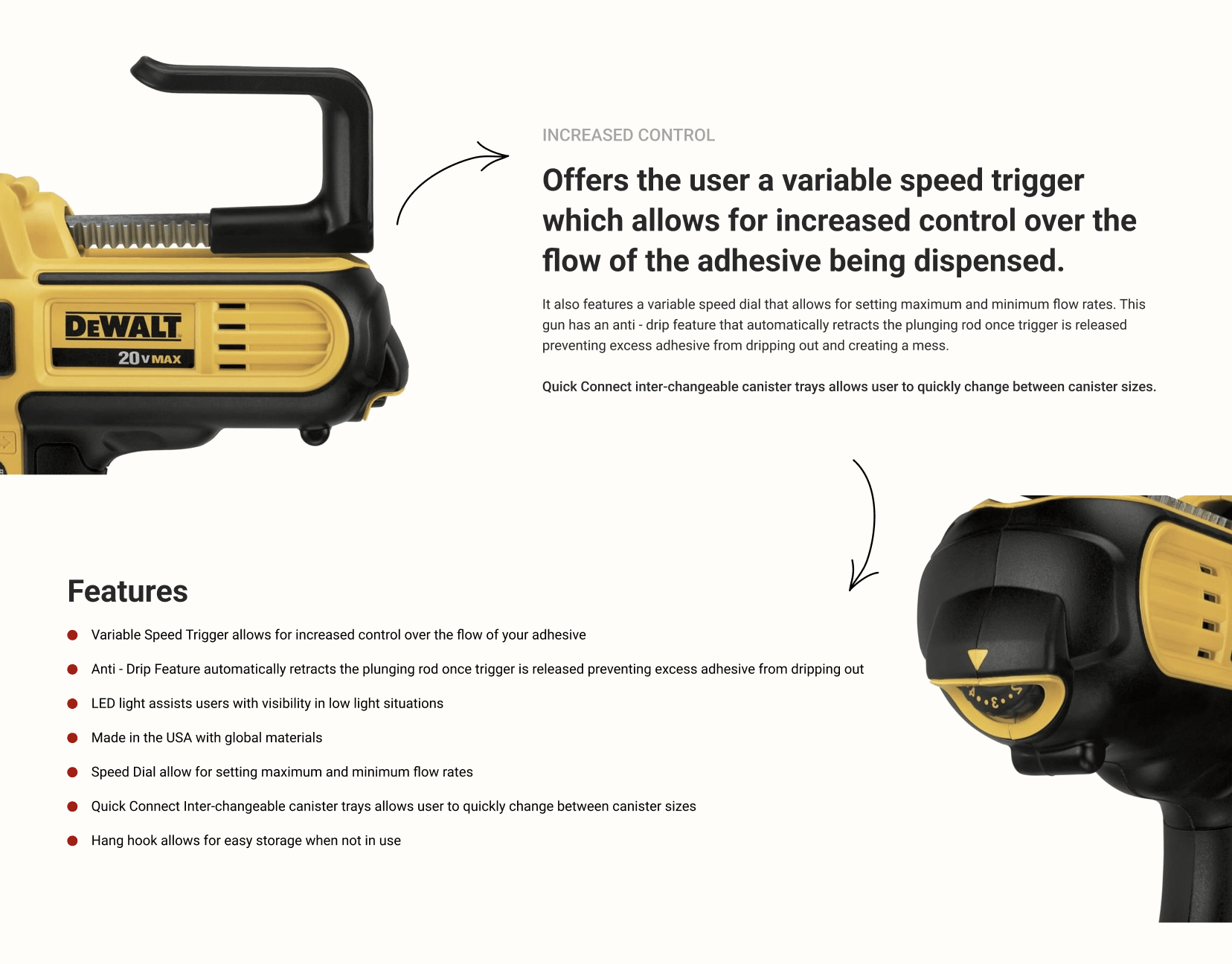
In an era of information overload, simplicity stands out. Rather than inundating visitors with excessive details, KL Jack’s product pages are designed to highlight the essential features without overwhelming the viewer.
This crisp presentation ensures that visitors can quickly grasp the product’s value, making the decision-making process smoother.
III. Mastering the Art of Upselling and Cross-selling
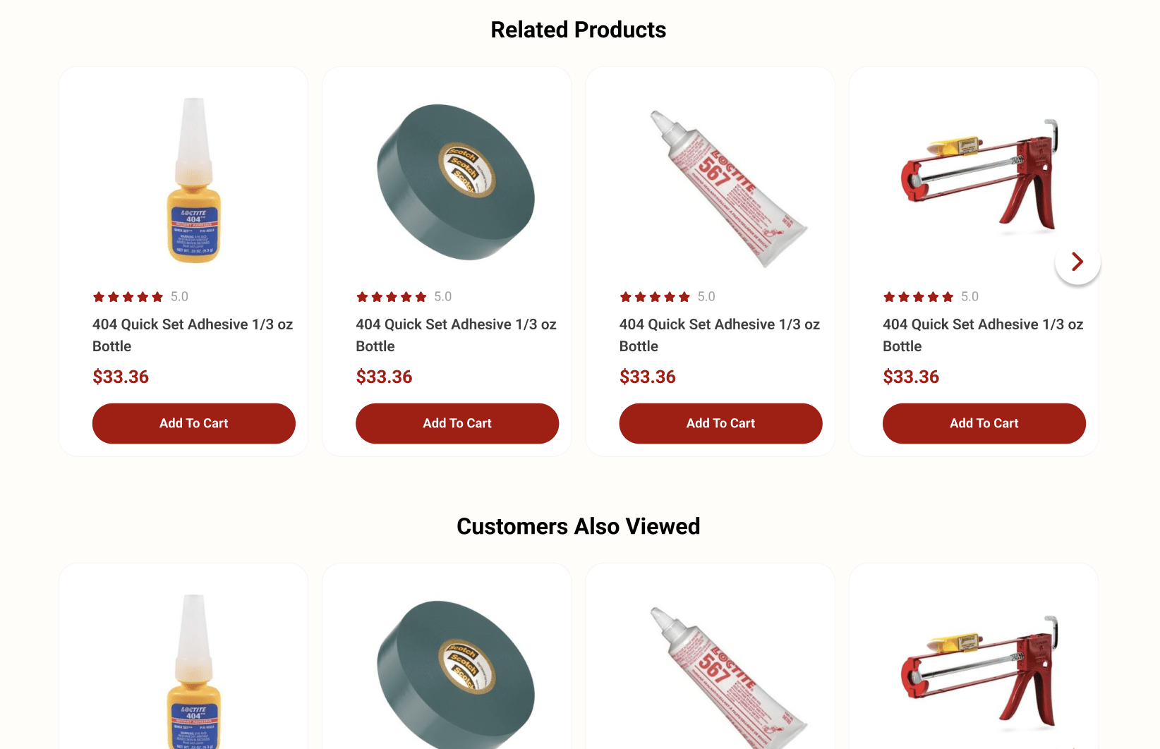
Sales, at its core, is both an art and a science. KL Jack’s approach to recommendations, upselling, and cross-selling is a testament to this. By showcasing complementary products or superior alternatives, they not only enhance the customer’s potential product experience but also increase the opportunity for sales. It’s a delicate balance between suggesting and selling, and KL Jack seems to have found the sweet spot.
Sticky Add to Cart: A Game-Changer
As users scroll and explore the depths of a product page, one element remains consistent, serving as a gentle reminder of their potential purchase—the Sticky Add to Cart feature.
I. Understanding Sticky Add to Cart
Imagine shopping in a physical store with your shopping basket magically following you, always within reach, making it effortless to add items. The Sticky Add to Cart feature mirrors this experience in the digital realm. As users delve deeper into product descriptions, reviews, or related items, the ever-present cart button ensures they never have to hunt to take the next step.
II. Boosting Conversions
It might seem like a minor tweak, but the implications are significant. With an increase in orders by 8% attributed to the Sticky Add to Cart feature, it’s evident that simplifying the user journey has direct benefits. By reducing friction and keeping the call-to-action consistently in view, KL Jack has capitalized on the principle that ease often leads to action.
III. A Testament to Thoughtful Design
While the Sticky Add to Cart feature is but one element of KL Jack’s redesign, it epitomizes the brand’s commitment to thoughtful design. Every aspect, no matter how seemingly minor, is geared towards improving the user experience and driving business results.
In summary, as the digital landscape becomes increasingly competitive, businesses like KL Jack are setting the standard. Their approach to product pages and innovative features such as the Sticky Add to Cart emphasizes that success in e-commerce isn’t just about having great products—it’s about creating an impeccable user journey. It serves as a gentle reminder to brands everywhere that in the digital age, evolution isn’t just beneficial—it’s essential.
Conclusion
In the ever-evolving realm of the digital world, websites are more than mere portals; they’re the first handshake, the opening conversation, and the face of a brand in this vast online marketplace. KL Jack’s transformative journey through their website redesign is not just a testament to aesthetic change, but a deep dive into what truly matters: the user.
From the inviting warmth of the homepage to the meticulous layout of product pages, from the convenience of the mega menus to the user-centric approach of category pages, the redesign is a masterclass in marrying function with form. Each feature and each design choice echoes the brand’s commitment to its audience, making every interaction on the website not just a transaction but an experience.
So, to other brands observing from the periphery, KL Jack’s digital transformation isn’t just an inspiration—it’s an invitation. An invitation to introspect, to reevaluate, and to understand that in the realm of the digital, redesigning isn’t just about aesthetics. It’s about realigning with purpose, redefining user experiences, and reaffirming commitments to customers.
Ready to embark on your own digital transformation journey? Dive deeper into the world of web design evolution with us. Let’s reshape your online presence together and craft experiences that resonate. Contact us and start your redesign today!


