InyoPools.com stands as a premier destination for pool supplies, equipment, and accessories, offering everything from pumps and filters to heaters and cleaners. For an eCommerce business like InyoPools.com, a well-designed website is essential. It not only attracts visitors but also converts them into loyal customers. Recognizing the need for a modern and efficient user experience, we undertook a comprehensive redesign of their website. This redesign aimed to enhance user engagement, streamline navigation, and ultimately drive sales and customer satisfaction.
The primary goal of this project was to transform InyoPools.com into a user-centric platform that reflects the quality and reliability of their products. By implementing the latest design principles and focusing on user experience, we aimed to set a new standard for eCommerce websites in the pool supplies industry. The following sections detail the specific changes made to the homepage, quick view functionality, mega menu, category pages, and product pages, and how these changes contribute to a more engaging and efficient online shopping experience.
Homepage Design
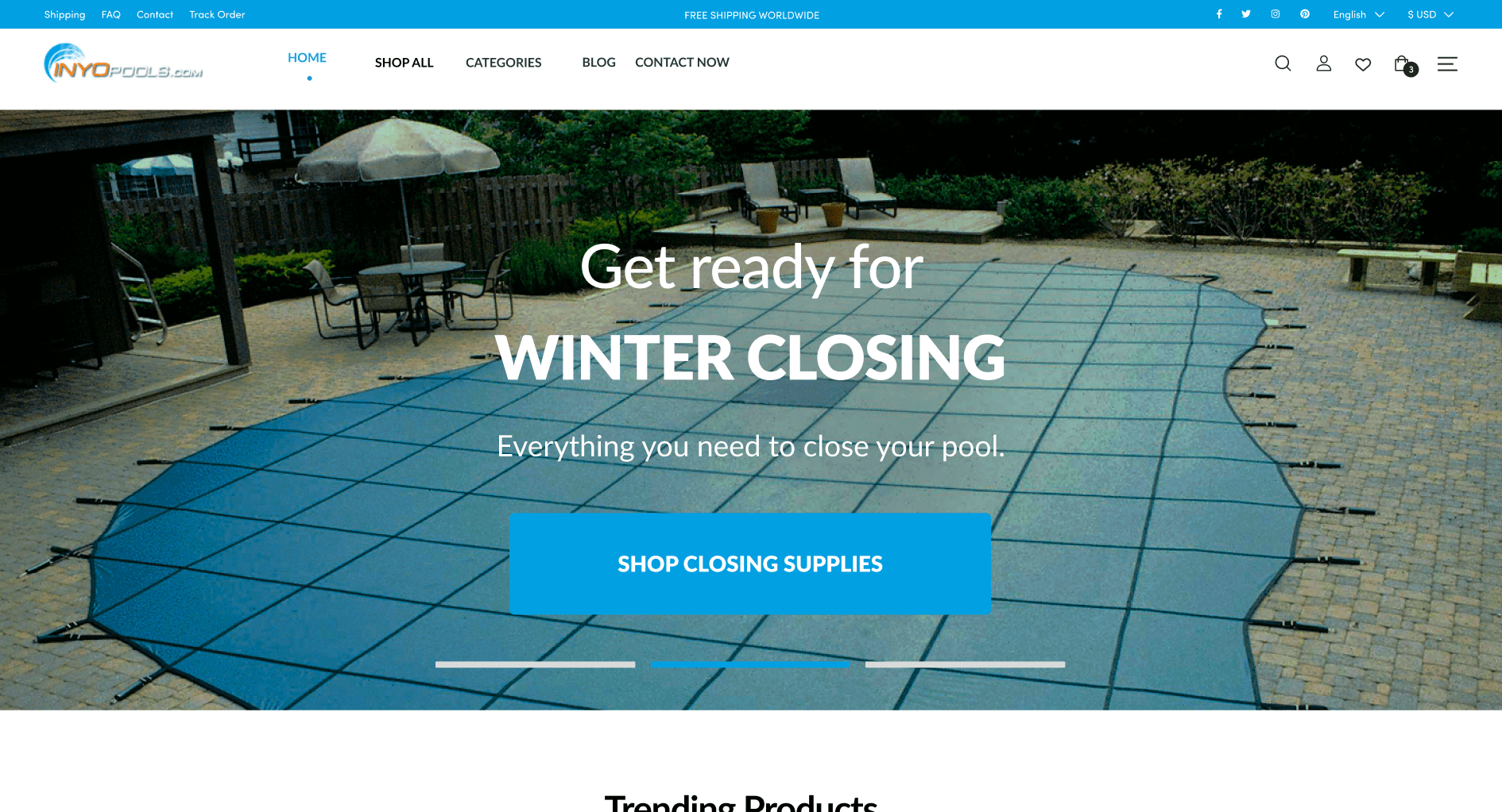
Header Banner
The header banner is the first visual element visitors encounter upon arriving at InyoPools.com. It acts as a digital billboard, announcing the brand’s identity and personality. Our redesign focused on creating a visually appealing and informative banner that immediately captures the visitor’s attention. This prominent placement of key information helps in setting a positive first impression and establishes trust with potential customers.
The banner was designed to be bold and dynamic, incorporating high-quality images and concise messaging that conveys the essence of InyoPools.com. By highlighting the brand’s core values and promotional offers, the banner effectively communicates what the company stands for and what it offers, driving immediate engagement.
User Interface (UI) Improvements
A significant aspect of the redesign was the overhaul of the user interface. The new UI is clean, intuitive, and visually appealing, aimed at increasing customer engagement and trust. Simplified navigation and clear, straightforward design elements ensure that users can easily find what they are looking for without feeling overwhelmed.
Our approach prioritized the removal of unnecessary elements and the use of clear, concise language. This not only makes the site more user-friendly but also distinguishes it from outdated, text-heavy competitor websites. By focusing on a minimalistic and functional design, we have created an environment where users feel comfortable and confident in exploring and purchasing products.
Accessibility Enhancements
Accessibility is a critical component of modern web design. The redesigned homepage ensures that all elements are accessible and visible to every type of user, including those with disabilities. By identifying and enhancing key elements, we have made it easier for users to navigate the site and find the information or products they need.
This commitment to accessibility not only broadens the potential customer base but also demonstrates InyoPools.com’s dedication to inclusivity and customer satisfaction. Ensuring that all users have a positive experience on the website helps build a loyal and diverse customer community.
Value Proposition Display
One of the standout features of the new homepage is the prominent display of InyoPools.com’s value proposition. This section showcases the unique selling points of the company, such as high-quality products, competitive pricing, and special offers. By making these elements highly visible, we aim to capture the visitor’s interest and encourage them to explore further.
The value proposition is presented using attractive graphics and compelling text, designed to draw the eye and convey the benefits of choosing InyoPools.com. This strategic placement helps in converting casual visitors into engaged customers by clearly communicating the advantages of the company’s offerings.
In summary, the redesigned homepage of InyoPools.com is a testament to the importance of modern, user-centric design. By focusing on key elements such as the header banner, user interface, accessibility, and value proposition, we have created a welcoming and efficient platform that enhances user experience and drives business growth. This approach serves as a model for other eCommerce websites looking to stay competitive and relevant in today’s digital age.
Quick View Functionality and Hover Effects
Hover Effects
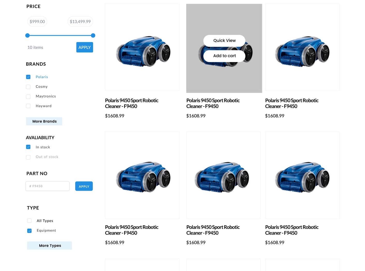
Hover effects play a pivotal role in enhancing the user experience on InyoPools.com. When users hover over an interactive element such as a link or button, the element responds with visually engaging transition effects. These can include changes in color, size, or even subtle animations. The purpose of these effects is twofold: to make the site more enjoyable to navigate and to provide immediate visual feedback to the user, indicating that the site is responsive and well-maintained.
The implementation of hover effects helps highlight key items on the web page, making it easier for users to identify clickable elements and important information. This dynamic interaction not only captures user interest but also encourages them to explore further, leading to longer site visits and increased chances of conversion.
Quick View Options
The introduction of quick view functionality is a significant improvement for InyoPools.com, aimed at optimizing the shopping experience. This feature allows users to view product details in a pop-up window without leaving the current page. For shoppers, especially those looking for multiple items, quick view options streamline the process by providing essential product information at a glance.
Quick view functionality reduces the need for users to navigate back and forth between product pages, thereby saving time and reducing frustration. It simplifies the decision-making process, making it easier for customers to compare products and make informed choices. This enhancement is particularly beneficial for users who are putting considerable effort into selecting the right products, as it makes the shopping experience faster, more efficient, and more enjoyable.
Incorporating quick view options also showcases InyoPools.com’s commitment to modern eCommerce practices. By prioritizing user convenience and efficiency, the site stands out as a user-friendly and forward-thinking platform, which can lead to higher customer satisfaction and increased sales.
Mega Menu Design
Advanced Mega Menu Solution
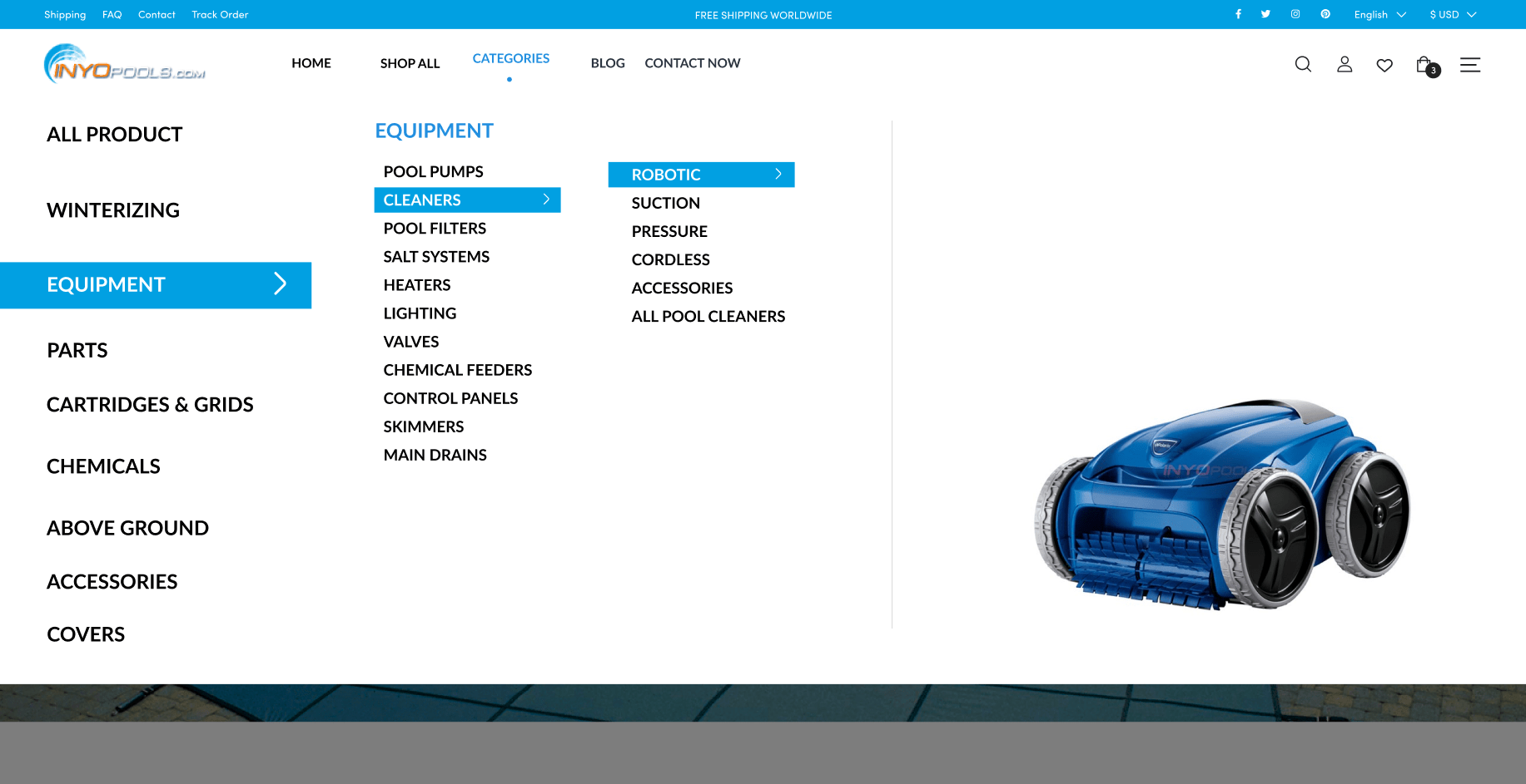
The new mega menu on InyoPools.com is a sophisticated navigation tool designed to improve the overall user experience. Unlike traditional dropdown menus, the mega menu provides a comprehensive view of the website’s content in a single, organized layout. This design choice is particularly effective for eCommerce sites with extensive product categories.
By using a mega menu, we have significantly reduced the clutter that often plagues large menus. The structured layout allows users to see all available options at a glance, making it easier to find what they are looking for without feeling overwhelmed. This streamlined navigation system helps users quickly and easily locate the content or products they need, enhancing their overall experience on the site.
Benefits for eCommerce Pages
For eCommerce websites like InyoPools.com, a mega menu offers several distinct advantages. It not only simplifies navigation but also promotes relevant products and guides shoppers to their desired items efficiently. The ability to display multiple categories and subcategories in an organized manner helps users understand the breadth of the product range available, encouraging them to explore different sections of the site.
Mega menus are particularly useful for websites with a large number of pages and product options. Traditional dropdown menus can become difficult to read and navigate when they contain too many choices. By contrast, mega menus present these options in a visually appealing and accessible format, making it easier for users to browse through categories and find specific products.
In summary, the quick view functionality, hover effects, and mega menu design on InyoPools.com have significantly enhanced the user experience. These improvements make the site more interactive, intuitive, and efficient, setting a high standard for eCommerce websites. By adopting these modern design elements, InyoPools.com has positioned itself as a leader in the industry, offering a superior shopping experience that meets the needs of today’s discerning customers. This approach serves as a valuable example for other outdated websites looking to modernize and improve their user engagement and satisfaction.
Category Pages
Search Interface Optimization
One of the most critical elements of any eCommerce website is the search functionality. According to Forrester Research, 43% of website visitors immediately head to the search bar. Recognizing this, we focused on optimizing the search interface for InyoPools.com to ensure it is interactive, easy to use, and visually appealing.
An effective search interface significantly enhances user engagement by making it easier for visitors to find exactly what they need. By streamlining the search process, we have increased the likelihood of conversions, as searchers are 1.8 times more likely to convert than non-searchers. The redesigned search bar is prominently positioned and designed to handle complex queries efficiently, providing users with accurate and relevant results quickly.
Filtering System
Given the extensive product range offered by InyoPools.com, an advanced filtering system was essential. Filters allow users to narrow down their search results based on specific criteria such as price, brand, or product type. This functionality is crucial for improving the user experience, especially when dealing with large catalogs.
Implementing a robust filtering system has several benefits. It presents a variety of products in an organized manner, making it easier for users to find what they are looking for without being overwhelmed by too many options. Additionally, a well-designed filtering system can increase website conversion rates by up to 26%. By addressing common UX issues with filtering, we have enhanced the overall usability of the site, making it more likely that visitors will find and purchase the products they need.
Product Pages
Product Ratings and Verification
Trust is a crucial factor in online shopping, and product ratings play a significant role in building that trust. For InyoPools.com, we integrated verified product ratings and reviews directly into the product pages. This transparency assures customers that they are purchasing high-quality, genuine products, as endorsed by other users.
Verified ratings provide potential buyers with confidence in their purchasing decisions. By showcasing customer feedback prominently, we help users make informed choices, which can lead to higher satisfaction and lower return rates. This feature is especially important for new customers who may be unfamiliar with the brand and its products.
Product Highlights and Features
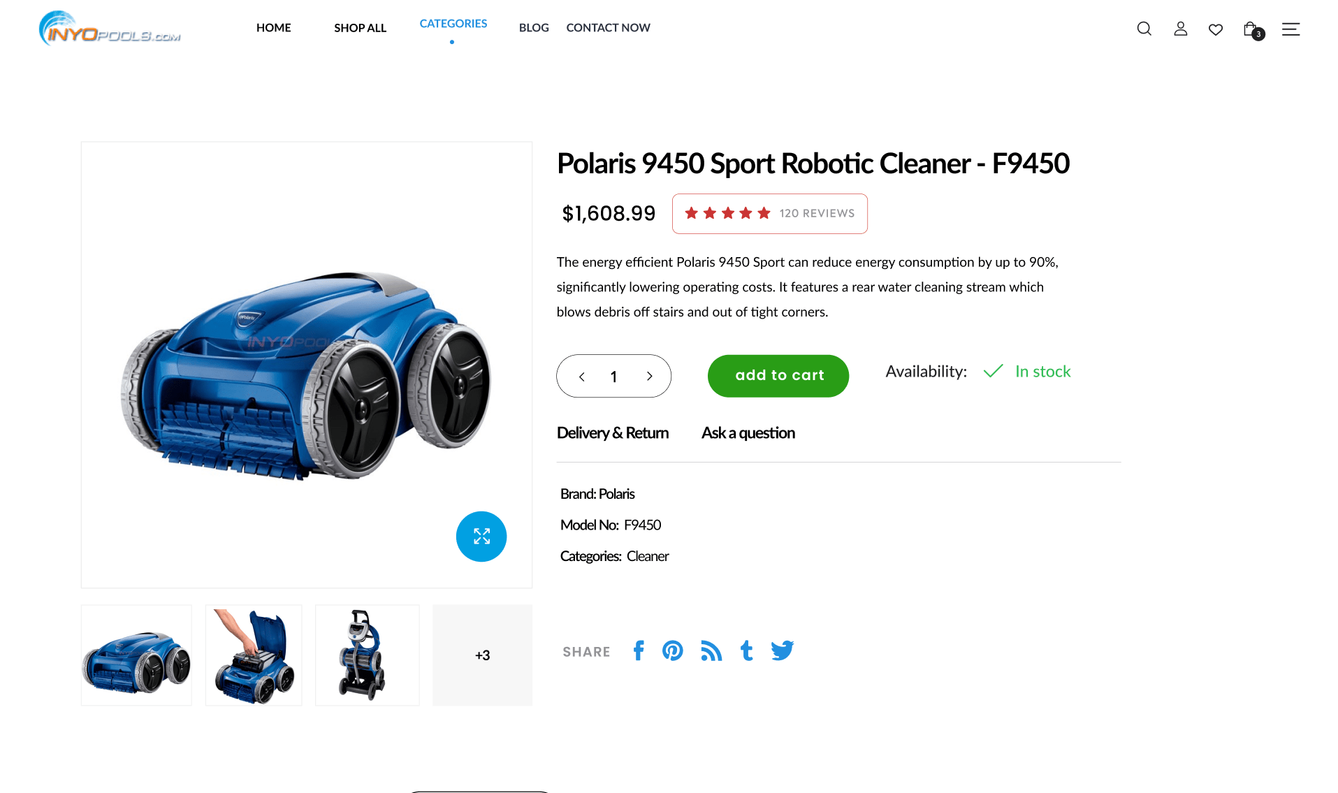
Effective product pages should highlight key features and benefits without overwhelming the user with too much information. For InyoPools.com, we ensured that product descriptions are clear and concise, focusing on the most important aspects that customers need to know. High-quality images, detailed specifications, and essential product information are presented in a user-friendly format.
This approach not only boosts trust but also aids in the decision-making process. Users can quickly grasp the value of a product, leading to more confident purchases. Additionally, we included sections for up-selling and cross-selling. Up-selling showcases higher-end versions of the product being viewed, while cross-selling presents complementary items. For instance, a pool pump page might recommend pool cleaners or filters that enhance the overall pool maintenance experience.
By incorporating these elements, the product pages are not only informative but also engaging. They guide users through the purchasing journey, helping them discover products that meet their needs and encouraging additional purchases. This comprehensive and user-centered design approach is vital for any eCommerce website looking to improve its performance and customer satisfaction.
In summary, the enhancements made to the category and product pages of InyoPools.com are designed to provide a superior user experience. From an optimized search interface and advanced filtering system to verified product ratings and effective product highlights, each element works together to create a seamless and enjoyable shopping experience. These improvements set a high standard for eCommerce websites, demonstrating the value of modern, user-centric design in driving engagement and conversions.
Conclusion
The redesign of InyoPools.com represents a significant transformation aimed at enhancing user experience and boosting business performance. Through careful planning and implementation of modern design principles, we have created a more intuitive, engaging, and efficient website that meets the needs of today’s online shoppers.
Summary of Redesign Benefits
The redesigned homepage now serves as a vibrant gateway to the brand, capturing visitors’ attention with a compelling header banner, a clean and user-friendly interface, and prominently displayed value propositions. These changes not only make the site more appealing but also increase customer engagement and trust.
The introduction of quick view functionality and hover effects has greatly improved the shopping experience. These features allow users to access product details effortlessly and enjoy a more interactive browsing experience. By reducing the steps required to view and purchase products, we have streamlined the shopping process, making it faster and more enjoyable.
The advanced mega menu provides a clear and organized navigation system, helping users find what they need quickly and efficiently. This improvement is particularly beneficial for an eCommerce site with a vast array of products, as it reduces clutter and guides users to relevant content.
Enhancements to the category pages, including an optimized search interface and a robust filtering system, have made finding products easier and more efficient. These features cater to the needs of engaged users who are more likely to convert, thereby driving higher sales and customer satisfaction.
On the product pages, verified ratings and reviews build trust and help customers make informed decisions. Clear product highlights and strategic use of up-selling and cross-selling techniques further enhance the shopping experience, encouraging additional purchases and boosting overall sales.
Encouragement for Other Businesses
The redesign of InyoPools.com serves as a testament to the impact that thoughtful, user-centered design can have on an eCommerce website. For businesses with outdated websites, this project highlights the critical importance of modernization. A well-designed website not only attracts visitors but also keeps them engaged, builds trust, and drives conversions.
Investing in a comprehensive redesign can yield significant benefits, including increased user engagement, higher conversion rates, and improved customer satisfaction. By focusing on the needs of the users and incorporating modern design elements, businesses can create a more effective and enjoyable online shopping experience.
In conclusion, the redesign of InyoPools.com has set a new standard for eCommerce websites. It demonstrates the value of prioritizing user experience and the positive outcomes that can result from a well-executed design strategy. For any business looking to stay competitive and relevant in the digital age, a website redesign is not just an option but a necessity. This approach ensures that customers receive the best possible experience, leading to sustained growth and success.


