Navigating the B2B eCommerce landscape, especially for industrial suppliers and manufacturers with vast, intricate catalogs, is no small feat. It requires a deep understanding of user experience, particularly the power of well-crafted category pages.
In this article, we dissect the practices of top industrial supply websites, zeroing in on what they do well and where they fall short. But we won’t stop there – we’ll also dive deep into individual website reviews, providing you with a comprehensive understanding of this crucial facet of eCommerce.
Remember, mastering category pages in the complex world of industrial supply and B2B sales isn’t just good business practice – it’s an art form. In the sections to follow, we’ll explore this art, giving you the insights you need to propel your business to the forefront of the industry.
Commonalities: Strengths and Shortcomings
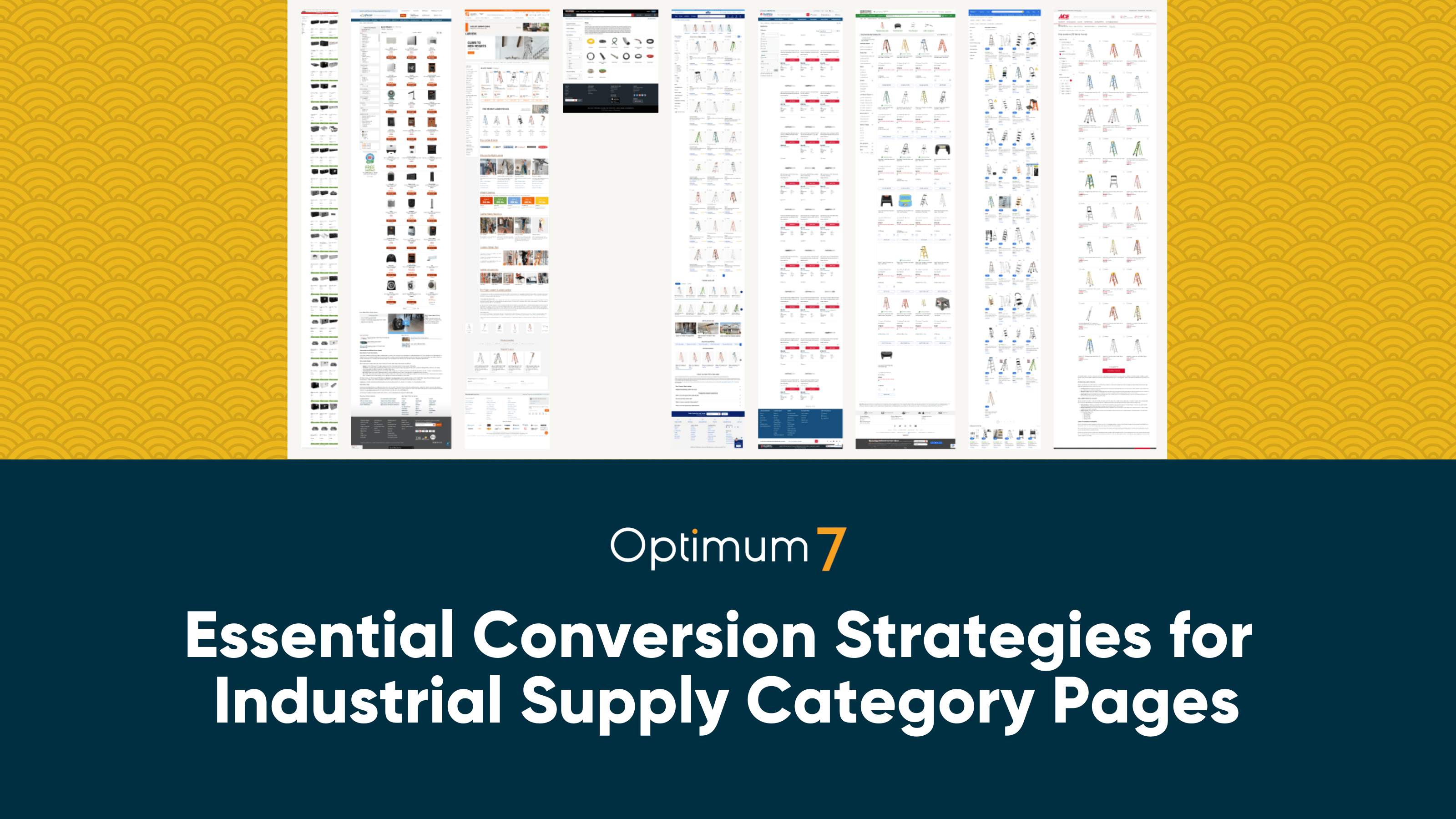
In our evaluation of industry leading websites – Tractor Supply Co, Sylvane, Global Industrial, Lowe’s, Walmart, Ace Hardware, Home Depot, and Menards – we found a set of powerful, common features. An efficient breadcrumb structure navigates users across these sites, making their journeys intuitive. The universal adoption of a “compare” feature underlines the industry’s commitment to helping customers make well-informed decisions. Transparent display of product reviews via star ratings, tactful presentation of key product information, and distinct ‘Add to Cart’ buttons further enhance user experiences.
Yet, even these industry leaders have room for improvement. Currently, the inability to add multiple items to the cart from the category page is a missed opportunity for streamlining user experience and boosting sales. Similarly, the positioning of best sellers on these sites is suboptimal – an easy fix that could potentially enhance visibility and drive sales. Lastly, showcasing related products could further engage customers, potentially increasing both conversion rates and order values.
Now, let’s delve into the individual strengths and weaknesses of each website:
Tractor Supply Co
Strengths
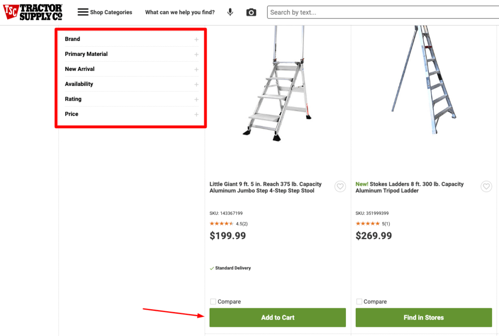
Tractor Supply Co showcases several areas of expertise. They’ve mastered the use of accordion-style filters – a subtle but effective design. It’s neat, it doesn’t interfere, and it enhances the user journey. Their breadcrumb structure? Unmistakably clear, guiding customers effortlessly across the site.
They’ve nailed the color of their ‘Add to Cart’ buttons, offering strong visual cues that draw users in. Coupled with this, their transparent approach to customer feedback is commendable. Star reviews are easy to spot, empowering shoppers to make informed purchase decisions. Plus, they’ve added a “compare” feature, another valuable tool for customers.
Weaknesses
Currently, you can’t place multi-item orders from the category page. It’s a stumbling block that could be impacting their conversions. They could benefit from more relevant filters, too. These would provide a tailored shopping experience, driving user engagement and sales.
They’re also missing a best sellers list. This feature is a golden opportunity to showcase popular items, and it’s being overlooked. And don’t forget about the visual layout. The space between product names and ‘Add to Cart’ buttons is excessive. Trimming it down could enhance the user experience and speed up purchase decisions.
Sylvane
Strengths
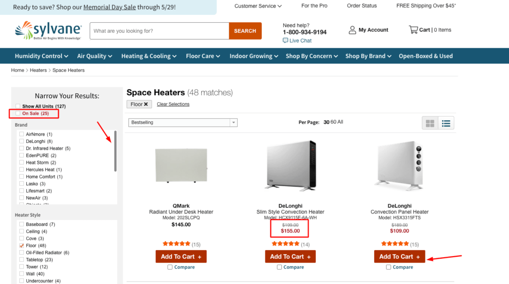
Sylvane is a stand-out for several reasons. First up, trust-building elements under the filters. These make customers feel secure, enhancing their connection with the brand. Then there’s their filter section. It’s got inner scroll bars, making it compact and user-friendly. Discounted items get the spotlight, too, catching shoppers’ attention and boosting sales. Their Add to Cart feature is speedy, making shopping a breeze. Plus, they’ve got a product comparison tool, giving shoppers the power to make informed decisions.
Weaknesses
Right now, they’re missing the multi-item order functionality. It’s a letdown for customers looking to buy in bulk and a potential hurdle for conversion rates. Their action buttons could use some work, too. Higher visibility could draw more clicks. And they’re missing a best sellers list. It’s a chance to highlight their top-performing items, steering customers towards popular choices.
Global Industrial
Strengths
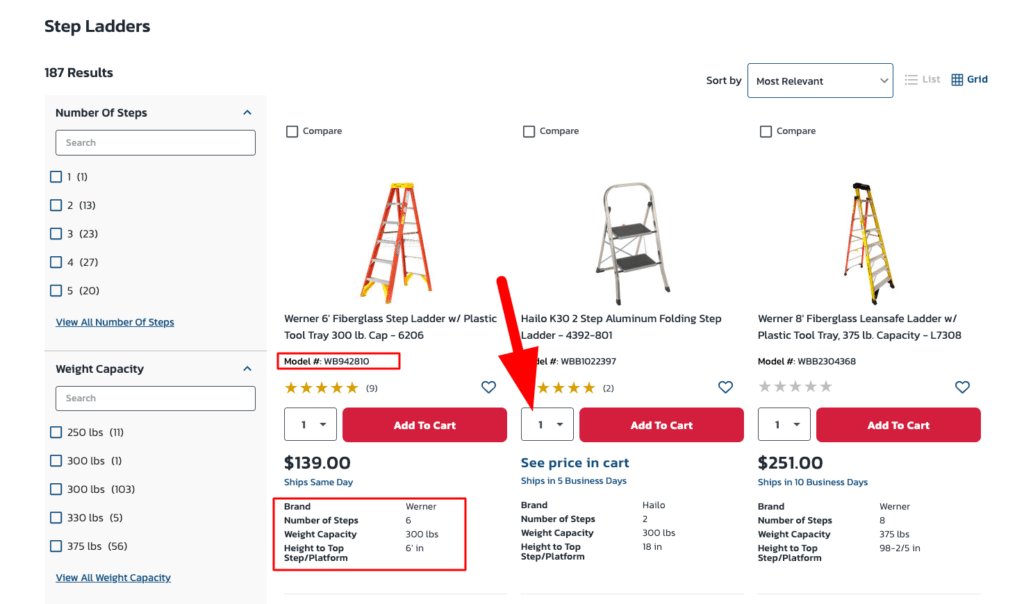
Global Industrial grabs attention with bold, red buttons. They’ve nailed the multi-add-to-cart functionality, streamlining the shopping experience. Critical product info? Front and center. Plus, model numbers are clearly displayed, a crucial detail for many B2B buyers. They also promote best sellers and shipping times, key details that customers look for.
Weaknesses
Right now, they’re not showcasing related products, a missed opportunity for upselling. And their content could use some SEO love. Richer, more engaging content would improve their search engine visibility.
Lowe’s
Strengths
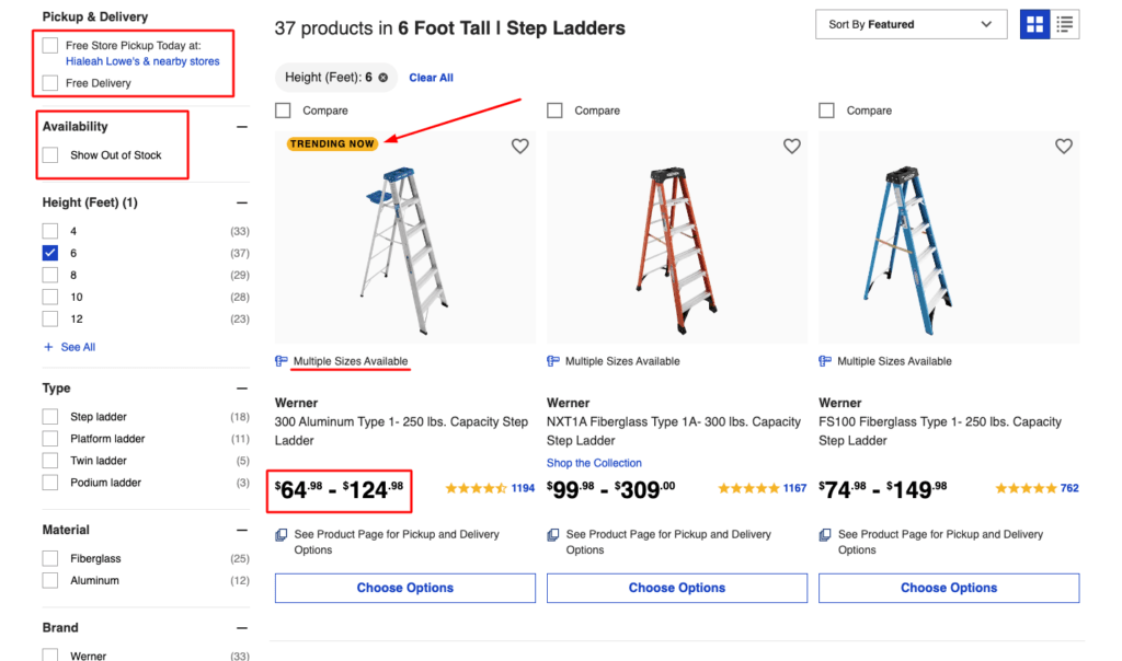
Lowe’s knows how to handle product pricing. Price bands highlight variation based on options, a critical detail for B2B buyers. Their filters are top-notch, and they’ve made a smart move by hiding out-of-stock items by default. Plus, they display delivery dates and pickup options, adding to the customer’s convenience.
Weaknesses
Best sellers need a more prominent spot. An ‘Add to Cart’ option on category pages could speed up the shopping process. And facilitating bulk orders? It’s a must for B2B.
Walmart
Strengths
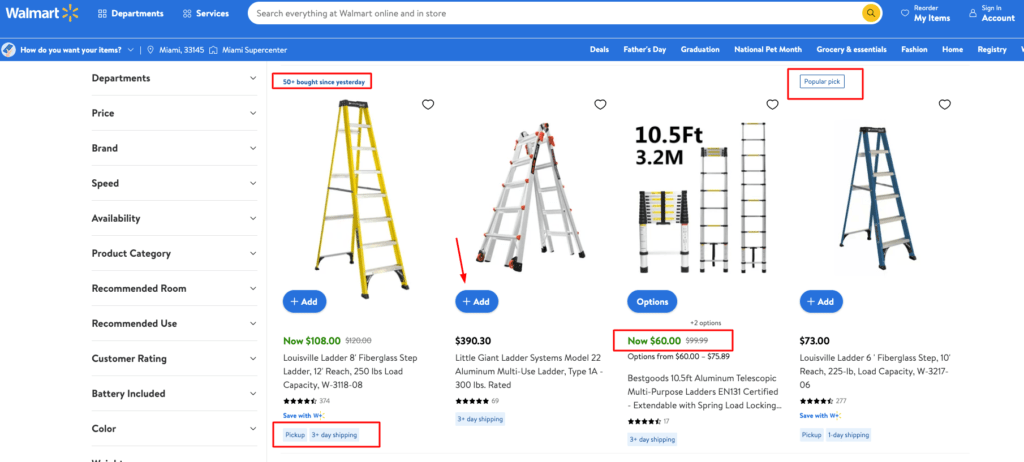
Walmart makes shopping simple with an easy add-to-cart function. They’re clear with pickup and shipping options and excel with their product categories. Even more, they do a great job of highlighting specific products through the use of tags such as “50+ bought since yesterday” and “Popular pick” to steer customers in the right direction. They have also mastered the art of highlighting discounted prices by highlighting them in green.
Weaknesses
Their sidebar is cluttered with irrelevant filters. Their “sponsored” items at the top actually take away from the user experience.
Ace Hardware
Strengths
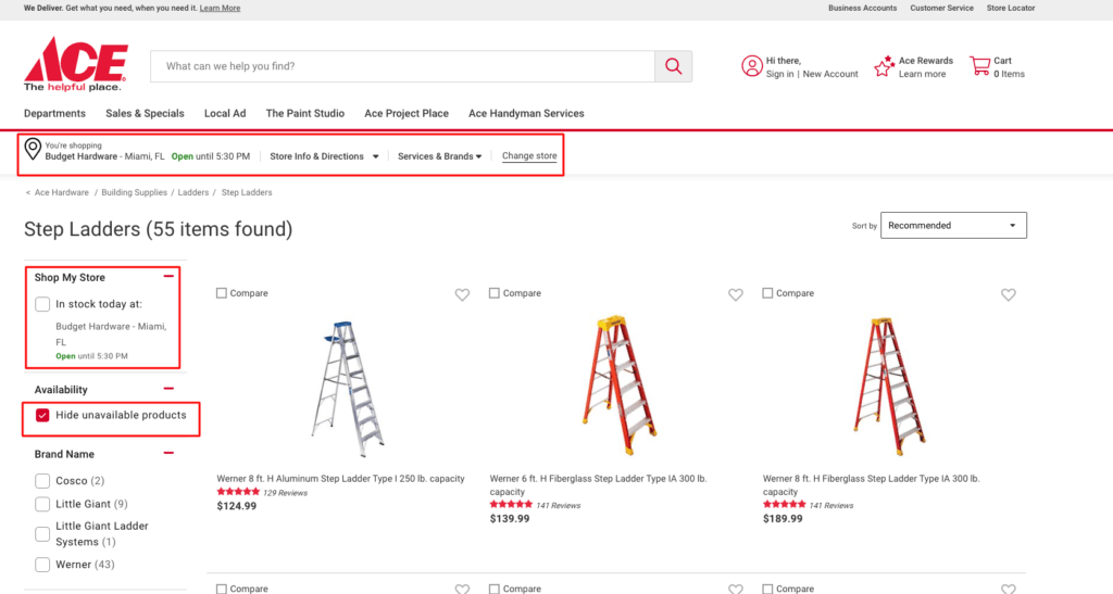
Ace keeps things clean with a straightforward breadcrumb structure. Their compare feature and sort function are user-friendly, enhancing the shopping experience. And by default, they hide unavailable products and filter by in-stock items in your store.
Weaknesses
They could benefit from an ‘Add to Cart’ function on category pages. Multi-add-to-cart functionality? It’s a no-brainer. And a bestseller list would steer customers to popular products.
Home Depot
Strengths
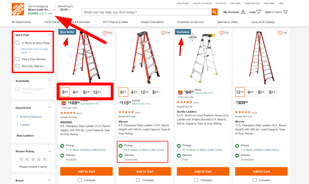
Home Depot’s filters are well-organized, leading to a smoother shopping experience. They block unavailable products by default – a plus for customer satisfaction. And they’re on the ball with info for pickup and delivery times.
The biggest strength you can see in action here is their ability to customize products from the category page. Check out how you can select the height of the ladder.
Weaknesses
Best sellers need more limelight. And enabling multi-add-to-cart functionality would be a big win.
Menards
Strengths
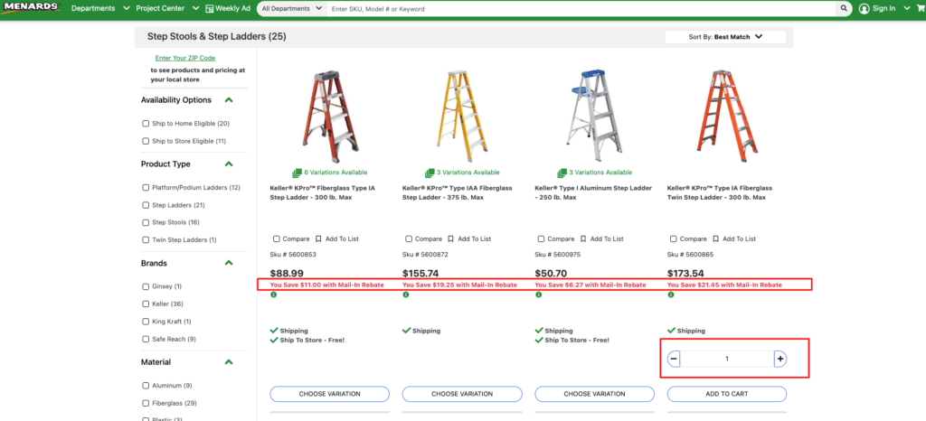
Menards shines with its multi-add-to-cart feature, a definite asset for B2B. Discounts are boldly highlighted, making them impossible to miss.
Weaknesses
Product variations are hidden until you click into the product description. Their button design needs more impact, and their filters could be better organized.
Elevating Your eCommerce Game: Translating Industry Standards into Competitive Advantage
It’s clear. Certain strengths have become the norm in the eCommerce world. Inclusion of these key features is no longer a luxury – it’s a necessity. To compete, your online store must embrace these standards.
Let’s turn common weaknesses into opportunities.
Addressing these areas isn’t just about catching up. It’s about setting yourself apart. It’s about showing customers you’re committed to a better, more efficient experience.
Are you falling behind?
If your online store lacks these features, you’re at risk. Competitors who recognize and incorporate these essentials are gaining ground. They’re outperforming those who don’t.
The eCommerce landscape is shifting.
Adaptation isn’t optional – it’s survival. Your website must not just adapt, but innovate. Optimize. Strive for excellence in user experience.
Your category pages? They’re not just product showcases.
They’re reflections of your brand. They show your understanding of customer needs. Ensure they meet the mark. As experts in conversion rate optimization, we can guide your business to category page success through a CRO audit and custom development work.
Give us a call today to learn more or request a free CRO audit by one of our experts!


