For Divers Direct, a titan in the scuba gear and dive equipment retail space, an online impression is more than a mere touchpoint—it’s an invitation to explore the depths of the ocean through their expertly curated products. With a legacy built on offering an extensive array of high-quality gear, fast and free shipping, and an unwavering commitment to customer satisfaction, the need for a digital platform that mirrors these values in every pixel and click became apparent. This digital transformation journey wasn’t just about a fresh coat of virtual paint—it was about aligning the company’s online presence with the innovative spirit that has always been at the core of Divers Direct.
As we navigate through the intricacies of this website redesign, we’ll uncover not just the “what” and the “how,” but also the “why” behind each decision. This exploration will reveal the impact of thoughtfully crafted web experiences and their power to elevate brand perception, engage customers meaningfully, and ultimately, drive a business forward. The transformation of Divers Direct serves as a beacon for all, illuminating the path toward digital evolution—a path that every modern retailer must consider to thrive in an increasingly online world.
First Impression is Everything: Homepage Redesign
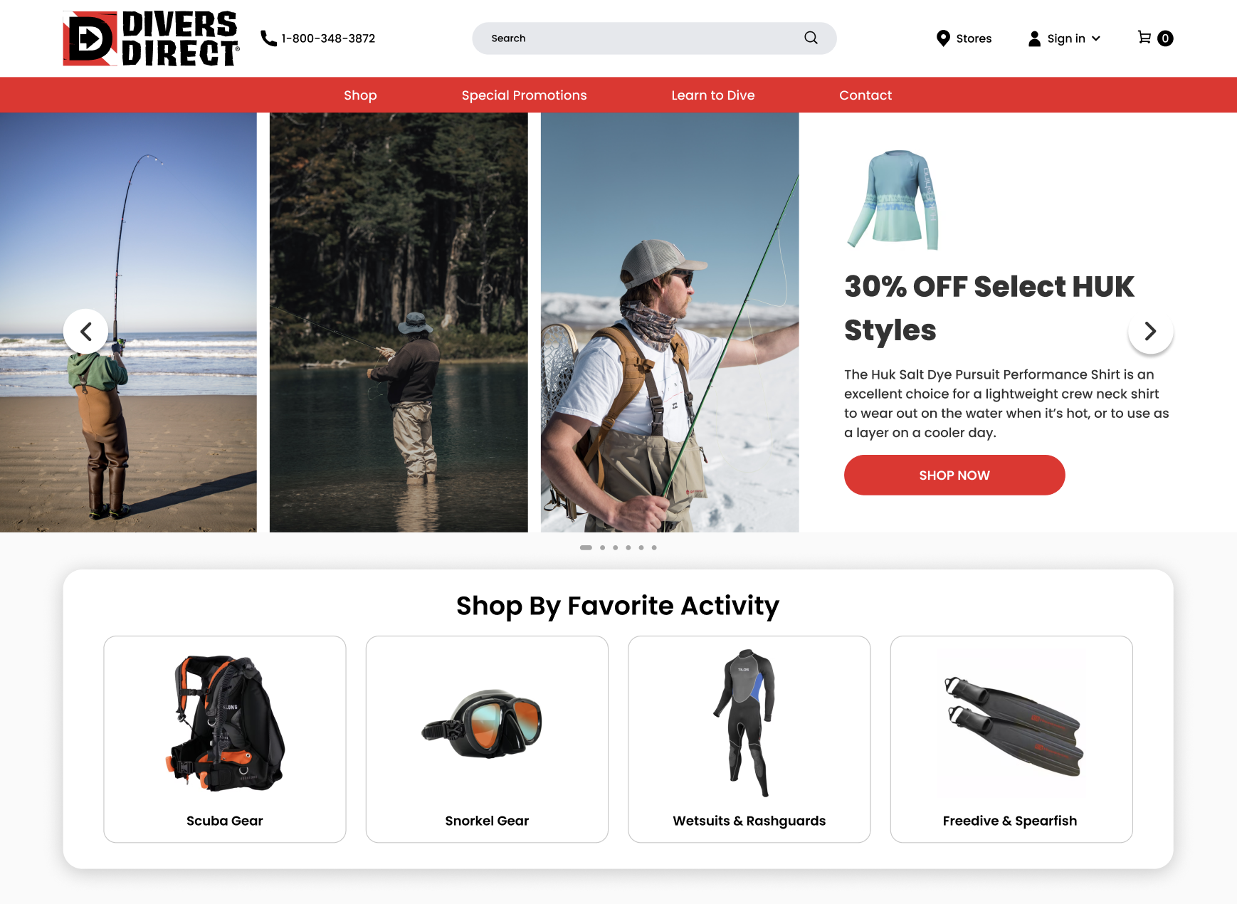
The homepage stands as the threshold to a brand’s digital realm, a pivotal moment where customers form lasting judgments within seconds. Understanding this, the redesign of Divers Direct’s homepage was approached with the meticulous care of a skilled jeweler setting a precious stone. The introduction of a header banner that does more than just greet the visitor—it tells a story. A story of adventure, quality, and expertise that resonates with the beating heart of the diving community. This banner isn’t simply a visual treat; it’s a strategic conduit for brand identity and a silent ambassador to the company’s core values.
In a sweeping move to elevate user engagement and foster trust, we introduced a brand-new User Interface (UI) that differentiates Divers Direct from the cluttered and outdated designs that often plague e-commerce sites. The philosophy was clear: increase engagement not by mere chance, but through a design that beckons interaction as naturally as the ocean calls to its divers. This new UI isn’t just about looking good—it’s about feeling right, crafting an intuitive digital space where trust is as inherent as it is implicit.
Our approach to simplicity in design ensures that every interaction feels familiar and effortless. In an online sea of complexity, the redesigned Divers Direct homepage stands as an island of clarity, where clear language and intentional design elements coalesce to provide a seamless experience. It sidesteps the confusion that often accompanies overly intricate designs, inviting the customer into a space where choice feels less like a challenge and more like a pleasure.
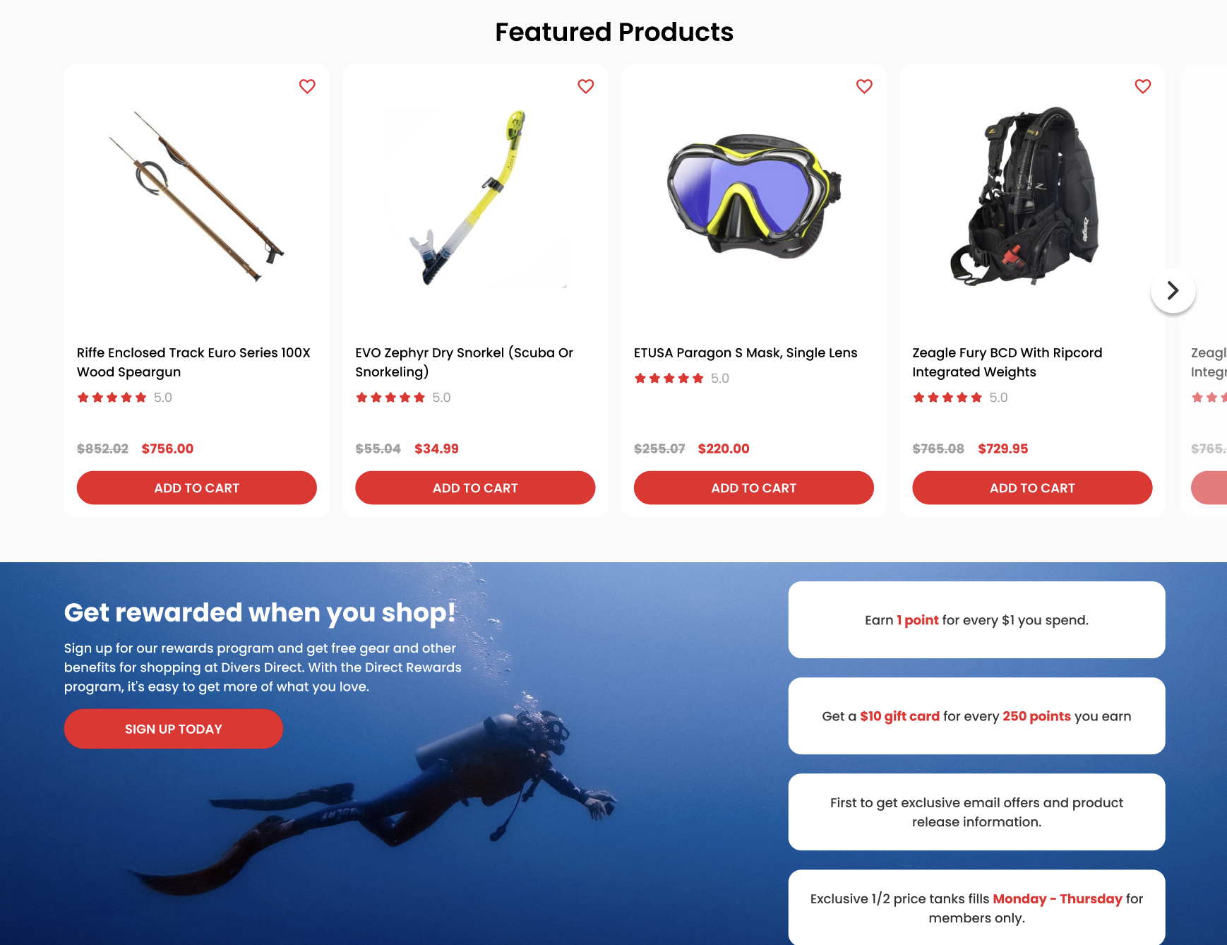
Banner ads, a staple of digital marketing, were reimagined to not only catch the eye but to carry meaningful messages that align with the viewers’ interests and needs. By enhancing accessibility, we’ve widened the doorway for every type of user, ensuring that this digital dive shop is as welcoming as its physical counterpart. The value proposition isn’t just visible; it’s vivid, emblazoned across the homepage in offers and assurances that speak directly to the consumer’s desires and pain points.
Through this homepage redesign, Divers Direct doesn’t just make a statement—it starts a conversation, one that invites the customer to explore, engage, and embark on a journey filled with promise. It stands as a testament to the power of first impressions and a shining example for businesses navigating the digital currents. It’s not merely a change—it’s a leap towards where the future of e-commerce is headed, and it’s a leap that all forward-thinking businesses should be prepared to take.
Interactive User Experience: Quick View & Hover Effects
Diving into the digital transformation of Divers Direct, we must shine a light on the subtleties that make for an extraordinary user experience. It’s the minutiae, like the responsive ripple of water to touch, that make a website not just seen but felt. Enter Quick View and Hover Effects—two elements that elevate the user interface from functional to fascinating.
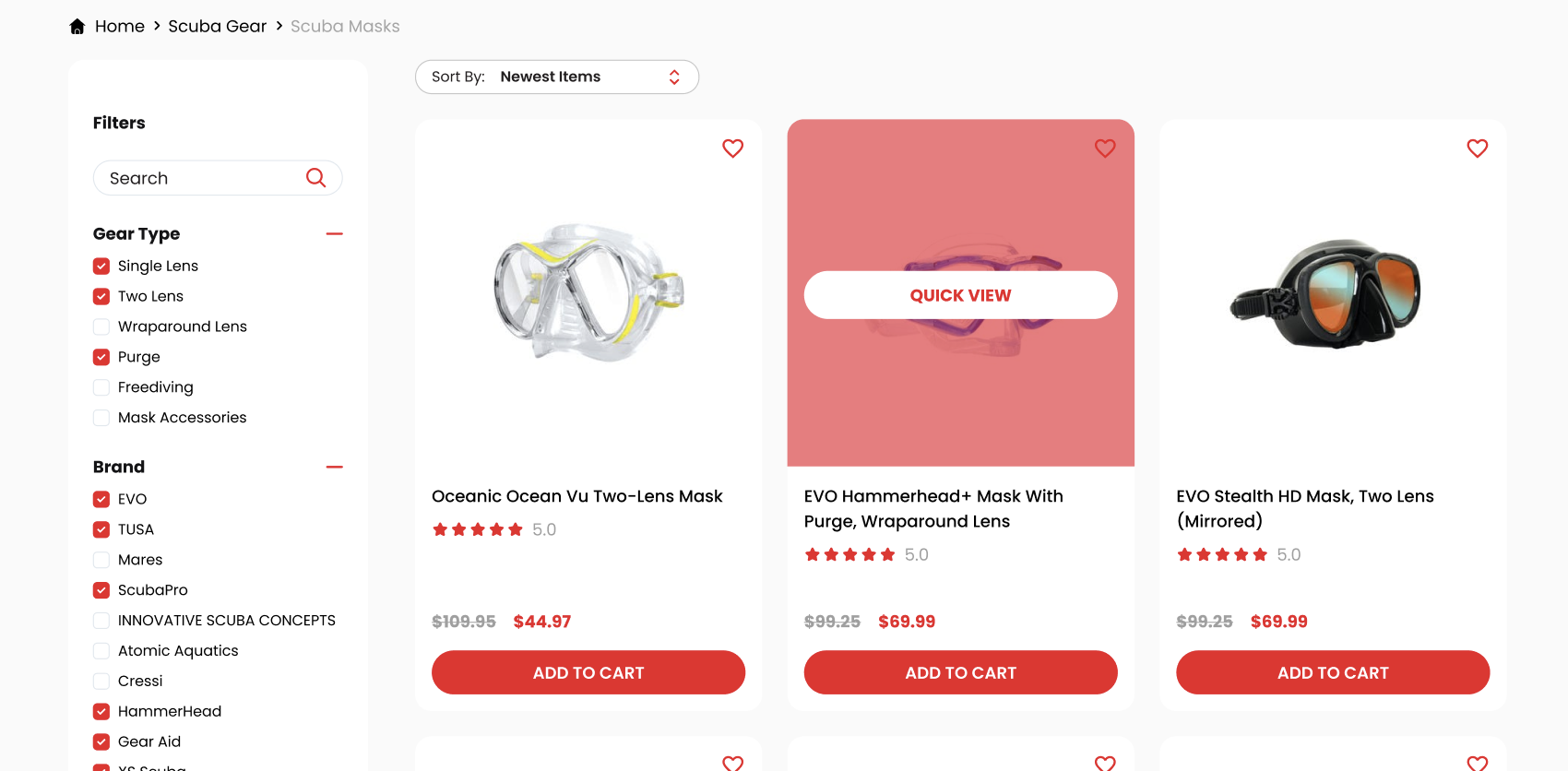
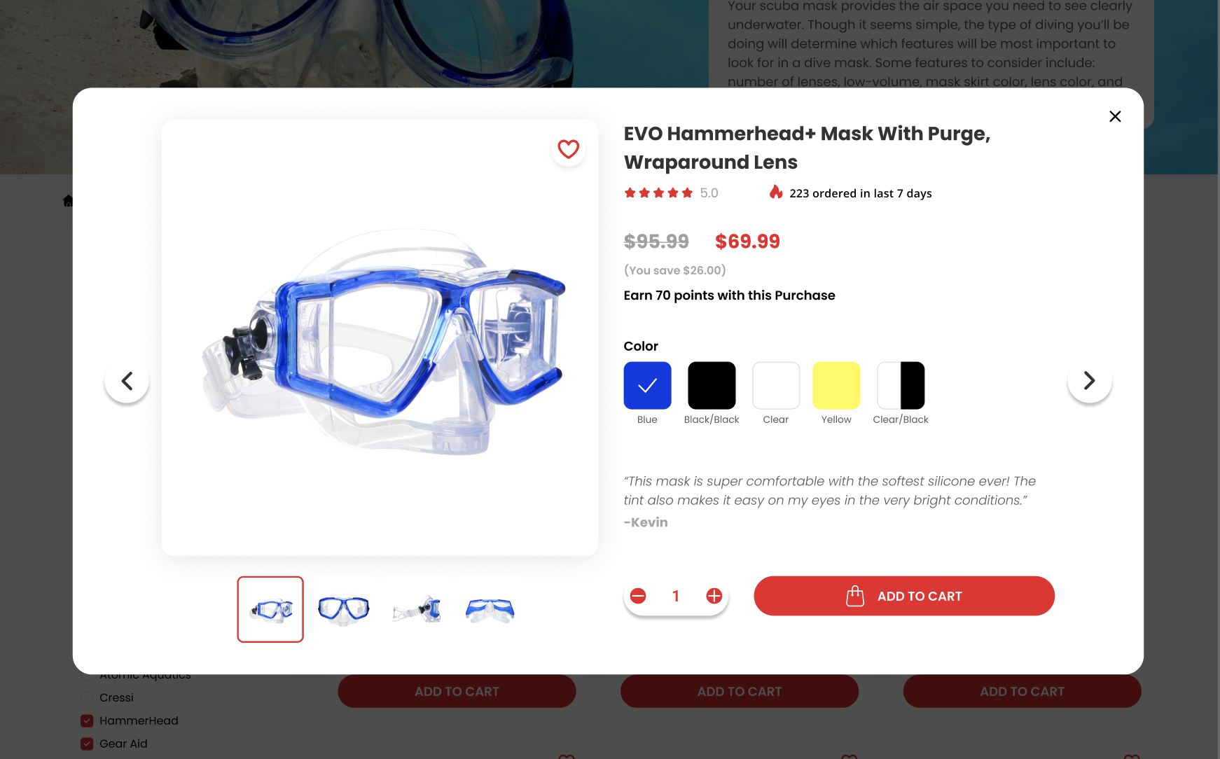
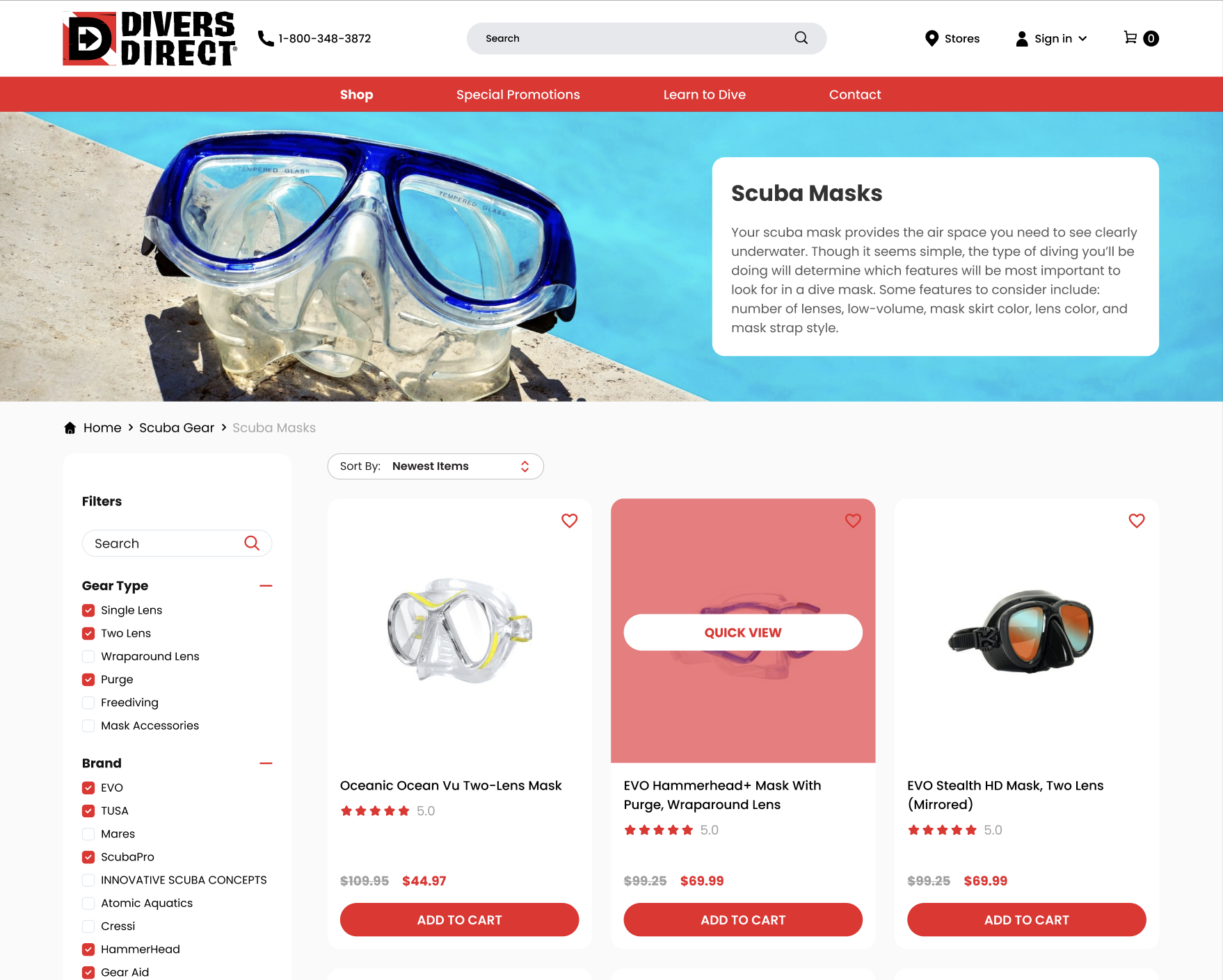
The newly implemented Quick View functionality is akin to a diver’s glance through a clear mask to the underwater world—immediate, unobstructed, and rich with information. This feature empowers customers with the ability to preview products in a heartbeat, without the need to navigate away from their current page. It’s a seamless way to engage with multiple products, making for an experience that is not just faster, but more focused. With Quick View, customers can glimpse the essence of a product, its features, and its fit for their needs, all with a simple hover and click. This streamlined journey from browsing to buying is not just a convenience; it’s a new standard for online shopping.
Hover effects, on the other hand, are the playful yet purposeful interactions that make each visit to the Divers Direct website a delight. As users navigate the site, they find that their cursor doesn’t just point; it communicates. Through color changes, movements, and transformations, hover effects indicate the site’s responsiveness, guiding users naturally to their desired destinations. This interactive dance isn’t just about aesthetics; it’s a demonstration of the website’s intelligence and anticipation of user needs.
Navigational Mastery with Mega Menus
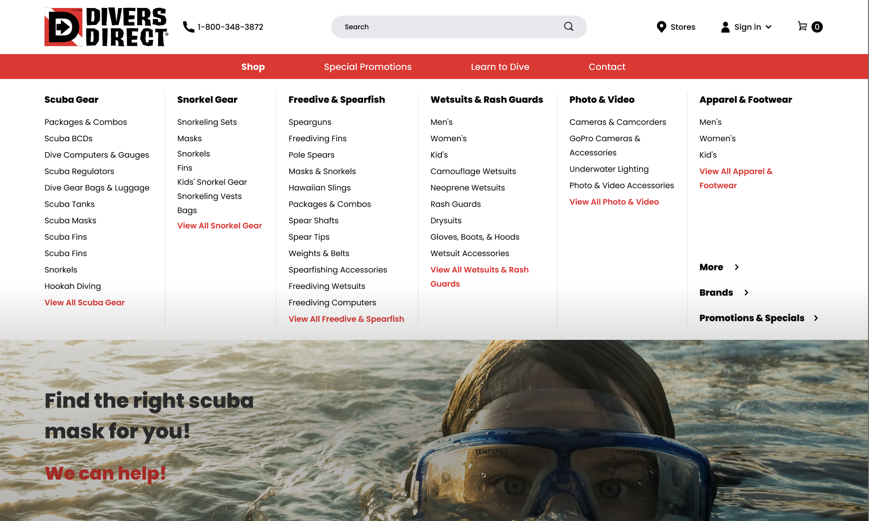
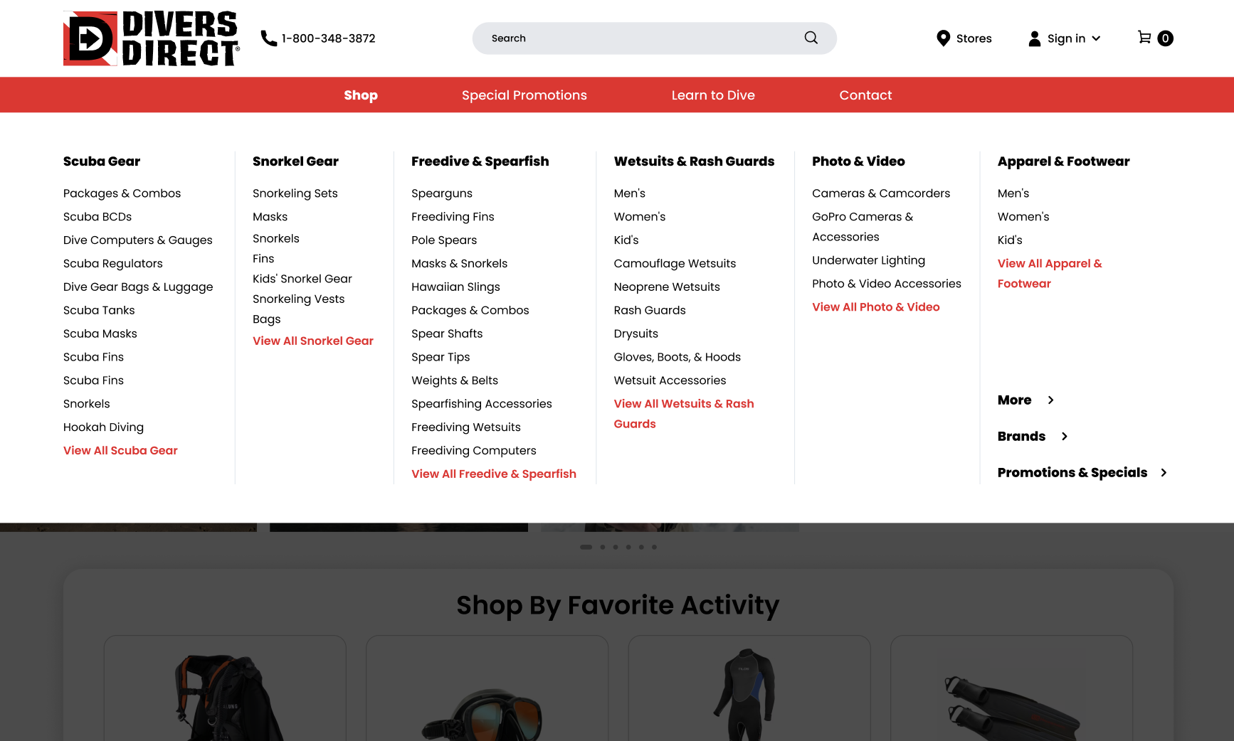
In the vast ocean of e-commerce, navigation can be the compass that leads customers to treasure—or the lack thereof that leaves them adrift. Divers Direct, in its digital rebirth, has embraced the mega menu, a lighthouse guiding shoppers through the dense fog of abundant information. This sophisticated navigation solution doesn’t just lead customers to their desired products; it enhances their journey with clarity and efficiency.
Mega menus do not merely outshine traditional dropdowns; they redefine the experience of site exploration. In the context of Divers Direct, with an array of products as diverse as the marine life they’re designed to encounter, the mega menu organizes and presents offerings in a manner that is immediately comprehensible. The user doesn’t just find a category; they discover a world of options, neatly arranged and easily accessible, turning what could be an overwhelming quest into an enjoyable exploration.
With this advanced navigation, we’ve not only decluttered the website but enriched the user experience with speed and sophistication. Mega menus facilitate not just the discovery of products but also the discovery of possibilities, showcasing related items and popular categories without overwhelming the shopper. The benefits are twofold: a simplified user journey and an enhanced opportunity for product discovery.
In these updates, the essence of Divers Direct’s commitment to a user-centric approach is evident. Through the use of Quick View, hover effects, and mega menus, the website moves beyond being a mere platform for transactions—it becomes a conduit for customer satisfaction and engagement. Such enhancements send a clear message to all online retailers still navigating with outdated tools: the current of change is swift, and to stay afloat, one must not just ride the wave, but become the wave. This is not about keeping pace with competitors; it’s about charting a course towards a horizon where the customer experience is as enriching as the depths of the sea itself.
Optimizing Category Pages for Maximum Engagement
The journey through an e-commerce site should be like navigating the calm seas with an intuitive compass, each wave leading to the next discovery. For Divers Direct, optimizing category pages has been a pivotal move, as essential as a diver’s kick that propels them through water. Research suggests that a significant segment of online shoppers head straight to the search bar, looking for a beacon to guide them. At Divers Direct, we’ve turned this insight into action, honing the search and filter interface for maximum efficiency and aesthetic appeal.
Engagement on category pages has been transformed from a mundane necessity to a dynamic experience. By introducing an interactive and visually appealing interface, the act of searching becomes less of a hunt and more of a guided tour. Users are not just searching; they are interacting with a sophisticated system designed to present them with a tailored experience. This approach takes the guesswork out of browsing, allowing shoppers to swiftly zero in on what they want.
The power of a well-implemented filter system cannot be overstated. On Divers Direct’s revamped site, filters are not just tools; they are personalized lenses that help users focus on the products that matter to them. With filters, we’ve seen a tangible increase in conversion rates, echoing findings that even simple filter enhancements can significantly uplift a site’s performance. By curating products with filters, Divers Direct offers a personalized shopping environment that speaks to individual needs, encouraging exploration and discovery within a framework of personalized relevance.
Perfecting the Product Page for Enhanced Trust & Sales
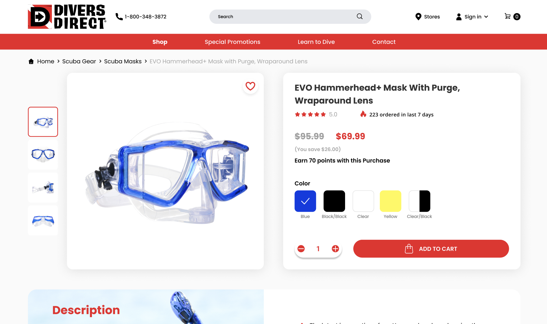
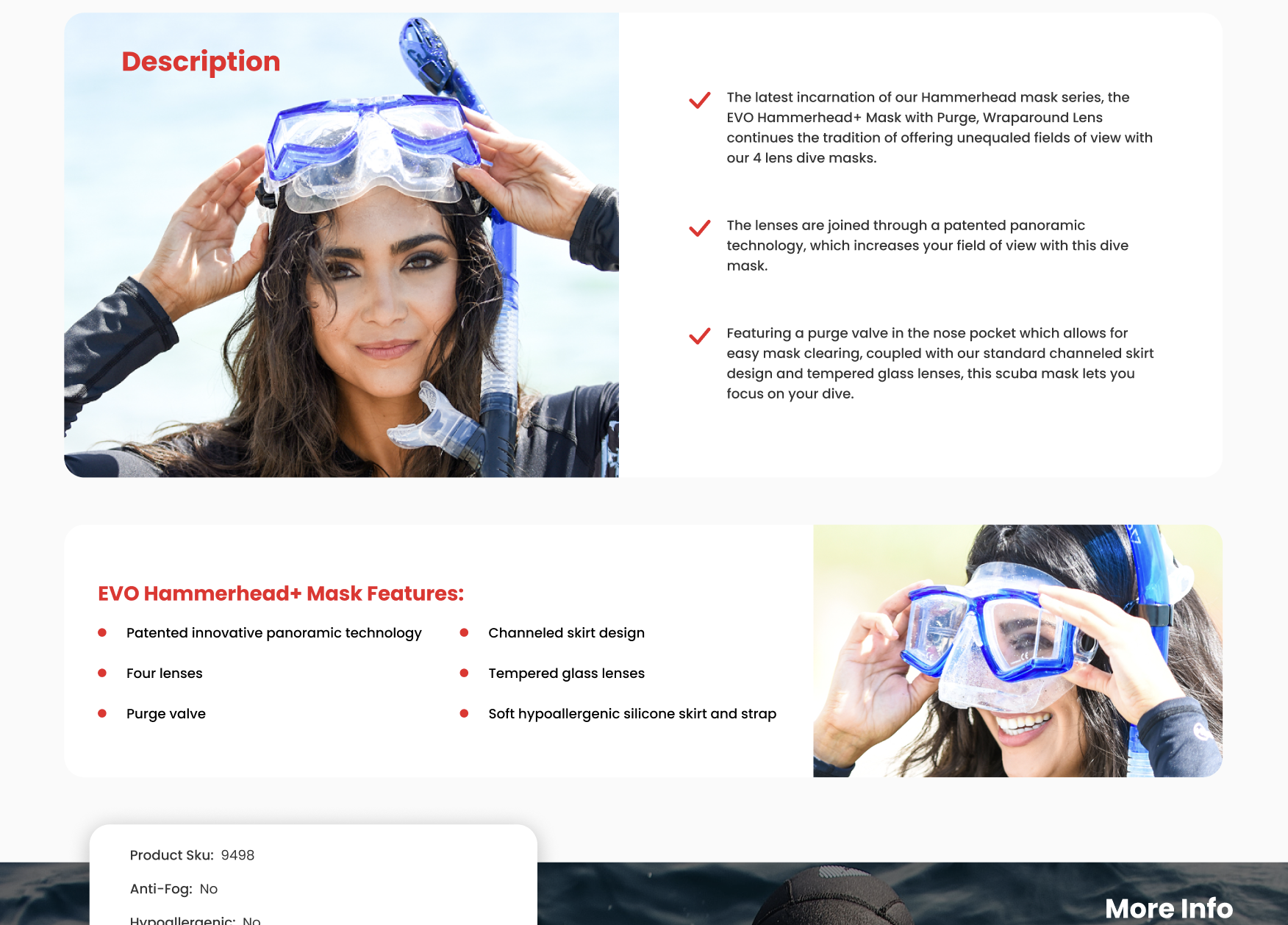
Product pages are the showcases of e-commerce, the virtual display cases where goods must speak for themselves without the aid of a salesperson’s charm. For Divers Direct, perfecting the product page has been an exercise in building trust and fostering sales. By incorporating verified product ratings and proofs of authenticity, these pages have become more than a stop on the buyer’s journey—they are a destination of assurance and confidence.
In an age where trust is currency, showcasing high-quality, authentic products is pivotal. Divers Direct has taken this to heart, ensuring that each product page is a testament to the quality and genuineness of the offerings. By highlighting product features and benefits without overwhelming the shopper, we create an environment conducive to informed decision-making. The product pages don’t just sell; they educate and reassure, boosting the customer’s confidence in their purchase.
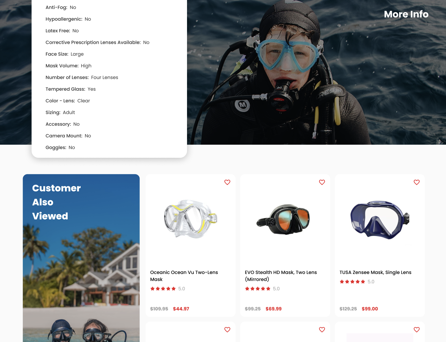
Cross-selling and up-selling have also been tactically integrated into the product pages. Like a knowledgeable sales associate who knows just what accessory would complement your gear, the site intelligently suggests relevant add-ons and alternatives. This strategy enhances the user experience by providing valuable recommendations that may not have been initially considered, thus enriching the shopping experience and increasing the average order value.
For those sailing the outdated waters of the digital retail sea, Divers Direct’s transformation serves as a lighthouse of inspiration. The revamped category and product pages illustrate a blueprint for success, showing that a focus on user engagement and trust-building can convert even the most casual browser into a loyal customer. This journey of redesign is not a call to keep up with digital trends; it’s an invitation to set the trends, to prioritize user experience, and to build a platform where customers don’t just shop—they engage, they trust, and they return.
Elevating Convenience with Sticky Add-to-Cart
In the world of e-commerce, the path to purchase is a critical one. At Divers Direct, an innovative twist has been added to streamline this journey: the sticky Add-to-Cart feature. Imagine browsing through a catalog of diving gear and finding the perfect set of fins. You’re intrigued, you scroll down to read reviews, to check details, and just as the decision to buy solidifies, the Add-to-Cart button is right there, following your scroll, as if reading your mind. It’s a subtle yet powerful tool that keeps the next step within arm’s reach, anytime the shopper is ready to make the leap.
This sticky functionality isn’t just a floating button; it’s a companion on the shopper’s journey, ensuring they never have to swim back upstream to find the point of purchase. With this approach, Divers Direct saw a notable uplift in orders—a testament to the feature’s effectiveness in enhancing customer experience and conversion rates. It simplifies the decision-making process, reduces friction, and accelerates the customer’s journey from interest to ownership.
Charting New Depths: A Redesign Voyage Summary
As we surface from the deep dive into Divers Direct’s website redesign, it’s clear that the impact of thoughtfully crafted digital changes reaches far beyond aesthetics. This journey has shown us that a website, like any ship, must be built for the user, ready to navigate through the evolving tides of consumer behavior and technological advancements. From the welcoming lighthouse of the homepage to the unobtrusive guidance of the sticky Add-to-Cart, each change has been a strategic enhancement to the user experience.
In the digital ocean, an outdated website is akin to an old chart; it may show the way, but it doesn’t account for new currents or shifting sands. The redesigned Divers Direct site stands as a beacon for what is possible when a brand chooses to sail with the winds of innovation rather than against them. It’s a narrative that goes beyond mere aesthetics, encompassing the user’s entire journey and catering to the minutiae of their interactional needs.
This redesign story is not a call to arms for change for the sake of change. Instead, it’s a demonstration that when changes are made with a deep understanding of users’ desires and the latest advancements in technology, the result is a more streamlined, engaging, and satisfying experience for everyone involved. It’s a shining example that when you dive into the depths of redesign with a clear vision and user-centric approach, the treasures you uncover can propel a business to new levels of success.
In closing, Divers Direct’s transformation should not be seen as a trendsetting wave to be caught, but rather as a guiding current that shows the boundless potential of harnessing the power of design to navigate the future of e-commerce. The call to action is subtle, yet profound: May every website ready to evolve consider these tides of change, for in the digital sea, it’s not about the swiftest; it’s about those who are willing to adapt to the depths. Dive into a conversation with us — contact us today to chart your website’s course to success.


