DiamondToolStore.com is a leading master distributor specializing in tools, equipment, chemicals, and various other products tailored for granite and stone fabrication, construction, and restoration. Recognizing the vital role a well-designed website plays in today’s digital age, DiamondToolStore.com embarked on a comprehensive redesign to enhance user experience, streamline navigation, and boost overall customer engagement.
A website serves as the digital storefront of a business. For DiamondToolStore.com, this meant creating a platform that not only showcases their extensive product range but also communicates their brand identity effectively. The redesign aimed to address the evolving needs of customers, making the site more intuitive, visually appealing, and functionally robust. This initiative underscores the importance of continuous improvement and adaptation to stay relevant and competitive.
Homepage Redesign
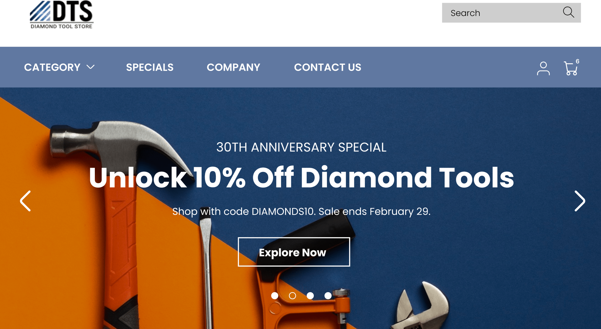
The homepage of DiamondToolStore.com underwent a significant transformation, starting with the header banner. This element is crucial as it’s the first thing visitors see. The new banner was designed to capture the essence of the brand, presenting a clear and engaging message that sets the tone for the rest of the site. It serves as a digital billboard, announcing who DiamondToolStore.com is and what it offers, while also highlighting key promotions and product offerings. This strategic placement of information helps in instantly grab visitors’ attention and pique their interest.
The user interface (UI) received a complete overhaul, focusing on modern, clean design principles. The updated UI is not just about aesthetics; it plays a critical role in increasing customer engagement. A visually appealing and easy-to-navigate interface helps in building trust and credibility. Customers are more likely to engage with a website that looks professional and is easy to use. This modern approach also differentiates DiamondToolStore.com from competitors who may still rely on outdated, text-heavy designs.
Simplicity was a key factor in the redesign. By utilizing clear language and avoiding unnecessary elements, the new design ensures that visitors can find what they need quickly and easily. This simplicity extends to the overall site navigation, where every element is designed with the user in mind. This approach minimizes confusion and enhances the user experience, making it more likely that visitors will stay longer and explore more.
Accessibility was another major consideration. The redesign ensured that the interface is accessible to all users, including those with disabilities. Key elements are easily identifiable, and the site is designed to be navigable with assistive technologies. This inclusivity not only broadens the potential customer base but also reflects DiamondToolStore.com’s commitment to serving all customers effectively.
A standout feature of the new homepage is the prominent display of the value proposition. This section is designed to catch the eye with attractive offers and clear, compelling messages about the benefits of the products and services offered. Phrases like “High quality,” “50% off,” and “Limited time offer” are strategically placed to draw immediate attention. This not only helps in converting visitors into customers but also reinforces the brand’s promise of quality and value.
Overall, the homepage redesign of DiamondToolStore.com exemplifies the power of a well-thought-out digital presence. By focusing on visual appeal, simplicity, and accessibility, the new design provides a superior user experience, encouraging engagement and fostering customer loyalty. It serves as a model for other businesses, demonstrating how a strategic redesign can significantly enhance online interaction and business performance without resorting to high-pressure sales tactics.
Quick View Functionality and Hover Effects
In the redesign of DiamondToolStore.com, implementing quick view functionality and sophisticated hover effects significantly enhanced the user experience. These features are integral in providing a seamless and engaging interaction with the website, catering to the needs of modern, tech-savvy consumers who value efficiency and responsiveness.
Hover effects add a dynamic layer to the user interface, responding instantly when a user hovers over an element. This interaction is not just visually appealing but also functional. For instance, when a visitor hovers over a product image, the image may enlarge, change color, or reveal additional information. These subtle yet impactful effects make the browsing experience more enjoyable and intuitive, signaling to users that the site is interactive and up-to-date.
Quick view functionality further simplifies the shopping process. When users can preview product details without navigating away from the current page, it reduces the steps needed to make a purchase decision. This feature is especially beneficial for users who are comparing multiple products or who want to quickly access essential information. By allowing a rapid overview of product details, quick view functionality minimizes friction in the user journey, leading to higher satisfaction and potentially increasing conversion rates.
Together, these enhancements address the common pain points associated with traditional, outdated e-commerce websites. Users no longer have to endure slow, cumbersome navigation to gather product information. Instead, they experience a streamlined process that respects their time and enhances their decision-making efficiency. This focus on user-centric design principles underscores the importance of adapting to evolving customer expectations, ensuring that the website remains competitive and relevant.
Mega Menu Design
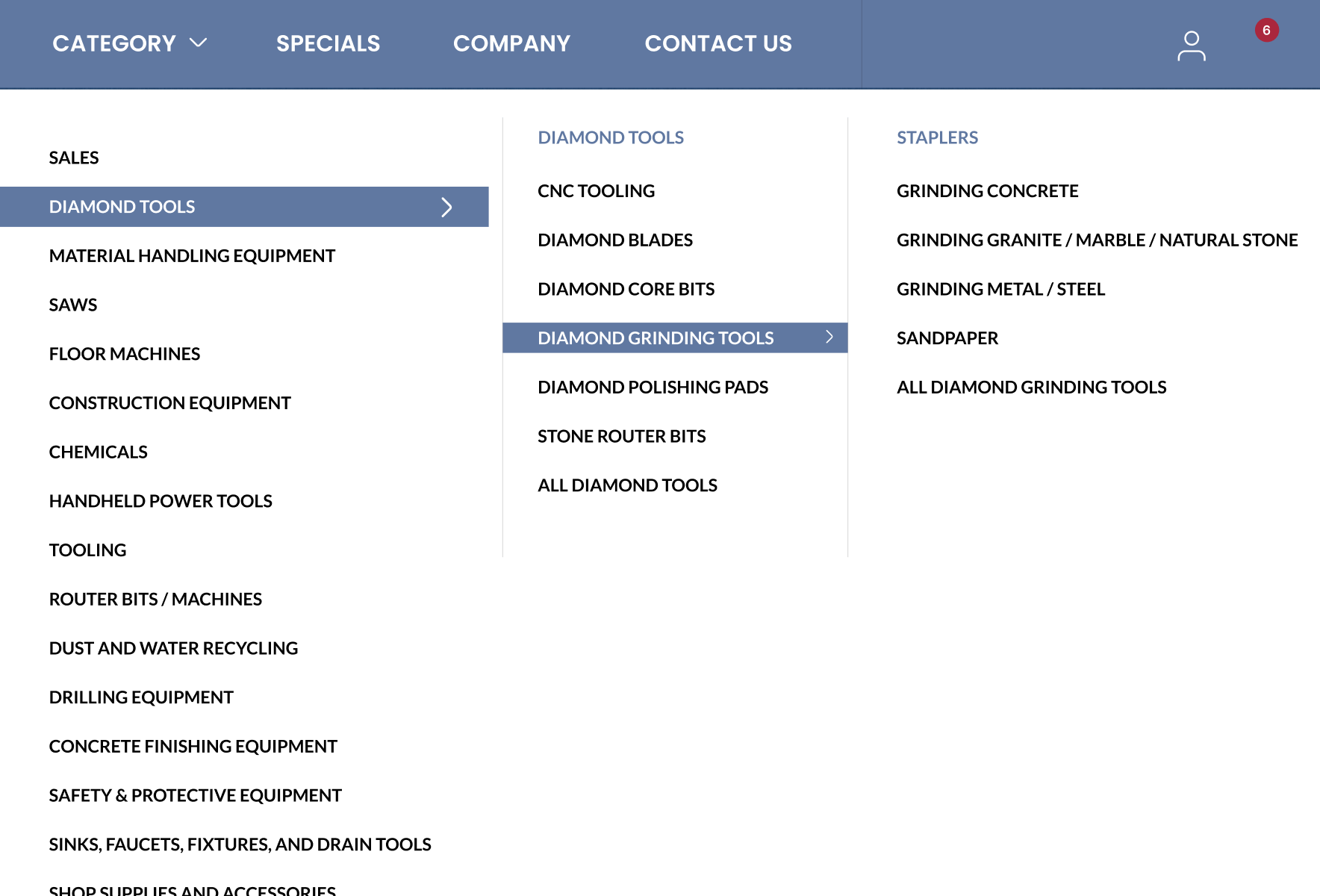
The introduction of a mega menu in the redesign of DiamondToolStore.com addresses the complexities of navigating an extensive product catalog. Traditional dropdown menus often become unwieldy with a large number of options, leading to a cluttered and confusing user experience. The mega menu resolves these issues by presenting a clean, organized, and comprehensive navigation structure.
Mega menus offer a premium navigation solution that allows users to see all available options at a glance. This feature is particularly advantageous for e-commerce sites with diverse product categories, like DiamondToolStore.com. Instead of sifting through multiple levels of dropdown menus, users can quickly find what they are looking for, enhancing their overall browsing experience.
The mega menu design also promotes relevant products and guides users efficiently through the website. By grouping related items and providing visual cues, it reduces cognitive load and helps users make informed choices. This organized layout not only simplifies navigation but also highlights special offers, new arrivals, and popular categories, directing users to high-value areas of the site.
The benefits of a mega menu extend beyond usability. It helps reduce bounce rates by ensuring that users can easily find and access the content they are interested in. This enhanced navigational tool contributes to a smoother user journey, making the shopping experience more enjoyable and effective. For businesses, it means higher engagement, longer visit durations, and increased likelihood of conversions.
In conclusion, the incorporation of quick view functionality, sophisticated hover effects, and a well-structured mega menu in the DiamondToolStore.com redesign exemplifies how modern design elements can significantly enhance user interaction. These features collectively transform the browsing experience, making it more efficient, enjoyable, and conducive to business success. By adopting such innovations, outdated websites can revitalize their online presence, meet contemporary user expectations, and maintain a competitive edge.
Category Pages Redesign
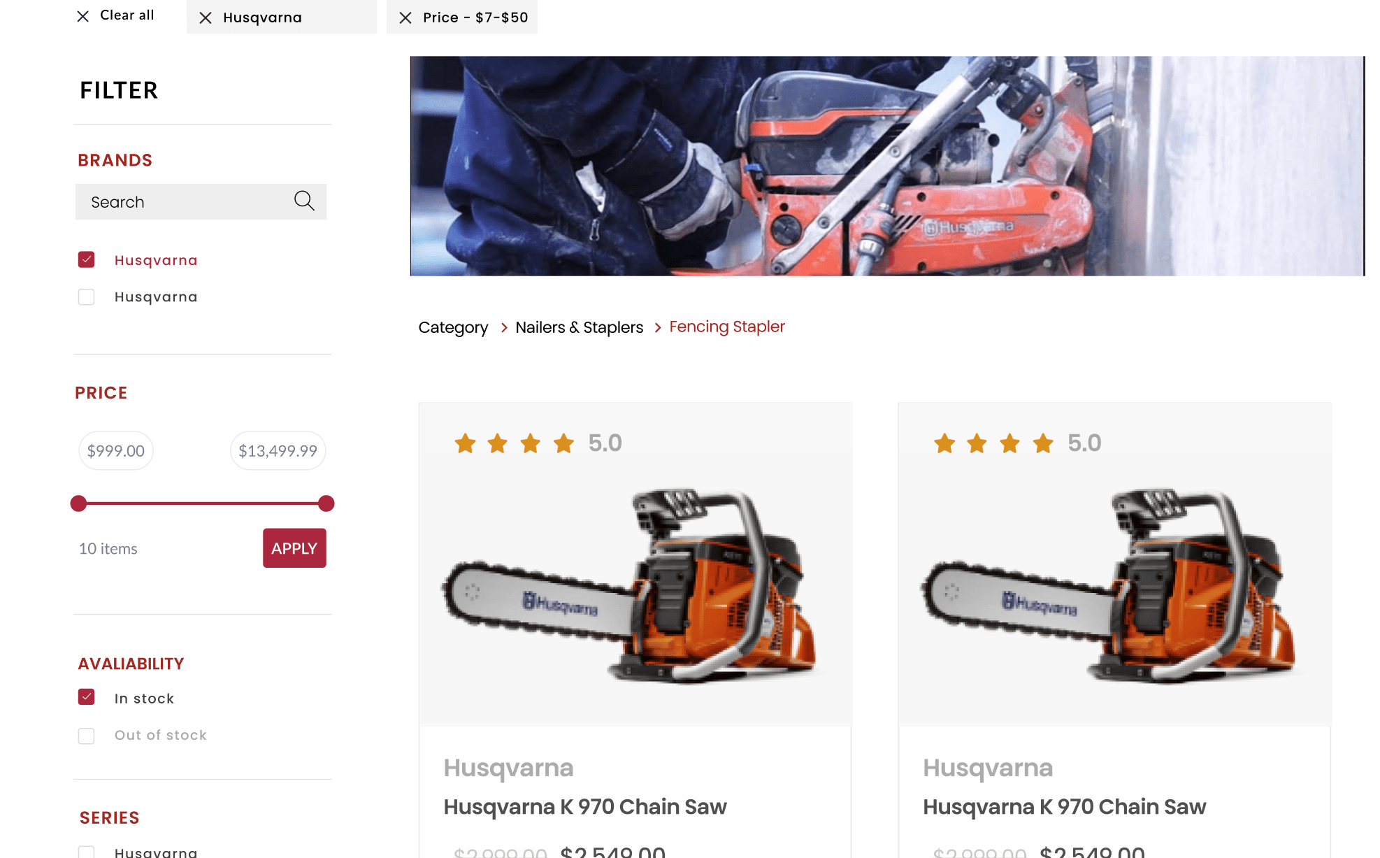
The category pages on DiamondToolStore.com have been meticulously redesigned to enhance user experience and facilitate efficient product discovery. Recognizing that a significant portion of visitors head straight to the search bar, the redesign focused on optimizing this critical functionality.
The new search interface is interactive, user-friendly, and visually appealing. These enhancements ensure that users can quickly find the products they need without unnecessary hassle. An effective search bar is a powerful tool in e-commerce, directly impacting user engagement and conversion rates. For DiamondToolStore.com, the revamped search functionality means that visitors are more likely to stay on the site, explore multiple products, and complete their purchases.
Additionally, the inclusion of a robust filtering system is essential for managing a large product inventory. Filters enable users to narrow down their search results based on specific criteria such as price, brand, or product features. This not only saves time but also improves the overall shopping experience by allowing customers to find exactly what they need with minimal effort. Well-designed filters can significantly boost user satisfaction and drive sales, as they make the shopping process more efficient and personalized.
By incorporating these user-centric design elements, the category pages are now more intuitive and easier to navigate. This transformation addresses common issues found in outdated websites, where poorly designed search and filtering systems often frustrate users and drive them away. The enhanced category pages on DiamondToolStore.com exemplify how thoughtful design improvements can lead to a more engaging and productive user experience.
Product Pages Redesign
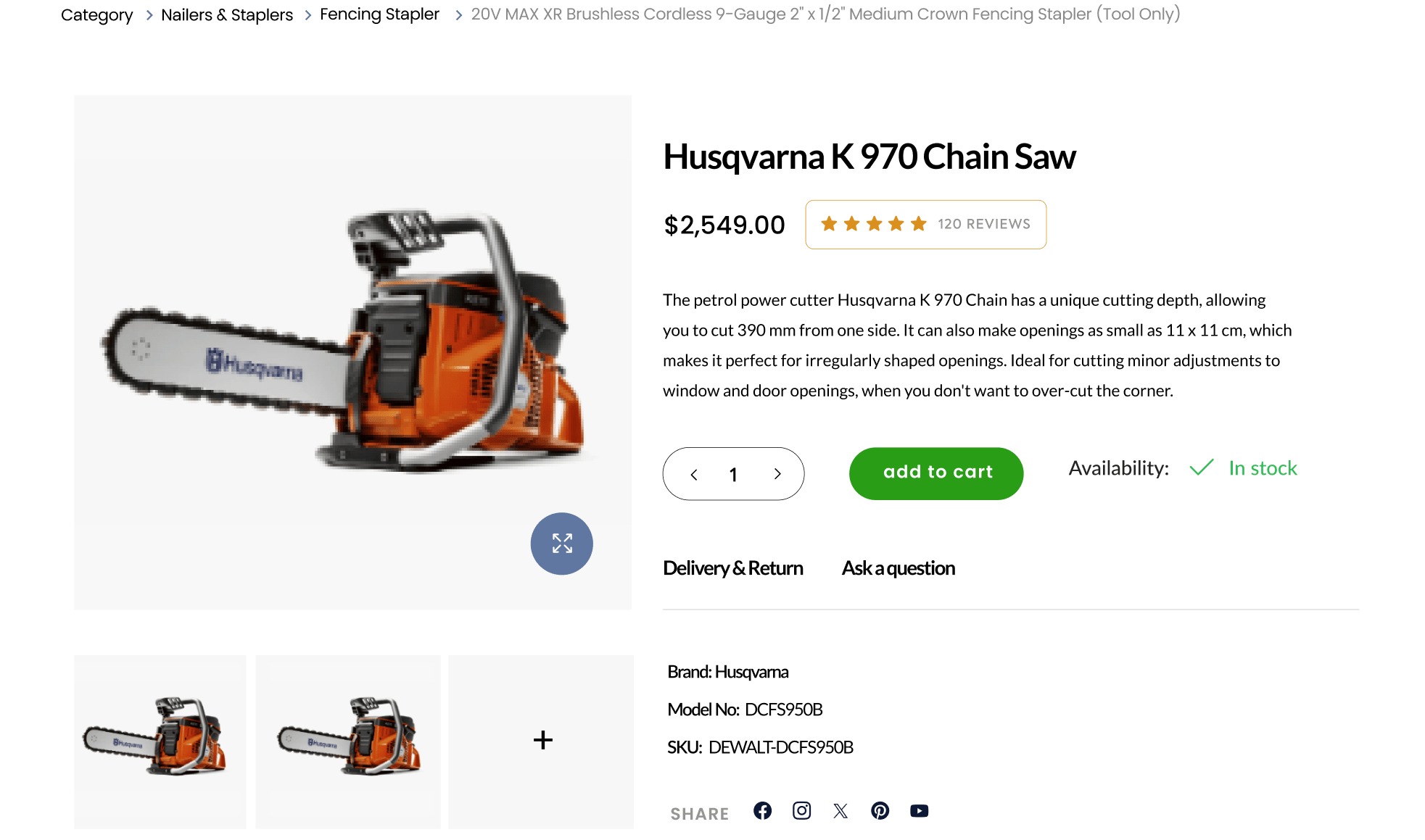
The redesign of the product pages on DiamondToolStore.com was guided by the principle of providing clear, concise, and useful information to help customers make informed purchase decisions. Central to this redesign was the inclusion of verified product ratings and reviews. Displaying customer feedback prominently helps build trust and credibility, assuring potential buyers of the product’s quality and reliability. This transparency is crucial in fostering a positive relationship between the business and its customers.
Highlighting key product features and benefits without overwhelming the user is another significant aspect of the redesign. The new layout presents product information in a digestible format, focusing on what matters most to the customer. This approach ensures that users can quickly grasp the essential details, leading to more confident purchasing decisions. Clear, well-organized information helps reduce decision fatigue and enhances the overall shopping experience.
Moreover, the redesigned product pages leverage up-selling and cross-selling strategies effectively. By showcasing similar higher-quality products or complementary items, DiamondToolStore.com can guide customers towards more comprehensive purchasing solutions. For example, a customer looking at a granite saw might also see recommendations for related accessories like blades and safety gear. This not only increases the average order value but also improves customer satisfaction by providing a more holistic shopping experience.
These enhancements address the shortcomings often found in outdated e-commerce websites, where cluttered and poorly organized product pages can deter potential buyers. The focus on clarity, trustworthiness, and additional value through recommendations sets a new standard for how product information should be presented.
In summary, the redesigned category and product pages on DiamondToolStore.com demonstrate the significant benefits of a user-focused approach. By prioritizing ease of use, transparency, and strategic product placement, the site now offers a more engaging and effective shopping experience. These changes highlight the importance of continuous improvement in website design, ensuring that businesses can meet the evolving needs of their customers and stay competitive in the digital marketplace.
Conclusion
The comprehensive redesign of DiamondToolStore.com highlights the transformative power of a well-executed website update. By addressing key areas such as the homepage, quick view functionality, hover effects, mega menu, category pages, and product pages, the redesign significantly enhances user experience, engagement, and overall satisfaction.
The revamped homepage sets a new standard for first impressions, showcasing a compelling header banner that captures the essence of the brand and immediately engages visitors. The introduction of a modern, clean user interface builds trust and encourages users to explore further, while the emphasis on simplicity and accessibility ensures that all visitors can navigate the site with ease.
Quick view functionality and sophisticated hover effects add an interactive dimension to the browsing experience, making it more intuitive and enjoyable. These features allow users to quickly access product information and interact with the site dynamically, reducing friction in the shopping process and increasing the likelihood of conversions.
The implementation of a mega menu revolutionizes site navigation, providing a clear and organized structure that makes it easy for users to find what they are looking for. This enhancement is particularly beneficial for e-commerce sites with extensive product catalogs, as it reduces clutter and improves overall usability.
Redesigning the category pages with an enhanced search interface and robust filtering system ensures that users can efficiently locate products that meet their specific needs. This user-centric approach not only improves engagement but also increases the chances of successful transactions, as visitors can quickly and easily find the items they are looking for.
On the product pages, the focus on verified ratings, clear presentation of key features, and strategic use of up-selling and cross-selling techniques further enhance the shopping experience. By providing transparent and useful information, the redesigned product pages help build customer trust and encourage informed purchase decisions.
This redesign project exemplifies the importance of continually evolving and improving digital platforms to meet changing user expectations and industry standards. Outdated websites that fail to prioritize user experience risk losing engagement and falling behind competitors. By embracing thoughtful, user-focused design principles, businesses can create more engaging, efficient, and satisfying online experiences.


