In today’s digital landscape, a company’s website is often the first point of contact between the business and its customers. For Cyberweld, an esteemed online retailer specializing in welding supplies and safety gear, maintaining an up-to-date, user-friendly website is crucial. With over 85 years of history as a trusted source for welding equipment, Cyberweld understands the importance of adapting to the evolving digital environment to continue serving its customers effectively.
A comprehensive website redesign can significantly impact an e-commerce business by enhancing user experience, increasing customer engagement, and boosting sales. For Cyberweld, this meant a complete overhaul of their website from the ground up, focusing on modern design principles, user-centric features, and seamless navigation. This article explores the various aspects of the redesign, detailing the importance of each change and its benefits, while illustrating why outdated websites should consider a similar transformation.
The Transformation of Cyberweld’s Homepage
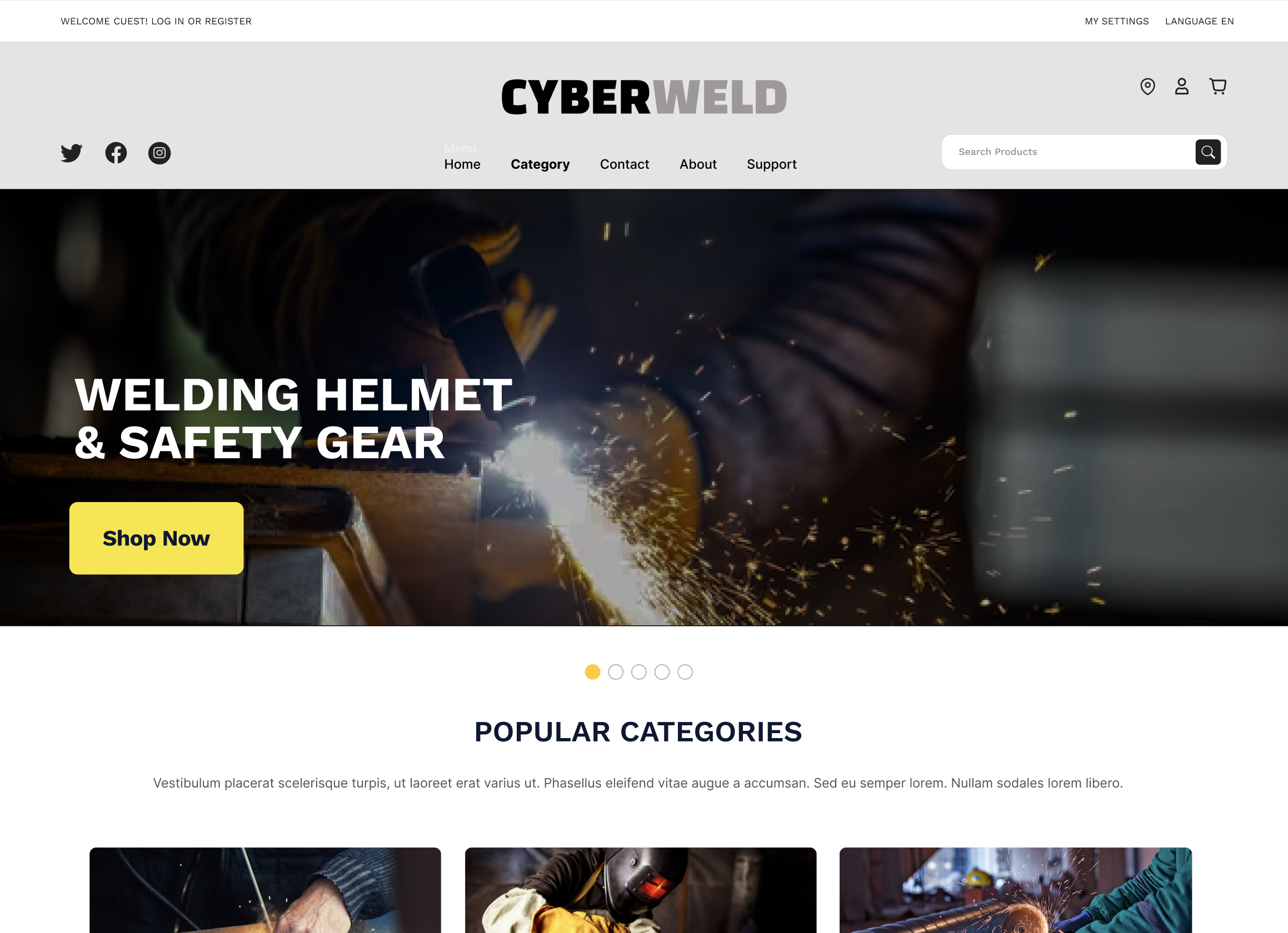
Crafting a Compelling Header Banner
The header banner is the digital equivalent of a storefront window display. It’s the first visual cue that greets visitors, setting the stage for their entire browsing experience. For Cyberweld, the redesigned header banner is not just about aesthetics; it’s a strategic element designed to capture attention and convey the brand’s core values succinctly.
The importance of the header banner cannot be overstated. As the first thing visitors see, it creates an immediate impression of the site’s professionalism and quality. A well-crafted header banner serves as a powerful marketing tool, drawing in potential customers and providing a snapshot of what Cyberweld stands for. This redesign features high-resolution images and bold graphics that enhance visual appeal, making the site more engaging and professional.
Moreover, the banner’s messaging has been refined to highlight Cyberweld’s commitment to quality and value. By using concise and compelling language, the banner quickly communicates the brand’s core values and key offerings. This clarity is crucial in building trust with visitors right from the start. An effective header banner can transform casual visitors into engaged users, paving the way for higher conversion rates. It encourages users to explore more of the site, leading to longer browsing sessions and a deeper connection with the brand.
In addition to its visual appeal, the header banner plays a vital role in navigation. Strategic placement of calls to action and promotional messages helps guide visitors to key areas of the site, such as featured products or special offers. This not only enhances the user experience but also drives traffic to important sections of the website, boosting overall engagement and sales.
Enhancing User Engagement with Modern UI
A user-friendly and visually appealing interface is vital in today’s competitive online marketplace. Cyberweld’s redesign places a strong emphasis on simplicity and ease of use. The new user interface (UI) employs clean, intuitive layouts that guide visitors effortlessly through the site. This redesign prioritizes user experience by minimizing clutter and focusing on essential elements, ensuring that visitors can find what they need quickly and easily.
Interactive elements, such as smooth animations and responsive design, add a dynamic layer to the browsing experience. These features are not merely decorative; they play a pivotal role in retaining visitors and encouraging them to spend more time on the site. For instance, subtle animations can draw attention to important information or guide users through the navigation process, making the site more intuitive and enjoyable to use.
By adopting a simplified and modern UI, Cyberweld has created an environment where users feel comfortable and engaged. The redesign includes clear language and streamlined interfaces that reduce confusion and enhance usability. This is particularly important for e-commerce sites, where ease of navigation can directly impact sales. A well-designed UI can significantly reduce bounce rates, as visitors are more likely to stay and explore rather than leave the site immediately.
The benefits of a modern UI extend beyond user engagement. A visually appealing and easy-to-use interface also builds trust with visitors. It signals that Cyberweld is a professional and reliable brand, capable of meeting customer needs efficiently. This trust is essential for converting visitors into loyal customers, as it reassures them of the quality and reliability of the products and services offered.
Adopting a modern UI also provides a competitive advantage. By distinguishing itself from competitors with outdated, text-heavy websites, Cyberweld can attract and retain more customers. The redesign signals quality and reliability, key aspects that build customer trust and drive engagement. In a crowded online marketplace, having a sleek and user-friendly interface can set a business apart and contribute significantly to its success.
In summary, the transformation of Cyberweld’s homepage through the redesign of the header banner and the implementation of a modern UI has resulted in a more engaging and user-friendly website. These changes not only enhance the overall user experience but also help build trust and drive higher conversion rates. For businesses with outdated websites, this redesign serves as a compelling example of the benefits of modernization. Improved customer satisfaction, increased trust, and higher sales are attainable through strategic and thoughtful design changes. Embracing such transformations is essential for staying competitive in today’s digital marketplace.
Strategic Use of Banner Ads
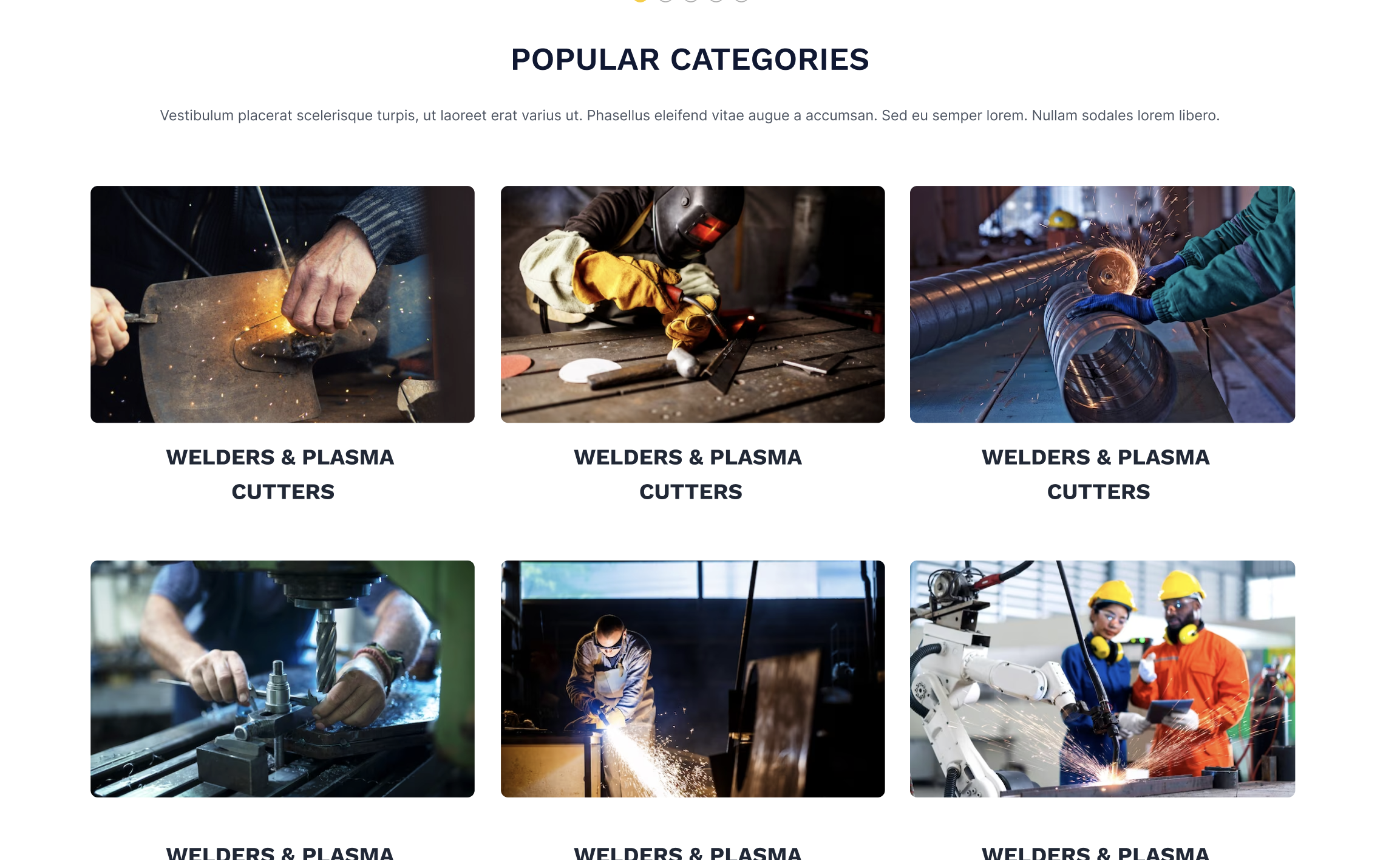
Banner ads remain a cornerstone of online marketing, and their integration into Cyberweld’s redesigned homepage enhances product visibility and drives targeted traffic. Positioned prominently, these ads showcase key promotions and featured products, enticing visitors with attractive offers like discounts and limited-time deals.
The effectiveness of banner ads lies in their ability to deliver clear calls to action. Cyberweld’s redesign ensures these ads are not only eye-catching but also accessible to all users, including those with disabilities. This inclusive approach broadens the site’s reach and enhances the overall user experience.
The Role of Banner Ads in Online Marketing
Banner ads serve as a powerful marketing tool, providing an effective way to promote products and services directly on the homepage. For Cyberweld, the strategic placement of these ads ensures that key promotions and featured products are highly visible to visitors. By highlighting attractive offers such as discounts and limited-time deals, these ads draw immediate interest and engagement, driving traffic to specific pages and increasing the likelihood of conversions.
Banner ads also serve as a visual guide, helping visitors navigate the site more effectively. Clear and compelling calls to action are essential in encouraging visitors to click on the ads and explore further. This not only enhances user engagement but also directs traffic to important sections of the website, such as special offers or new product launches. The redesigned banner ads for Cyberweld are designed to be both visually appealing and functional, ensuring that they capture attention while providing valuable information.
Design Considerations for Effective Banner Ads
Effective banner ads are more than just eye-catching graphics; they require careful consideration of design elements to maximize their impact. For Cyberweld, the redesign of banner ads involved several key considerations:
- Visual Appeal: High-quality images and bold graphics are used to create visually appealing ads that stand out on the homepage. These visuals draw attention and encourage visitors to engage with the content.
- Clarity: Clear and concise messaging is crucial in conveying the value of the offer. The redesigned ads use straightforward language to highlight the benefits of the promotion, ensuring that visitors understand the value proposition quickly.
- Accessibility: Ensuring that banner ads are accessible to all users, including those with disabilities, is a priority in the redesign. This includes using appropriate color contrasts, font sizes, and alternative text for images to ensure that the ads are easily readable and navigable by all visitors.
Impact on User Experience and Conversion Rates
The strategic use of banner ads on Cyberweld’s redesigned homepage has a significant impact on user experience and conversion rates. By showcasing key promotions and featured products, these ads provide valuable information that helps visitors make informed purchasing decisions. The clear calls to action encourage visitors to explore further, leading to higher engagement and increased conversions.
Additionally, the use of accessible design elements ensures that all visitors, regardless of their abilities, can engage with the ads effectively. This inclusive approach broadens the reach of the site, making it more user-friendly and appealing to a wider audience. The result is a more engaging and efficient online shopping experience that drives higher sales and customer satisfaction.
Communicating Value Effectively
A strong value proposition is essential in capturing visitor interest and driving conversions. Cyberweld’s redesigned homepage prominently features value propositions that communicate the benefits of their products and services succinctly. Phrases like “High quality,” “50% off,” and “Limited time offer” are strategically placed to grab attention and encourage immediate action.
The Importance of a Clear Value Proposition
In the competitive world of e-commerce, a clear and compelling value proposition can make all the difference in attracting and retaining customers. For Cyberweld, the value proposition is prominently displayed on the homepage to ensure that visitors immediately understand the benefits of shopping with them. This quick communication of value is crucial in capturing visitor interest and encouraging them to explore the site further.
The value proposition highlights key features and offers, such as high-quality products, significant discounts, and limited-time deals. These elements are designed to appeal to the target audience and provide a compelling reason to choose Cyberweld over competitors. By clearly stating the benefits and offers, the value proposition helps visitors quickly understand the value they provide, setting themselves apart from competitors.
Strategic Placement and Messaging
The strategic placement of the value proposition on the homepage ensures that it is one of the first things visitors see. This prominence is essential in capturing attention and encouraging immediate action. For Cyberweld, the value proposition is displayed in a visually appealing and easily readable format, using bold text and contrasting colors to make it stand out.
The messaging is clear and concise, using phrases like “High quality,” “50% off,” and “Limited time offer” to communicate the value quickly and effectively. These messages are designed to appeal to the target audience’s needs and desires, providing a strong incentive to make a purchase. By focusing on the benefits and offers, Cyberweld can engage visitors and encourage them to take the next step in the buying process.
Enhancing User Experience and Driving Conversions
A well-crafted value proposition not only captures attention but also enhances the overall user experience. By clearly communicating the benefits and offers, Cyberweld helps visitors make informed purchasing decisions. This transparency builds trust and confidence in the brand, which is essential in driving conversions.
The value proposition also plays a crucial role in guiding visitors through the site. By highlighting key offers and benefits, it encourages visitors to explore further and discover more about the products and services available. This increased engagement leads to longer browsing sessions and a higher likelihood of conversion.
In conclusion, the strategic use of banner ads and the effective communication of value propositions are integral to Cyberweld’s redesigned homepage. These elements work together to enhance the user experience, increase engagement, and drive higher conversion rates. For businesses with outdated websites, incorporating these strategies can lead to significant improvements in customer satisfaction, trust, and sales. Embracing such changes is essential for staying competitive in today’s digital marketplace.
Mega Menu Design
Navigating a website with a large number of pages and options can be challenging for users. To address this, we proposed implementing a premium advanced mega menu solution for Cyberweld. This feature aims to facilitate easy navigation, reduce clutter, promote relevant products, and guide shoppers precisely to what they are looking for.
Advantages of Mega Menus Over Traditional Dropdowns
Mega menus offer significant advantages over traditional dropdown menus, especially for e-commerce sites with extensive product categories. Unlike traditional dropdowns, which can become cumbersome and difficult to navigate when there are many options, mega menus display categories in a well-organized, visually appealing manner. This allows users to see all their options at a glance, making it easier to find what they need quickly.
Our redesign for Cyberweld’s mega menu involves organizing various product categories, such as welders, helmets, and safety gear, into easily accessible sections. This organized presentation is designed to enhance usability and encourage exploration of different product categories, potentially increasing the average order value.
Enhancing User Experience Through Better Navigation
A well-designed mega menu significantly improves the overall user experience by providing a clear and intuitive navigation structure. For Cyberweld, the proposed mega menu includes images and brief descriptions for each category, helping users quickly identify the products they are interested in. This visual aid is particularly useful for new customers who may not be familiar with all the product categories available.
Moreover, our mega menu design aligns with Cyberweld’s commitment to accessibility. By ensuring that the menu is easy to use for all visitors, including those with disabilities, Cyberweld can create an inclusive shopping environment that caters to a diverse customer base.
Category Pages
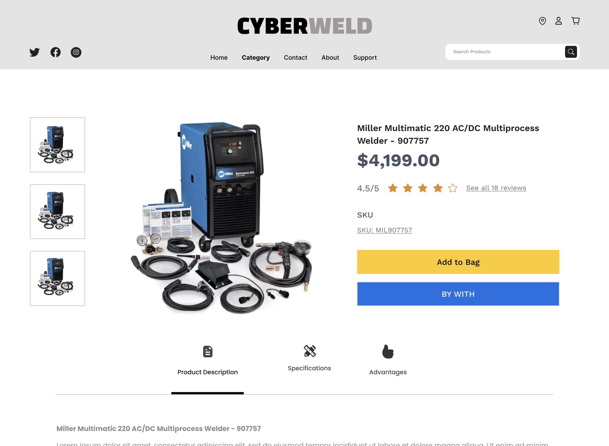
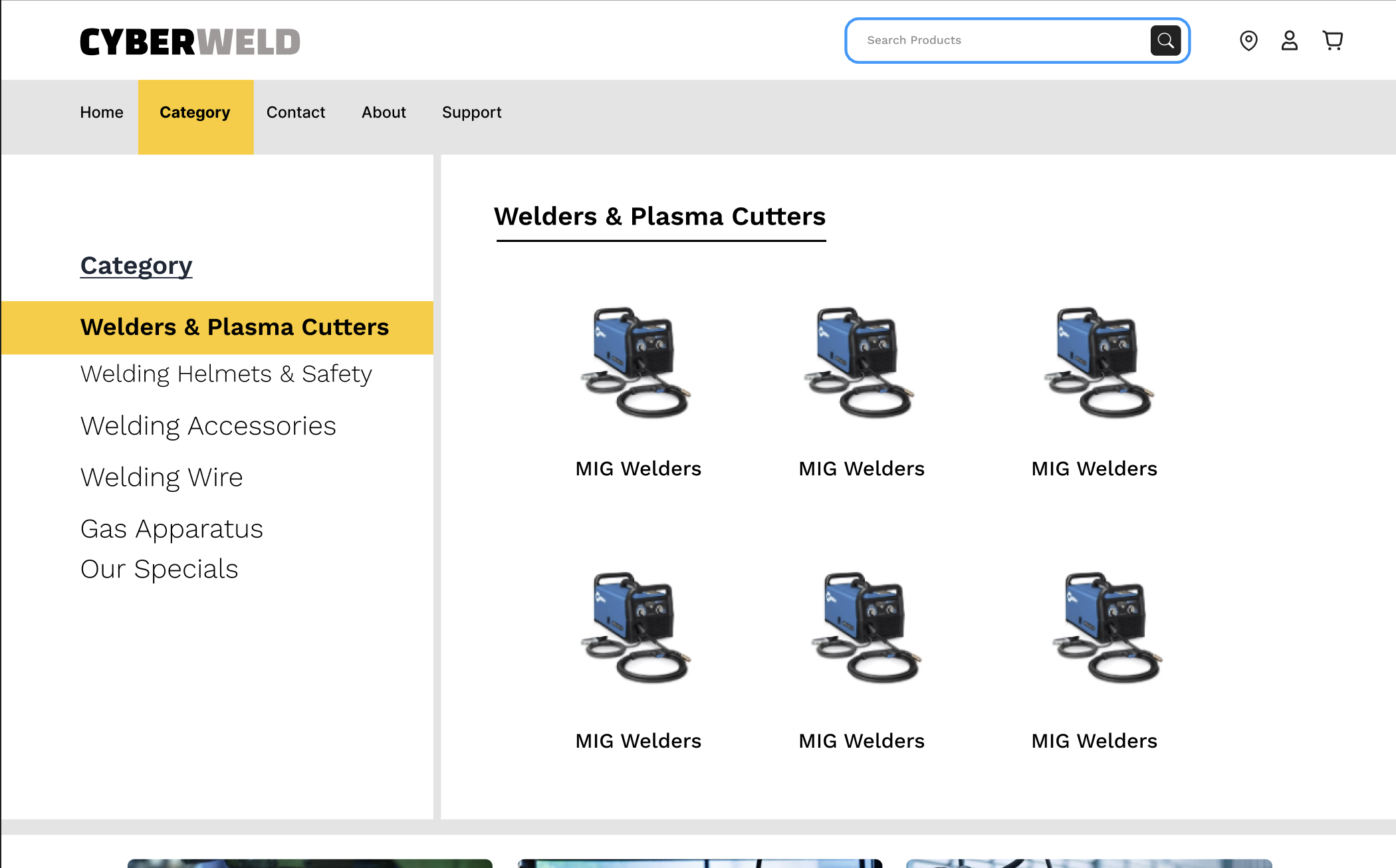
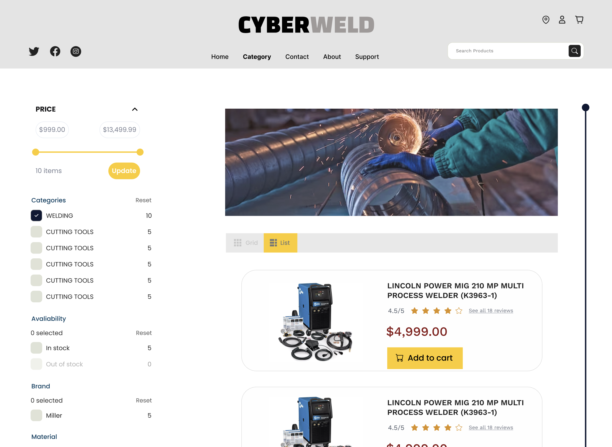
Effective category pages are crucial for e-commerce websites, particularly those with a large inventory. According to Forrester Research, 43% of website visitors immediately head to the search bar on an e-commerce site. Searchers are more engaged and are 1.8 times more likely to convert than non-searchers.
Optimizing the Search Interface
To optimize the entire search process and make finding products seamless, our redesign for Cyberweld includes an interactive, easy-to-use, and aesthetically pleasing search interface. By enhancing the search functionality, we aim to provide users with a more efficient way to find the products they need, thereby improving the overall shopping experience.
Implementing a Robust Filtering System
For websites with a large number of products, a filtering system is essential. Filters help present a variety of products, improve the user experience, reach a wider audience, and increase sales. Even the simple act of adding filters can increase a website’s conversion rate by 26%. Fixing issues with filters’ UX design can produce powerful results.
Our redesign includes a robust filtering system for Cyberweld that allows users to narrow down their search results based on specific criteria, such as brand, price range, and product features. This functionality is particularly useful for an e-commerce site like Cyberweld, which offers a wide range of products.
Conclusion
Our comprehensive redesign for the redesign of Cyberweld’s website encompasses several key elements aimed at enhancing the user experience, increasing engagement, and driving higher conversion rates. From the strategic use of a compelling header banner and a modern user interface to the implementation of mega menus and optimized category pages, each component is designed to create a more user-friendly, efficient, and appealing online shopping environment.
For businesses with outdated websites, this redesign highlights the significant benefits of modernization. By adopting these strategic changes, companies like Cyberweld can improve customer satisfaction, build trust, and ultimately achieve higher sales. Embracing such transformations is essential for staying competitive in today’s digital marketplace, and our redesign sets a clear path for achieving these goals.
In summary, the anticipated improvements are poised to make a substantial impact on the business. The focus on user-centric design and modern web practices ensures that Cyberweld can continue to meet the needs of its customers effectively, paving the way for future growth and success.


