A successful website redesign can be transformative for any business, especially for those in the competitive retail industry. This was the case with CabinetsToGo.com, a leading provider of high-quality kitchen cabinets and design services. With expert kitchen designers available at every store, CabinetsToGo.com aims to turn dream kitchens into reality. However, even with a strong business model and a solid customer base, their online presence needed an overhaul to stay relevant and competitive.
The primary objective of the redesign was to enhance user engagement and experience. In today’s digital age, a website is often the first interaction a customer has with a business. Therefore, creating a user-friendly, visually appealing, and functional website is crucial for attracting and retaining customers. Our goal was to build a site that not only looks modern and professional but also simplifies the shopping process and improves accessibility for all users. This comprehensive redesign aims to build trust, foster brand loyalty, and differentiate CabinetsToGo.com from competitors with outdated, text-heavy designs.
Homepage Redesign
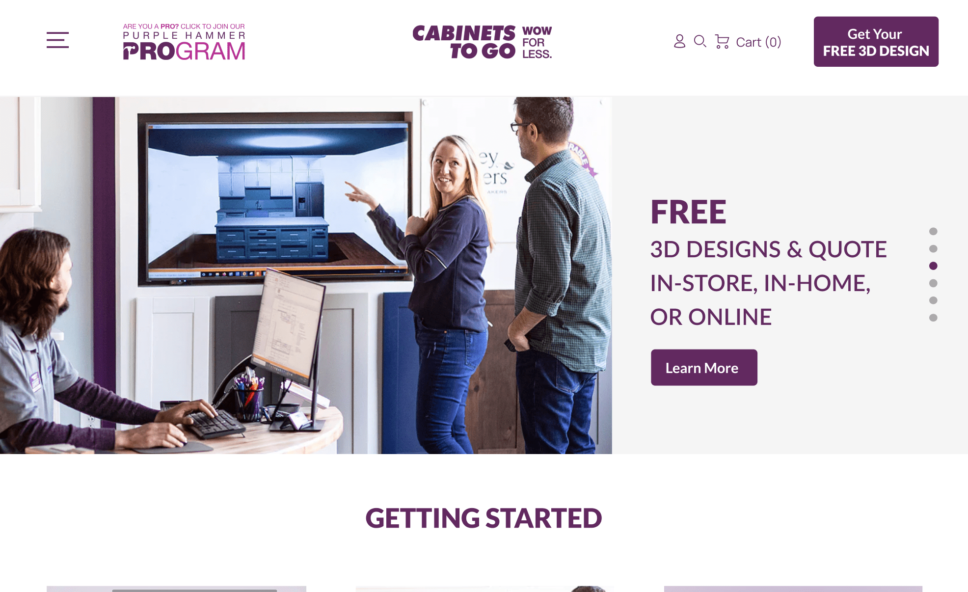
Header Banner
The header banner is a vital component of any homepage, acting as the first visual interaction users have with a website. It serves as a digital billboard that communicates who you are and what you offer. For CabinetsToGo.com, we crafted a new header banner designed to immediately capture attention and convey the brand’s identity and values. The primary goal was to establish a strong first impression that resonates with visitors and encourages them to explore further. By incorporating high-quality visuals and concise, impactful messaging, we created a banner that effectively announces the brand’s presence and what it stands for.
New User Interface (UI)
The new user interface is designed to significantly boost customer engagement and trust in CabinetsToGo.com’s products. In an era where users are inundated with information, a cluttered and text-heavy website can be a major turn-off. Our redesign focuses on creating an intuitive and visually appealing interface that stands out from the competition. This modern UI not only looks good but also functions seamlessly, making it easier for users to navigate the site and find what they need. A well-designed interface enhances user satisfaction, increasing the likelihood of repeat visits and long-term loyalty.
Simple Design Philosophy
In line with modern design principles, we prioritized simplicity and clarity in the new website layout. Simple interfaces are more effective because they reduce cognitive load, making it easier for users to understand and interact with the site. By using clear language and avoiding unnecessary elements, we ensured that visitors can focus on what matters most: finding and purchasing the right products. This approach minimizes confusion and frustration, leading to a smoother, more enjoyable user experience.
Banner Ads
Banner ads are a powerful tool for promoting products and driving traffic to specific parts of a website. In our redesign, we strategically placed banner ads on the homepage to highlight special offers and featured products. These ads are designed to be visually appealing and engaging, with compelling calls to action that encourage users to click through and learn more. By measuring the effectiveness of these ads, we can continually optimize their placement and content to maximize their impact.
Accessibility
Ensuring that the website is accessible to all users was a key consideration in our redesign. We implemented best practices to make the interface usable for individuals with varying abilities. This includes optimizing color contrast, providing text alternatives for images, and ensuring that navigation elements are easily identifiable and operable. An accessible website not only complies with legal standards but also expands the potential customer base by making the site usable for everyone.
Value Proposition
A strong value proposition is essential for capturing the attention of visitors and converting them into customers. On the redesigned homepage, we prominently feature the value propositions of CabinetsToGo.com, such as high-quality products, competitive pricing, and limited-time offers. These elements are designed to immediately attract the viewer’s eye and communicate the benefits of choosing CabinetsToGo.com over competitors. By highlighting what sets the brand apart, we aim to drive engagement and increase sales.
Category Pages
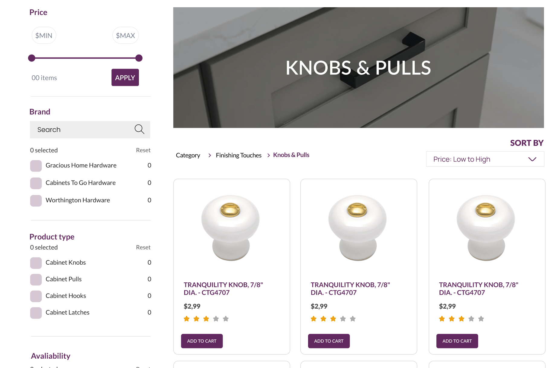
Effective category pages are crucial for guiding users to the products they seek, especially on e-commerce websites with extensive inventories. For CabinetsToGo.com, the redesign of category pages was essential to enhance the shopping experience and increase conversion rates.
Optimized Search Interface
According to Forrester Research, 43% of website visitors head straight to the search bar. These users are 1.8 times more likely to convert compared to those who browse without using search. Recognizing this, we optimized the search interface to be interactive, user-friendly, and visually appealing. An effective search function should facilitate quick and accurate results, minimizing the time and effort users spend looking for products.
Our redesign includes an auto-suggest feature that provides instant search results as users type, helping them find products faster. We also integrated advanced search filters that allow users to narrow down results based on various criteria such as price, color, material, and style. This level of interactivity not only enhances user satisfaction but also increases the likelihood of conversion by presenting relevant products efficiently.
Filtering System
A robust filtering system is indispensable for websites with a large number of products. Even websites with fewer products benefit from filters, as they streamline the shopping process and improve user experience. For CabinetsToGo.com, we implemented a comprehensive filtering system that allows users to sort and filter products based on multiple attributes.
Filters improve the overall usability of the site by helping users quickly find what they need without wading through irrelevant options. Research indicates that adding filters can increase conversion rates by 26%. By making it easier for users to locate specific products, we enhance their shopping experience and boost the likelihood of purchase. The filtering system also helps in reaching a broader audience by catering to diverse preferences and requirements.
Product Pages
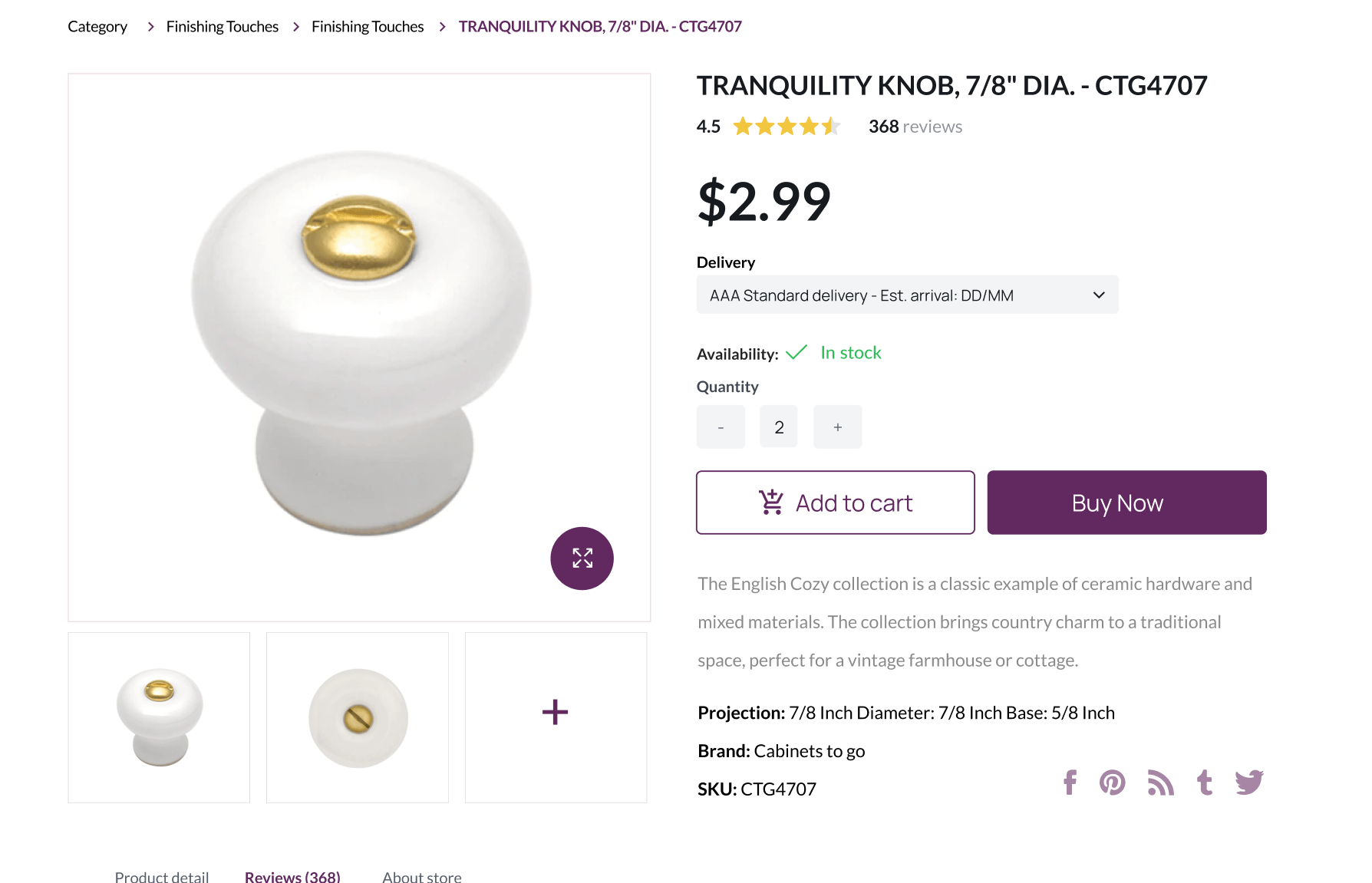
Product pages are where purchase decisions are made, so their design and functionality are paramount. For CabinetsToGo.com, we focused on creating product pages that build trust, provide comprehensive information, and encourage sales.
Verified Product Ratings
One of the key elements we introduced is verified product ratings. Customer reviews and ratings are powerful tools for building trust and credibility. By displaying authentic feedback from verified buyers, we reassure potential customers about the quality and reliability of the products. This transparency helps users make informed decisions and increases their confidence in purchasing from the site.
Verified ratings also contribute to search engine optimization (SEO), as they generate fresh content and keywords that improve the site’s visibility on search engines. This, in turn, drives more organic traffic to the product pages.
Product Highlights and Features
Presenting product highlights and features effectively is crucial for capturing user interest without overwhelming them with information. Our redesign focuses on a clean, organized layout that emphasizes key product attributes.
We use concise bullet points and high-quality images to showcase the most important features, making it easy for users to grasp the benefits quickly. This approach not only enhances the visual appeal of the product pages but also aids in decision-making by providing clear, accessible information.
Up-selling and Cross-selling
To maximize sales opportunities, we incorporated up-selling and cross-selling strategies into the product pages. Up-selling involves presenting users with higher-end versions of the product they are viewing, encouraging them to consider a more premium option. Cross-selling, on the other hand, showcases complementary products that enhance the main item.
For example, a kitchen cabinet set might be paired with matching handles, hinges, or interior lighting solutions. By strategically placing these recommendations on the product pages, we provide added value to the customer while increasing the average order value. This not only improves the shopping experience but also drives additional revenue for the business.
Quick View Functionality and Hover Effects
Improving user interaction and streamlining the shopping experience were key objectives in the redesign of CabinetsToGo.com. The implementation of quick view functionality and hover effects plays a crucial role in achieving these goals.
Hover Effects
Hover effects enhance the user experience by providing interactive feedback when a user hovers over an element such as a link or button. This interaction is not only enjoyable but also signals that the site is responsive and well-maintained. For CabinetsToGo.com, we implemented hover effects that include color changes, size adjustments, and subtle animations.
These visual cues help guide users’ attention to key items and actions on the web page, making navigation intuitive and engaging. For example, buttons that change color on hover indicate they are clickable, while product images that enlarge slightly can draw attention to specific items. This dynamic interaction keeps users engaged and encourages them to explore more of the site.
Quick View Options
Quick view functionality significantly enhances the shopping experience by allowing users to preview product details without navigating away from the current page. This feature is particularly beneficial for users who are comparing multiple items or want to quickly gather information about products.
On CabinetsToGo.com, the quick view option provides a summary of essential product details, such as price, availability, and key features, in a pop-up window. Users can view these details and even add items to their cart directly from the quick view window, saving time and reducing the need to click back and forth between product and category pages.
This seamless experience is particularly valuable for users looking to make quick purchasing decisions or those who prefer a streamlined shopping process. By minimizing the steps required to access product information, the quick view functionality enhances user satisfaction and increases the likelihood of conversion.
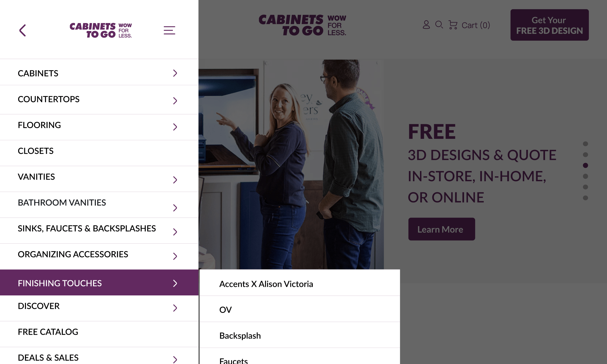
Mega Menu Design
For websites with extensive product offerings, effective navigation is essential. The redesign of the mega menu on CabinetsToGo.com addresses this need by providing a sophisticated, user-friendly solution that simplifies navigation and enhances the overall user experience.
Advanced Mega Menu Solution
Mega menus are an advanced navigation tool that display a wide array of options in a structured, visually appealing layout. Unlike traditional drop-down menus, which can become cluttered and difficult to use when they contain many options, mega menus organize content into categories and subcategories that are easy to scan and select.
On CabinetsToGo.com, the mega menu provides clear, organized access to the various product categories, from kitchen cabinets to accessories and installation services. This structure helps users quickly find what they are looking for without having to sift through a cluttered menu.
Benefits of Mega Menus
The primary advantage of a mega menu is its ability to reduce clutter and make navigation more efficient. For e-commerce websites with a wide range of products, this is particularly important. Users can see a broad overview of available categories at a glance, which helps them locate products faster and with less effort.
Additionally, mega menus promote relevant products by allowing businesses to highlight popular categories, special deals, or new arrivals within the menu itself. This visibility can drive traffic to specific sections of the website and encourage users to explore more products.
Comparing Mega Menus to Regular Dropdowns
Traditional dropdown menus can become unwieldy and hard to navigate as the number of options grows. In contrast, mega menus offer a more organized and aesthetically pleasing way to present numerous options. By categorizing items and providing a clear visual hierarchy, mega menus improve usability and reduce the frustration often associated with large dropdown menus.
For CabinetsToGo.com, the mega menu not only enhances navigation but also supports the overall design aesthetic of the site. It ensures that users can easily find the products they need, promoting a smoother and more enjoyable shopping experience.
Conclusion
By focusing on key areas such as the homepage, category pages, product pages, quick view functionality, hover effects, and mega menu design, we have created a website mockup that is both visually appealing and highly functional.
The updated homepage, with its engaging header banner and simplified user interface, sets a strong first impression and encourages visitors to explore the site. The emphasis on accessibility and clear value propositions ensures that all users can navigate and understand the offerings, enhancing overall user satisfaction and trust in the brand.
In the category pages, the optimized search interface and robust filtering system facilitate efficient product discovery, making it easier for users to find exactly what they are looking for. This not only improves the user experience but also significantly increases conversion rates, as users are more likely to purchase when they can quickly locate relevant products.
Product pages have been redesigned to build trust and provide essential information in a clear and concise manner. Verified product ratings, well-organized product highlights, and strategic up-selling and cross-selling all contribute to an informed and confident purchasing decision. These elements help to reassure customers of the product quality and encourage higher sales through thoughtful recommendations.
The implementation of quick view functionality and interactive hover effects further enhances the shopping experience by making product information readily accessible and engaging. These features reduce the friction in the shopping process, allowing users to make decisions more quickly and enjoyably.
The advanced mega menu design offers a streamlined and efficient way for users to navigate a large array of products. By reducing clutter and providing a clear, organized structure, the mega menu ensures that users can find what they need with ease, promoting a more intuitive and satisfying shopping journey.
In summary, the redesign of CabinetsToGo.com showcases the importance of staying current with web design trends and continuously seeking improvements to enhance user interaction. An outdated website can significantly hinder user experience and business growth, while a modern, well-designed site can drive engagement, build trust, and increase sales. By embracing these design principles, any business can create a more compelling and effective online presence, ultimately leading to greater success.


