A successful website redesign can be a game-changer for any business, significantly enhancing user experience and boosting overall performance. For BulbAmerica.com, a leading provider of light bulbs, fixtures, LED lighting, and more, our comprehensive redesign aimed to modernize the website and make it more user-friendly, engaging, and effective in converting visitors into customers.
In this article, we will walk you through the key aspects of the redesign process, highlighting the specific changes we made and explaining the rationale behind each decision. Our goal is to showcase how a well-thought-out redesign can lead to increased customer engagement, trust, and ultimately, sales.
Homepage Redesign
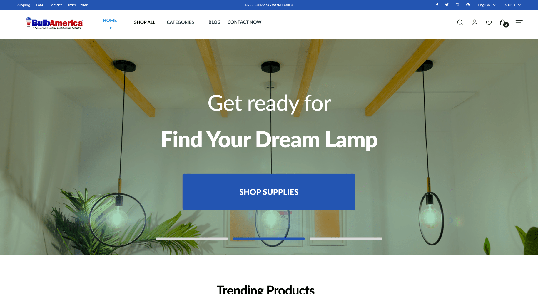
Header Banner
The header banner is the first visual element visitors encounter when they arrive at a website. For BulbAmerica.com, we transformed this space into a powerful marketing tool. The new banner is designed to immediately capture attention and convey the brand’s identity and personality. This is crucial because it sets the tone for the entire user experience. A well-crafted header banner can communicate key messages about the brand and its offerings, making a strong first impression.
By utilizing high-quality visuals and concise, impactful messaging, the header banner now effectively highlights BulbAmerica.com’s core value propositions. This immediate clarity helps visitors understand what the brand stands for and what they can expect, fostering a sense of trust and interest from the outset.
User Interface Enhancements
A significant part of the redesign focused on overhauling the user interface (UI). The new UI is not only visually appealing but also intuitive, making it easier for visitors to navigate the site and find what they need. This improvement in usability is essential for increasing customer engagement. An engaging UI encourages visitors to explore more pages, spend more time on the site, and ultimately make a purchase.
We prioritized simplicity in design, using clear language and avoiding unnecessary elements that could cause confusion. This approach ensures that visitors can focus on the products and services offered without getting distracted by a cluttered interface. A clean and straightforward design is particularly important for eCommerce sites like BulbAmerica.com, where ease of use directly impacts conversion rates.
Banner Ads
Banner ads are strategically placed throughout the site to promote key products and special offers. These ads are designed to be eye-catching without being intrusive, striking a balance between attracting attention and maintaining a pleasant browsing experience. Effective banner ads can drive traffic to specific product pages and increase sales by highlighting promotions and limited-time offers.
By embedding these advertisement images within the site, we create additional touchpoints where visitors can engage with the brand and learn about its offerings. This not only helps in boosting sales but also enhances brand recognition and recall.
Accessibility
Ensuring that the website is accessible to all users was a top priority. We implemented various accessibility features to make sure that the interface is usable for people with different abilities. This includes optimizing color contrasts, ensuring that all interactive elements are easily navigable via keyboard, and providing alternative text for images.
Making a website accessible is not just about compliance; it’s about creating an inclusive experience that can be enjoyed by everyone. By focusing on accessibility, we ensure that BulbAmerica.com can serve a broader audience, which can lead to increased customer satisfaction and loyalty.
Value Proposition
A prominent value proposition is essential for attracting and retaining customers. On the redesigned homepage, we made sure that BulbAmerica.com’s value propositions are clear and compelling. Whether it’s highlighting the high quality of their products or special offers like discounts and limited-time deals, these messages are strategically placed to catch the visitor’s eye immediately.
The value proposition is presented in a visually appealing manner, using bold fonts and vibrant colors to draw attention. This ensures that visitors can quickly understand the benefits of shopping with BulbAmerica.com, which can significantly enhance conversion rates.
In summary, the homepage redesign for BulbAmerica.com focuses on creating an engaging, user-friendly, and visually appealing interface that communicates the brand’s identity and value propositions effectively. Each change was made with the goal of improving user experience, increasing customer engagement, and driving sales. By following these principles, any outdated website can benefit from a comprehensive redesign that meets the needs and expectations of modern users.
Mega Menu Design
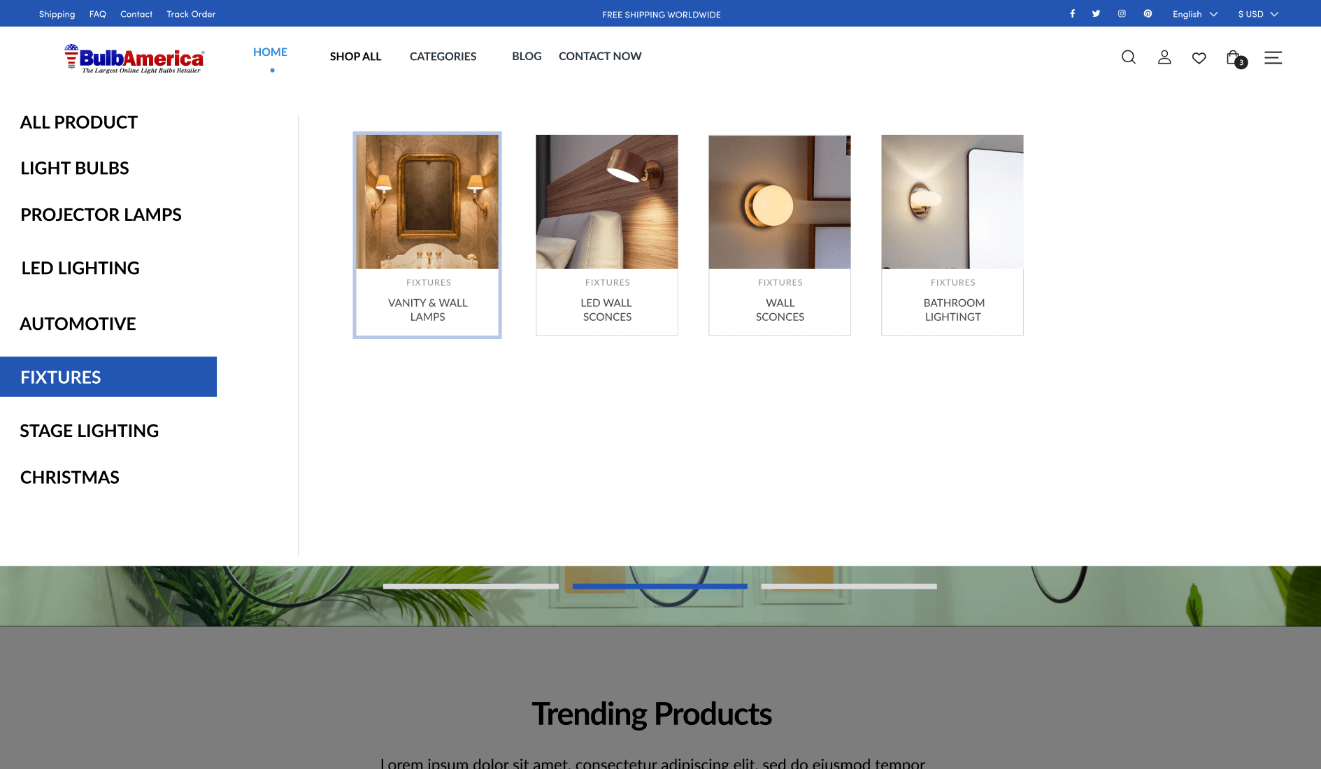
Navigating a website should be intuitive and seamless, especially for eCommerce platforms like BulbAmerica.com. Our redesign incorporated an advanced mega menu solution that significantly improved user navigation and reduced clutter. The mega menu allows for a structured and organized display of a wide range of categories and products, making it easy for users to find exactly what they are looking for without feeling overwhelmed.
Traditional drop-down menus can become cumbersome when dealing with numerous pages and product categories. They often result in long, unwieldy lists that are hard to read and navigate. By contrast, our mega menu organizes options into clearly defined sections and subcategories. This not only enhances the user experience by providing a clear, at-a-glance view of available options but also promotes relevant products and guides users efficiently through the website.
For an eCommerce site like BulbAmerica.com, which offers a vast array of lighting products and fixtures, the mega menu is particularly beneficial. It allows customers to quickly access different product categories, such as LED lighting, fixtures, and specialty bulbs, without endless scrolling or clicking through multiple pages. This streamlined navigation can lead to higher customer satisfaction and increased sales as users can effortlessly find and purchase the products they need.
Additionally, the mega menu’s design is responsive and adaptable, ensuring that it works well on both desktop and mobile devices. This cross-device compatibility is essential in today’s digital age, where users access websites from various devices. Ensuring a smooth and consistent experience across all platforms can help retain customers and reduce bounce rates.
Overall, the mega menu redesign for BulbAmerica.com represents a significant improvement in usability and user experience. It demonstrates how a thoughtfully designed navigation system can make a website more accessible, engaging, and efficient, ultimately driving better business outcomes.
Product Pages
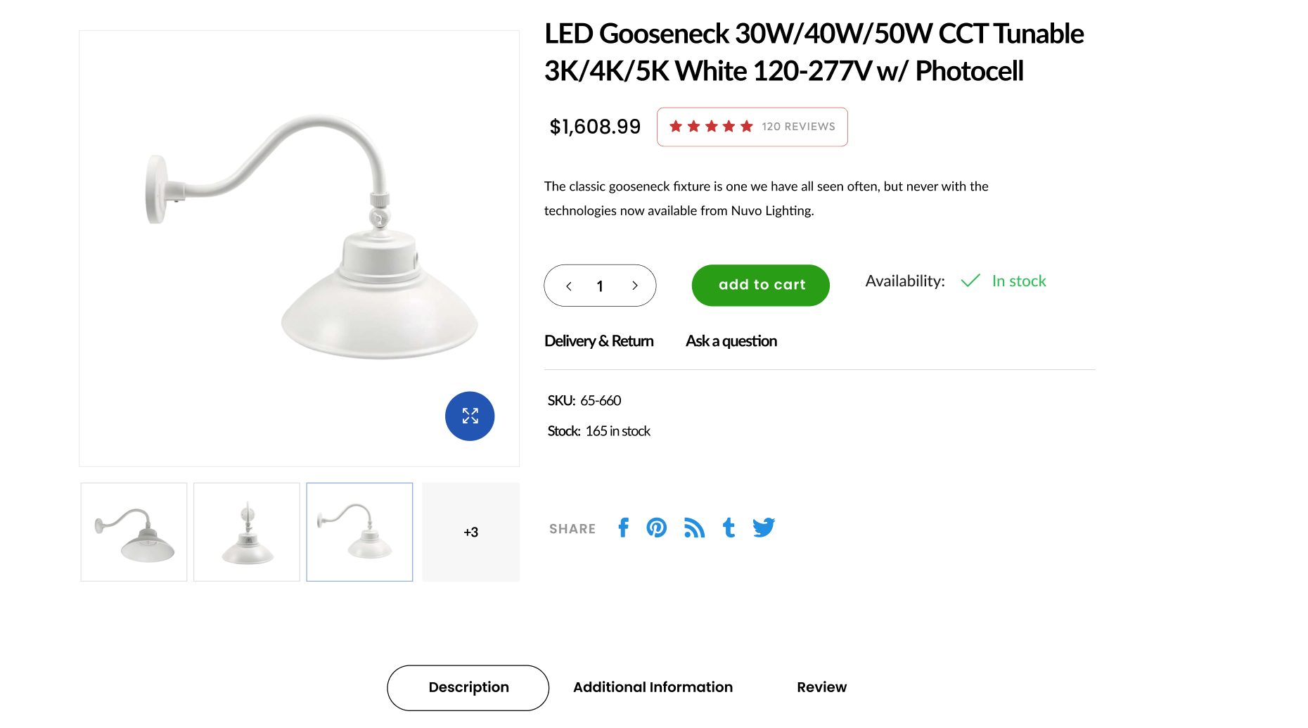
Product pages are the heart of any eCommerce website, and for BulbAmerica.com, we focused on creating pages that build trust, provide essential information, and enhance the overall shopping experience. The redesigned product pages now feature several key elements that contribute to a more engaging and informative user experience.
First and foremost, we added verified product ratings and reviews. These elements serve as social proof, helping to build trust with potential customers. When visitors see positive reviews and high ratings from other buyers, they are more likely to feel confident in making a purchase. This transparency about product quality and customer satisfaction is crucial for converting visitors into buyers.
We also ensured that the product highlights and features are presented clearly and concisely. It’s important to provide all necessary information without overwhelming the user. By using bullet points, icons, and short descriptions, we made it easy for visitors to quickly grasp the key benefits and specifications of each product. This approach helps users make informed decisions and reduces the likelihood of returns due to unmet expectations.
Incorporating up-selling and cross-selling strategies was another crucial aspect of the redesign. On each product page, we included recommendations for similar higher-quality items (up-selling) and complementary products (cross-selling). For instance, if a customer is looking at an LED bulb, they might also see suggestions for compatible fixtures or accessories that enhance their purchase. These recommendations not only increase the average order value but also provide a more comprehensive shopping experience, meeting multiple needs in one visit.
Moreover, the redesigned product pages are optimized for speed and performance. Slow-loading pages can frustrate users and lead to abandoned shopping carts. By improving page load times and ensuring that all elements are optimized for quick rendering, we enhanced the overall user experience and increased the likelihood of completed purchases.
The visual design of the product pages was also updated to be more aesthetically pleasing and aligned with BulbAmerica.com’s brand identity. High-quality images, consistent color schemes, and a clean layout all contribute to a professional and trustworthy appearance. This visual appeal is vital for keeping users engaged and encouraging them to explore more products.
In conclusion, the product page redesign for BulbAmerica.com emphasizes trust, clarity, and user engagement. By incorporating verified reviews, clear product information, effective up-selling and cross-selling, and optimized performance, we created a more effective and enjoyable shopping experience. These improvements highlight the importance of continuously updating and refining eCommerce websites to meet the evolving needs and expectations of users.
Quick View Functionality and Hover Effects
Enhancing user experience is a primary goal of any website redesign, and for BulbAmerica.com, we focused on incorporating quick view functionality and hover effects to make shopping more efficient and enjoyable.
Quick View Functionality
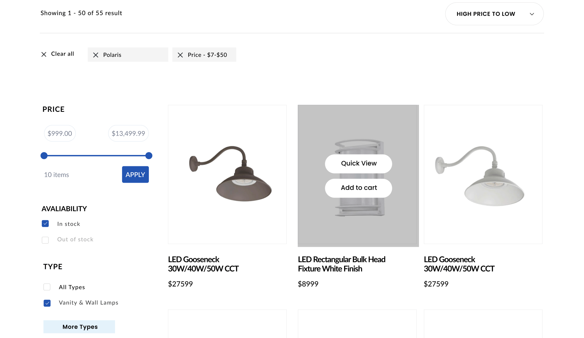
Quick view options are a vital addition to any eCommerce website. They allow users to get a brief overview of a product without navigating away from the current page. For BulbAmerica.com, this means that customers can quickly access key details about light bulbs, fixtures, and other products with just a click. This functionality significantly reduces the time and effort required to browse multiple items, making the shopping process faster and more efficient.
For example, when a user hovers over a product image, a quick view button appears. Clicking this button opens a pop-up window displaying essential information such as price, specifications, and customer reviews. This feature allows users to make informed decisions without repeatedly navigating back and forth between product pages. The convenience of quick view functionality can enhance user satisfaction and encourage more purchases, as customers can easily compare products and find exactly what they need in a shorter amount of time.
Hover Effects
Hover effects play a crucial role in improving the interactivity and aesthetics of a website. These effects occur when a user places the cursor over an interactive element, such as a product image or a button, prompting a visual change. For BulbAmerica.com, we implemented hover effects that enhance the browsing experience by providing immediate visual feedback.
When users hover over a product image, the image might change color, zoom in slightly, or display additional information such as a product name or a brief description. These subtle animations make the site feel more dynamic and engaging. Hover effects can also guide users’ attention to important elements, helping them navigate the site more intuitively.
By incorporating these interactive elements, we not only made the site more visually appealing but also improved its usability. Hover effects provide users with immediate feedback, confirming that the site is responsive and functional. This enhances the overall user experience, making the website more enjoyable to explore.
In summary, the addition of quick view functionality and hover effects to BulbAmerica.com greatly enhances the user experience. These features streamline the shopping process, reduce navigation time, and make the site more interactive and engaging. For any outdated website, incorporating such functionalities can significantly improve usability and customer satisfaction.
Category Pages
Category pages are essential for organizing and presenting a wide range of products in a manner that is both accessible and user-friendly. For BulbAmerica.com, we redesigned the category pages to improve navigation, enhance user engagement, and boost conversion rates.
Search Interface Optimization
One of the most important features of a category page is the search interface. According to Forrester Research, 43% of website visitors immediately head to the search bar upon entering an eCommerce site. For BulbAmerica.com, we optimized the search interface to be interactive, easy to use, and aesthetically pleasing.
The search bar is prominently placed and designed to be highly visible, encouraging users to utilize it. It features predictive text and auto-suggestions, helping users find products quickly by displaying relevant results as they type. This reduces the time spent searching and increases the likelihood of finding desired items, thus enhancing user satisfaction and engagement.
Filtering System
A robust filtering system is crucial for any eCommerce website with a large inventory. For BulbAmerica.com, we implemented an advanced filtering system that allows users to narrow down their search based on various criteria such as product type, price range, brand, and customer ratings. This system makes it easy for customers to find exactly what they are looking for without sifting through hundreds of irrelevant products.
Filters are particularly beneficial for improving the user experience and increasing conversion rates. They provide a more personalized shopping experience by allowing users to tailor their search results to their specific needs. Additionally, an effective filtering system can significantly reduce the time it takes for users to find the products they want, making the shopping process more efficient and enjoyable.
Enhanced Visual Design
The visual design of the category pages was also a major focus of the redesign. We aimed to create a clean, organized, and visually appealing layout that highlights the products effectively. High-quality images, consistent color schemes, and clear typography all contribute to a professional and inviting appearance.
Each category page is designed to provide a seamless browsing experience. Products are displayed in a grid format with sufficient white space, ensuring that the pages are not cluttered and are easy to navigate. Key information such as product names, prices, and ratings is prominently displayed, allowing users to make quick comparisons and informed decisions.
In conclusion, the redesigned category pages for BulbAmerica.com offer a more organized, efficient, and visually appealing shopping experience. By optimizing the search interface, implementing a comprehensive filtering system, and enhancing the visual design, we created a user-friendly environment that caters to the needs of modern shoppers. These improvements demonstrate how thoughtful design and functionality can transform an outdated website into a highly effective eCommerce platform.
Conclusion
The comprehensive redesign of BulbAmerica.com demonstrates the transformative power of a well-executed website overhaul. Each aspect of the redesign was carefully planned and implemented to improve user experience, increase customer engagement, and drive higher conversion rates.
The enhanced homepage, with its attention-grabbing header banner and intuitive user interface, sets a welcoming tone for visitors, immediately conveying the brand’s identity and value propositions. The strategic placement of banner ads and a commitment to accessibility ensure that all users can navigate and interact with the site easily, fostering a broader and more inclusive customer base.
The introduction of quick view functionality and engaging hover effects streamlines the shopping experience, allowing customers to quickly and efficiently access product information. This not only saves time but also keeps users engaged, making it more likely they will complete their purchases.
Our advanced mega menu design simplifies navigation, making it easy for customers to find exactly what they need. By organizing a vast array of products into clear, accessible categories, the mega menu reduces clutter and enhances the overall user experience.
The redesigned category pages, featuring optimized search interfaces and comprehensive filtering systems, enable users to personalize their shopping experience. These improvements help customers find their desired products quickly and efficiently, increasing satisfaction and encouraging repeat visits.
On the product pages, the inclusion of verified ratings, clear product highlights, and effective up-selling and cross-selling strategies build trust and offer added value to customers. By presenting information in a clear and concise manner, we help users make informed decisions, boosting their confidence in the brand and its offerings.
In summary, the redesign of BulbAmerica.com highlights the significant impact that thoughtful, user-centric design changes can have on an eCommerce website. By focusing on usability, accessibility, and engagement, we have created a platform that meets the needs of modern shoppers and stands out in a competitive market. Any outdated website can benefit from a similar approach, transforming it into a more effective and enjoyable destination for users.


