For Botach.com, a leading supplier of tactical and outdoor gear, the digital landscape presented both a challenge and an opportunity. Recognized for offering top-notch equipment at competitive prices, Botach.com embarked on a transformative journey – a complete website overhaul from the ground up. This wasn’t merely about keeping up with trends; it was about redefining how they connected with their customers – the brave individuals protecting our country.
The significance of this redesign lies not only in aesthetic enhancement but in its strategic approach to improving user experience, boosting functionality, and reinforcing the brand’s commitment to quality and service. This comprehensive article aims to unravel the layers of this transformation, showcasing how each element of the redesign plays a crucial role in elevating Botach.com’s online presence. We delve into the rationale behind these changes, demonstrating how an outdated website isn’t just a cosmetic concern but a potential setback in today’s fast-paced digital retail world.
The Homepage – A Portal to Modernized Shopping
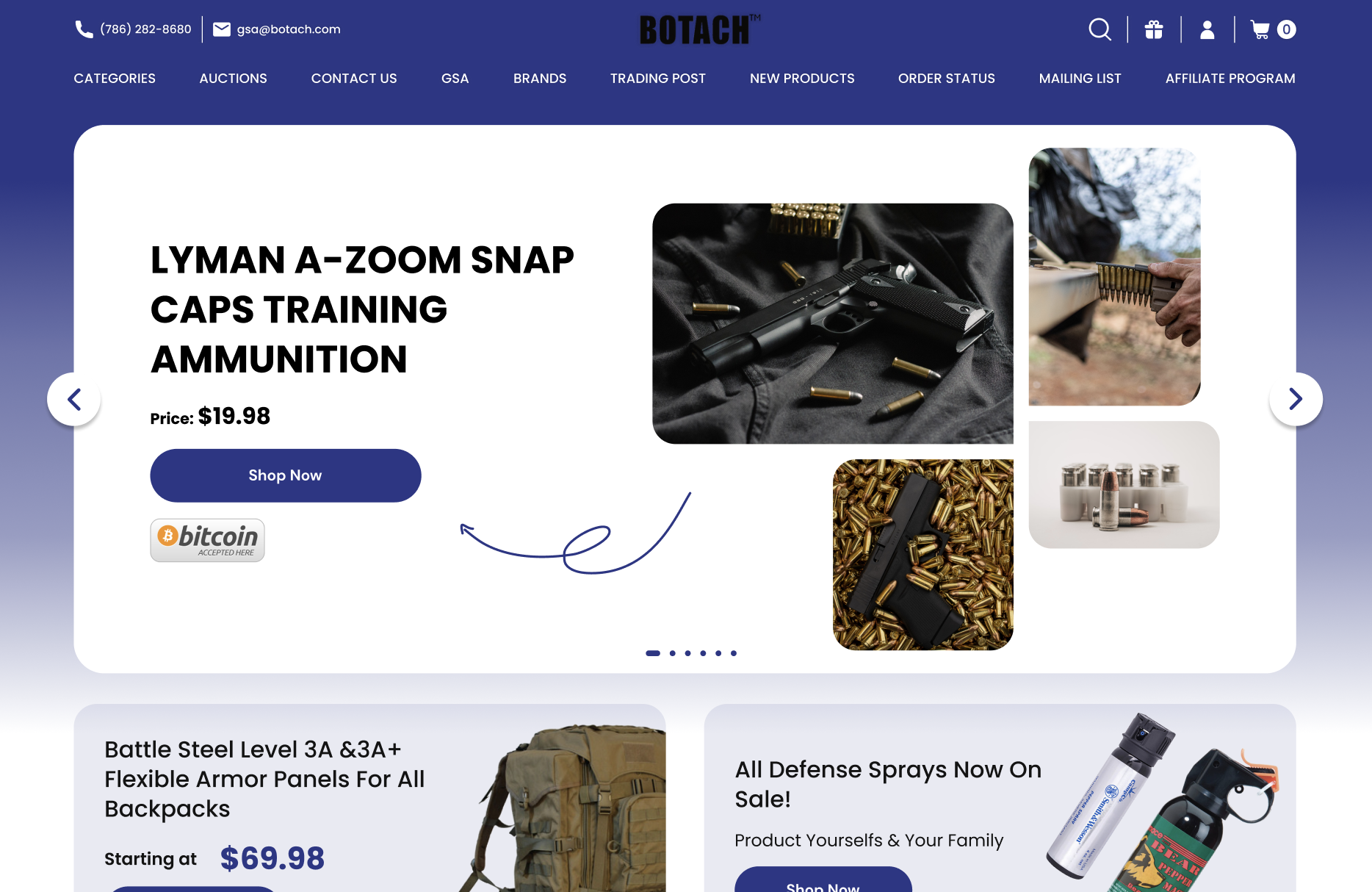
The homepage of Botach.com now greets visitors with a revamped header banner – a crucial element in digital marketing strategy. This banner serves as a digital billboard, instantly conveying the essence of Botach.com to every visitor. It’s here that the brand’s identity and core message come to life. The new design focuses on capturing the spirit of Botach.com – serving those who protect our nation, with an emphasis on the quality and reliability of their products. This powerful first impression is pivotal in establishing a connection with the customer, setting the stage for their entire browsing experience.
Revamping the User Interface
The redesign introduces a brand-new User Interface (UI), meticulously crafted to enhance customer engagement and establish trust. In the world of online shopping, the UI is the bridge between the customer and the product; it needs to be intuitive, responsive, and visually appealing.
Botach.com’s new UI is a leap from outdated, text-heavy layouts to a modern, streamlined interface. This change is more than just visual appeal; it’s about creating an environment where customers can shop with confidence and ease, knowing that they’re interacting with a site that’s as professional and reliable as the products it offers.
Simplifying Design for Enhanced Usability
A key aspect of Botach.com’s redesign is the emphasis on simplicity and clarity. The new website design strips away unnecessary complications, opting for clear, concise language and an interface that’s easy to navigate. This approach minimizes customer confusion and frustration, making the shopping experience more enjoyable and straightforward.
It’s a testament to the philosophy that in web design, less is often more, especially when dealing with a diverse range of customers.
Commitment to Accessibility
Inclusivity and accessibility are at the forefront of the new design. The updated Botach.com is built to be accessible to all users, regardless of their technical prowess or physical capabilities. This commitment to accessibility not only broadens the site’s reach but also reinforces Botach.com’s dedication to serving all its customers, reflecting a deep understanding of and respect for the diverse needs of its user base.
In this part, we’ve explored the foundational changes made to the Botach.com homepage. Each element, from the impactful header banner to the simplified user interface, works cohesively to create a welcoming and efficient gateway for shoppers. This is just the beginning of a deeper dive into the extensive redesign that has positioned Botach.com as a frontrunner in the digital retail space for tactical and outdoor gear.
Mastering Navigation with Mega Menus
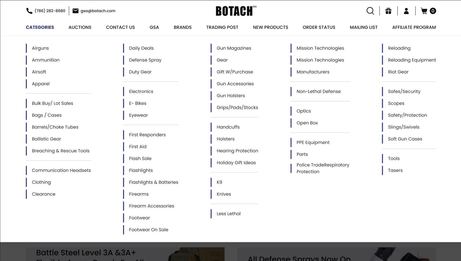
In its pursuit of a superior user experience, Botach.com has embraced the use of mega menus, a robust solution to the often cumbersome traditional dropdown menus. The mega menu offers an expansive view of the website’s categories and products, presenting them in a structured, easily navigable format. This design choice is particularly beneficial for Botach.com, given its wide array of products and categories.
The mega menu’s design allows users to see all available options at a glance, reducing the time spent searching for specific items. This level of clarity and organization is crucial in an e-commerce setting, where the ease of finding products can directly impact sales. The mega menu not only enhances user experience but also streamlines the journey from homepage to checkout, effectively reducing user drop-off rates.
Implementing Mega Menus Effectively
Botach.com’s mega menus are carefully curated to showcase the most relevant categories and products. This isn’t just about listing items; it’s about guiding the customer through the website’s offerings in a logical, intuitive manner. The layout is clean and organized, with clear headings and categorized products, making it easy for users to find what they’re looking for.
Additionally, the mega menus are designed to promote featured products, new arrivals, and special deals, ensuring that customers are always aware of the latest and best that Botach.com has to offer. This strategic placement of products not only aids in navigation but also serves as an effective marketing tool, highlighting items that might interest the user.
In these sections, we’ve seen how Botach.com has revolutionized its user interface with engaging hover effects and efficient Quick View functionality, and how it has mastered site navigation with the implementation of mega menus. These enhancements collectively contribute to a seamless, enjoyable shopping experience, emphasizing that staying abreast of digital trends and user expectations is not just beneficial but essential for the success of modern e-commerce websites.
Refining the Search Experience – Optimizing Category Pages
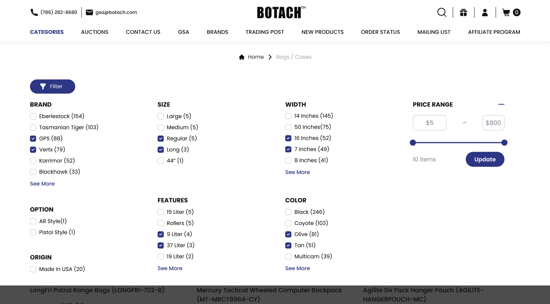
In the digital marketplace, the ability to find what you’re looking for quickly and efficiently is paramount. Recognizing this, Botach.com’s redesign places a strong emphasis on enhancing the search functionality and filter options on its category pages. These pages now feature an interactive search interface, which is not only user-friendly but also visually appealing, making the product search process both efficient and enjoyable.
The advanced filtering system is a game-changer for Botach.com, catering to a diverse range of customer needs and preferences. With a vast array of products, the ability to filter based on specific criteria such as price, brand, or product type is invaluable. This level of customization in the search process significantly improves user experience, enabling customers to navigate the extensive product catalog with ease. The result is a more targeted shopping experience, where users can quickly find products that match their specific requirements, thereby increasing the likelihood of purchase.
Strategies for Effective Product Categorization
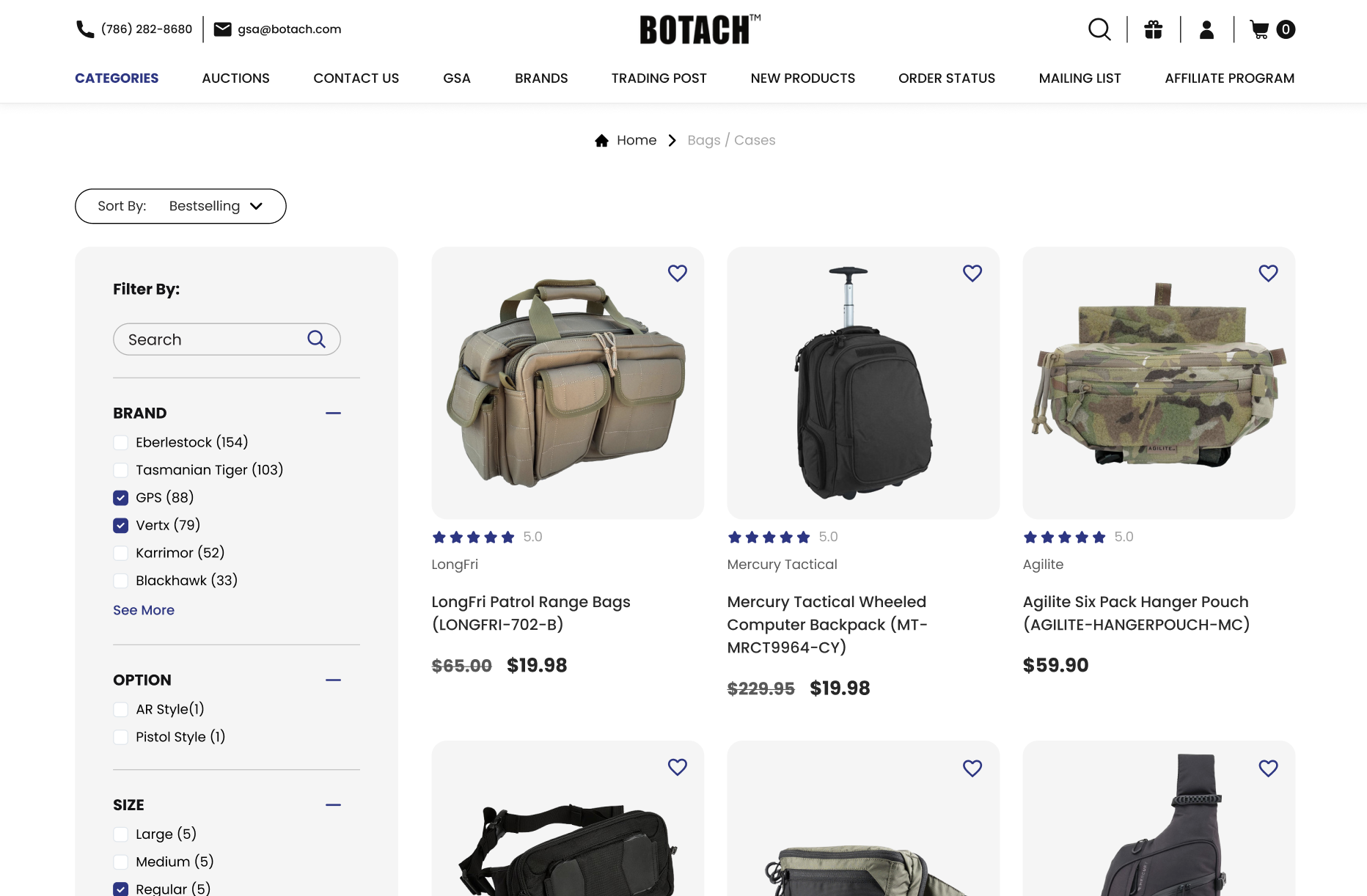
Effective product categorization on Botach.com has been key to making the site more navigable and user-friendly. The redesign ensures that products are logically organized and easy to locate.
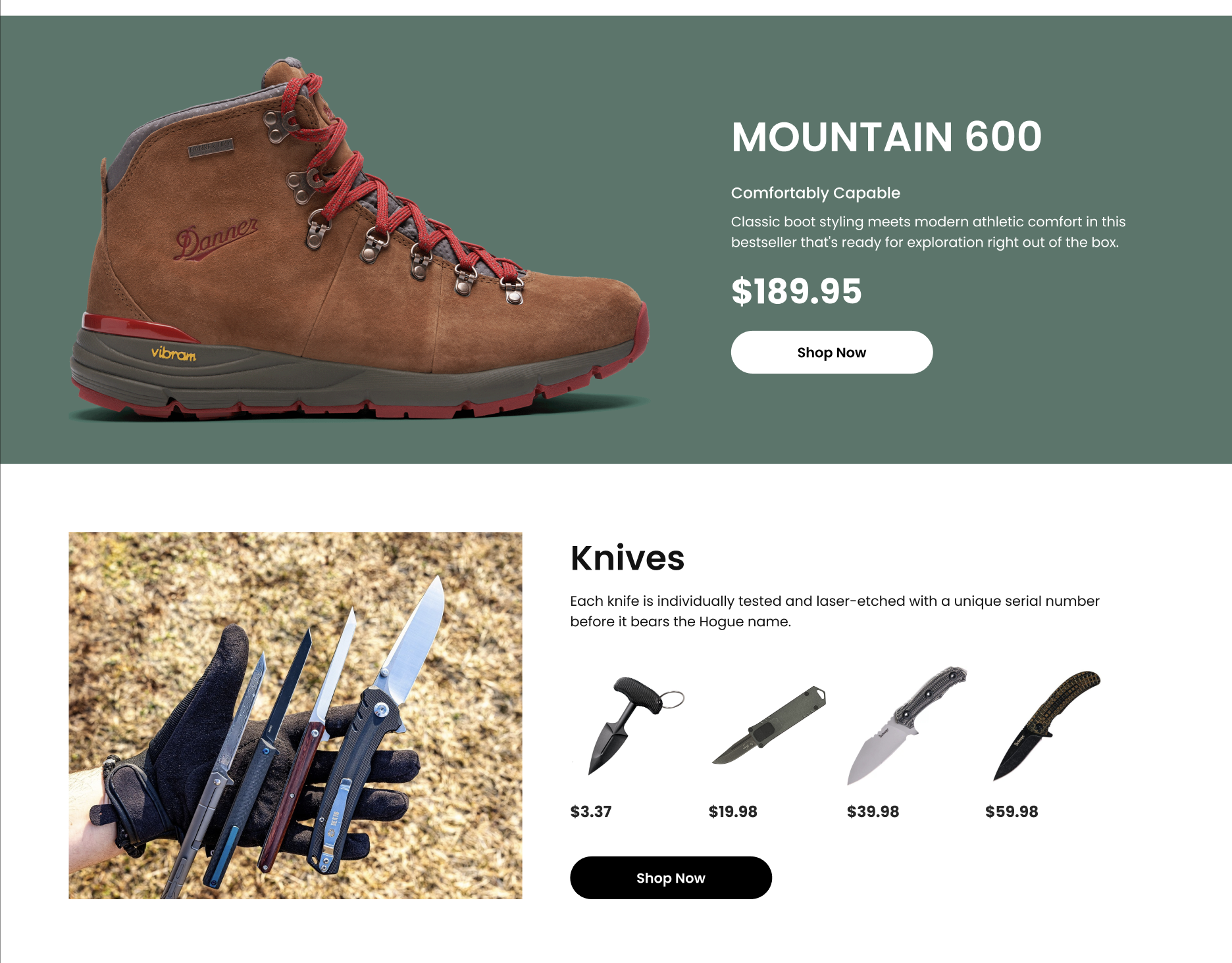
Clear categorization not only aids in discovery but also helps in showcasing the breadth of Botach.com’s offerings. By making it simpler for customers to browse through different categories, the site effectively broadens the user’s shopping experience, encouraging exploration and discovery of new products.
The Art of Display – Perfecting Product Pages
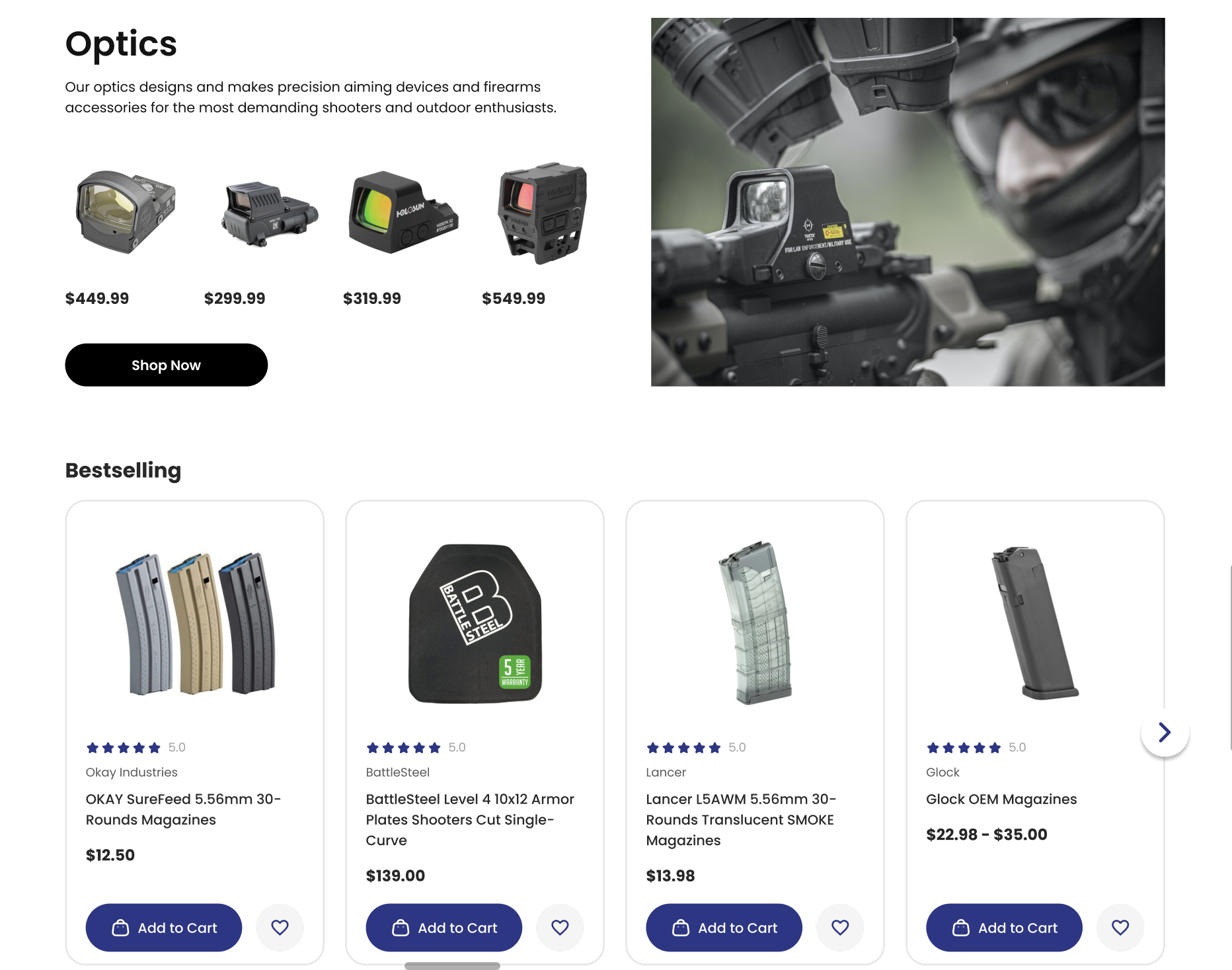
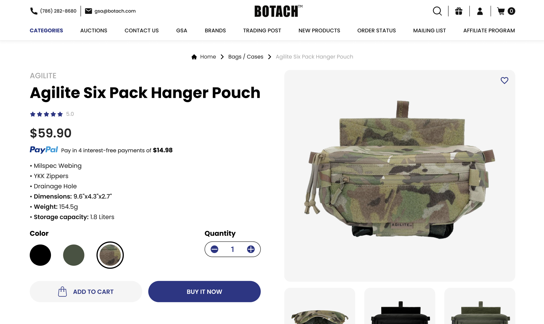
In an online world where trust is crucial, Botach.com has enhanced its product pages by adding verified product ratings and evidence of authenticity. These features are vital in building customer confidence and fostering a sense of reliability. Verified ratings provide prospective buyers with honest feedback from other customers, aiding in their decision-making process. By showcasing authentic and high-quality products, the site reassures customers of their purchase, reinforcing Botach.com’s commitment to offering the best gear.
Effective Presentation of Product Information
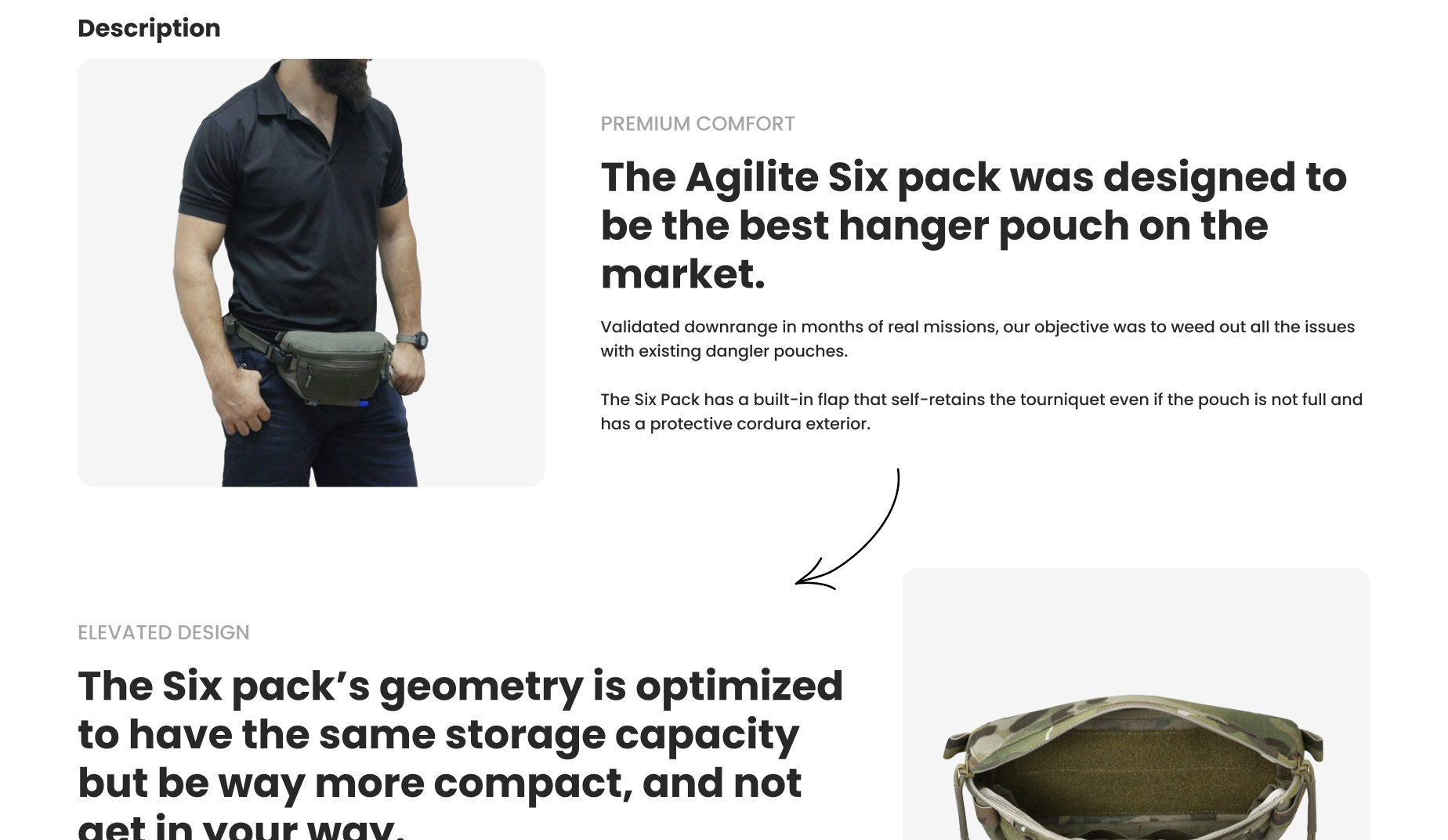
The product pages of Botach.com have been meticulously designed to present detailed information in a clear and concise manner. Balancing comprehensive product descriptions with a user-friendly layout is crucial in ensuring that customers are not overwhelmed. The redesign focuses on highlighting key product features and benefits in an easily digestible format, allowing customers to understand the value proposition quickly.
Furthermore, the product pages incorporate strategic upselling and cross-selling recommendations. These suggestions are carefully curated to complement the customer’s current interests, offering options for similar higher-end products or accessories that enhance the main product. This approach not only improves the shopping experience but also increases the potential value of each customer visit.
By optimizing search and categorization on category pages and refining the product pages, Botach.com ensures that customers not only find what they are looking for but also enjoy the process of discovery and exploration. These enhancements underline the importance of a well-thought-out redesign in staying competitive and relevant in the e-commerce landscape.
The “Sticky Add to Cart” Revolution
In the world of e-commerce, minimizing customer effort is paramount, and Botach.com’s introduction of the “Sticky Add to Cart” feature is a testament to this philosophy. This innovative functionality is designed to streamline the shopping experience by keeping the ‘Add to Cart’ button constantly visible, no matter how far down the page a customer scrolls. It’s a subtle yet impactful feature that ensures ease and convenience are at the forefront of the customer journey.
This persistent visibility of the Add to Cart button serves as a constant, gentle prompt for action, significantly reducing the steps a customer must take to make a purchase. By eliminating the need for customers to scroll back up to add items to their cart, Botach.com effectively removes a barrier in the shopping process, making it smoother and more intuitive.
Impact on Customer Experience and Conversions
The integration of the Sticky Add to Cart feature is more than just a functional enhancement; it’s a strategic move towards increasing conversion rates. By maintaining an ever-present pathway to purchase, Botach.com has observed a noticeable uptick in sales. This is in line with the broader trend across e-commerce platforms, where simplifying the customer journey directly correlates with improved conversion rates. The Sticky Add to Cart feature exemplifies how a small change can have a significant impact on the shopping experience and business outcomes.
Conclusion: Navigating the Future with a Redesigned Botach.com
As we conclude our exploration of Botach.com’s comprehensive redesign, it’s clear that this transformation goes beyond aesthetic updates. Each aspect of the redesign, from the engaging hover effects and Quick View options to the user-friendly Mega Menus and optimized category pages, has been meticulously crafted to enhance the customer experience. The introduction of the Sticky Add to Cart feature further cements Botach.com’s commitment to providing a seamless and efficient shopping experience.
Botach.com’s journey is a shining example for businesses contemplating the value of a website redesign. It demonstrates that staying current with digital trends is not just about keeping up appearances; it’s about fundamentally improving how customers interact with your brand. In today’s digital age, a website is not just a platform for transactions; it’s a crucial touchpoint for building relationships with customers.
For businesses looking to embark on their own digital transformation, Botach.com serves as an inspiration. The results speak for themselves: enhanced user engagement, improved trust, and increased sales. If you’re ready to take your website to the next level and want to learn more about how a redesign can benefit your business, we invite you to contact us. Let’s work together to create a digital presence that truly represents your brand and meets the needs of your customers.


