In today’s digital era, the virtual storefront has increasingly become the first point of contact between businesses and their customers. For BladeOps, a leading purveyor of premium knives, a robust online presence isn’t just a convenience—it’s a necessity. With a diverse range of products from top-notch brands, their website is a reflection of both their inventory’s caliber and their commitment to customer service. Recognizing the evolving expectations of modern shoppers, we embarked on a journey to redesign BladeOps’ website, ensuring that every visitor’s experience is seamless, intuitive, and memorable. Our goal was not only to uplift aesthetics but also to enhance functionality and foster trust.
Setting the First Impression: The Homepage
As the old adage goes, “You never get a second chance to make a first impression.” In the digital world, this saying rings truer than ever. The homepage of a website is analogous to a storefront window; it’s the initial view that can either invite visitors inside or leave them indifferent.
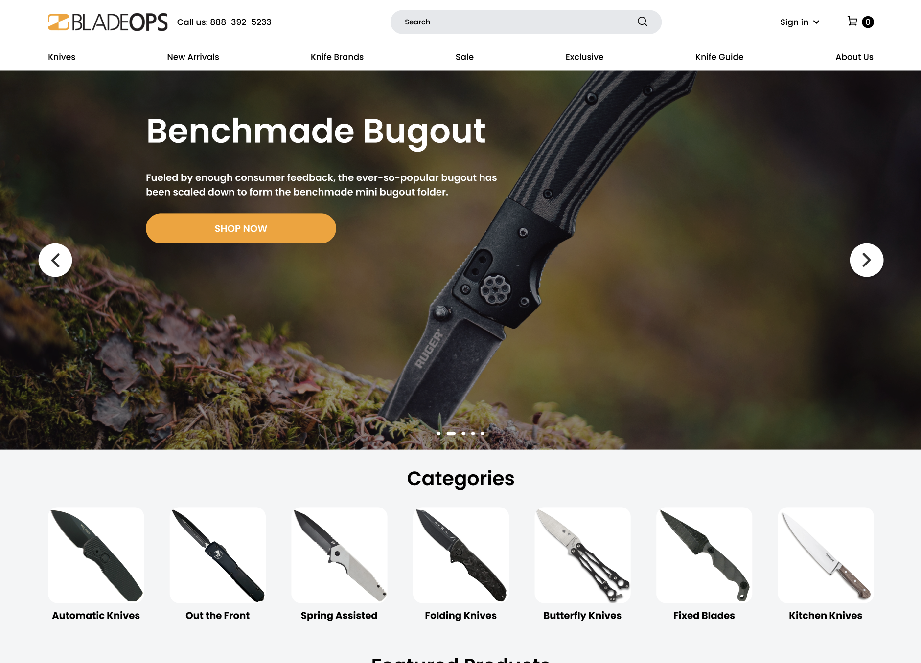
The Power of a Header Banner The header banner is the virtual billboard of a website. As the first element that meets the visitor’s eyes, it plays a pivotal role in setting forth the brand identity and communicating the essence of the business. For BladeOps, it was imperative to use this space judiciously, ensuring that the chosen imagery, typography, and messaging resonate with the brand’s ethos and promise. A well-crafted header banner doesn’t just captivate—it communicates.
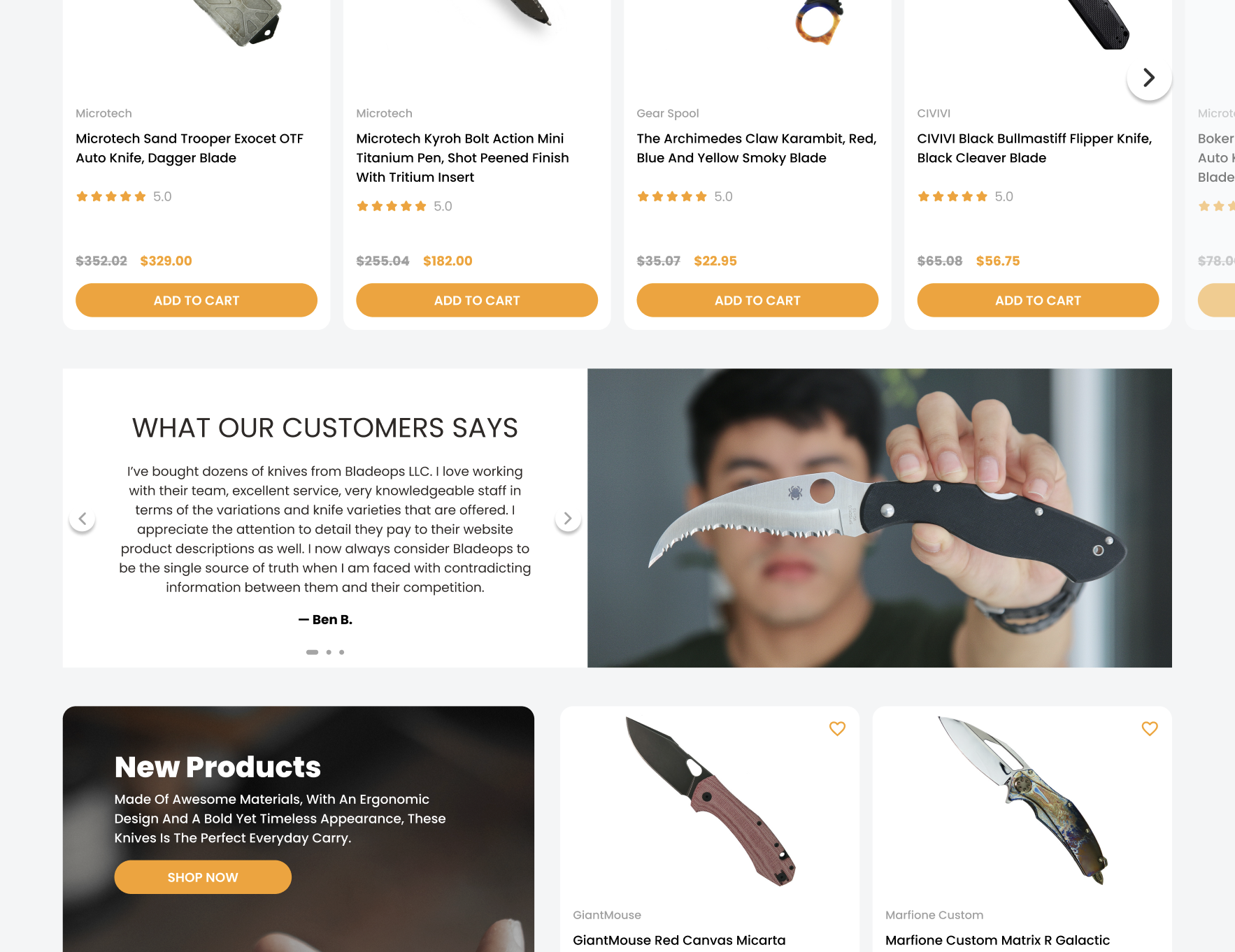
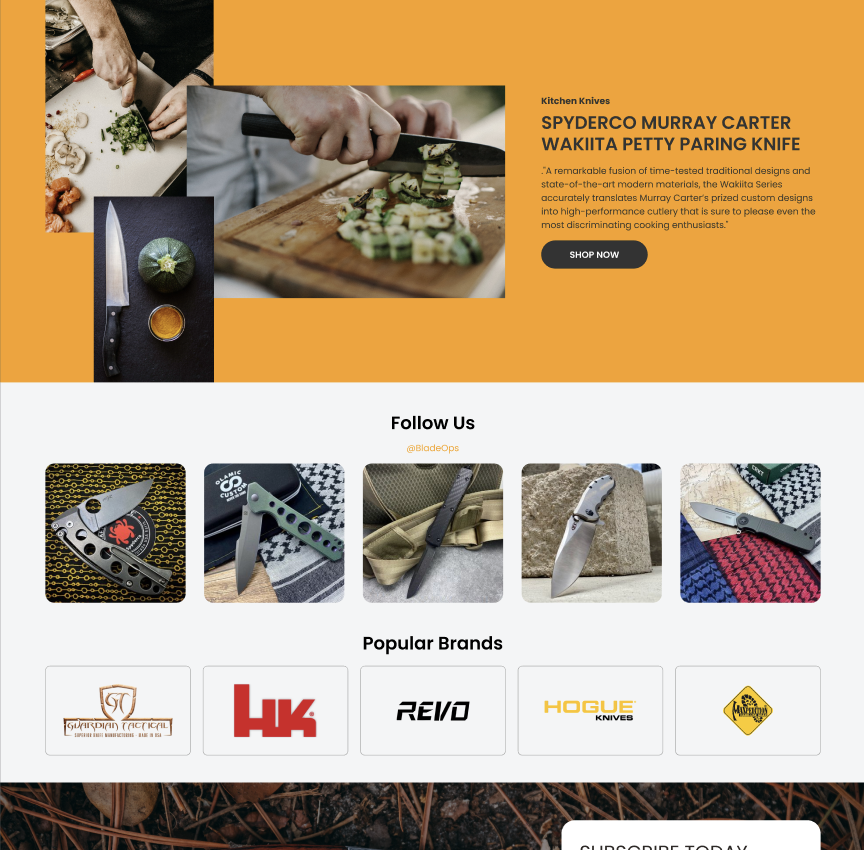
Refreshed User Interface A modern user interface (UI) isn’t merely a nod to contemporary design trends—it’s a testament to a business’s adaptability and its commitment to its clientele. The updated UI of BladeOps aims to increase customer engagement and bolster trust. In an age where digital fatigue is real, and countless websites compete for attention, it is those that prioritize user-centric design that stand out. The new design does precisely this, offering a refreshing departure from outdated, text-heavy counterparts, making navigation effortless and the browsing experience delightful.
Keeping it Simple While the digital landscape offers endless possibilities, it’s crucial to remember that sometimes, less is more. Simplifying the design and using clear language avoids cognitive overload, ensuring that visitors can quickly and easily find what they’re looking for. By eschewing inessential elements and focusing on what truly matters, BladeOps’ homepage exudes clarity and purpose.
The Impact of Banner Ads Banner ads have evolved from being mere promotional tools to being integral components of brand storytelling. For businesses like BladeOps, these ads serve as a dual-purpose medium—highlighting specific products while reinforcing the brand narrative. However, it’s essential that these ads align with the overarching design theme, blending seamlessly into the user’s journey and offering value, not interruptions.
Accessibility Matters Inclusivity is not just a buzzword; it’s the cornerstone of modern web design. Ensuring that the BladeOps interface is accessible to every user, irrespective of their abilities, underscores the brand’s commitment to serving a diverse audience. By identifying and refining key elements, the redesigned homepage ensures that every visitor feels welcomed and catered to.
Highlighting the Value Proposition Every business offers something unique, and it’s essential to spotlight this value proposition prominently. By strategically placing compelling offers, like “High quality” or “Limited time offer,” BladeOps not only draws attention to its competitive edge but also incentivizes visitors to delve deeper into the website.
Elevating User Experience: Quick View & Hover Effects
Modern websites are not just about presenting information; they’re about crafting experiences. In a world where every click counts and user attention spans are fleeting, the nuances of design play a pivotal role in ensuring visitors not only stay but also engage meaningfully with a website.
What are Hover Effects? Hover effects are akin to the subtle cues in face-to-face interactions, the ones that make communication fluid and intuitive. When a user’s cursor hovers over a particular element and that element responds—be it through a change in color, size, or form—it creates a dynamic interplay that enhances interactivity. For BladeOps, implementing these hover effects signifies a keen attention to detail. It’s a gentle nudge, a soft invitation for the user to explore further, signaling that the website is responsive and attuned to their actions.
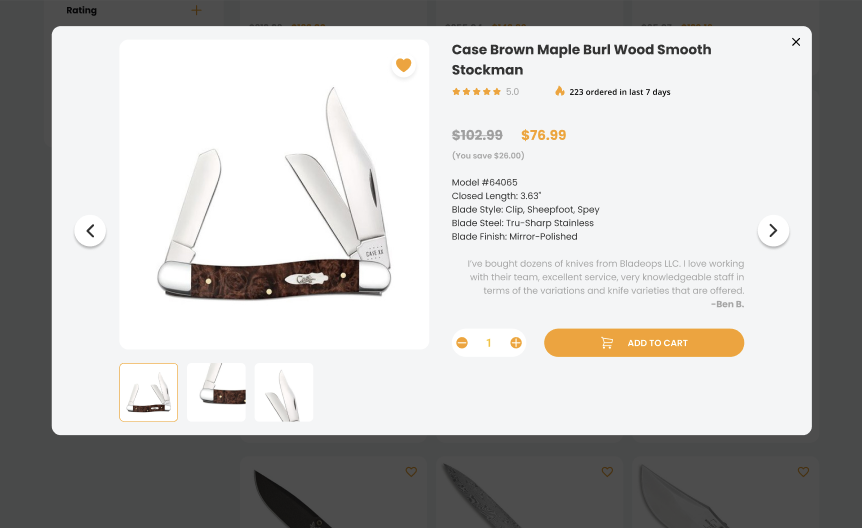
The Merits of Quick View Options Time is of the essence, especially in the realm of e-commerce. Quick view options are the digital equivalent of glancing at a product in a physical store without having to take it off the shelf. By offering a snapshot of the product details without navigating away from the current page, BladeOps provides its users with a seamless shopping experience. It’s especially beneficial for those who juggle multiple tabs or are in the initial stages of product exploration. Not only does it make browsing efficient, but it also subtly underscores the brand’s understanding of user preferences and the importance of streamlined processes.
Navigating with Ease: The Mega Menu
As websites grow and expand their product offerings, navigation can easily become a complex challenge. How does one ensure that a visitor can effortlessly find what they’re looking for without getting overwhelmed?
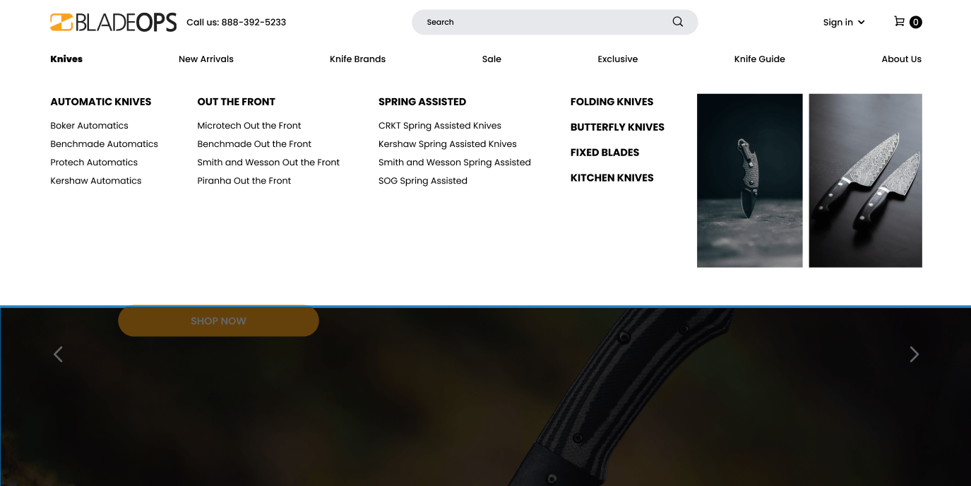
Defining Mega Menu Imagine walking into a vast department store, but instead of getting lost in the aisles, there’s a knowledgeable guide by your side, directing you exactly where you want to go. That’s the essence of a mega menu. For BladeOps, the implementation of an advanced mega menu solution is akin to providing that knowledgeable guide to its online visitors. With clear categories and sub-categories, it offers an aerial view of all the website has to offer, ensuring visitors can navigate with precision and ease.
Benefits over Traditional Dropdowns Traditional dropdown menus, while familiar, can become cumbersome when dealing with a broad range of products or services. They can lead to elongated lists that users find tedious to scroll through. Mega menus, on the other hand, are expansive, allowing for better organization and visualization of options. Especially for e-commerce platforms like BladeOps, where the array of products is vast, mega menus are not just a design choice; they’re a user-centric solution, ensuring that visitors can seamlessly traverse through the various offerings.
Incorporating hover effects, quick view options, and mega menus are not just trendy design elements; they’re strategic tools in enhancing user experience. For businesses still operating with traditional navigation systems and static interfaces, observing the evolution of sites like BladeOps can offer valuable insights. It’s not about blindly chasing the latest design fads but about recognizing the changing needs and preferences of the digital audience. A thoughtful redesign, in this context, is less about aesthetics and more about aligning with the evolving dynamics of user interaction and expectations in the digital realm.
Seamless Product Search: Category Pages
In the vast expanse of an e-commerce platform, the search functionality often acts as a compass, guiding users through myriad products and options. It’s more than just a tool—it’s a vital component of the user experience. And for businesses like BladeOps, optimizing this feature can mean the difference between a fleeting visit and a loyal customer.
The Importance of Search Engagement Forrester Research highlights a compelling fact: 43% of website visitors immediately head to the search bar. These searchers aren’t just casual browsers; they are engaged visitors, displaying an intent to find and possibly purchase. With a conversion likelihood that’s 1.8 times more than non-searchers, it’s evident why the search interface demands careful attention.
Elevating the Search Experience BladeOps’ redesigned category pages prioritize three key elements: interactivity, ease of use, and aesthetics. A search experience isn’t just about finding a product; it’s about the journey of discovery. An interactive interface engages users, a user-friendly design ensures they find what they’re looking for, and an aesthetically pleasing layout makes the journey enjoyable.
The Power of Filters When faced with an array of products, filters act as a sieve, narrowing down choices based on preferences. Whether it’s for a website with a vast product range or a smaller boutique setup, filters are indispensable. They empower users, giving them control over their browsing experience. By adding this feature, BladeOps not only enhanced usability but also tapped into the potential for a 26% increase in conversions, as seen in UX design studies.
Detailed Insights: Product Pages
Diving deeper into the website, individual product pages are where decisions are made. It’s where curiosity transforms into consideration, and for many, the final push towards purchase.
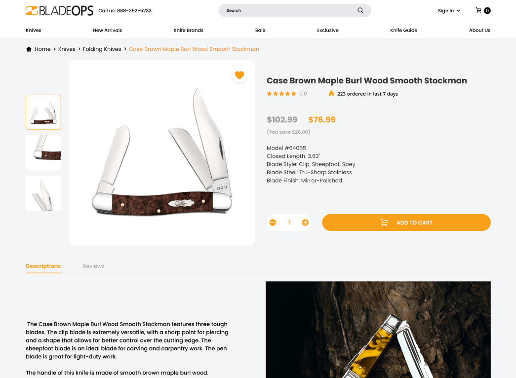
Verified Product Ratings and Authenticity Proofs In an online world, trust is paramount. By incorporating verified product ratings and proofs of authenticity, BladeOps assures its customers of the quality they’re investing in. These aren’t just badges or stickers; they’re symbols of commitment to quality and transparency.
Showcasing Product Highlights without overwhelming information overload can be a deterrent. Striking the right balance between providing essential product details and maintaining a clean, uncluttered design is crucial. BladeOps’ redesigned product pages walk this tightrope skillfully, offering insights without overwhelming the visitor.
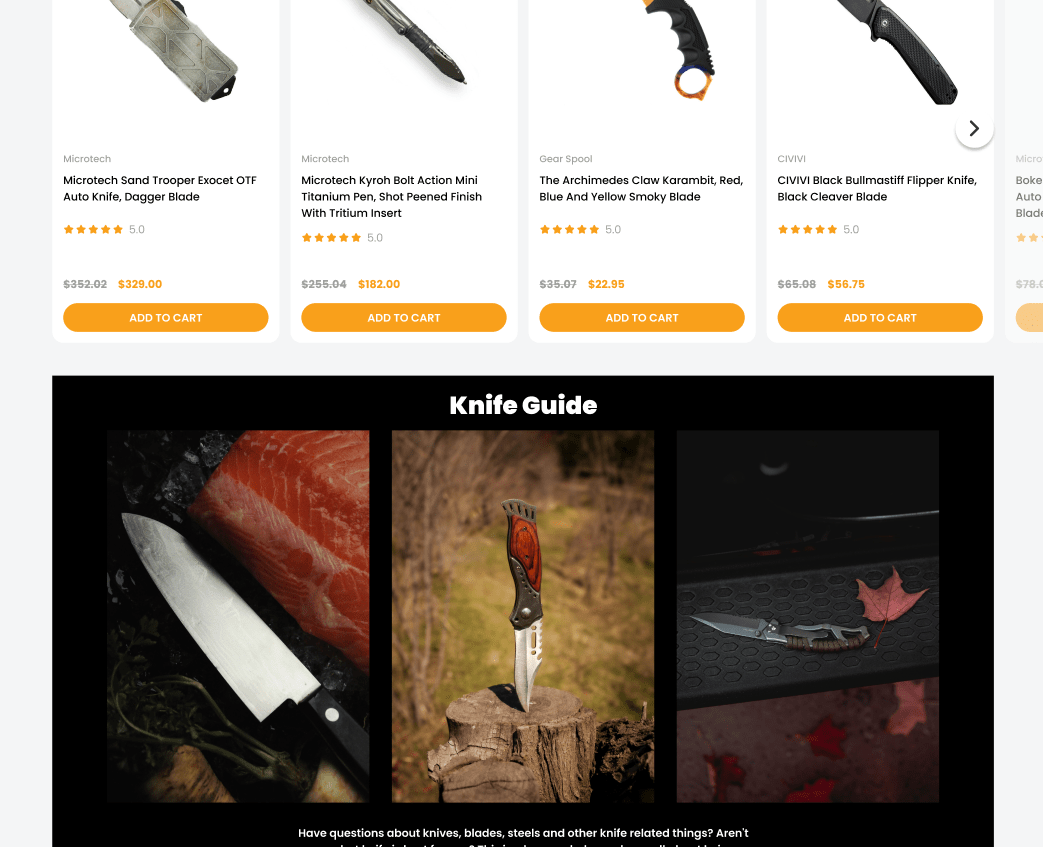
Upselling and Cross-Selling: Enhancing the Product Experience Recommendations on product pages aren’t just opportunities for increased sales; they’re also tools to enhance the user’s overall product experience. By suggesting complementary products or higher-quality alternatives, BladeOps not only increases its basket value but also adds value to the customer’s purchase journey.
Ensuring Constant Engagement: Sticky Add to Cart
In a digital space where every element competes for user attention, ensuring uninterrupted engagement becomes paramount. One innovative approach that BladeOps has integrated is the Sticky Add to Cart feature—a testament to how modern design can seamlessly merge with functionality.
Defining Sticky Add to Cart Imagine browsing a vast store, and as you explore, you have a personal assistant beside you, ready to immediately note down any product you show interest in. The Sticky Add to Cart offers a similar experience. As users scroll down product pages, gleaning insights, and evaluating their choices, the add-to-cart button remains within easy reach, moving with their scroll. This omnipresent feature reduces friction, ensuring that the moment a decision is made, action can be immediately taken.
The Tangible Benefits Incorporating such a feature is not just about aesthetics or modern design trends; it’s grounded in tangible results. By implementing the Sticky Add to Cart button, BladeOps saw an increase in orders by 8%. This highlights the symbiotic relationship between user-friendly design and business outcomes.
Conclusion
The journey of BladeOps’ website redesign serves as a compelling narrative on the power of thoughtful digital transformation. In an era where the digital realm is constantly evolving, it’s not just about staying updated—it’s about staying ahead. It’s about recognizing the nuances of user behavior, anticipating their needs, and delivering an experience that’s not just satisfactory but exemplary.
While it’s easy to get caught in the allure of aesthetics, BladeOps’ approach underscores that true redesign goes beyond the surface. It delves deep, reimagining structures, optimizing functions, and above all, placing the user at the heart of every decision.
For businesses still navigating the digital space with outdated designs, this isn’t a call to merely change. It’s an invitation to evolve, to recognize the potential of what’s possible when modern design meets intuitive functionality.
Let the transformation of BladeOps inspire a journey of your own—towards a digital presence that’s not just seen but remembered. Contact us today and start your redesign journey.


