In today’s digital landscape, a website is often the first interaction customers have with a brand. A well-designed website not only creates a strong first impression but also facilitates easy navigation and a seamless user experience. For Auto Tool World, the primary goals of the redesign were to enhance user engagement, improve navigation, and boost conversion rates. By addressing the shortcomings of the old design and incorporating modern design principles, Auto Tool World set out to create a more engaging and efficient platform for its users. This redesign serves as a case study for how updating an outdated website can bring substantial benefits to a business.
Homepage Redesign
The Power of the Header Banner
The header banner is the focal point of the homepage, and its redesign was pivotal. This space is not just a placeholder for an image; it’s a powerful marketing tool that sets the tone for the entire website. For Auto Tool World, the redesigned header banner is vibrant and dynamic, instantly conveying the brand’s identity and core values.
Imagine arriving at a website and being greeted by a bold, eye-catching banner that highlights competitive pricing and fast delivery. This immediate communication of key selling points is essential. The new header banner for Auto Tool World achieves this by combining visually appealing graphics with concise, impactful messaging. It’s designed to grab attention and invite visitors to explore further, setting a positive tone from the moment they land on the site.
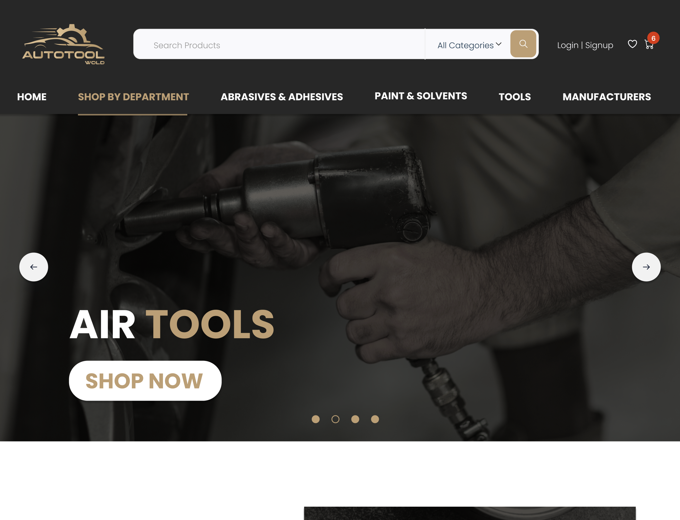
A well-crafted header banner significantly increases customer engagement and trust. By prominently showcasing Auto Tool World’s competitive pricing and fast delivery, the banner immediately communicates the brand’s key selling points. Additionally, incorporating visually appealing elements and concise messaging quickly captures the visitor’s attention and encourages further exploration of the site.
Streamlined User Interface (UI)
The user interface is the heart of the website’s interaction design. Auto Tool World’s previous website was functional but text-heavy, which could overwhelm and confuse visitors. The new design embraces simplicity and clarity. By minimizing clutter and using clear, straightforward language, the redesigned UI makes it easier for customers to find what they’re looking for.
A sleek and modern interface doesn’t just look good; it enhances usability. Auto Tool World’s new UI features intuitive navigation menus, strategically placed call-to-action buttons, and a visually appealing layout that guides users effortlessly through the site. This improvement is not just about aesthetics; it’s about creating a user experience that keeps customers engaged and encourages them to explore more products, ultimately leading to higher conversion rates.
Moreover, the improved UI sets Auto Tool World apart from its competitors, many of which may still rely on outdated and cluttered designs. By adopting a modern and sleek interface, Auto Tool World not only enhances the user experience but also positions itself as a forward-thinking and customer-centric brand.
Effective Banner Ads
Banner ads are a staple of e-commerce websites, serving as mini-billboards that can drive traffic to specific products or promotions. In the redesign, Auto Tool World optimized the placement and design of banner ads to maximize their effectiveness. These ads are now strategically positioned to catch the eye without overwhelming the visitor.
The redesigned banner ads incorporate compelling visuals and strong calls-to-action, making it easy for visitors to take the next step. Whether it’s highlighting a seasonal sale or promoting a new product line, these ads are designed to be both attractive and functional, enhancing the overall shopping experience and driving engagement.
Accessibility Enhancements
Ensuring that a website is accessible to all users is not only a best practice but also a necessity in today’s digital world. The redesign of Auto Tool World’s homepage includes several accessibility enhancements aimed at making the site usable for people with diverse needs.
Key elements such as text size, color contrast, and navigational aids have been carefully considered to ensure that the interface is easy to read and navigate for everyone. Implementing these accessibility features helps to create an inclusive online environment, allowing Auto Tool World to reach a broader audience and provide a better experience for all users. By making the site easier to read and navigate, the redesign ensures that all users can enjoy a seamless shopping experience, broadening the website’s appeal and reach.
Showcasing the Value Proposition
The value proposition is a crucial element in capturing visitors’ attention. Auto Tool World’s redesign places a strong emphasis on clearly showcasing what sets the brand apart. High-quality products, competitive prices, and exceptional service are prominently featured on the homepage, immediately communicating the benefits to potential customers.
Using bold headlines, engaging visuals, and concise messaging, the value proposition is designed to stand out and draw visitors in. This clear and compelling communication helps to build trust and encourages visitors to explore further, increasing the likelihood of conversions.
Quick View Functionality
Enhancing User Experience
In the world of e-commerce, convenience is key. Auto Tool World’s redesigned website includes a Quick View functionality that significantly enhances the user experience. This feature allows visitors to preview product details without leaving the current page. By simply hovering over a product, users can see essential information such as price, specifications, and availability.
This functionality is particularly beneficial for customers who are browsing multiple products. Instead of clicking back and forth between product pages, they can quickly compare different items and make informed purchasing decisions. This not only saves time but also makes the shopping experience more enjoyable and efficient.
Increasing Engagement and Conversions
Quick View functionality also plays a crucial role in increasing engagement and conversions. When customers can easily access product information, they are more likely to stay on the website longer and explore more products. This increased engagement often leads to higher conversion rates, as customers are more likely to add items to their cart and complete their purchase.
By improving the overall shopping experience, the Quick View feature helps Auto Tool World retain customers and encourage repeat visits. This functionality demonstrates how thoughtful design choices can have a significant impact on user satisfaction and business performance.
Mega Menu Implementation
Advanced Navigation Solutions
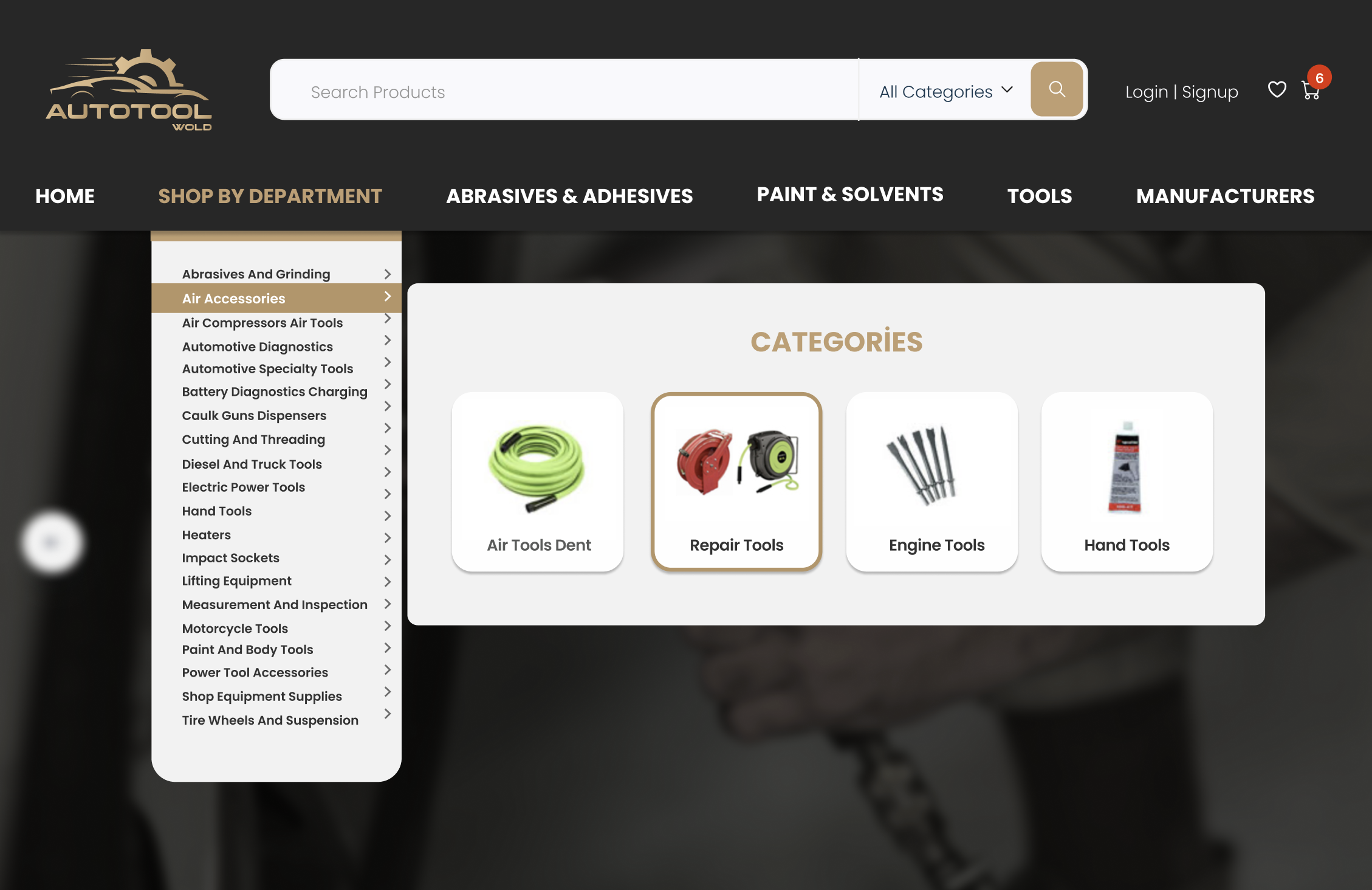
For websites with extensive product ranges, effective navigation is essential. Auto Tool World’s redesigned website features a sophisticated Mega Menu that allows customers to quickly and easily find what they’re looking for. Unlike traditional dropdown menus, which can become cumbersome with a large number of options, a Mega Menu displays all categories and subcategories in a well-organized, visually appealing format.
This advanced navigation solution helps reduce clutter and makes it easier for customers to browse the website. By grouping related items together and providing clear labels, the Mega Menu guides shoppers to their desired products with minimal effort. This not only enhances the user experience but also promotes relevant products and encourages cross-selling.
Improving User Experience and Sales
A well-designed Mega Menu can significantly improve user experience and boost sales. By providing a clear and intuitive navigation system, Auto Tool World ensures that customers can find the products they need quickly and easily. This reduces frustration and helps maintain a positive perception of the brand.
Additionally, the Mega Menu’s ability to showcase a wide range of products in an organized manner encourages customers to explore more categories and discover new items. This increased visibility can lead to higher sales, as customers are more likely to make additional purchases when they can easily find related products.
Category Pages Redesign
Optimized Search Interface
For an e-commerce website with a vast inventory, an efficient search interface is crucial. According to Forrester Research, 43% of website visitors immediately head to the search bar. Recognizing this, Auto Tool World has optimized its search functionality to make finding products as seamless as possible.
The new search interface is interactive, easy to use, and aesthetically pleasing. It includes features such as auto-suggestions, filters, and sorting options to help customers quickly locate the products they’re interested in. This streamlined search process not only enhances user satisfaction but also increases the likelihood of conversions, as customers can effortlessly find and purchase the items they need.
Effective Filtering System
A robust filtering system is essential for any e-commerce website, especially one with a large number of products. Auto Tool World’s redesigned category pages feature an improved filtering system that allows customers to narrow down their options based on various criteria such as brand, price, and specifications.
This filtering system is designed to be intuitive and user-friendly, making it easy for customers to apply and adjust filters as needed. By presenting a variety of options and allowing users to refine their search results, the filtering system improves the overall shopping experience and increases the chances of finding the perfect product.
According to studies, implementing an effective filtering system can increase a website’s conversion rate by up to 26%. For Auto Tool World, these enhancements not only improve user experience but also contribute to higher sales and customer satisfaction.
Product Pages Enhancements
Building Trust with Product Ratings and Verification
In e-commerce, building trust with customers is paramount. One way Auto Tool World achieves this is by incorporating verified product ratings and proof of authenticity on their product pages. These ratings, provided by real customers, offer valuable insights into the quality and performance of the products.
By showcasing verified ratings and reviews, Auto Tool World helps potential customers make informed purchasing decisions with confidence. Knowing that other customers have had positive experiences with a product can significantly influence a buyer’s decision, increasing the likelihood of a purchase.
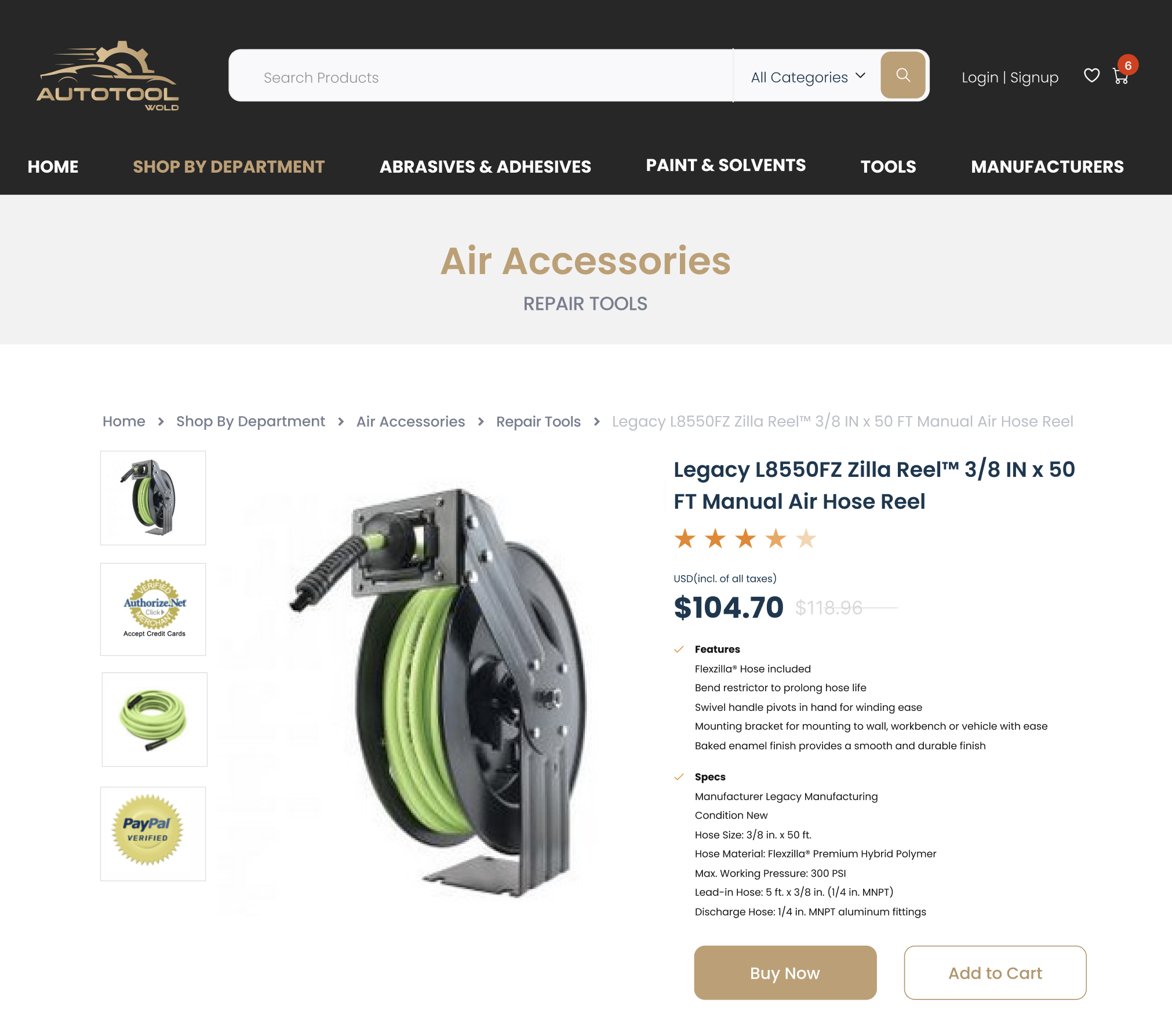
Highlighting Product Features
Presenting product highlights and features in a clear and concise manner is essential for capturing customer interest. Auto Tool World’s redesigned product pages are designed to provide all the necessary information without overwhelming the user.
Key features, specifications, and benefits are prominently displayed, making it easy for customers to understand what sets each product apart. This straightforward presentation not only helps customers make quick decisions but also enhances their overall shopping experience.
Up-Selling and Cross-Selling Strategies
Effective up-selling and cross-selling strategies can significantly boost sales by encouraging customers to purchase additional or higher-value items. Auto Tool World’s redesigned product pages incorporate recommendations for related products, allowing for both up-selling and cross-selling opportunities.
For example, a customer viewing a specific tool might see recommendations for higher-quality alternatives or complementary products such as accessories or replacement parts. These suggestions are tailored to enhance the customer’s experience and provide added value, making it more likely that they will make additional purchases.
Conclusion
The comprehensive redesign of Auto Tool World’s website demonstrates how thoughtful design changes can significantly enhance user experience and business performance. Each element, from the header banner to the accessibility features, plays a vital role in creating a modern, user-friendly, and effective online presence. For businesses with outdated websites, Auto Tool World’s transformation serves as a compelling example of the benefits of investing in a strategic redesign.
For businesses looking to embark on their own digital transformation, Auto Tool World serves as an inspiration. If you’re ready to take your website to the next level and want to learn more about how a redesign can benefit your business, we invite you to contact us. Join us in driving forward with digital excellence.


