In today’s rapidly changing digital world, having a modern and user-friendly website is essential for any business, particularly for industry leaders like ATNCorp. As a prominent player in the field of high-performance tactical and hunting night vision optics and thermal vision optics, ATNCorp recognized the necessity to revamp its online presence to better serve its customers and stay ahead of the competition. The redesign of ATNCorp’s website was not just a visual overhaul but a strategic move to enhance user experience, improve functionality, and drive engagement. This article delves into the comprehensive redesign process, highlighting the significant changes made and the rationale behind them. Through this case study, we aim to illustrate how a well-executed website redesign can substantially benefit businesses, emphasizing the importance of staying current in the digital age.
Optimizing Category Pages for Better Search and Filtering
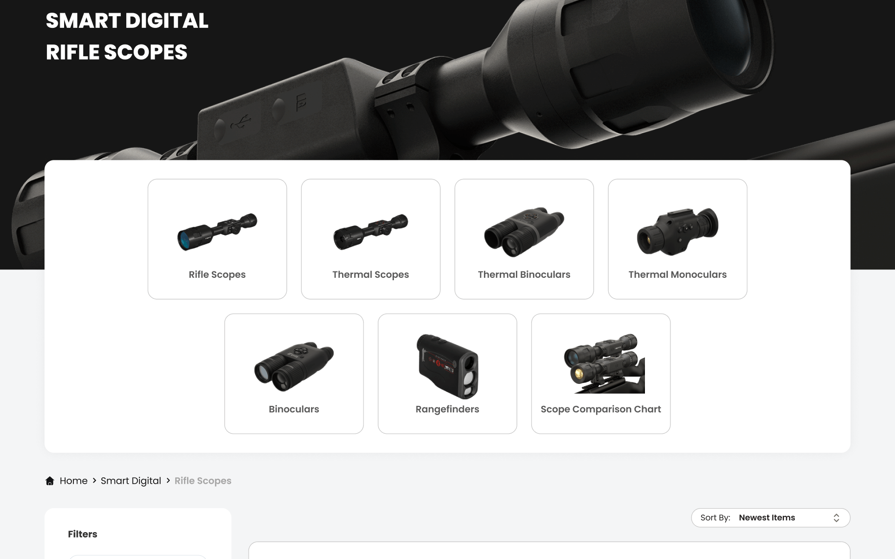
A key aspect of the ATNCorp website redesign focused on optimizing the category pages to enhance the search and filtering experience for users. According to Forrester Research, 43% of website visitors immediately head to the search bar when they land on an e-commerce site, and these searchers are 1.8 times more likely to convert than non-searchers. Recognizing this behavior, we prioritized creating an intuitive and efficient search interface to cater to this critical user segment.
Interactive and Easy-to-Use Search Interface
The redesigned search interface was crafted to be both interactive and user-friendly. By incorporating autocomplete suggestions and predictive text, users can quickly find the products they are looking for, reducing the time and effort required to perform a search. The search bar’s prominent placement and clear design ensure it is easily accessible, encouraging users to utilize it as their primary navigation tool. An aesthetically pleasing design further enhances the experience, making the process of searching for products more engaging and less cumbersome.
Advanced Filtering System
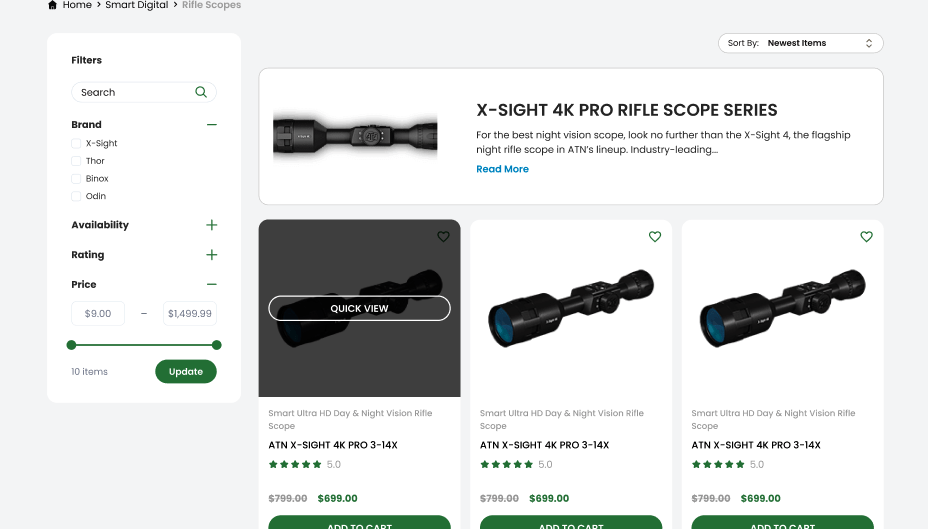
For a website like ATNCorp, which features a vast array of products, an effective filtering system is essential. The new filtering system was designed to be comprehensive yet straightforward, allowing users to narrow down their search results based on various criteria such as price, brand, features, and customer ratings. This system not only improves the user experience but also significantly boosts conversion rates. Studies have shown that adding filters can increase a website’s conversion rate by 26%, highlighting the powerful impact of a well-designed filtering system.
The benefits of the new filtering system are manifold. Users can now effortlessly find the exact products they need without sifting through irrelevant items. This streamlined process reduces frustration and increases the likelihood of completing a purchase. Additionally, by presenting a variety of filtering options, the system caters to a wider audience, accommodating different preferences and shopping behaviors.
Enhanced User Experience
By optimizing the search and filtering functionalities, the redesigned category pages significantly enhance the overall user experience. Visitors can quickly locate and explore products, leading to higher engagement and satisfaction. This seamless navigation is particularly important for retaining customers and encouraging repeat visits.
Moreover, an effective search and filtering system positions ATNCorp as a customer-centric brand, attentive to the needs and preferences of its users. This alignment with user expectations fosters trust and loyalty, essential components for long-term business success.
Enhancing User Experience with Hover Effects and Quick View
In the redesign of ATNCorp’s website, a significant emphasis was placed on enhancing the user experience through the implementation of hover effects and quick view functionalities. These changes are designed to make the browsing and shopping process more interactive, engaging, and efficient for users, ultimately leading to higher satisfaction and loyalty.
Hover Effects: A Subtle yet Powerful Tool
Hover effects are visual changes that occur when a user places their cursor over an interactive element, such as a link, button, or image. These effects can include color changes, size adjustments, rotations, and more, depending on how they are coded. While seemingly minor, hover effects play a crucial role in enhancing the overall user experience.
The primary benefit of hover effects is that they provide immediate visual feedback, signaling to users that an element is interactive and responsive. This makes the website feel more dynamic and alive, improving user engagement. When users see that the site reacts to their actions, it reinforces the perception that the site is well-maintained and functional. This subtle interaction can significantly enhance the overall browsing experience, making it more enjoyable and intuitive.
Furthermore, hover effects help to highlight key elements on the web page, guiding users’ attention to important links and calls to action. This can be particularly useful in directing users towards featured products, special offers, or critical information, thereby improving navigation and usability.
Quick View Functionality: Streamlining the Shopping Experience
The quick view functionality is another critical feature introduced in the ATNCorp website redesign. This feature allows users to get a snapshot of product details without having to load a separate product page. By hovering over a product image, users can see essential information such as price, description, and key features, along with options to add the item to their cart or view more details.
The primary advantage of quick view functionality is that it significantly streamlines the shopping process. Users can quickly assess multiple products without the need to navigate back and forth between product and category pages. This reduces friction and saves time, particularly for users who are looking to compare several items before making a purchase decision.
Quick view also enhances the overall shopping experience by making it more efficient and user-friendly. When users can easily access the information they need, they are more likely to stay on the site and complete their purchases. This feature is especially beneficial for users who are short on time or are browsing on mobile devices, where ease of navigation is paramount.
Importance for All Websites
The implementation of hover effects and quick view functionalities demonstrates how relatively simple changes can lead to substantial improvements in user experience. These features make the website more interactive, engaging, and efficient, ultimately leading to higher user satisfaction and loyalty. For any business looking to improve its online presence, incorporating such features can provide significant benefits.
Outdated websites often suffer from poor user engagement and high bounce rates due to a lack of interactive elements and cumbersome navigation. By integrating hover effects and quick view functionalities, businesses can modernize their websites, making them more appealing and user-friendly. These enhancements are not just cosmetic; they are strategic improvements that can drive user engagement, retention, and conversion rates.
Increasing Conversions with Sticky Add to Cart
A critical component of the ATNCorp website redesign is the introduction of the sticky add to cart functionality. This feature is designed to enhance the customer shopping experience by providing a persistent cart button that follows users as they scroll through product pages. This seemingly simple addition has a profound impact on user convenience and conversion rates.
Sticky Add to Cart: Enhancing Convenience
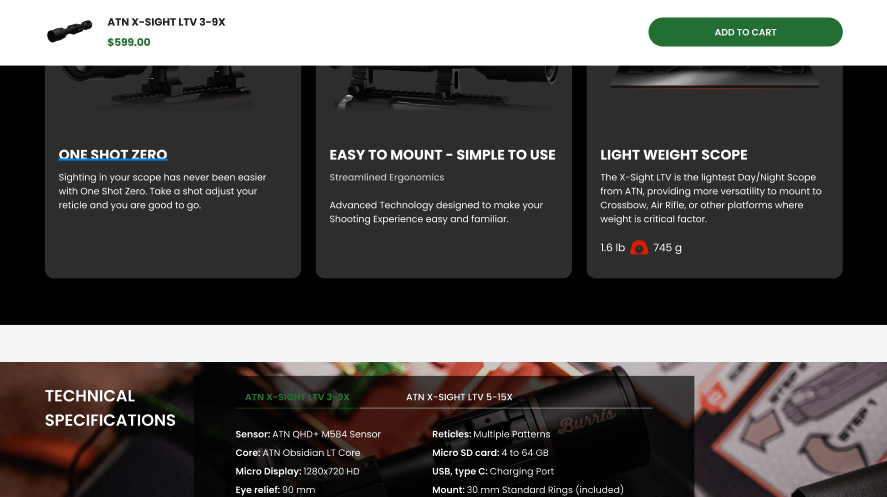
The sticky add to cart button is a floating bar that remains visible on the screen as users scroll down a product page. This ensures that the add to cart option is always within reach, regardless of where the user is on the page. The constant visibility of the cart button reduces the effort required for users to add items to their cart, making the shopping process more seamless and intuitive.
The convenience provided by this feature is particularly important for users who are exploring detailed product information and might otherwise need to scroll back up to add an item to their cart. By eliminating this step, the sticky add to cart button reduces friction in the purchase process, making it easier for users to complete their transactions.
Boosting Conversion Rates
The sticky add to cart functionality has a direct impact on conversion rates. By making it easier for users to add items to their cart at any point during their browsing session, this feature encourages more spontaneous and frequent additions to the cart. This increased accessibility can lead to higher order volumes and improved overall sales.
Statistics show that implementing a sticky add to cart button can increase orders by up to 8%. This significant boost in conversions highlights the importance of streamlining the user journey and reducing barriers to purchase. By providing a more convenient and efficient shopping experience, businesses can drive higher engagement and sales.
Importance for All Websites
The sticky add to cart functionality is a valuable addition to any e-commerce website. For outdated websites, incorporating this feature can address common pain points in the shopping process, such as difficulty in navigating back to the cart and losing track of selected items. By modernizing the shopping experience with a sticky add to cart button, businesses can enhance user satisfaction and drive higher conversion rates.
Outdated websites often struggle with high abandonment rates due to cumbersome navigation and a lack of intuitive features. The sticky add to cart button is a simple yet effective solution that can transform the user experience, making it more convenient and user-friendly. This feature exemplifies how thoughtful design improvements can lead to substantial business benefits, demonstrating the value of staying current with web design trends and best practices.
Importance of Homepage Redesign
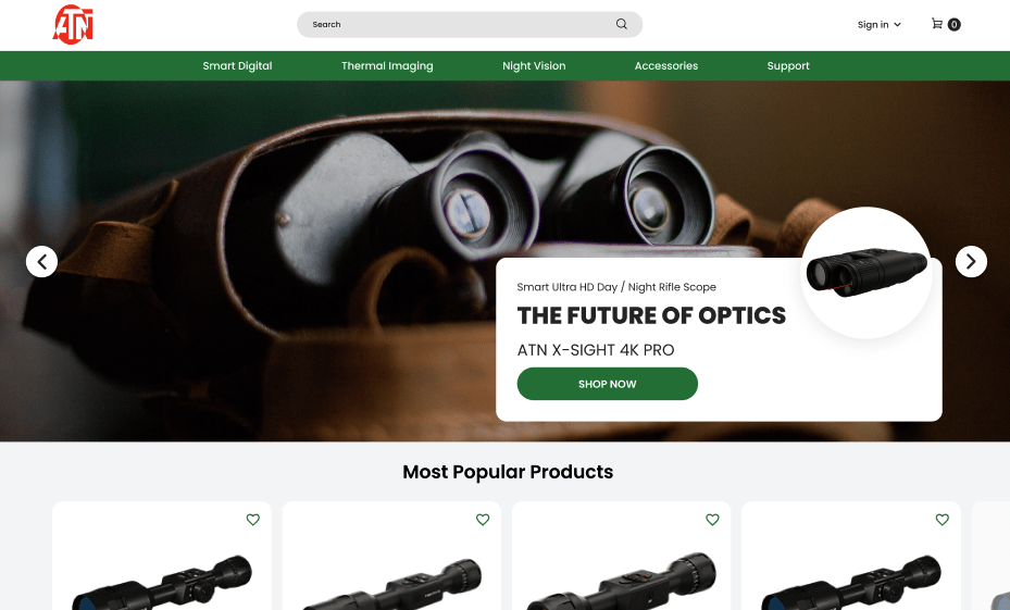
The homepage of a website serves as the virtual front door to a business. For ATNCorp, a leader in high-performance tactical and hunting night vision optics and thermal vision optics, the homepage redesign was a pivotal component of the overall website revamp. The goal was to create a compelling, user-friendly interface that not only attracts visitors but also engages them effectively from the moment they land on the site.
Header Banner: The First Impression
The header banner is often the first element that visitors notice upon arriving at a website. It acts as a digital billboard, introducing the brand and its core values. For ATNCorp, the redesigned header banner was crafted to clearly communicate the brand’s identity and personality. A well-designed banner sets the tone for the rest of the website, making a powerful first impression that can influence the user’s perception and engagement.
By focusing on visual appeal and clarity, the new header banner effectively captures the attention of visitors, encouraging them to explore further. This initial engagement is crucial for reducing bounce rates and increasing the time users spend on the site.
New User Interface: Enhancing Engagement and Trust
A significant aspect of the homepage redesign was the introduction of a brand-new user interface (UI). The primary aim of this redesign was to enhance customer engagement and build trust in ATNCorp’s products and services. A modern, visually appealing UI differentiates the website from outdated, text-heavy competitors, making it more attractive to potential customers.
The new UI emphasizes simplicity and usability, ensuring that users can easily navigate the site and find the information they need. By avoiding cluttered designs and using clear, concise language, the redesigned homepage provides a more pleasant and efficient user experience. This approach not only helps in retaining visitors but also increases the likelihood of conversions, as users are more likely to trust and purchase from a site that is easy to use and visually appealing.
Interactive UI Designs: Retaining Customers and Building Loyalty
Interactive UI designs play a crucial role in retaining customers and building brand loyalty. For ATNCorp, incorporating interactive elements such as hover effects and quick view functionalities on the homepage helps keep users engaged. These features provide immediate feedback and enhance the browsing experience, making it more enjoyable and intuitive.
By creating a more dynamic and interactive homepage, ATNCorp can better capture the interest of visitors and encourage them to stay longer on the site. This increased engagement can lead to higher conversion rates and greater customer loyalty over time.
Banner Ads: Effective Brand Promotion
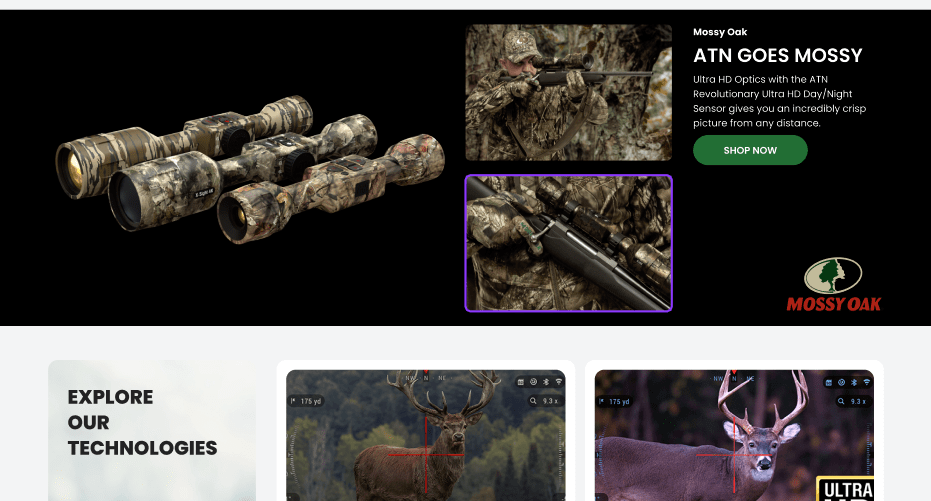
Banner ads embedded on the homepage are a vital tool for promoting products and increasing brand awareness. For ATNCorp, strategically placed banner ads help showcase key products and offers, driving traffic to specific sections of the site. These ads are designed to be visually appealing and are integrated seamlessly into the overall design, ensuring that they enhance rather than disrupt the user experience.
By using banner ads effectively, ATNCorp can attract attention to special offers and new products, encouraging visitors to explore and make purchases. This approach not only boosts sales but also reinforces the brand’s market presence.
Accessibility: Ensuring Inclusivity
An essential aspect of the homepage redesign was ensuring that the interface is accessible to all users, including those with disabilities. By implementing accessibility best practices, such as using high-contrast text, providing alternative text for images, and ensuring keyboard navigability, ATNCorp ensures that its website is inclusive and user-friendly for everyone.
Making the homepage accessible helps in reaching a broader audience and demonstrates a commitment to inclusivity, which can enhance the brand’s reputation and foster customer loyalty.
Streamlining Navigation with Mega Menu
Efficient navigation is a cornerstone of a well-designed website, particularly for e-commerce sites with extensive product offerings. The ATNCorp website redesign included the implementation of a mega menu, a feature that significantly improves the navigation experience by organizing content in a clear and user-friendly manner.
Mega Menu: An Advanced Navigation Solution
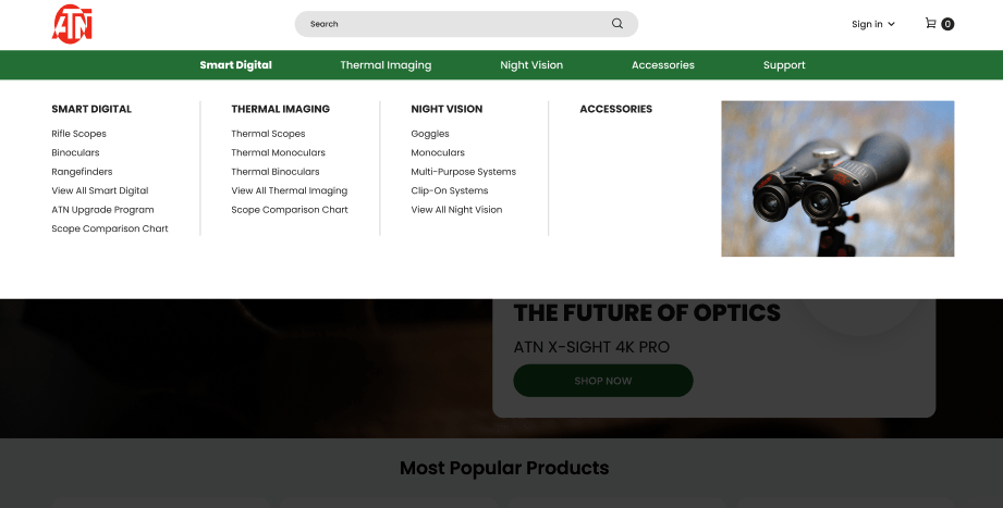
A mega menu is an advanced navigation tool that provides a comprehensive overview of a website’s content in a single, expandable menu. Unlike traditional dropdown menus, which can become cumbersome and difficult to read when dealing with a large number of options, a mega menu neatly categorizes and displays all available links and sections.
For ATNCorp, the mega menu allows users to quickly and easily find the products and information they need. By grouping related items and providing visual cues, the mega menu reduces the time and effort required to navigate the site. This streamlined approach enhances the overall user experience, making it easier for visitors to explore and discover the full range of products and services offered by ATNCorp.
Reducing Clutter and Promoting Relevant Products
One of the key benefits of the mega menu is its ability to reduce visual clutter on the website. By consolidating all navigation options into a single, organized menu, the homepage and other key pages remain clean and focused. This reduction in clutter not only makes the site more visually appealing but also helps users concentrate on the most important content.
The mega menu also provides an excellent platform for promoting relevant products and categories. For instance, ATNCorp can highlight popular product lines or special offers directly within the menu, guiding users towards items that may interest them. This targeted approach helps in driving traffic to high-priority sections of the site, increasing the likelihood of conversions.
Enhancing User Experience with Clear Navigation
Clear and intuitive navigation is essential for a positive user experience. The mega menu’s structured layout ensures that users can easily understand and navigate the site’s content. By providing a clear path to various sections and products, the mega menu minimizes confusion and frustration, leading to a more enjoyable browsing experience.
For users who may be unfamiliar with ATNCorp’s extensive product range, the mega menu serves as a helpful guide, allowing them to explore and discover new products with ease. This improved navigation experience can lead to higher engagement and satisfaction, as users are more likely to find what they are looking for quickly and efficiently.
Importance for All Websites
Implementing a mega menu is beneficial for any website, especially those with a large number of pages and options. Outdated websites often suffer from poor navigation, making it difficult for users to find the information they need. By adopting a mega menu, businesses can modernize their navigation systems, making them more user-friendly and efficient.
For e-commerce sites like ATNCorp, where product variety and ease of access are critical, a mega menu can significantly enhance the user experience. This feature not only improves usability but also helps in promoting key products and offers, driving higher engagement and sales. Websites that invest in such advanced navigation solutions demonstrate a commitment to providing the best possible user experience, which can lead to greater customer satisfaction and loyalty.
Enhancing Product Pages for Trust and Conversions
The redesign of ATNCorp’s website placed a significant emphasis on enhancing product pages to build trust and drive conversions. Product pages are where users make their purchase decisions, and their design and functionality can greatly influence whether a visitor becomes a customer. By focusing on key elements such as product ratings, highlights, and recommendations, ATNCorp aimed to create a more informative, trustworthy, and engaging shopping experience.
Verified Product Ratings and Authenticity
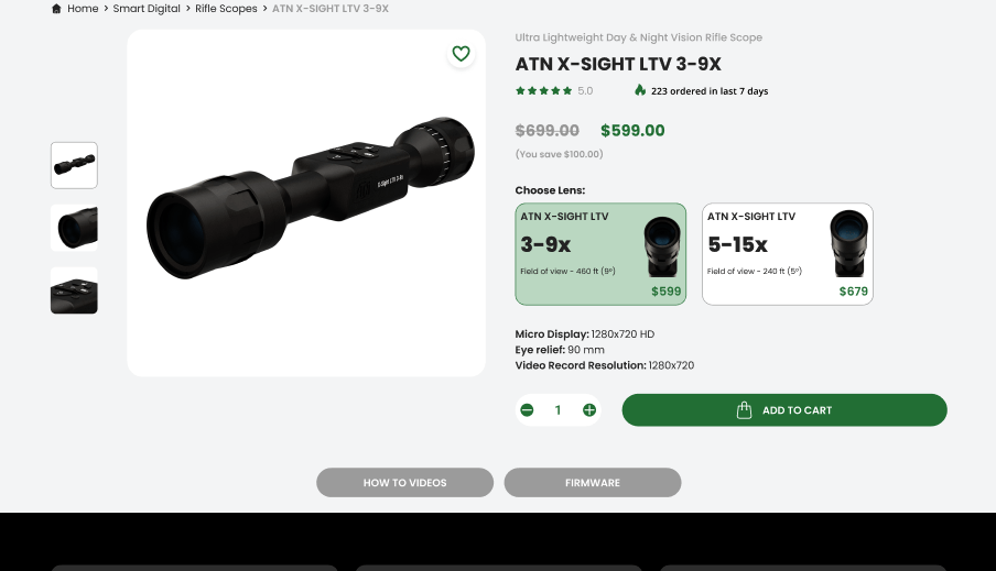
One of the primary features added to the product pages is verified product ratings. Customer reviews and ratings provide social proof, helping potential buyers make informed decisions. By displaying verified ratings, ATNCorp ensures that customers can trust the feedback they see, which is crucial for building credibility.
Verified ratings act as a testament to the quality and reliability of the products. When potential buyers see positive feedback from other users, they are more likely to trust the product and the brand. This transparency helps in reducing the perceived risk of purchasing online, thereby increasing the likelihood of conversions.
Clear and Concise Product Highlights
Another important aspect of the redesigned product pages is the presentation of product highlights and features. The goal was to provide essential information in a clear and concise manner, avoiding overwhelming users with too much detail. By focusing on the most important aspects of the product, such as key features, benefits, and specifications, ATNCorp ensures that users can quickly understand what the product offers.
This streamlined approach helps in keeping users engaged, as they do not have to sift through unnecessary information to find what they need. Clear and concise product descriptions also enhance the overall user experience, making it easier for customers to compare products and make decisions.
Up-sell and Cross-sell Strategies
To further enhance the product pages, ATNCorp implemented up-sell and cross-sell strategies. Up-selling involves showcasing similar, higher-quality products, while cross-selling recommends complementary products that enhance the user’s experience. For example, when a user views a thermal vision optic, they might see recommendations for protective cases or additional accessories.
These strategies not only help in increasing the average order value but also improve the user experience by providing relevant suggestions. By offering related products, ATNCorp makes it easier for customers to find everything they need in one place, which can lead to higher satisfaction and loyalty.
Importance for All Websites
Enhancing product pages is crucial for any e-commerce website. Outdated product pages often lack clear information, verified ratings, and relevant recommendations, which can deter potential buyers. By modernizing product pages, businesses can build trust, improve the shopping experience, and drive higher conversions.
For businesses looking to improve their online presence, focusing on product pages is a vital step. Providing clear and concise information, showcasing verified ratings, and implementing up-sell and cross-sell strategies are all effective ways to enhance the user experience and increase sales. These improvements demonstrate a commitment to meeting customer needs and expectations, which is essential for long-term success in the competitive digital marketplace.
Conclusion
The comprehensive redesign of ATNCorp’s website highlights the significant impact that thoughtful design and strategic enhancements can have on user experience and business performance. By focusing on key areas such as homepage design, navigation, search and filtering functionalities, product pages, and shopping cart features, ATNCorp has created a modern, user-friendly website that meets the needs of today’s digital consumers.
These improvements not only enhance the overall user experience but also drive higher engagement, trust, and conversions. For businesses looking to stay competitive in the digital age, investing in a comprehensive website redesign is a crucial step. It ensures that the online presence aligns with user expectations, provides a seamless and enjoyable shopping experience, and ultimately supports business growth and success.


