In the world of traditional and primitive archery, 3Rivers Archery stands out as a beacon of expertise and quality. Renowned as the largest supplier of longbows, recurves, and a myriad of archery supplies, 3Rivers Archery has built a reputation for excellence among archery enthusiasts. However, in today’s digital age, even a well-established business like 3Rivers Archery must continuously evolve to meet the ever-changing demands of the online marketplace. A website is often the first point of contact between a business and its customers, and its design can significantly impact user experience and business growth.
Recognizing the need for a more modern and user-friendly online presence, 3Rivers Archery is considering a comprehensive redesign of its website. This article delves into the potential redesign process, showcasing the anticipated transformative changes and benefits. By understanding these possibilities, businesses can glean valuable insights into how a website redesign can enhance user engagement, build trust, and ultimately drive success.
Section 1: Homepage Redesign
Header Banner
One of the most pivotal elements of the 3Rivers Archery website redesign proposal is the introduction of a new header banner. The header banner is not just a visual element; it is the first impression a visitor gets upon landing on the site. It acts as a digital billboard, announcing who the business is and what it stands for. For 3Rivers Archery, the new header banner would be crafted to perfectly encapsulate the brand’s identity and personality.
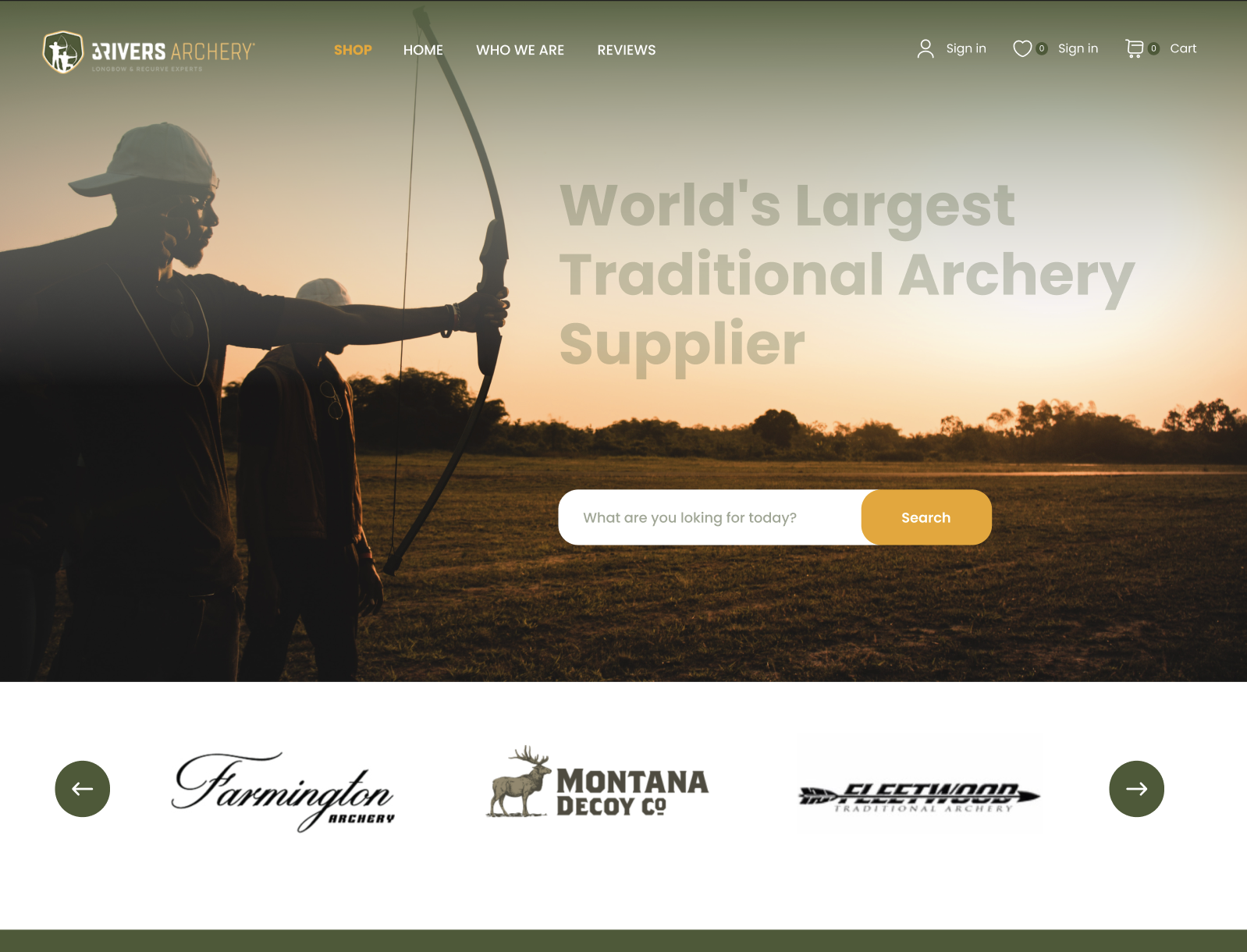
The importance of a well-designed header banner cannot be overstated. It serves as a primary marketing tool that sets the tone for the user’s entire browsing experience. The proposed banner at 3Rivers Archery is designed to increase customer engagement with eye-catching visuals and clear messaging. By immediately conveying the essence of the brand, it would help build customer trust and distinguish the site from outdated, text-heavy competitors. This strategic move would ensure that visitors are captivated right from the start, making them more likely to explore further and engage with the content.
User Interface
A significant overhaul of the user interface (UI) is also proposed to improve the overall customer experience. The new UI design would be not only aesthetically pleasing but also highly functional, aiming to enhance user interaction with the site. One of the key principles guiding the redesign is simplicity. A simple, clean interface avoids overwhelming users with unnecessary elements and complex designs. Instead, it uses clear language and straightforward navigation paths.
This shift to a more streamlined UI would bring several benefits. First, it reduces the cognitive load on users, making it easier for them to find what they are looking for. Second, it enhances the overall user experience by providing a smooth and enjoyable browsing experience. An attractive and intuitive UI also helps retain customers, encouraging them to stay loyal to the brand. In a market where retaining customers can be just as crucial as acquiring new ones, this aspect of the redesign plays a vital role.
Accessibility
Another critical aspect of the redesign is ensuring accessibility for all users. The new interface would be designed to be visible and navigable for users with different needs, including those with disabilities. Key elements would be identified and highlighted to guide users to their desired destinations effortlessly. This commitment to accessibility reflects 3Rivers Archery’s dedication to inclusivity, ensuring that every visitor can have a positive experience on the site.
Value Proposition
The redesigned homepage would prominently feature a clear and compelling value proposition. This is essential in drawing attention to the unique offerings of 3Rivers Archery. The value proposition would showcase high-quality products, attractive offers, and limited-time deals, capturing the viewers’ interest right away. By taking up significant space on the homepage, it would ensure that the most important messages are the first things visitors see, effectively driving engagement and conversions.
Section 2: Mega Menu Implementation
Mega Menu Overview
One of the standout features of the proposed 3Rivers Archery website redesign is the implementation of a mega menu. Unlike traditional drop-down menus, mega menus offer a more expansive and organized way to present navigation options. For a website like 3Rivers Archery, which boasts a vast array of products and categories, a mega menu would provide a practical solution to streamline user navigation.
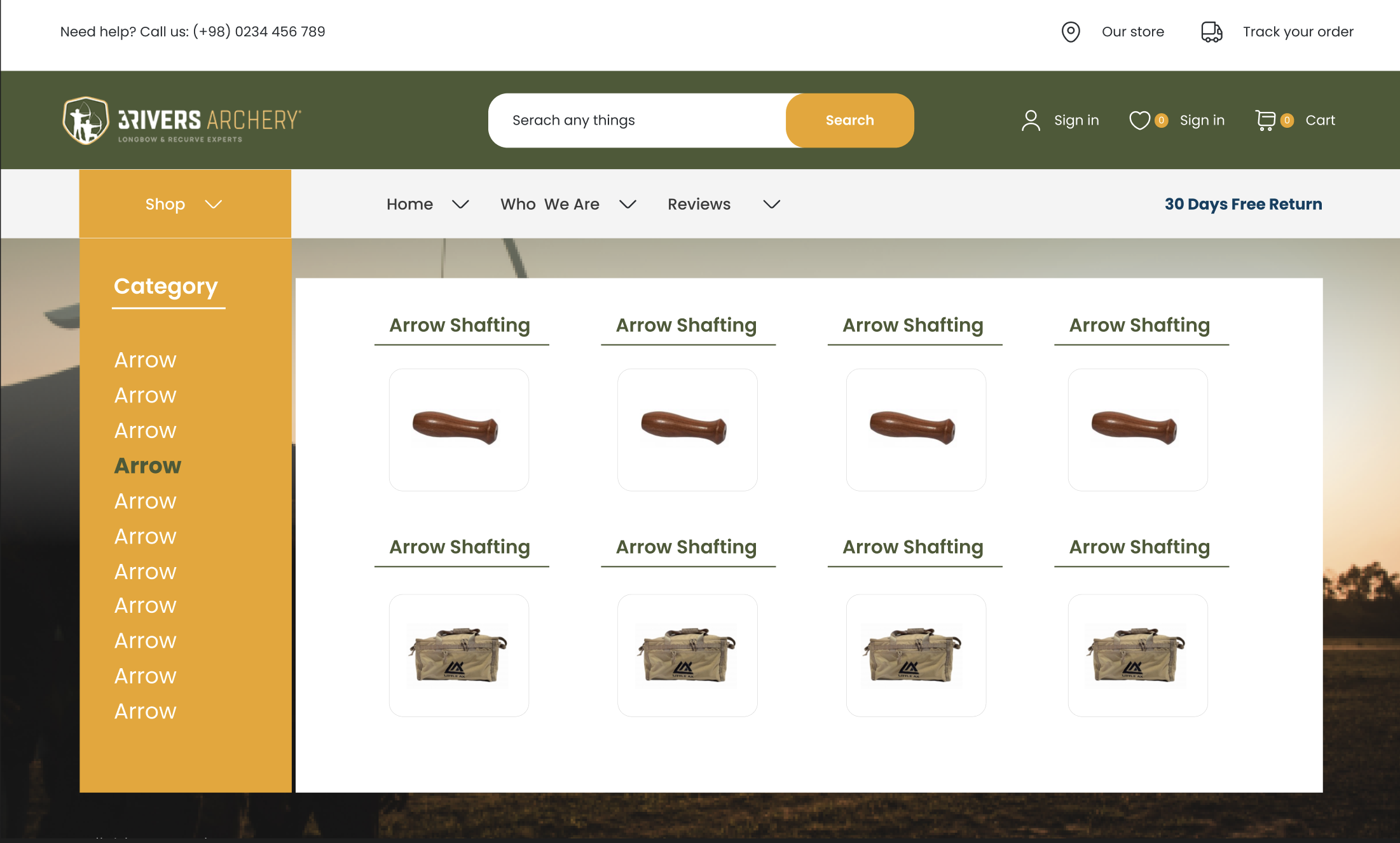
Mega menus are designed to display multiple levels of hierarchy within a single, visually coherent structure. This approach not only reduces clutter but also promotes relevant products and guides shoppers directly to what they are looking for. By presenting a broad range of options at a glance, mega menus simplify the decision-making process for users, making it easier for them to find and explore various product categories without feeling overwhelmed.
User Experience
The enhanced navigation afforded by the mega menu would significantly improve the user experience on the 3Rivers Archery website. Users could quickly and easily locate their desired products or categories, minimizing the time spent searching and maximizing engagement with the site’s offerings. This is particularly beneficial for eCommerce sites with extensive product lines, as it helps prevent user frustration and reduces bounce rates.
Moreover, mega menus allow for the inclusion of images, descriptions, and even promotional banners within the menu itself. This additional context can help guide users to specific products or highlight current deals, further enhancing the shopping experience. By offering a visually rich and organized navigation system, 3Rivers Archery would ensure that users can find what they need with minimal effort, leading to increased satisfaction and higher conversion rates.
The benefits of a mega menu extend beyond user satisfaction. For businesses, it provides an opportunity to showcase a wider range of products and highlight key categories. This can lead to increased product visibility and, ultimately, higher sales. Implementing a mega menu can be a game-changer for outdated websites struggling with cumbersome navigation systems, making it a worthwhile consideration for any website redesign.
Section 3: Category Pages Optimization
Search Interface
An optimized search interface is a cornerstone of the proposed 3Rivers Archery redesign, reflecting the importance of intuitive search functionality in enhancing user experience. According to Forrester Research, 43% of website visitors immediately head to the search bar upon entering an eCommerce site, and these searchers are 1.8 times more likely to convert than non-searchers. Recognizing this, the redesign would focus on creating an interactive, easy-to-use, and aesthetically pleasing search interface.
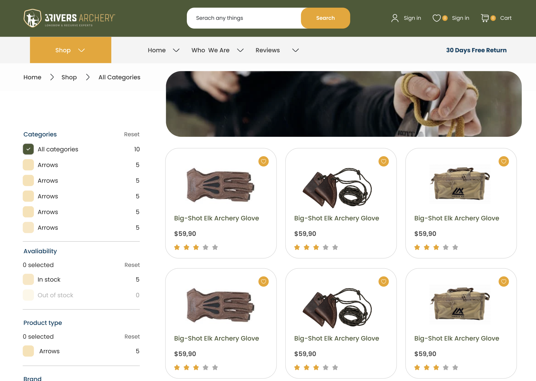
The new search interface on the 3Rivers Archery website would be designed to be highly responsive and user-friendly. It would feature auto-suggestions, predictive text, and clear categorization of search results, helping users find products quickly and accurately. This seamless search experience would not only improve user satisfaction but also increase the likelihood of conversions, as users are more likely to find and purchase the products they are looking for.
Filtering System
In addition to an optimized search interface, the redesign also proposes the introduction of an advanced filtering system. This system is essential for websites with large product catalogs, such as 3Rivers Archery. Filters allow users to narrow down their search results based on various criteria, such as product type, price range, brand, and more. This functionality is crucial for providing a tailored shopping experience and helping users quickly find the products that meet their specific needs.
Filters are not just a convenience; they are a powerful tool for improving user experience and driving sales. Studies have shown that the mere presence of filters can increase conversion rates by up to 26%. By fixing issues with filter UX design, websites can achieve even more significant results. For 3Rivers Archery, the new filtering system would enable users to explore the extensive product range more efficiently, making the shopping experience more enjoyable and productive.
Interactive and Aesthetic Design
The redesign also places a strong emphasis on creating an interactive and visually appealing category page design. This includes the use of high-quality images, clear product descriptions, and intuitive navigation elements. By combining these design principles, the new category pages would provide a more engaging and informative shopping experience.
An aesthetically pleasing design not only attracts users but also encourages them to spend more time on the site, exploring different products and categories. This increased engagement can lead to higher conversion rates and greater customer satisfaction. For businesses with outdated websites, investing in an interactive and attractive category page design can yield substantial benefits, making it an essential component of any comprehensive redesign strategy.
The combined impact of an optimized search interface, an advanced filtering system, and an interactive design would ensure that 3Rivers Archery’s category pages are both functional and user-friendly. These enhancements would make it easier for users to navigate the site, find the products they need, and enjoy a seamless shopping experience. By addressing these critical aspects, the proposed redesign sets a new standard for eCommerce websites, demonstrating the importance of a thoughtful and user-centric approach to web design.
Section 4: Product Pages Enhancement
Product Ratings and Proof
A key element of the proposed 3Rivers Archery website redesign is the enhancement of product pages, particularly through the inclusion of verified product ratings and proof of authenticity. These additions are crucial for building customer trust and confidence, which are vital components of a successful eCommerce experience. Displaying verified customer ratings would provide potential buyers with honest feedback from other users, increasing their trust in the product and the brand. This transparency helps customers make informed purchasing decisions, reducing the likelihood of returns and complaints.
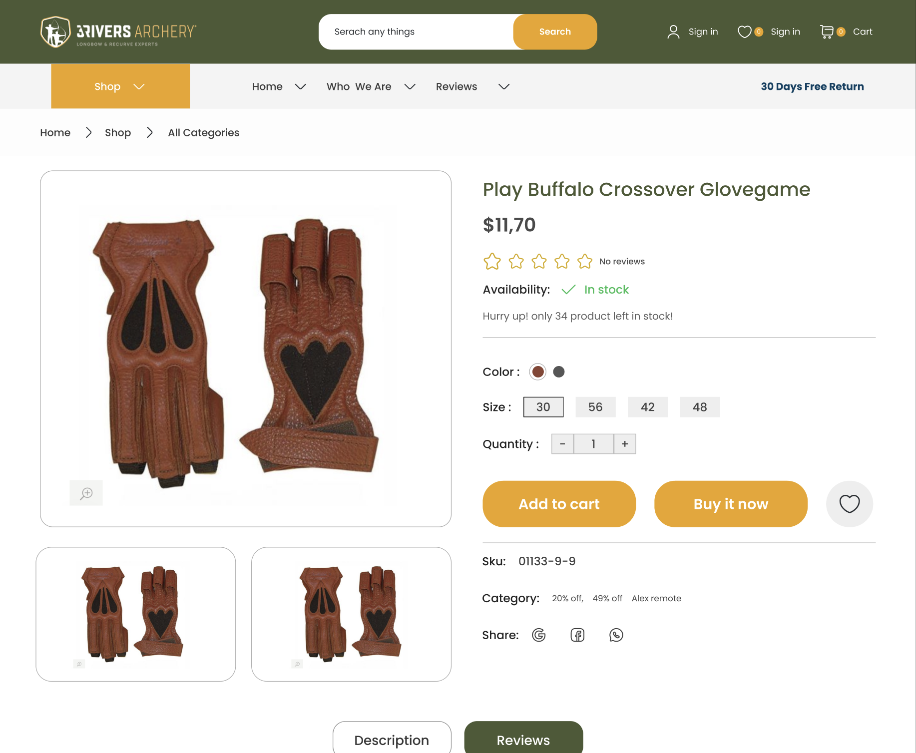
For certain products, especially high-value or specialized items, providing proof of authenticity reassures customers about the quality and genuineness of the product. This not only boosts customer confidence but also differentiates 3Rivers Archery from competitors who may not offer such guarantees. By emphasizing these aspects, the redesigned product pages effectively address common customer concerns, leading to higher satisfaction and increased sales.
Product Highlights and Recommendations
The new product pages would also focus on presenting product highlights and features without overwhelming the user. This balanced approach ensures that customers receive essential information in a digestible format, helping them make quick yet informed decisions. Key product features would be showcased prominently, allowing users to easily understand the benefits and specifications of each item.
Another significant improvement is the use of recommendations for up-selling and cross-selling. Up-selling involves showing visitors similar products of higher quality, while cross-selling showcases complementary products that can enhance the user’s overall experience. For instance, a bow purchase could be accompanied by recommendations for arrows, quivers, or maintenance kits. This strategy not only increases the average order value but also enhances customer satisfaction by providing them with a complete solution for their needs.
Section 5: Sticky Add-to-Cart Functionality
What is Sticky Add to Cart?
A standout feature in the 3Rivers Archery website redesign proposal is the implementation of a sticky add-to-cart functionality. This feature involves a cart button that follows the shopper as they scroll down the product page. The purpose of this functionality is to enhance the customer experience by making it easier to add products to the cart without having to scroll back up to find the add-to-cart button.
Enhanced Customer Experience and Conversion Rates
The sticky add-to-cart button would significantly improve the shopping experience by providing a constant reminder of the purchasing option. This convenience can be particularly beneficial for customers who like to browse through detailed product descriptions and reviews before making a decision. By keeping the add-to-cart button always accessible, the redesigned website would reduce friction in the purchasing process, making it more likely that users will complete their transactions.
The impact of this feature is supported by statistics: implementing a sticky add-to-cart button can increase orders by up to 8%. This boost in conversions is a testament to the effectiveness of making the shopping process as seamless and user-friendly as possible. For outdated websites, integrating such modern functionalities can lead to substantial improvements in user engagement and sales performance.
Conclusion
The enhancements proposed for the 3Rivers Archery website redesign, including the implementation of mega menus, optimization of category pages, enhancement of product pages, and the introduction of sticky add-to-cart functionality, highlight the importance of thoughtful and user-centric design. By focusing on building trust through verified ratings and proof of authenticity, simplifying the presentation of product information, leveraging up-selling and cross-selling strategies, and streamlining the purchasing process with a sticky add-to-cart button, the proposed redesign addresses key aspects of the user experience. These anticipated changes demonstrate that even well-established businesses can benefit from a comprehensive website redesign, ensuring they stay competitive and meet the evolving expectations of their customers. As digital landscapes continue to evolve, it is essential for businesses to regularly evaluate and update their websites to meet modern standards and user expectations. For businesses looking to stay ahead of the curve, a redesign is not just an option but a necessity for sustained growth and success.


